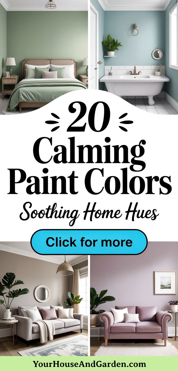
A refreshed wall hue can instantly dial down stress, yet not every pigment nurtures serenity. Color psychologists consistently point to softened blues, sages, warm neutrals and muted pastels as top choices because lower-saturation, lower-contrast values trigger the parasympathetic “rest-and-digest” response. Recent color-of-the-year launches likewise skew toward gentle mid-tones—proof that paint brands see calm as the mood of 2025. Below, discover twenty calming paint colors, each described as a complete design theme so you can immediately imagine how it will look, feel and pair with furnishings across your home.
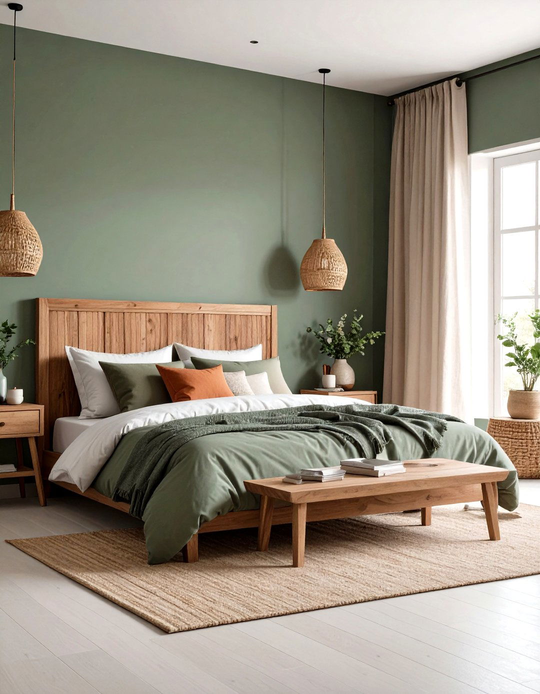
1. Soft Sage Green Paint Color
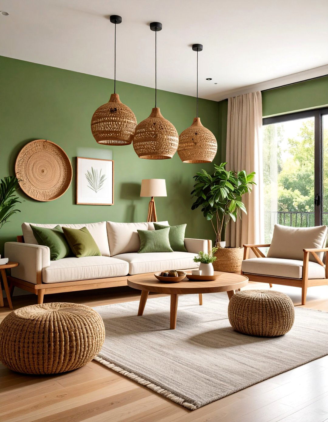
To introduce an organic hush, opt for a soft sage green paint color that blends muted moss with a whisper of gray. Research shows mid-value greens remind the brain of verdant landscapes, lowering heart rate and blood pressure while encouraging focus. Pair this hue with matte black hardware, woven rattan lighting and creamy textiles for a modern biophilic scheme. Because sage occupies the intersection of warm yellow and cool blue, it behaves as a surprising neutral, letting walnut furniture or brass fixtures shine without visual tension. Finish the look with botanical artwork and textured linens to amplify the restful vibe.
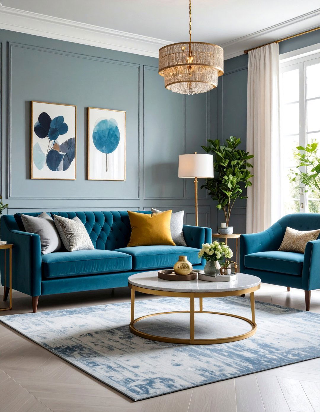
2. Misty Blue Gray Paint Color
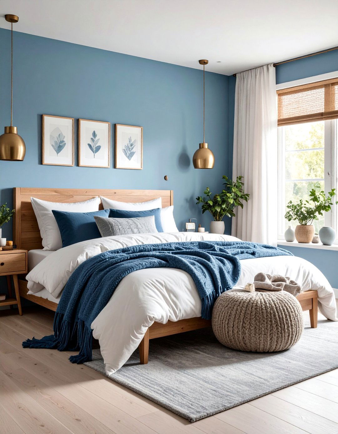
Misty blue gray paint color wraps a room in the quiet stillness of early morning fog. The subtle infusion of blue promotes calm cognition, while the touch of gray keeps the palette sophisticated rather than sugary. Layer it with chunky wool throws, fog-toned ceramics and brushed-nickel fixtures to craft a Scandinavian spa ambiance. Unlike brighter sky blues, this desaturated note softens harsh daylight glare and flatters both warm and cool wood species equally, so it works in open-plan homes. Finish with eucalyptus greenery to echo its cool undertone.
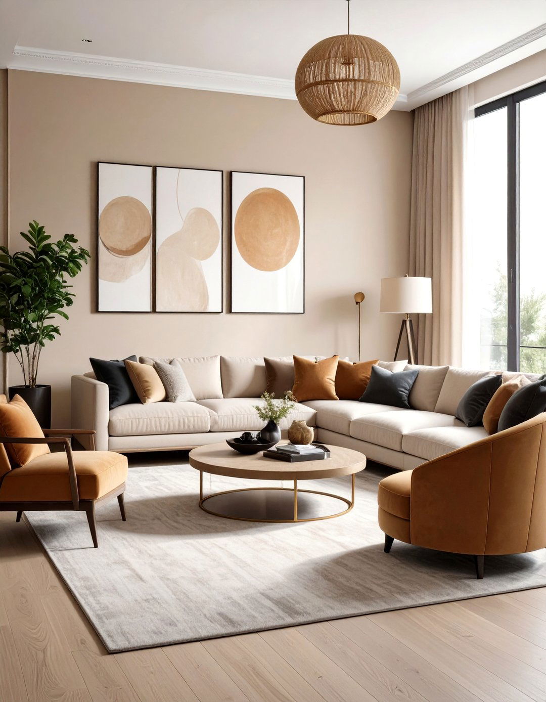
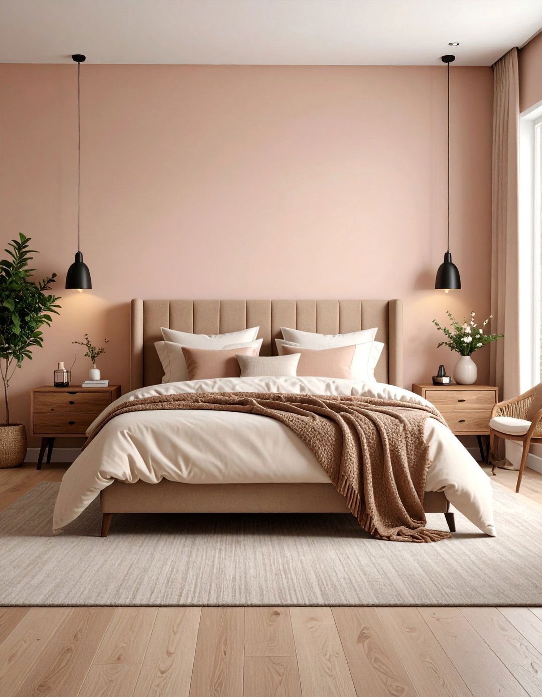
3. Warm Greige Paint Color
Warm greige paint color merges beige’s cozy warmth with gray’s subtle refinement to create a cocooning background that never feels sterile. Color therapists note that balanced warm-cool neutrals help settle overstimulated minds because they lack dominant chroma yet radiate gentle comfort. Use it across walls, millwork and ceilings to blur architectural lines, then layer tonal linens, flax drapery and wheat-colored sisal rugs for a monochrome sanctuary. When you introduce accents—olive pottery, aged leather or antique brass—the muted backdrop makes each piece read like curated art. Dim-to-warm LED lighting further enriches the hue’s enveloping softness after sunset; consider matte lime-wash for an even softer, cloud-like effect.
4. Pale Lavender Paint Color
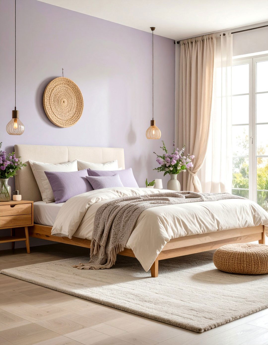
Another soothing option is a pale lavender paint color, blending the clarity of blue with the warmth of red in the faintest whisper, which studies link to lowered anxiety in healthcare settings. By choosing a version with gray undertones instead of sugary pink, you gain a sophisticated pastel suitable for adult bedrooms or meditation corners. Pair it with ivory bedding, raw oak nightstands and sheer voile curtains to amplify its airy, feminine grace. Because lavender sits opposite chartreuse on the color wheel, just a few potted ferns or olive-leaf branches supply fresh contrast without adding noise. Finish with brushed-gold accents to elevate the romantic scheme.
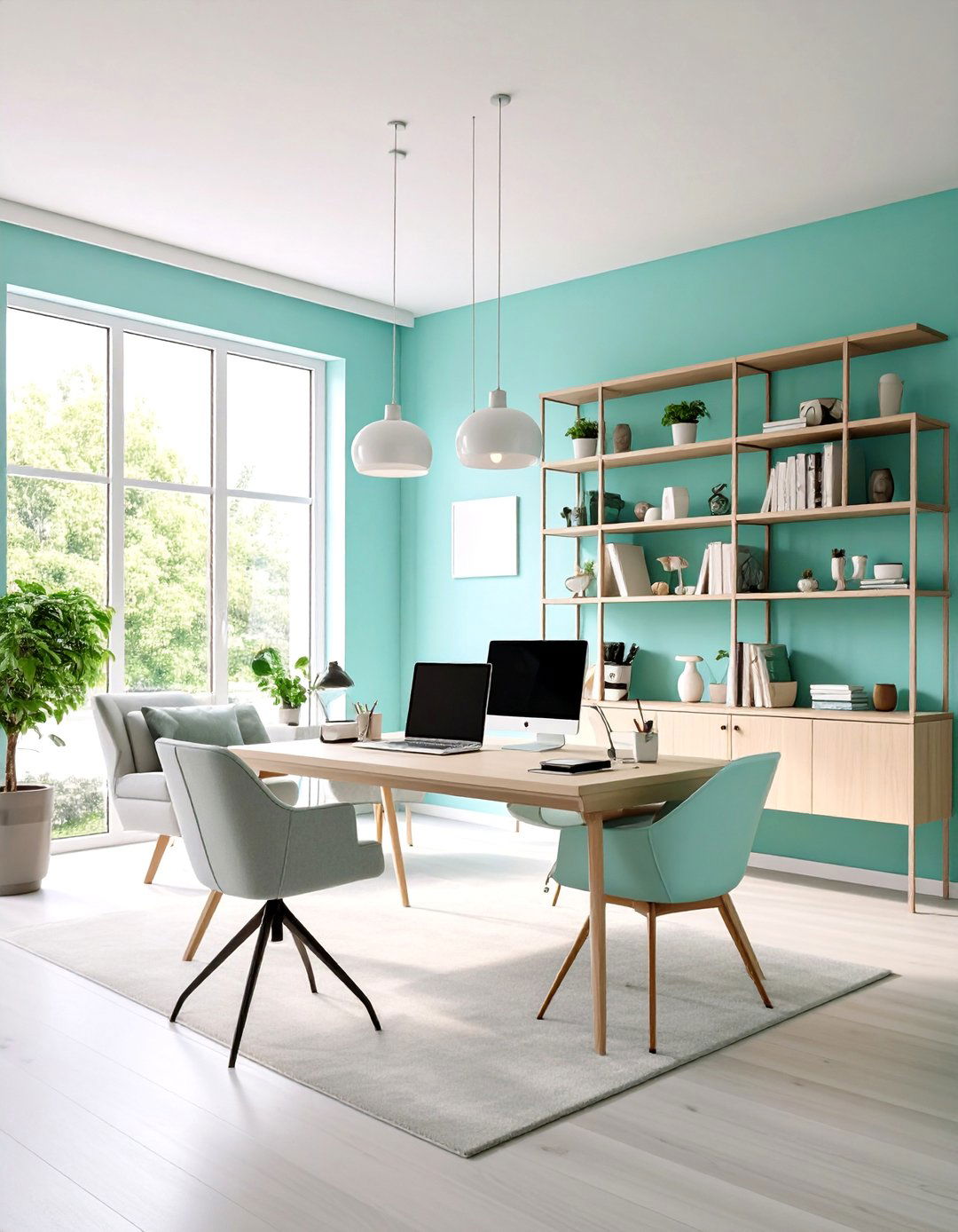
5. Muted Aqua Paint Color
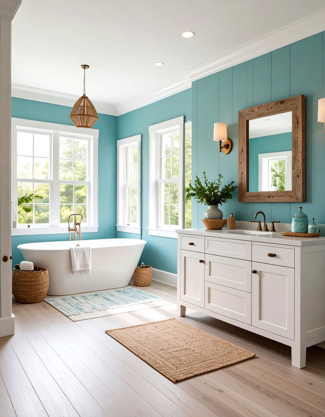
To recall tranquil coastal shallows, bring in a muted aqua paint color that tempers turquoise cheer with a breath of gray. Oceanic hues are clinically shown to reduce pulse rate by mimicking expansive horizons, giving small bathrooms or home offices a sense of spacious calm. Complement this tone with white-oak cabinetry, sea-salt pottery and weathered driftwood frames for an understated beach cottage theme. Unlike brighter aquas, the desaturation prevents a kitschy, child-like feel while still delivering refreshing energy on humid afternoons. Soft linen Roman shades and woven jute runners complete the breezy palette without visual clutter; for effortless upkeep add eggshell finish.
6. Dusty Rose Paint Color
Surprisingly, a dusty rose paint color can be just as calming as cooler tones when its saturation is dialed back to a mauve-tinged neutral. Soft pinks stimulate oxytocin release, fostering feelings of safety and affection—key ingredients for cozy reading nooks or nurseries. Choose a chalky, brown-based variant to avoid saccharine overload, then layer camel leather, linen-blend drapes and terracotta pots for an earthy modern palette. Brass sconces and cream boucle chairs warm the space further, proving pink can read as sophisticated rather than juvenile. A matte finish diffuses light, preventing glare and maintaining the whisper-soft atmosphere throughout quiet afternoons.
7. Whisper White Paint Color
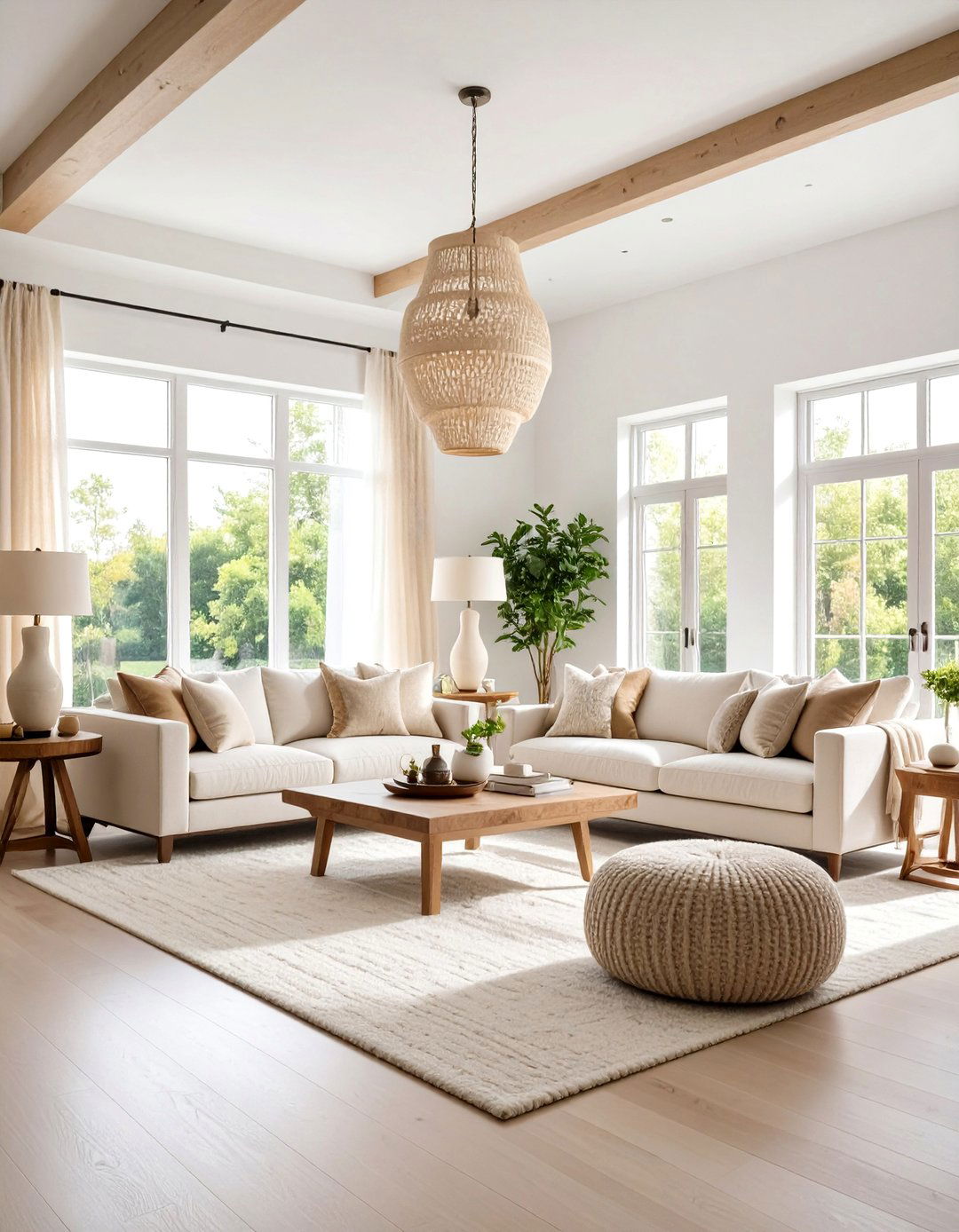
Whisper white paint color is far from clinical; its barely-there hint of warm ochre keeps spaces bright yet soothing, much like diffused morning sunlight. The 2025 trend toward sun-kissed off-whites highlights how homeowners crave neutrality without sterility, as showcased by leading paint capsules. Coat walls, trim and ceilings in the same finish to erase visual boundaries and create a seamless, cloud-like envelope. Layer pale linen sofas, boucle throw pillows and alabaster lamps for tone-on-tone depth. Because this white carries just enough warmth, it flatters natural fiber rugs and pale oak floors, avoiding the blue cast stark whites can introduce at nighttime illumination.
8. Light Taupe Paint Color
Looking for earthy calm that feels mature? Light taupe paint color marries mushroom gray and gentle beige, delivering a velvety neutrality often favored in boutique hotels. Surveys reveal that brown-gray mid-tones evoke grounded stability, helping occupants feel sheltered from external noise. Coordinate it with caramel suede cushions, bronze hardware and charcoal artwork for an understated, gallery-like mood. The subtle pink undertone in many taupes flatters skin tones, making this shade ideal for living rooms where conversation and relaxation coexist. Use satin finish on millwork to bounce soft light, while matte walls recede and enhance the cocoon effect during quiet evenings.
9. Powder Blush Pink Paint Color
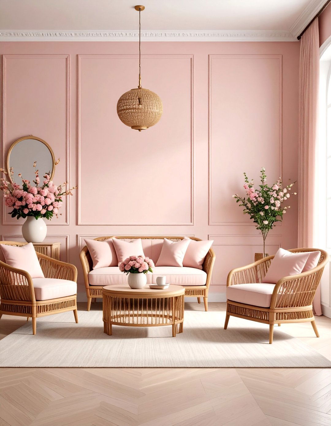
Powder blush pink paint color offers a barely-there pastel that softens architectural edges without overt femininity. Neurological studies show low-intensity pinks encourage empathy and reduce aggressive behavior, which is why some rehabilitation spaces employ this hue. Blend it with ivory wainscoting, cane furniture and brushed rose-gold accents for a gentle, modern-French vibe. Unlike deeper roses, this powdery shade reflects light evenly, preventing the shadowy banding that can make small rooms feel cramped. A satin finish amplifies its luminous quality, while crisp white ceiling paint keeps the palette grounded; finally, introduce sisal textures to balance its airy sweetness throughout the space.
10. Smoky Sky Blue Paint Color
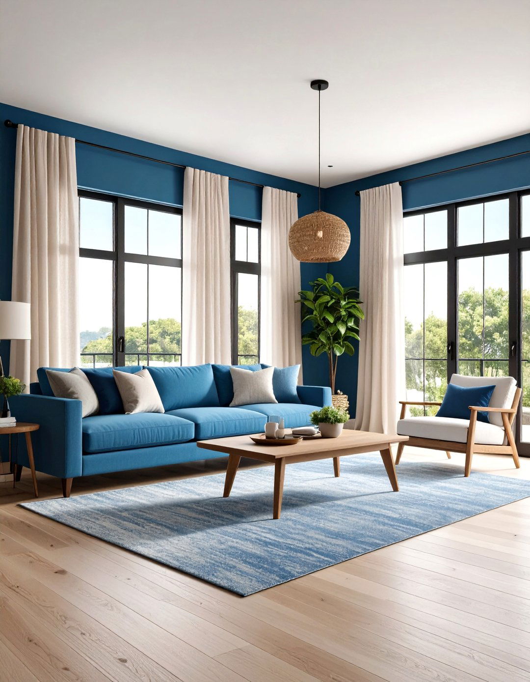
Smoky sky blue paint color captures the hazy horizon just before dusk, mixing stilled blue with a wisp of gray to ease mental chatter. Color experts rank muted blues as the most physiologically calming family, slowing respiratory rate and deepening breath. Combine this hue with bleached-pine floors, linen gauze curtains and matte black window frames for a relaxed coastal-modern scheme. Because its undertone is neutral, you can add caramel leather sofas or brass pendants without clashing. In evening artificial light it shifts toward dusty slate, giving the room a cocooning mood perfect for slow conversations and mindful breathing sessions too.
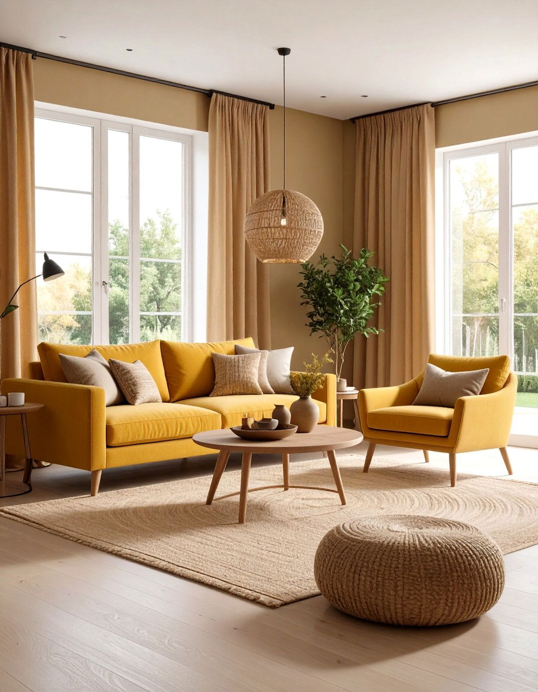
11. Gentle Buttercream Paint Color
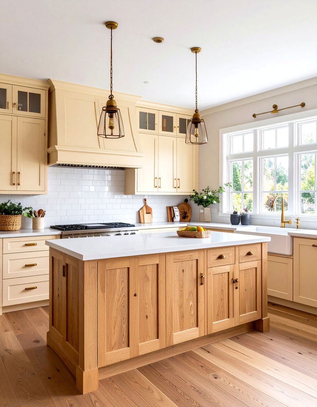
Gentle buttercream paint color serves comfort on a wall, infusing a space with the softness of whipped vanilla but avoiding the heaviness of pure yellow. Studies associate pale creamy yellows with optimism and daylight, making windowless kitchens or basements feel brighter without overstimulation. Pair with natural maple cabinetry, unlacquered brass hardware and butcher-block counters for an inviting farmhouse kitchen. A light gray subway-tile backsplash cools the palette just enough, while oatmeal cotton Roman shades echo its warmth. For cohesion, finish ceilings in the same hue at half strength, creating a seamless, luminous envelope that evokes sunrise comfort year-round for everyone.
12. Quiet Seafoam Paint Color
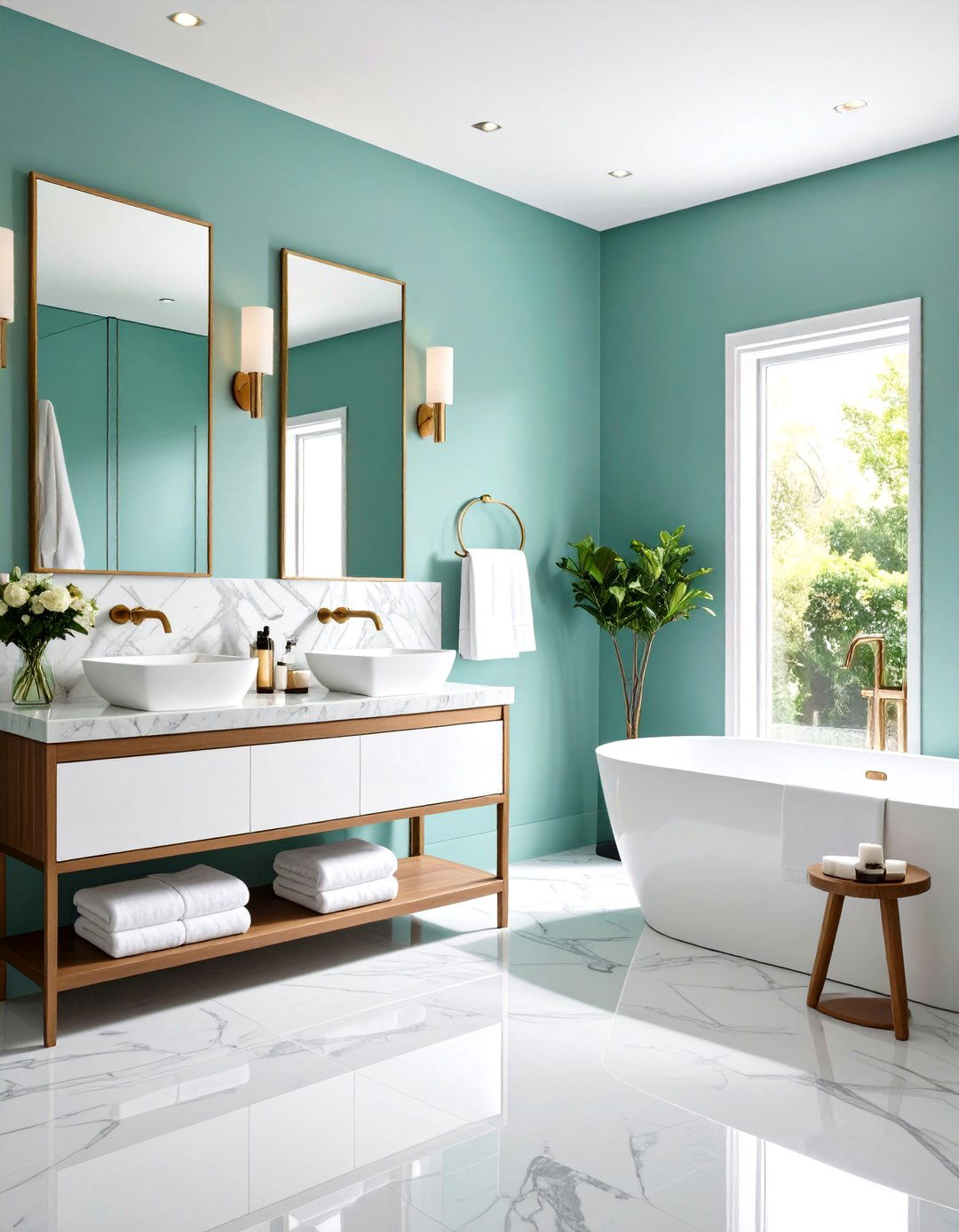
By blending soft green with airy blue, a quiet seafoam paint color conjures spa water clarity, which designers frequently recommend for bathrooms and yoga corners seeking immediate relaxation. Its cool undertone pairs effortlessly with honed Carrara marble, polished chrome fixtures and fluffy white towels, cultivating a boutique-hotel feel at home. Unlike brighter seafoam variations from the early 2000s, today’s grayed base keeps the look sophisticated and reduces color fatigue. Add driftwood stools, eucalyptus bundles and frosted glass accessories to reinforce its watery essence. A satin finish allows gentle light reflection reminiscent of rippling waves, deepening the restorative sensation for occupants.
13. Silvery Gray Paint Color
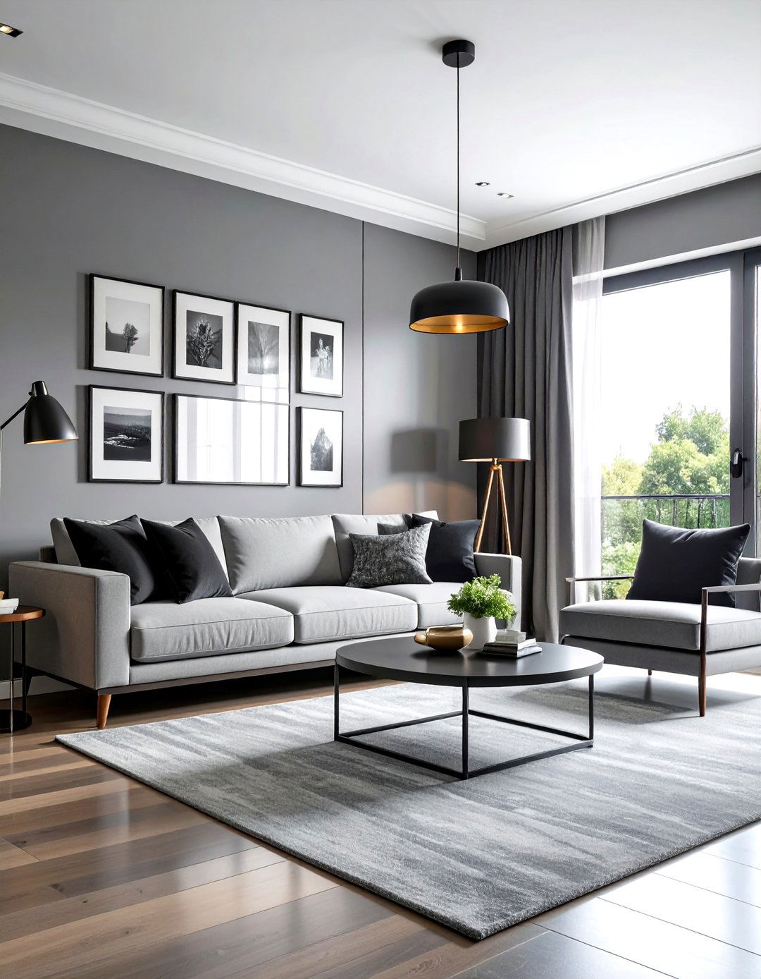
Silvery gray paint color delivers calm through subtle cool undertones and a refined metallic whisper that bounces soft light. Experts note that true achromatic grays sometimes feel flat, but introducing a hint of silver increases perceived brightness without upping saturation, keeping stress hormones low. Style it with charcoal velvet pillows, chrome task lamps and black-and-white photography to craft an urban zen living room. Because the hue is neutral, you can add seasonal accent colors—sage in spring, cinnamon in fall—without repainting. Use an eggshell finish to emphasize its polished sheen, and keep floors light oak to prevent an overly cold scheme.
14. Delicate Mint Paint Color
Delicate mint paint color offers a feather-light whisper of green that feels as refreshing as a cool glass of water on a summer afternoon. Low-chroma greens support cognitive restoration by recalling nature, making this shade perfect for study spaces or creative studios. Pair mint walls with whitewashed birch desks, acrylic shelves and pale gray upholstery for an airy, modern palette that keeps focus sharp. Unlike saturated mints of retro diners, today’s pastel base includes a drop of gray, avoiding visual overload. Finish with matte nickel hardware and clear glass pendant lights to maintain the clean, buoyant spirit across the workspace.

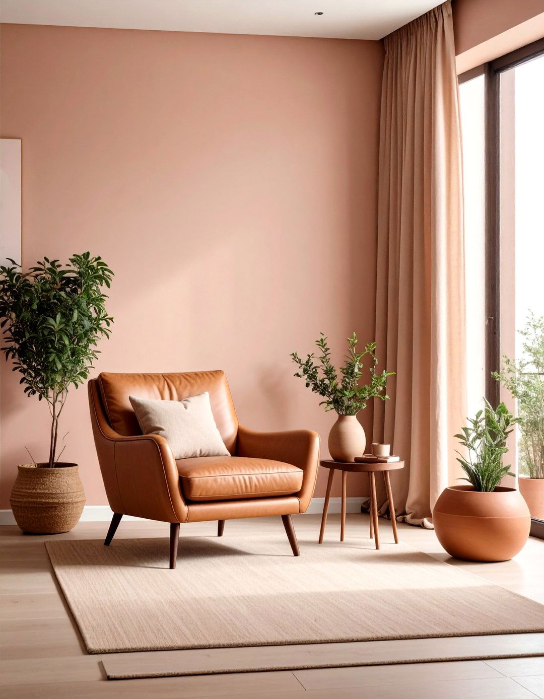
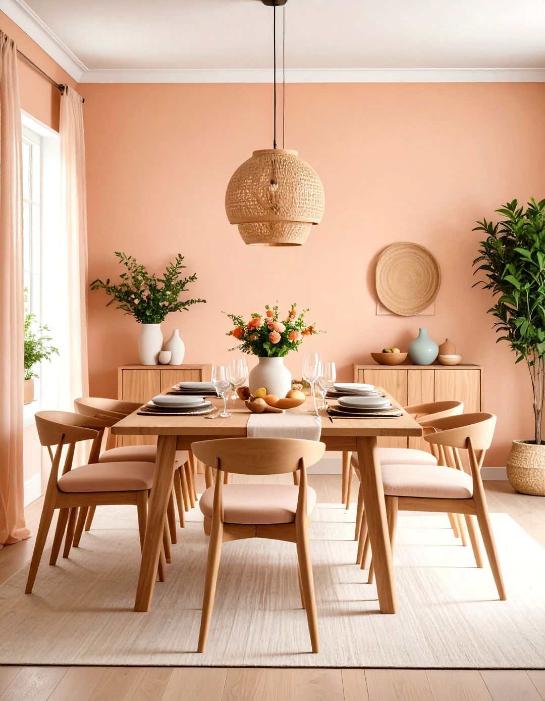
15. Calm Coral Blush Paint Color
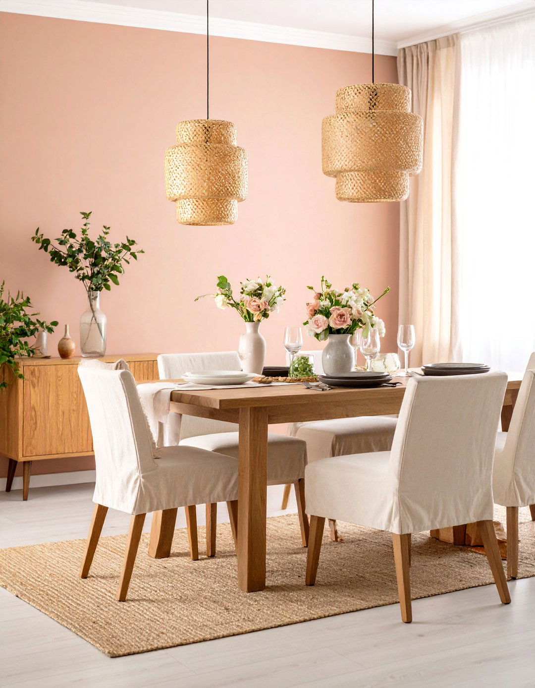
Owing to its subtle infusion of muted orange, a calm coral blush paint color radiates gentle warmth that feels like sunset reflecting off adobe walls. Designers find that low-saturation corals encourage sociability without the agitation sometimes produced by pure reds. Introduce this hue in dining rooms and conversation pits paired with weathered oak tables, off-white slipcovered chairs and natural fiber pendants for a Mediterranean-casual mood. The gray undertone modernizes the shade, preventing a tropical kitsch vibe. Complement with woven baskets, terra-cotta planters and patinated brass flatware to reinforce the organic palette and foster leisurely, heartwarming meals throughout the evening gathering.
16. Tranquil Teal Paint Color
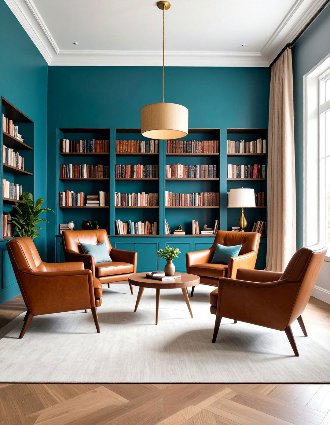
Unlike its vibrant cousins, a tranquil teal paint color tempers deep blue-green with charcoal, offering moody sophistication alongside meditative depth. Color mapping studies indicate darker mid-tone teals evoke feelings of protected quiet, ideal for libraries or cozy TV lounges. Dress the space with cognac leather chairs, brass picture lights and textured linen drapery to balance the hue’s richness. Because teal bridges warm and cool, it complements both walnut shelves and brushed steel electronics seamlessly. Soft pool-blue throw pillows and cream wool rugs add contrast without breaking serenity. Use a velvety matte finish to enhance its enveloping quality after dusk hours.
17. Dusty Sage Blue Paint Color
Take serenity up a notch with a dusty sage blue paint color—an intriguing hybrid that mixes muted green, gray and blue into a balanced restorative tone. Environmental psychologists note that multi-hued mid-tones keep the eye moving gently, which reduces visual fatigue compared with flat monochromes. Frame this shade with black steel stair railings, ribbed oak paneling and alabaster sconces for an upscale farm-industrial feel. Because the color carries green undertones, potted herbs or eucalyptus wreaths reinforce its biophilic message. Choose low-sheen eggshell to hide minor wall imperfections and maintain a velvety, weathered quality reminiscent of misty farmland mornings year-round calm.
18. Subtle Mauve Paint Color
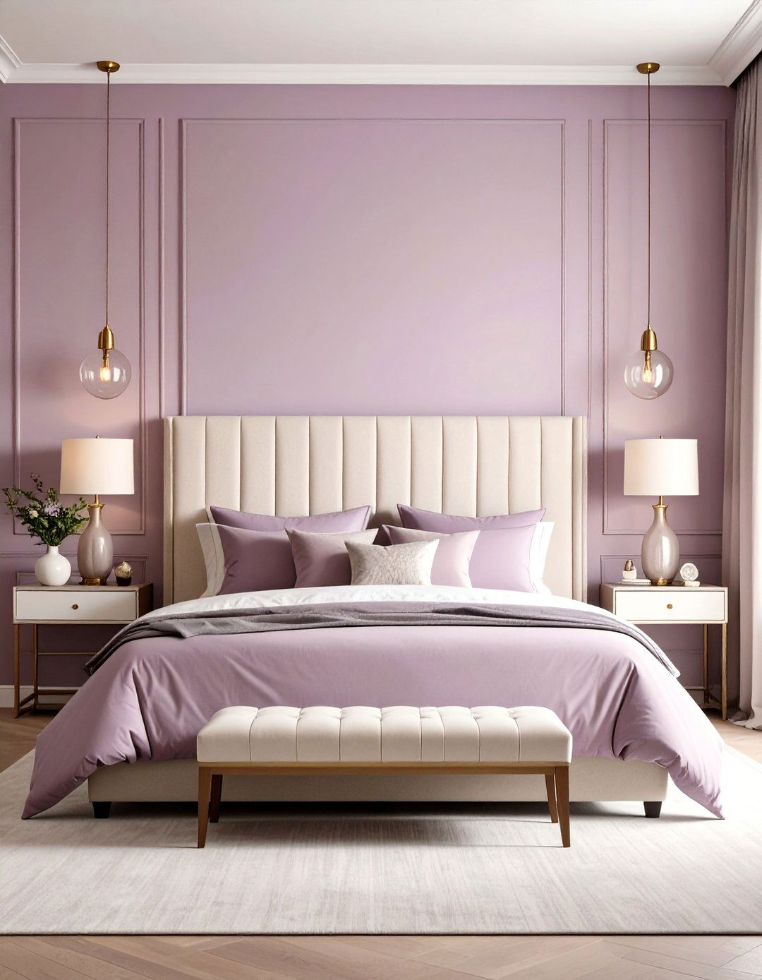
Subtle mauve paint color whispers sophistication by fusing muted purple with brown undertones, resulting in a dusk-petal neutral that’s neither too sweet nor too gray. Designers prize mauve for bedrooms because it promotes emotional balance, a benefit associated with its equal mix of warm and cool pigments. Style the space with off-white boucle headboards, smoked-glass pendants and brushed-bronze hardware for restrained glamor. The color’s gentle depth masks nighttime shadows, helping light sleepers relax. During daylight it reads like a soft neutral, making artwork pop yet never overwhelming. A washable matte finish ensures the cocoon effect remains velvety all year long.
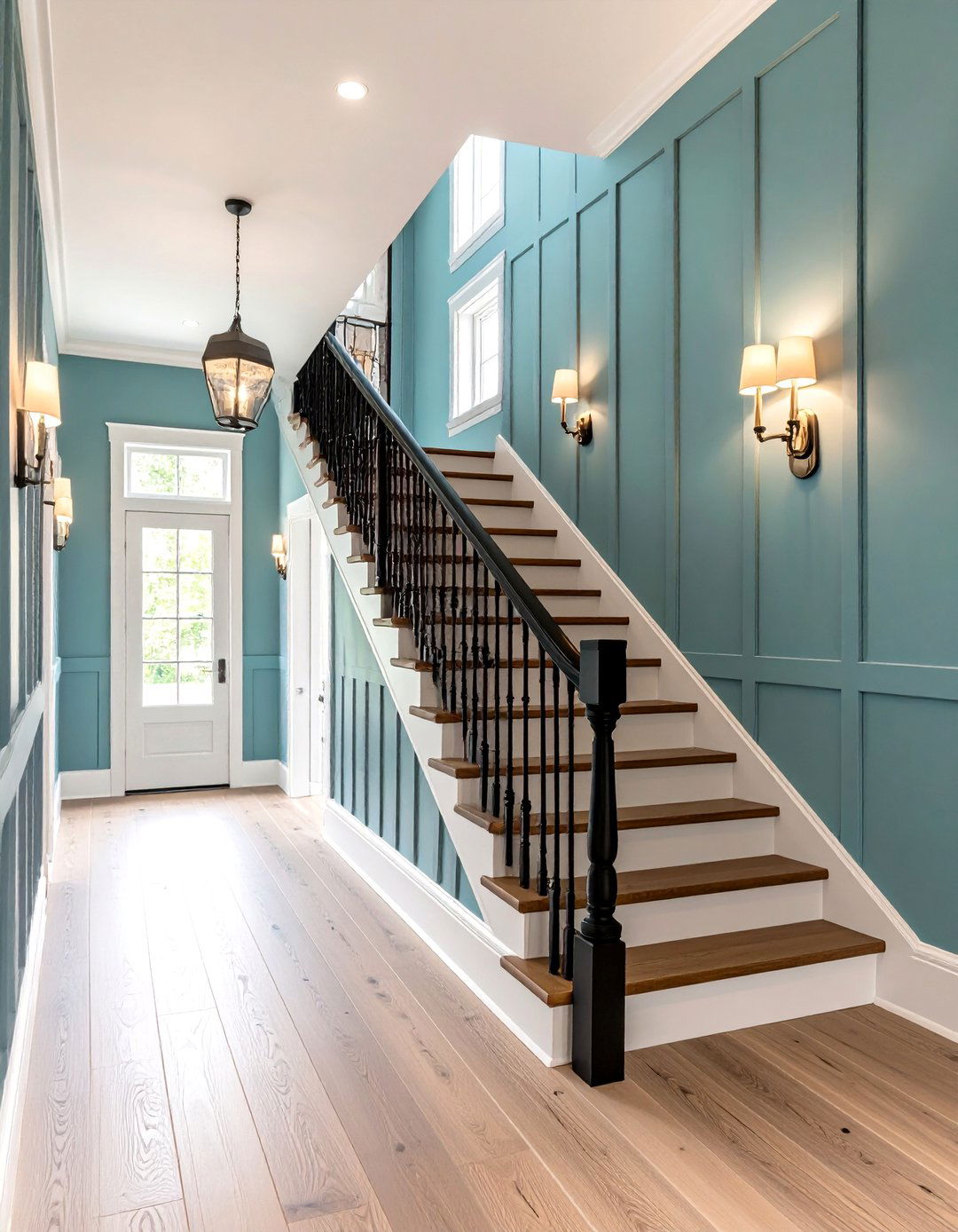
19. Breezy Coastal Blue Paint Color
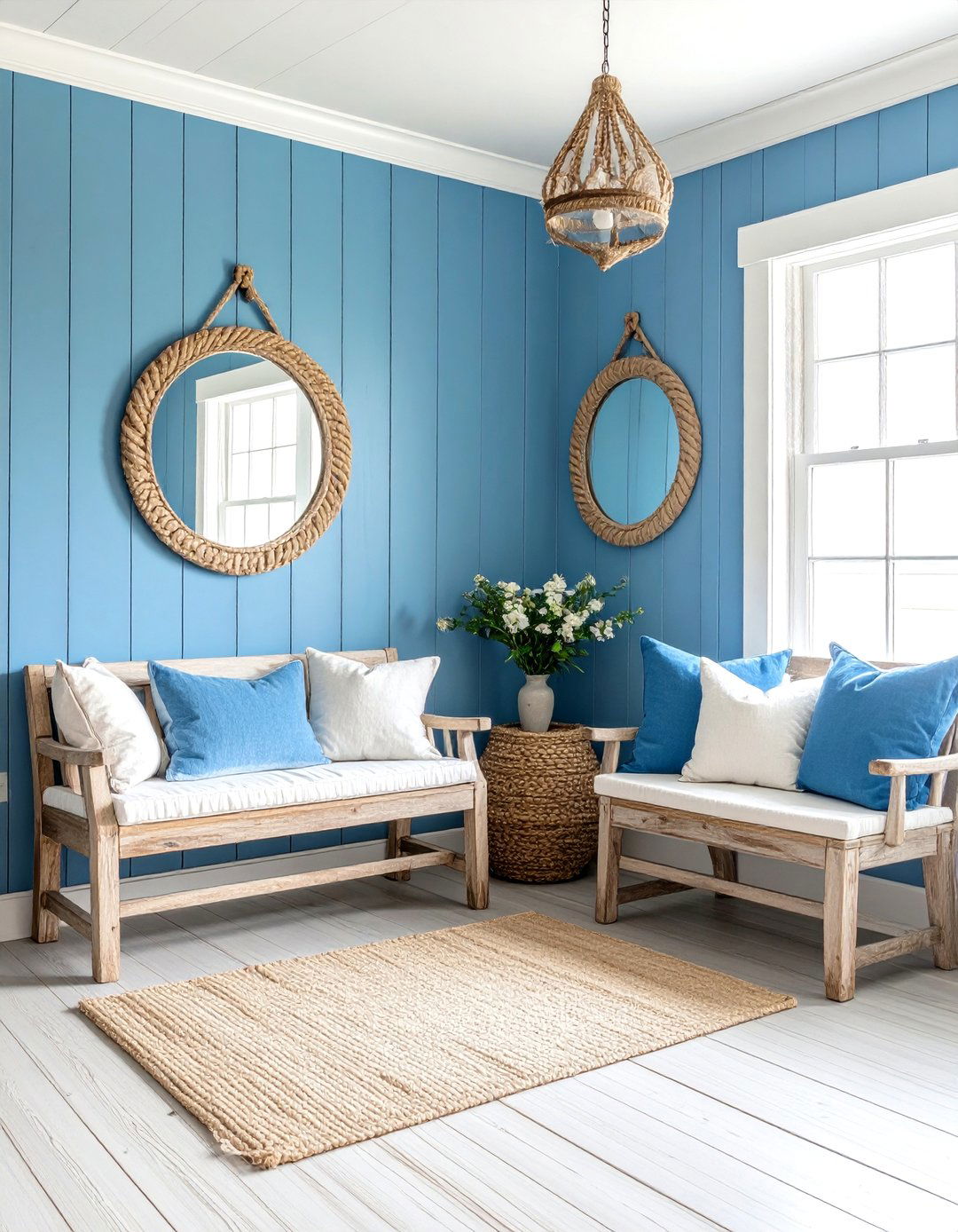
Breezy coastal blue paint color skims ocean horizons, mixing powder blue with a drop of sea-spray gray to evoke perpetual vacation mode. Travel-therapy research indicates that imagery of open water encourages deep breathing and lowers cortisol; translating that palette onto walls replicates the benefit at home. Combine white shiplap, rope mirrors and driftwood benches for a relaxed Hamptons aesthetic. Because the hue is medium-light, it prevents the stark contrast that sometimes makes pure whites appear dingy. A 50-percent tint on ceilings completes the wraparound sky effect, while striped cotton rugs anchor the casual scheme for barefoot summer mornings indoors.
20. Cinnamon Slate Paint Color
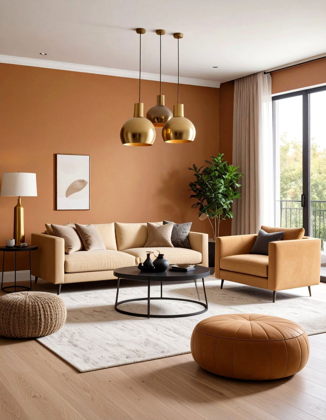
Finally, cinnamon slate paint color introduces an earthy merge of heathered plum and velvety brown, crowned as a 2025 color of the year because of its rich yet soothing depth. The muted undertone grounds busy open-plan spaces, reducing visual clutter and inviting slower living. Partner it with creamy boucle sectionals, blackened steel coffee tables and warm brass pendants for a sophisticated, cocoon-like lounge. In north-facing rooms it counteracts cool daylight, while south-facing exposures reveal subtle warmth. A matte finish accentuates its velvety texture; touch-up is easy, making it practical for high-traffic family areas seeking restful ambiance throughout long winter nights.
Conclusion:
All things considered, calming paint colors succeed when they temper saturation, borrow cues from nature and weave in subtle temperature balance. The twenty palettes above show how warm neutrals, hushed greens, airy blues and muted rosy tones can each spin a unique mood while still supporting relaxation. Begin by sampling swatches in your own lighting, then layer complementary textures and finishes to amplify the chosen hue’s serenity. With thoughtful application, any room can become a restorative retreat in 2025 and beyond.
Related posts:
Leave a Reply