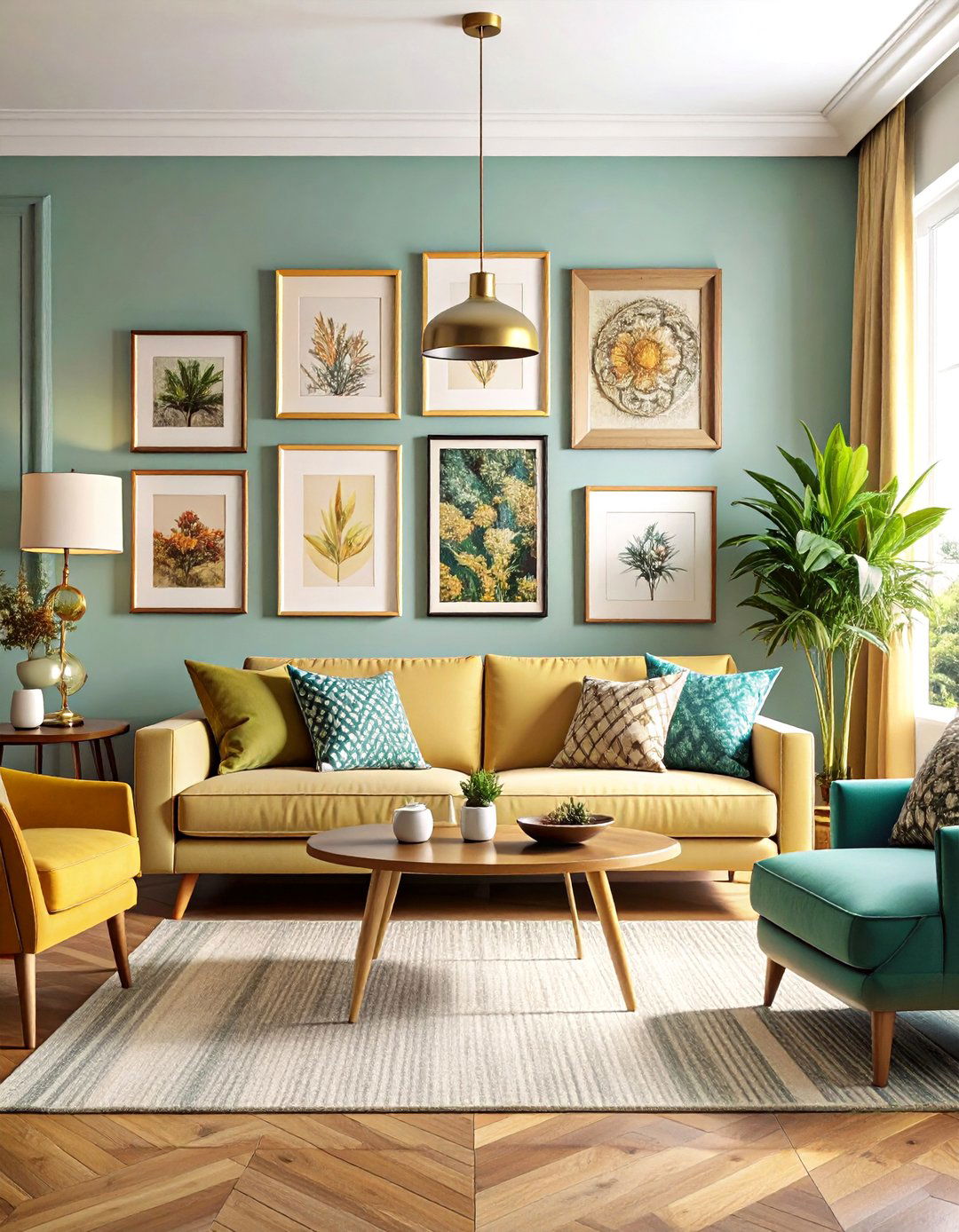
Color is fast becoming the easiest way to turn a practical bathroom cabinet into a personality-packed focal point. Designers forecasting 2025 interiors point to richer earth tones, soothing blues and greens, and bolder accent shades replacing the flat builder-grade finishes of the past. Lists of designer-approved hues now run the gamut from classic warm whites to statement sage, terracotta, and matte black, proving there is a palette for every style. At the same time, natural wood stains and mixed-metal finishes keep rising, giving homeowners fresh ways to layer warmth and texture without a full remodel. The twenty ideas that follow show how a simple coat of paint—or stain—can revive your bathroom cabinet and set the mood for the entire space.
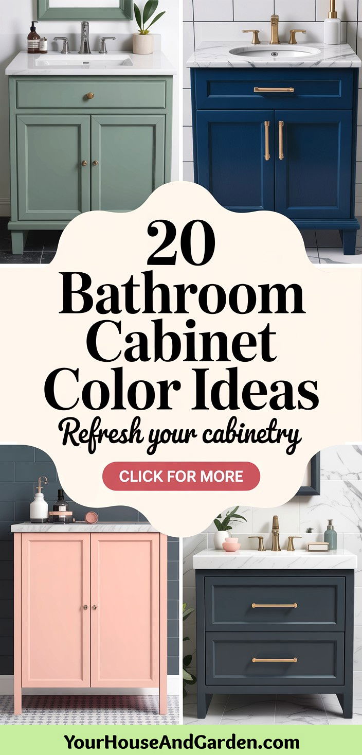
1. Crisp Bright White Cabinets

A timeless bright-white cabinet remains the interior equivalent of a deep breath in a cluttered world. Architects still choose soft, warm whites—think satin finishes rather than stark gloss—to reflect light and visually expand compact bathrooms, especially those with limited daylight. Pairing the cabinet with pale walls, pale quartz tops, and brushed-nickel fixtures keeps the scheme serene, while switching hardware to matte black introduces contrast without repainting. Practicality is a plus: high-quality enamel resists moisture stains and can be spot-touched when toothpaste marks happen. If you fear white feels clinical, layer in rattan baskets or a patterned floor mat to break up the monochrome without diluting its freshness.
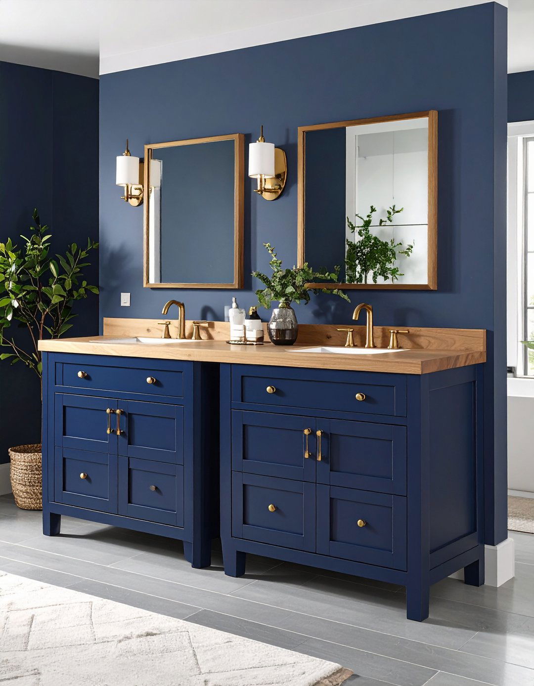
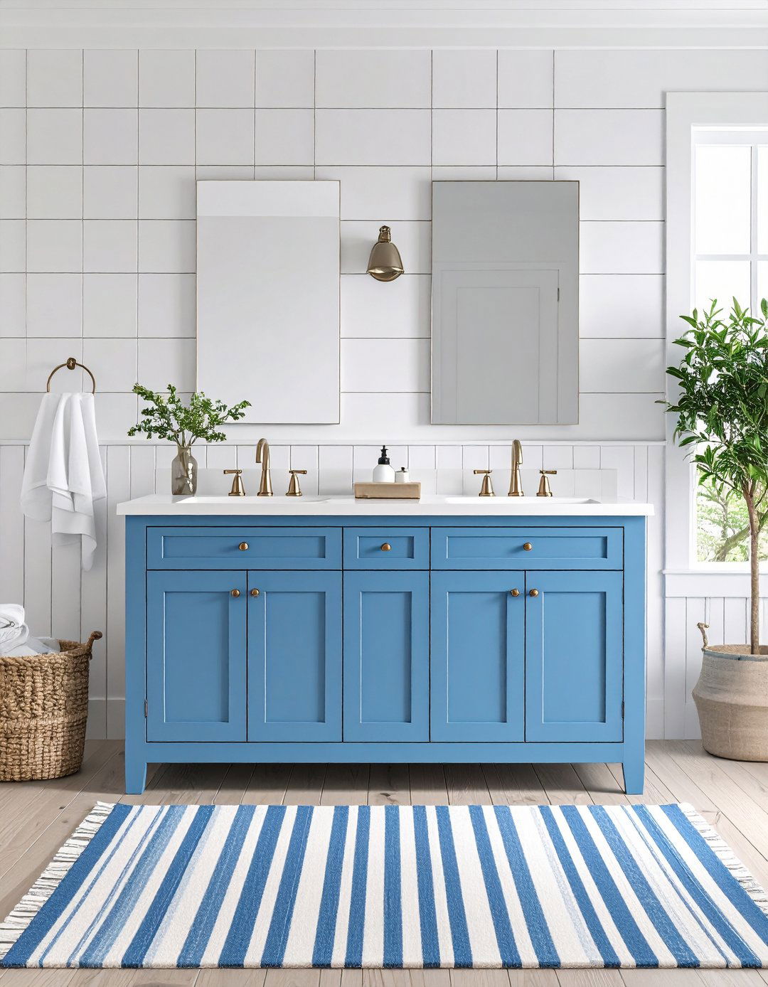
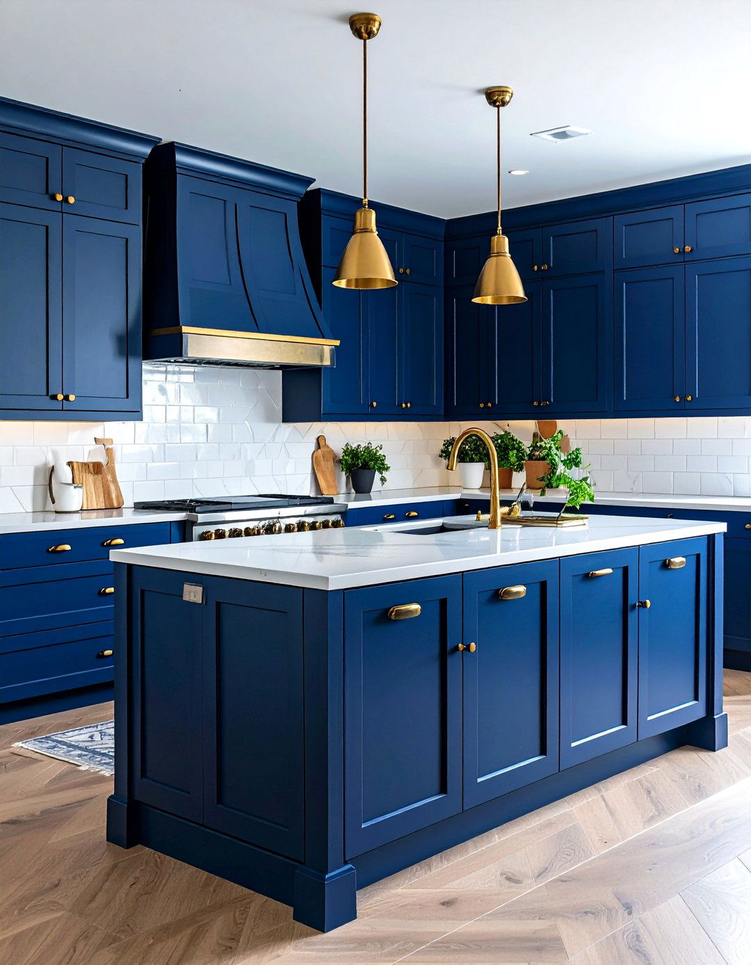
2. Deep Navy Blue Cabinets

Bold yet grounding, deep navy blue cabinets act like tailored jeans for the bathroom—they flatter almost every surface they touch. Color-trend reports highlight navy as a top pick for adding depth while keeping a room sophisticated. Because darker pigments absorb light, balance the vanity with a bright counter and mirrors that bounce illumination around. Brass or brushed-gold pulls sparkle against the blue, and swapping in a patterned wallpaper above the splash line instantly delivers boutique-hotel energy. Maintenance remains simple: modern cabinet paints include mildew-resistant additives, so wiping condensation with a microfiber cloth maintains the rich hue. Navy also hides everyday scuffs better than lighter colors, extending time between touch-ups.
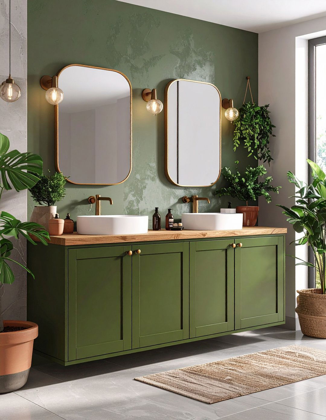
3. Sage Green Serenity Cabinets
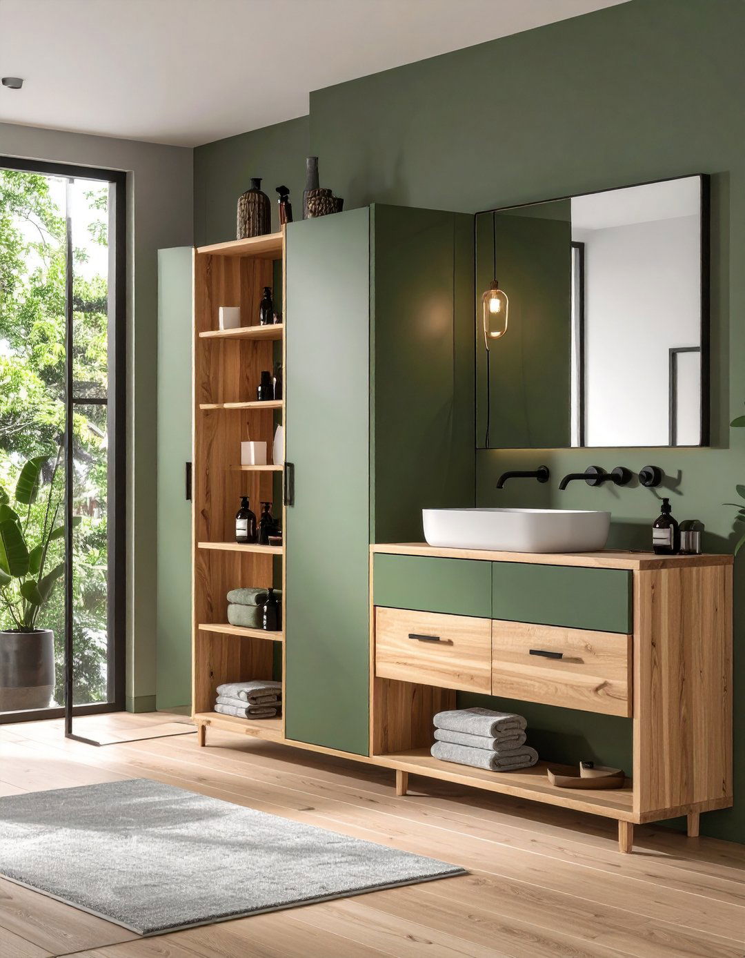
After a long day, few colors feel as restorative as sage green, a subtle blend of gray and botanical green that designers call a “neutral with soul”. On cabinets, the shade softens hard tile lines and echoes any houseplants or bamboo accessories, turning the vanity into a spa-like anchor. Its mid-tone value masks small shoe scuffs yet remains light enough to brighten the room. Pair with honey-oak shelves or matte-black hardware for a modern organic mood, or lean coastal with crisp white shiplap. If you ever tire of sage, its muted undertone means you can easily glaze over it rather than sanding back to bare wood—saving both time and dust.
4. Charcoal Gray Statement Cabinets
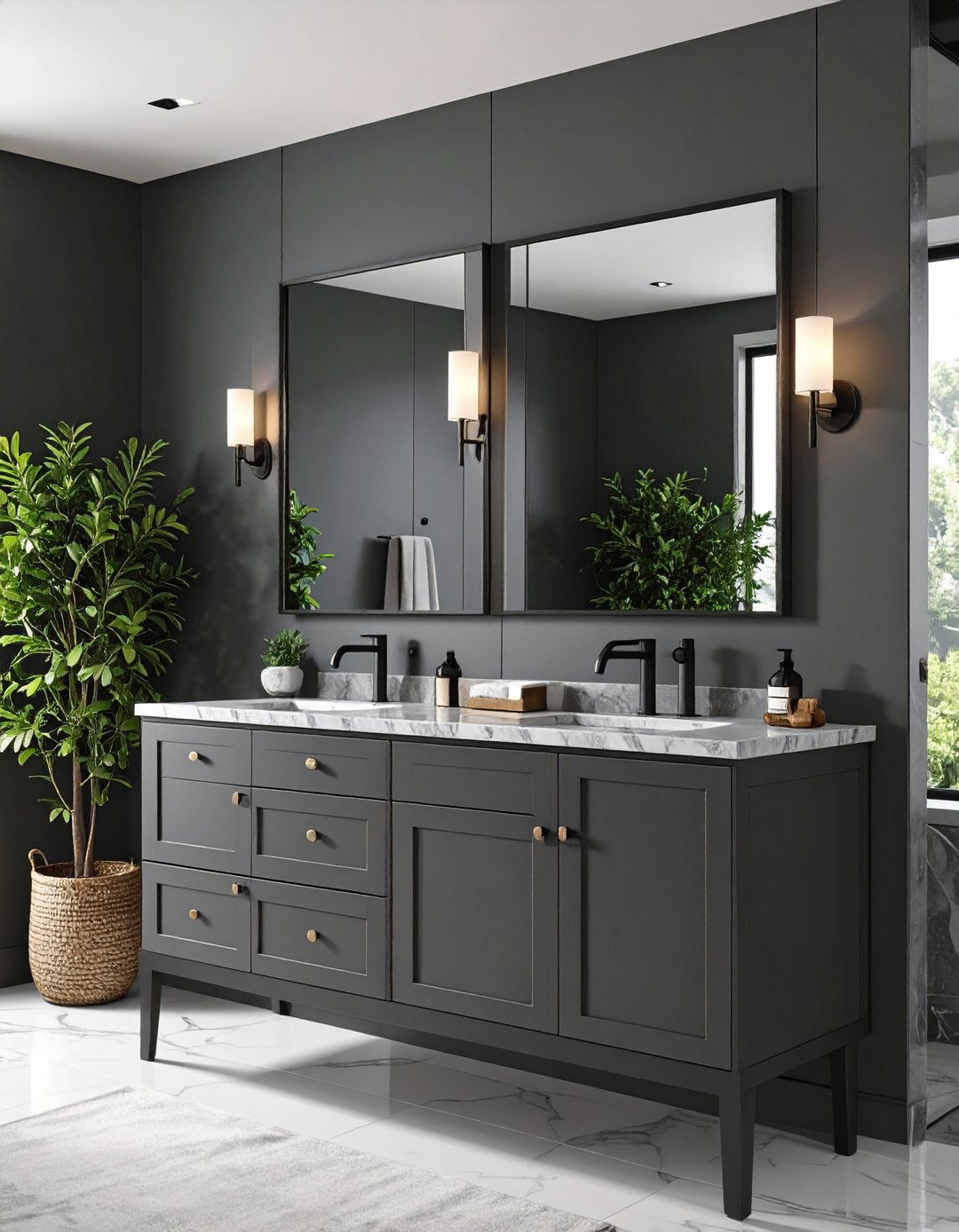
Looking for drama without venturing into gothic black? Charcoal gray cabinetry delivers a sophisticated middle ground that feels luxurious under both cool LEDs and warm sconces. The near-black pigment emphasizes polished counters—think Carrara marble or white quartz—and pairs naturally with matte-black faucets, creating a cohesive shadow-play. Designers note that charcoal works particularly well in bathrooms that already feature patterned floors, because the deeper base grounds busy visuals. Maintenance rewards follow: dust is less obvious than on black, yet water spots wipe off just as quickly. To stop the room from feeling heavy, add big frameless mirrors or install under-cabinet LED strips that create a floating illusion.
5. Soft Blush Pink Cabinets
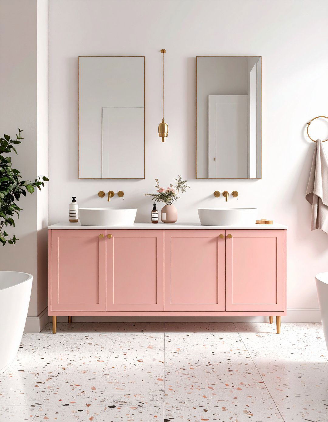
Surprisingly grown-up, blush-pink cabinets lend a diffused glow that flatters skin tones—great for morning routines—and offers a nostalgic nod to retro powder rooms. Modern paint formulas mix a touch of beige into the pink, avoiding a candy finish and helping the color behave like a warm neutral. Pairing blush with terrazzo tiles or unlacquered-brass taps adds sophistication, while white walls keep the palette airy. Because blush is softer than red-based pinks, it plays nicely with cool fixtures such as chrome. Seal the paint with a water-based polyurethane top-coat to guard against makeup spills and nail-polish-remover drips.
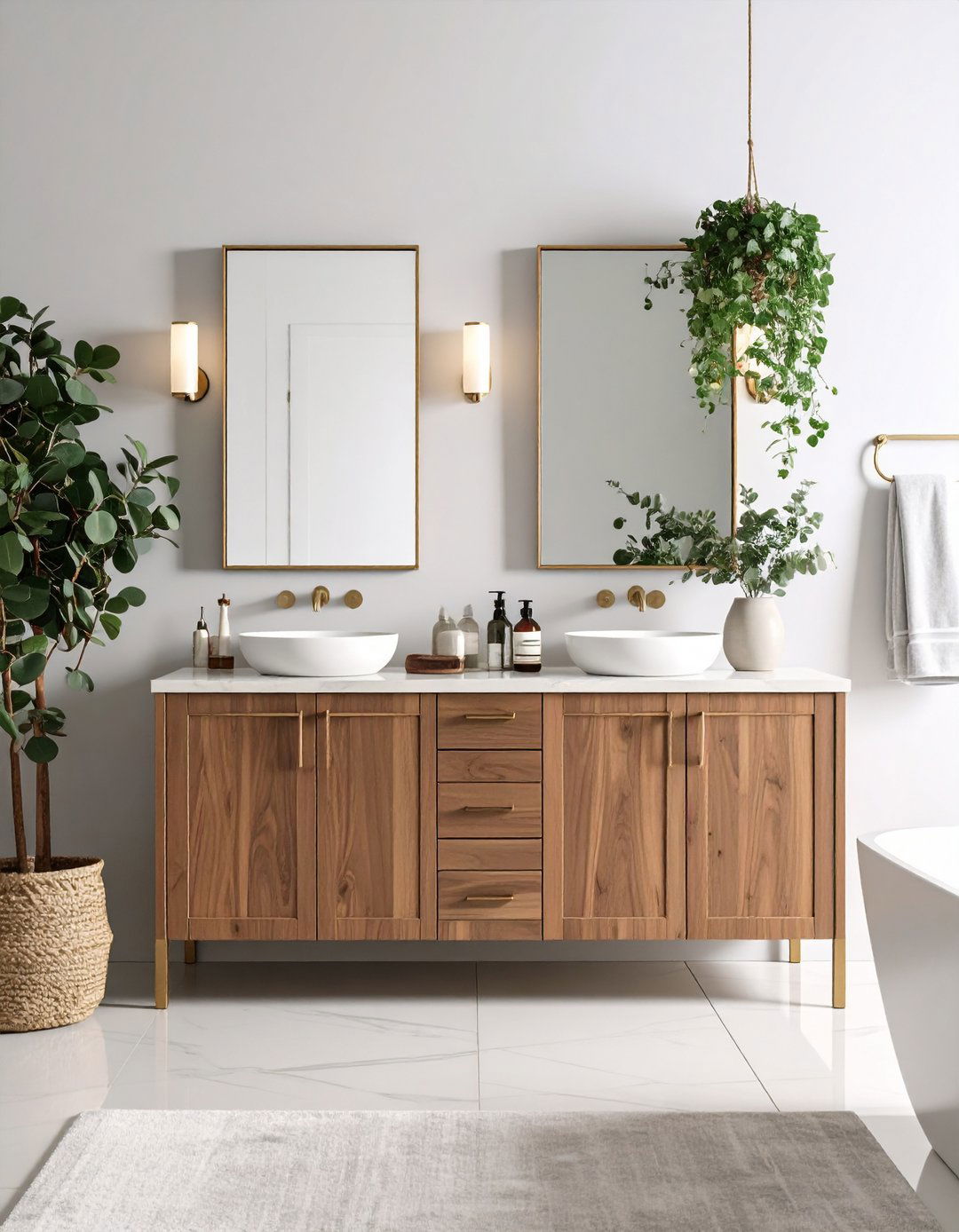
6. Natural Light Wood Cabinets
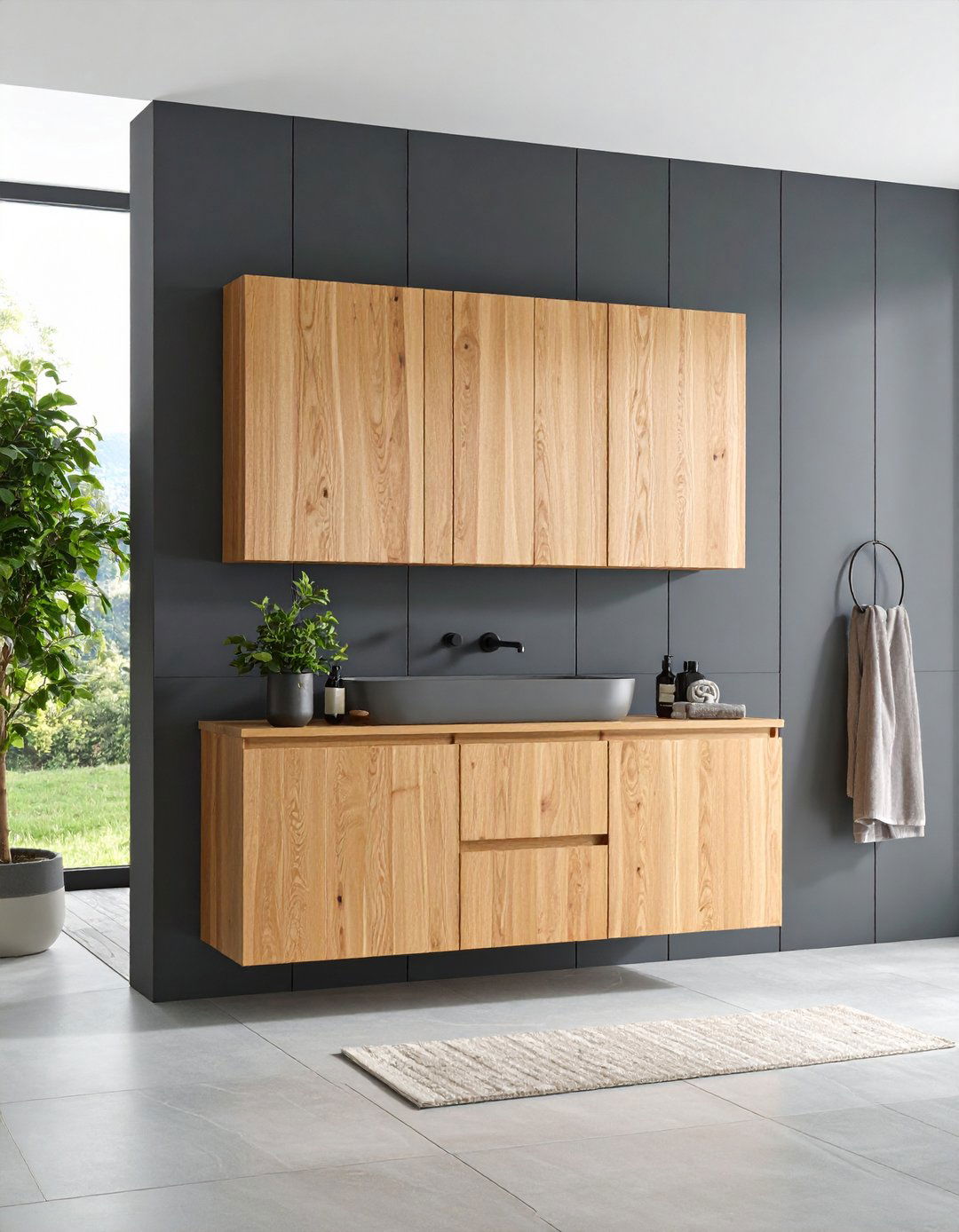
Nothing matches the instant warmth of a light-stained wood cabinet, especially varieties like oak or birch that show subtle grain. Designers lean on this look to break up expanses of hard tile and create a nature-inspired spa vibe without any color at all. A clear matte polyurethane seals the pores yet keeps the tactile quality intact, and finger-pull hardware maintains a minimalist silhouette. Light wood also ages gracefully: as stain mellows, the cabinet gains character rather than looking dated. If you crave contrast, paint the wall paneling charcoal or emerald so the wood pops. Just remember to condition the wood before staining to ensure an even, blotch-free finish.
7. Matte Black Modern Cabinets

Certainly not for the faint-hearted, matte black cabinets bring instant architectural weight and can disguise unsightly plumbing gaps, making the vanity appear custom-built. A modern satin-matte formula resists fingerprints better than older high-gloss blacks, though regular microfiber buffing still keeps the surface crisp. Contrast is the design secret: white subway tile, polished-nickel taps, or even a warm oak mirror frame stop the scheme from slipping into cave-like darkness. If full black feels risky, test-drive with just the drawer fronts—keep the frame white for a chic color-block effect you can reverse later.
8. Two-Tone Color-Block Cabinets
By mixing two complementary finishes—say midnight navy drawers under a natural-oak countertop—you create a cabinet that looks bespoke for a fraction of custom prices. The approach allows you to play with bold colors without overwhelming the eye, because the neutral partner acts as breathing space. Practicality is built in: reserve the darker color for lower sections that collect scuffs, and use lighter tones above to bounce light. Tape crisp lines and apply the lighter shade first; once fully cured, mask and roll on the darker paint so edges stay razor-sharp. Finish by choosing hardware finishes that appear in both color blocks—brushed brass is a reliable bridge.
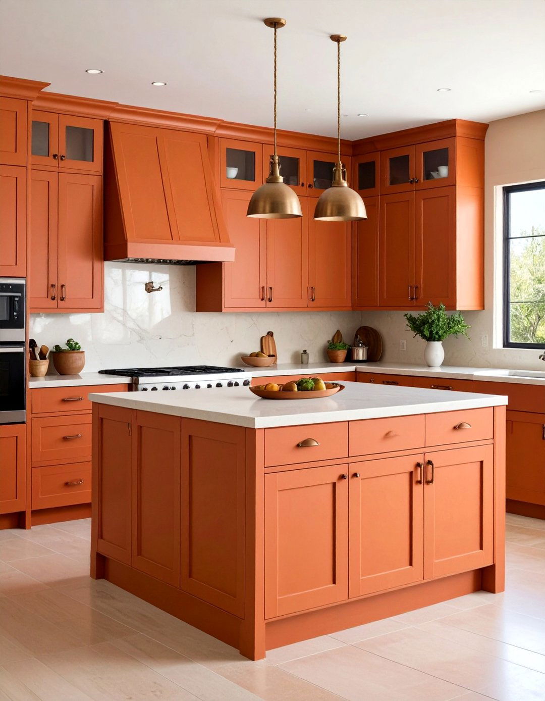
9. Terracotta Warmth Cabinets
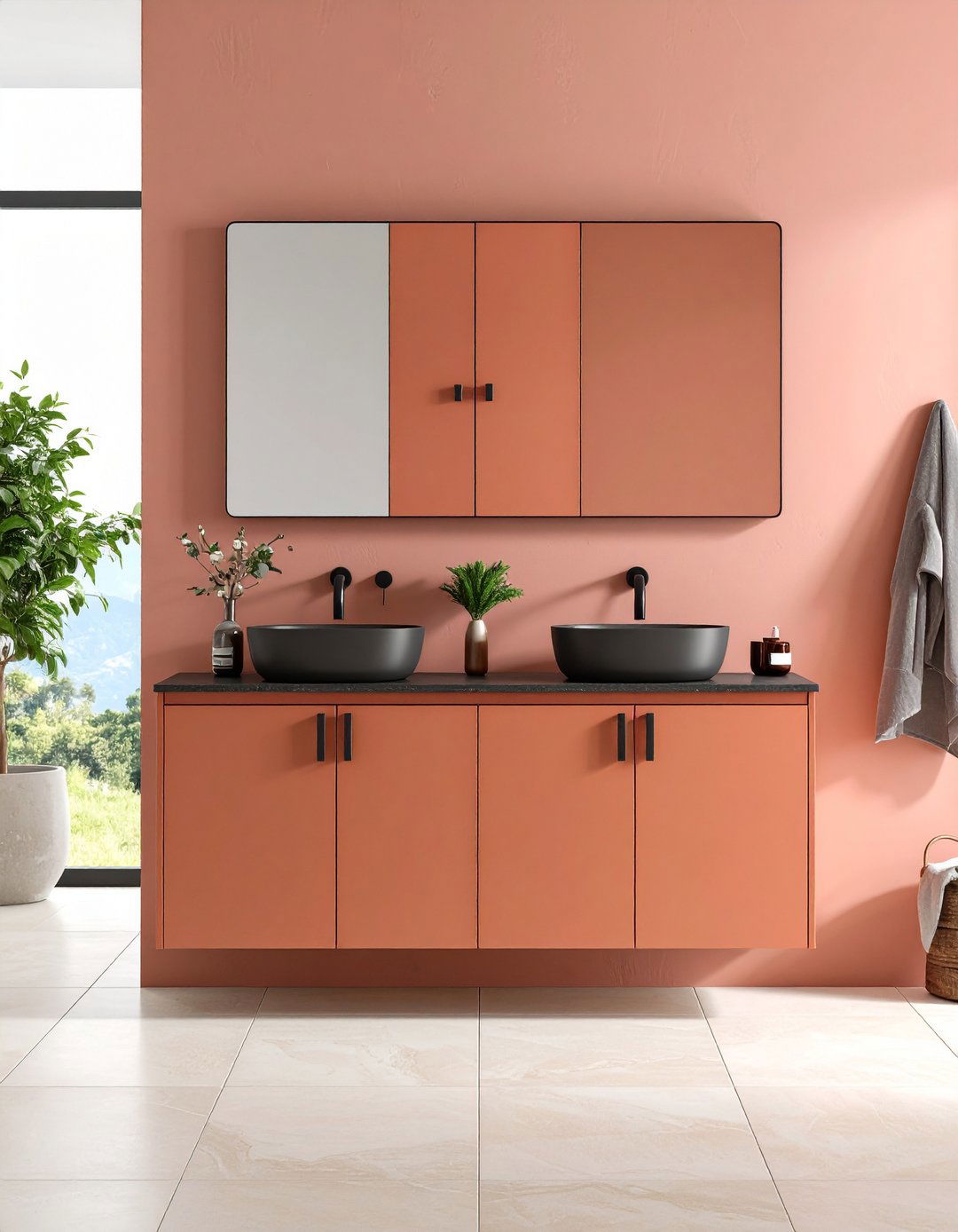
Owing to its sun-baked vibe, terracotta instantly transports a bathroom from sterile to Mediterranean retreat. The warm red-orange pigment pairs beautifully with creamy tiles, woven baskets, and even indoor cacti, channeling earthy calm. To prevent the color turning too rustic, keep lines streamlined and hardware contemporary—think matte black pulls or slim brass bars. Seal with a satin varnish so subtle sheen highlights brushstrokes, giving handmade charm. Terracotta also hides dried watermarks better than flat white, reducing daily wipe-downs. For small rooms, paint only the drawer fronts and match the frame to wall color, so the warmth feels intentional rather than overpowering.
10. Taupe Tranquil Cabinets
Looking for a shade that never clashes yet feels richer than off-white? Taupe sits perfectly between gray and brown, delivering spa serenity with a hint of modern edge. Its chameleon undertone changes under different light, adding dimension without busy patterns. Design pros layer taupe vanities with creamy quartz counters and eucalyptus accessories for a health-club aesthetic. Because the pigment is mid-value, it’s forgiving: dust and lint don’t shout, and quick sponge wipes remove toothpaste splatter. Upgrade standard pulls to brushed-nickel or leather-loop handles, both of which echo taupe’s quiet sophistication.
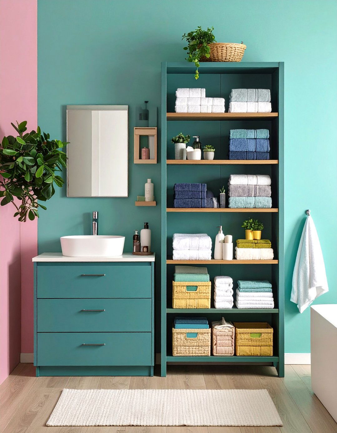
11. Teal Energy Cabinets
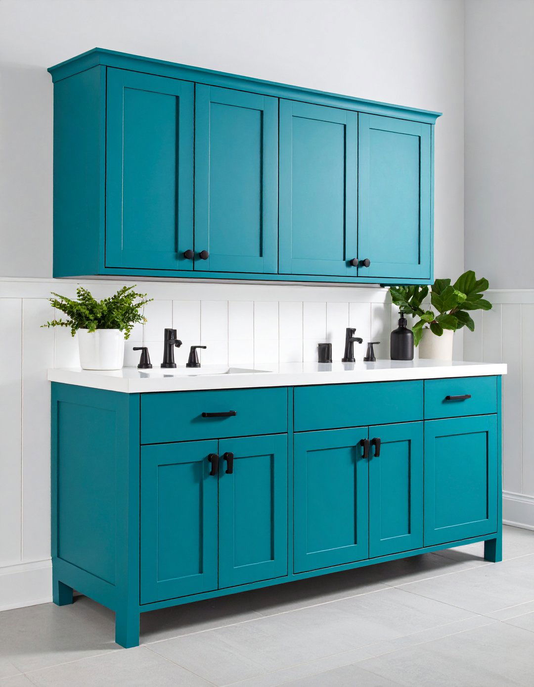
That burst of holiday-energy you feel when walking into a coastal hotel can live in your home via a vibrant teal cabinet. Saturated yet balanced by green undertones, teal thrives alongside crisp white wainscoting and patterned cement tiles. Because strong pigments need solid coverage, apply a tinted primer first to stop patchiness, and finish with a high-quality urethane-acrylic enamel for wipe-clean durability. Temper the boldness with matte-black or brushed-gold hardware, or double down by adding a matching teal frame around the mirror. If the color ever feels too lively, swap the lighting to warm-temperature bulbs—the golden glow will calm the blue punch.
12. Peach Fuzz Glow Cabinets

Surrounded by morning sun, a cabinet painted in Pantone’s Peach Fuzz radiates gentle warmth that flatters every skin tone while nodding to current color-of-the-year hype. The creamy peach pairs naturally with brushed-nickel or white-ceramic knobs and looks playful against terrazzo floors. To keep things grown-up, ground the palette with charcoal towels or a black-framed mirror. Paint pros suggest two thin coats of primer before applying light pastels so the color doesn’t skew too pink. Touch-up pens mixed at the same formula let you camouflage blow-dryer knocks without repainting the entire door.
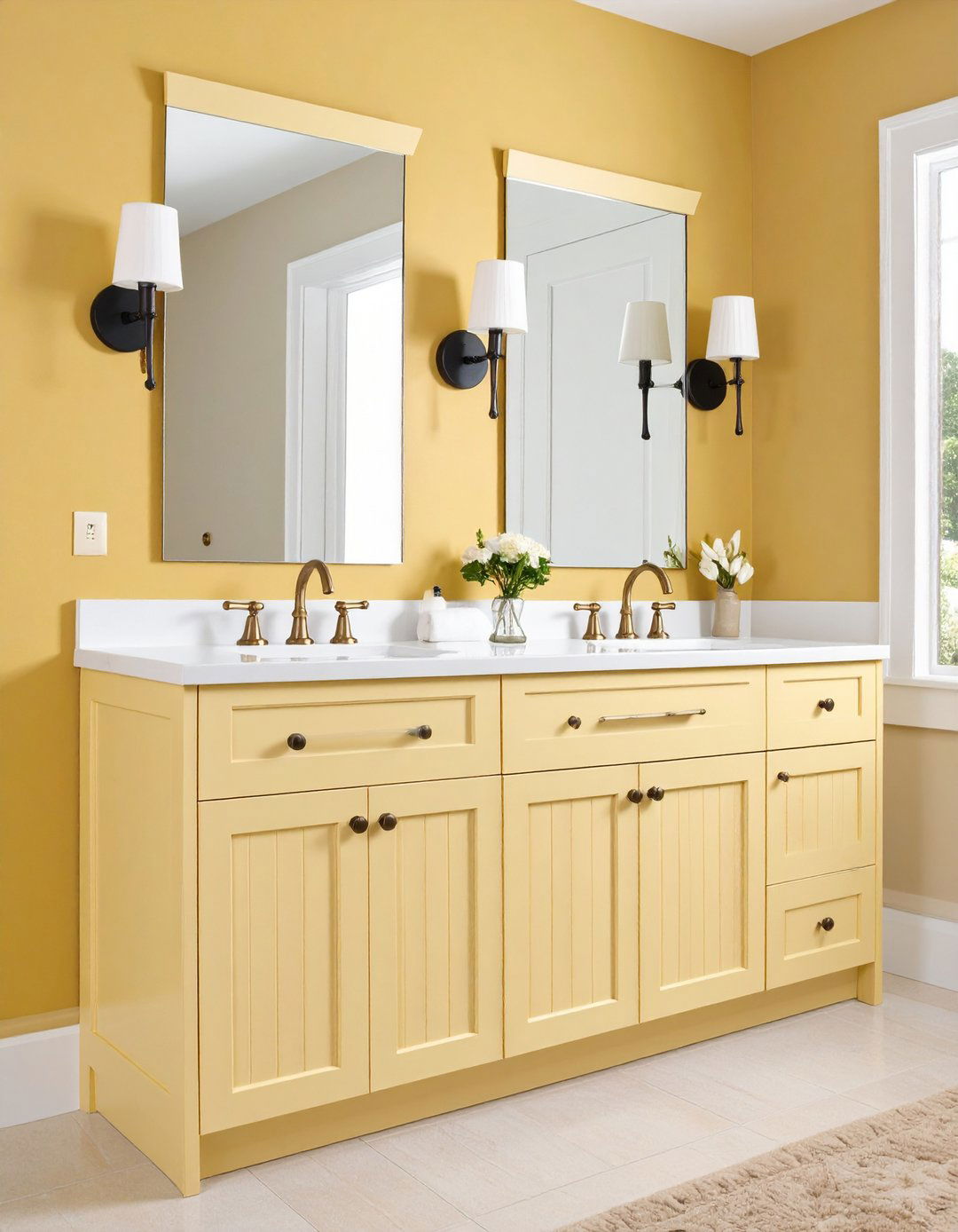
13. Mustard Yellow Pop Cabinets
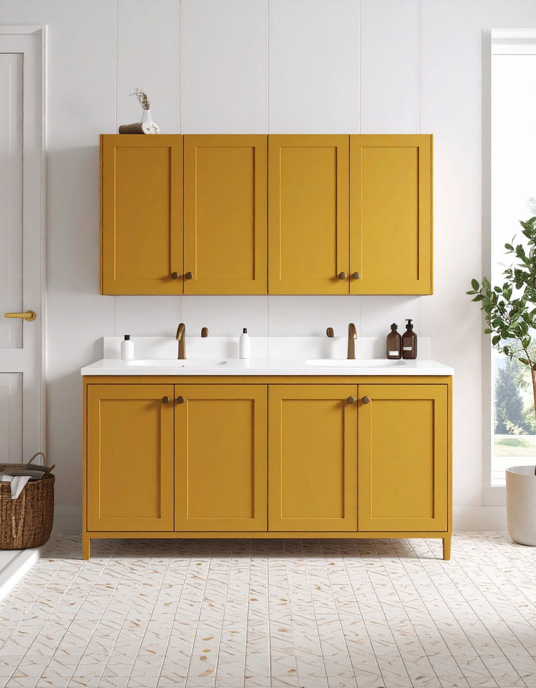
Certainly the most cheerful option on this list, mustard-yellow cabinets give a windowless powder room the energy of midday sun. Unlike lemon yellow, mustard carries a brown base that hides soap drips and allows bronze hardware to shine. Keep wall colors simple—soft white or warm gray—to avoid visual overload, and consider echoing the hue in a small patterned floor tile. Because yellow pigments can fade, opt for UV-stable cabinet enamel and finish with a non-yellowing clear coat. Should you ever tire of the bold look, mustard sands and primes easily thanks to its mid-tone depth.
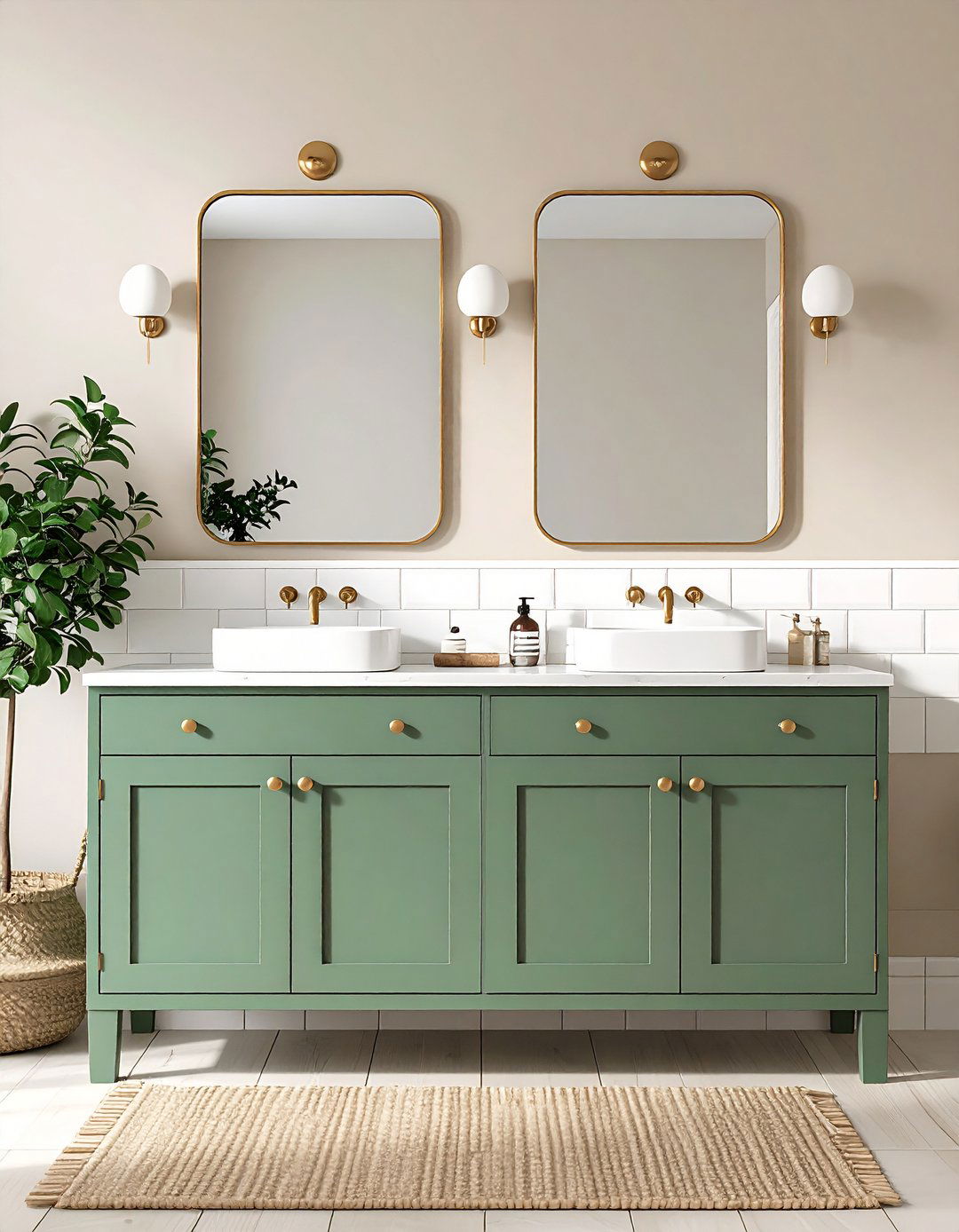
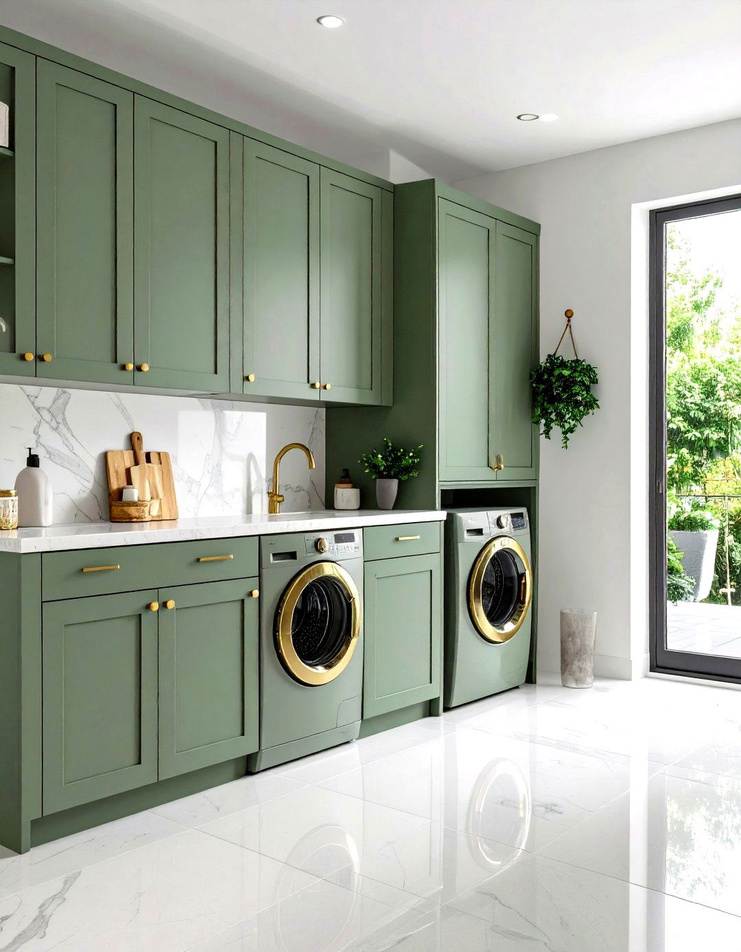
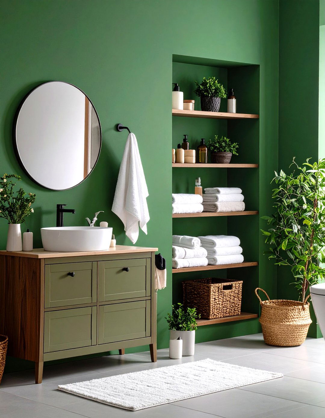
14. Olive Green Organic Cabinets
As biophilic design gains momentum, olive-green cabinets lead the charge, delivering an earthy note that feels simultaneously vintage and cutting-edge. Designers love olive for its ability to pair with both warm brass and cool chrome, making fixture updates painless. Satin finishes prevent the color from looking military, while recessed-panel doors highlight subtle shadows within the green. For texture, top with a butcher-block counter and add terracotta planters nearby. Maintaining olive is simple: a mild dish-soap solution removes makeup dust and water rings without dulling the lush hue.


15. Balanced Greige Cabinets
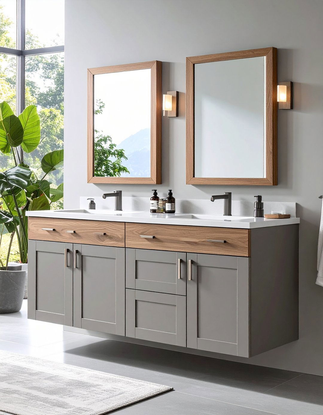
Unlike pure gray, greige blends warm beige into the mix, creating cabinets that adapt to every lighting condition without feeling cold. Homeowners favor the color when resale is on the horizon because it complements virtually any tile or countertop. To highlight the undertone you prefer, choose accessories wisely: walnut frames pull out the warmth, while polished chrome emphasizes cooler notes. Greige also works wonders for busy families because fingerprints and soap splashes are far less obvious than on darker tones. Finish with slim stainless pulls for a crisp, contemporary touch.
16. Cozy Cream Cabinets
When pure white seems stark, creamy off-white cabinets wrap the room in quiet warmth reminiscent of candlelight. The subtle yellow undertone teams beautifully with limestone floors and unlacquered-brass taps, crafting a timeless European vibe. To keep the palette from turning too traditional, add matte-black sconces or install contemporary fluted drawer fronts—the contrast refreshes the classic shade. Maintenance is straightforward: a mild vinegar solution removes hairspray residue while keeping the soft sheen intact. If you later decide to change color, cream’s light base accepts nearly any topcoat with minimal priming.
17. Rich Walnut Stain Cabinets
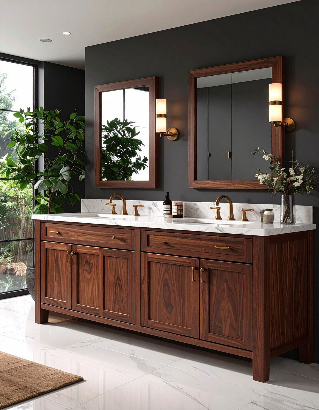
Bringing depth without pigment, a deep walnut stain showcases natural grain and turns the cabinet into a handmade-furniture feature. The brown tone adds luxury in modern and heritage bathrooms alike and pairs especially well with marble counters that include warm veining. Protect the finish with two layers of wipe-on polyurethane; the oil enriches the color and seals against humidity. For accent metals, aged bronze or antique brass echo walnut’s warmth, while matte black provides modern contrast. Regular maintenance involves nothing more than wiping with mineral-oil-damp cloths to preserve luster.
18. Powder Blue Calm Cabinets
Soft as a summer sky, powder-blue cabinets deliver instant calm and are ideal for compact baths you wish felt larger. The pale pigment reflects light yet injects enough color to avoid blandness, especially when paired with white beadboard and polished-nickel faucets. Designers recommend sealing the top edge of the door with clear caulk to prevent moisture wicking, which can lift light colors. If you enjoy layering, add navy towels and a striped rug for subtle nautical flair. Powder blue also disguises toothpaste splatter better than pure white, buying you a little grace between cleanings.
19. Seafoam Green Splash Cabinets
Imagine coastal waves captured in cabinetry—that’s the effect seafoam green brings, marrying mint freshness with oceanic blue undertones. The cheerful pastel teams up effortlessly with white subway tile or sandy-beige walls for a beach-house vibe. Because pastels can feel flat, apply a satin finish so low gloss reflects light softly. Nickel or chrome pulls keep the palette breezy; for more personality, swap them for rope-knot handles. Seal edges thoroughly—lighter greens can yellow if water infiltrates raw MDF. The reward is a vanity that sparks vacation mood every morning.
20. Subtle Metallic Bronze Cabinets

To wrap things up, a brushed-bronze cabinet finish offers a glam twist without the high shine of traditional metallics. The muted shimmer bounces light around small bathrooms and pairs beautifully with slate floors, black fixtures, or even terracotta walls. Application is easier than you might think: specialty all-in-one metallic paints bond to existing laminate after a light sand and degrease, meaning an afternoon project yields high-end impact. Designers often glaze bronze with a chocolate tint to age the metal slightly, disguising inevitable nicks. If full bronze feels bold, limit the effect to drawer fronts and paint the frame espresso—an elegant compromise.
Conclusion:
From whisper-soft creams to confident charcoals, the colors above prove a bathroom cabinet can be both storage and statement. Choosing shades grounded in current trends—such as nature-inspired greens, earthy terracotta, or mixed-metal bronze—means your vanity will look intentional and stylish for years, yet each pick remains adaptable to fixture swaps and future paint layers. Consider the room’s light, existing tile, and desired mood, then match the finish durability to your household traffic. With the right prep and sealer, even daring mustard or deep walnut becomes a practical, wipe-clean surface. A single weekend of painting is often all that separates an aging vanity from a fresh, design-magazine-worthy focal point.
Related posts:
Leave a Reply