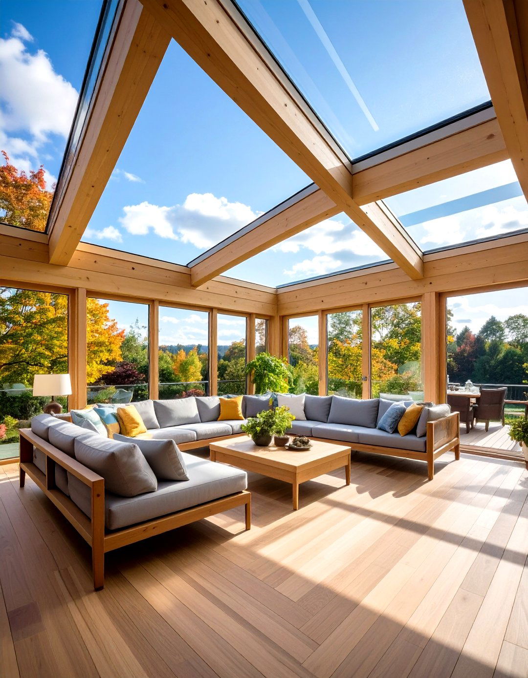
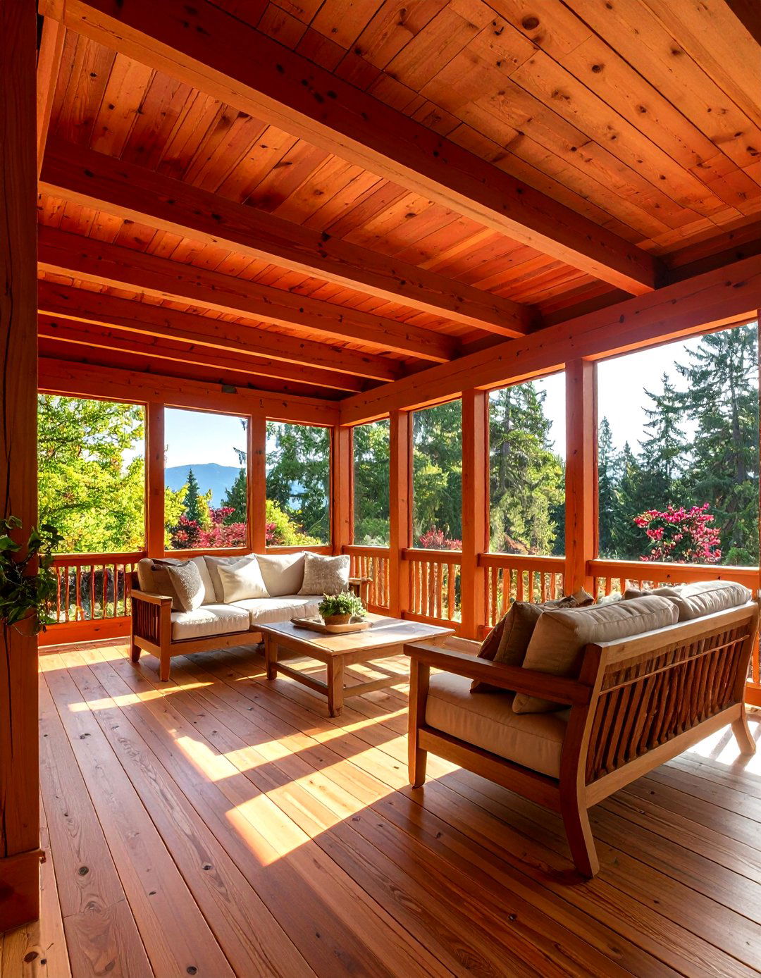
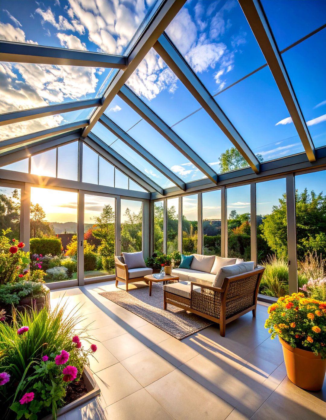
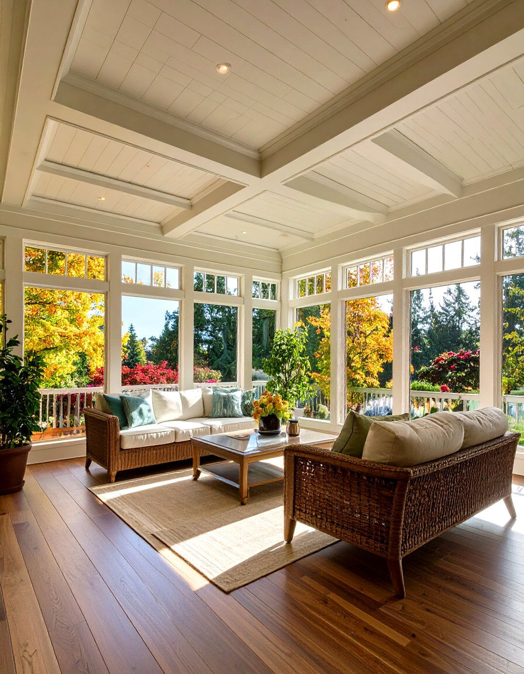
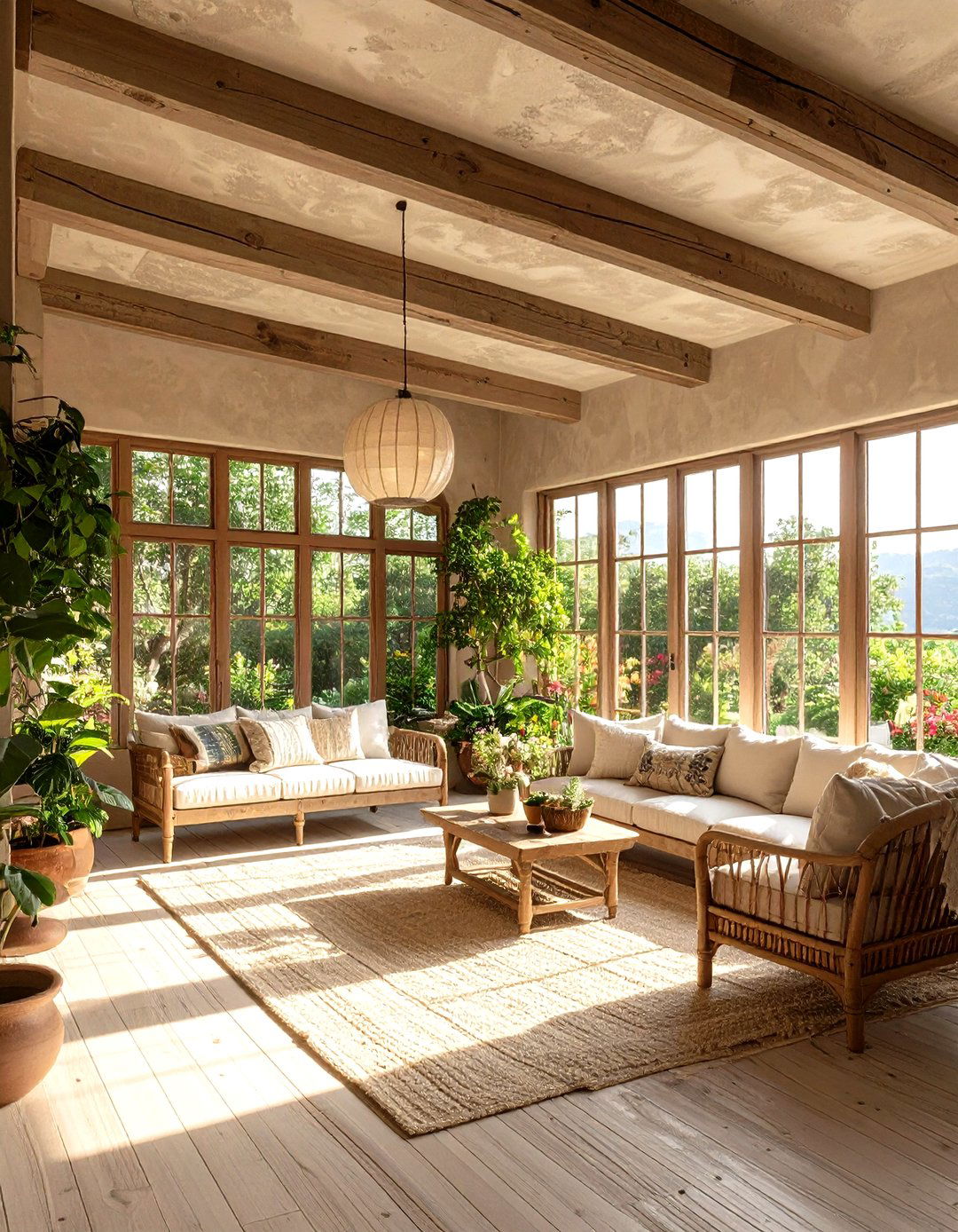
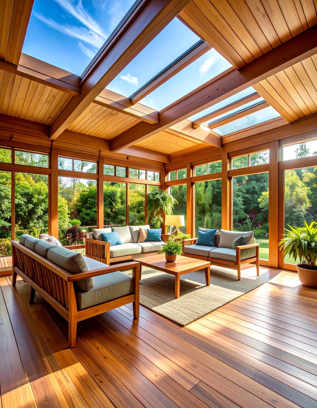
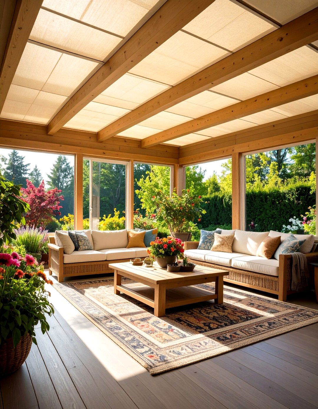
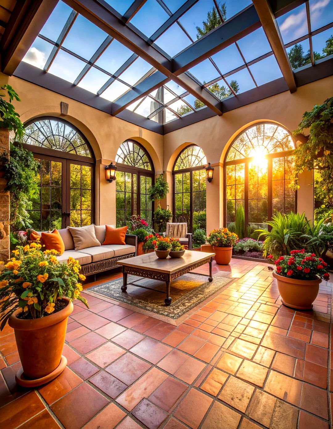
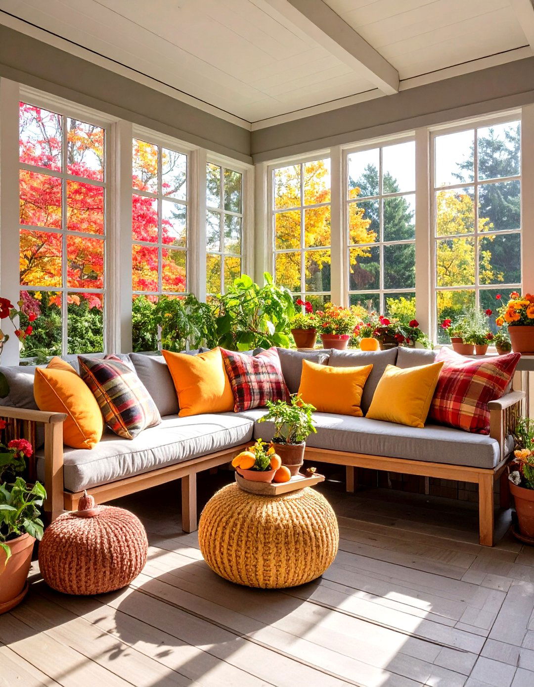
Sunrooms are unique transitional spaces that bridge the outdoors and indoors, bathing interiors in natural light and offering a serene retreat within the home. Selecting the right paint color for a sunroom is crucial to enhance its airy ambiance, complement outdoor views, and create the desired mood—be it calming, vibrant, or cozy. This article presents 20 carefully curated color ideas, ranging from timeless neutrals and soft pastels to bold, feel-good hues, each chosen for its ability to harmonize with sunlight and interior decor. Whether you prefer the crisp clarity of whites, the soothing calm of greens and blues, or the joyful warmth of yellows and corals, you’ll find inspiration to transform your sunroom into a bright, inviting sanctuary.

1. Classic Bright White
Opting for a warm white like Benjamin Moore’s Swiss Coffee (OC-45) creates a clean, timeless backdrop that allows sunlight to flood the room and accentuates architectural details without competing with the view. Swiss Coffee’s subtle warmth prevents the space from feeling stark or clinical, fostering a cozy yet open atmosphere ideal for any sunroom purpose—from plant display to casual lounging.
2. Creamy White
Sherwin-Williams Creamy (SW 7012) offers a gentle, buttery undertone that enhances the golden glow of natural light, making your sunroom feel inviting and soft. Unlike pure white, Creamy adds depth and warmth to walls, seamlessly blending with both wooden flooring and rattan accents for a cohesive, relaxed look.
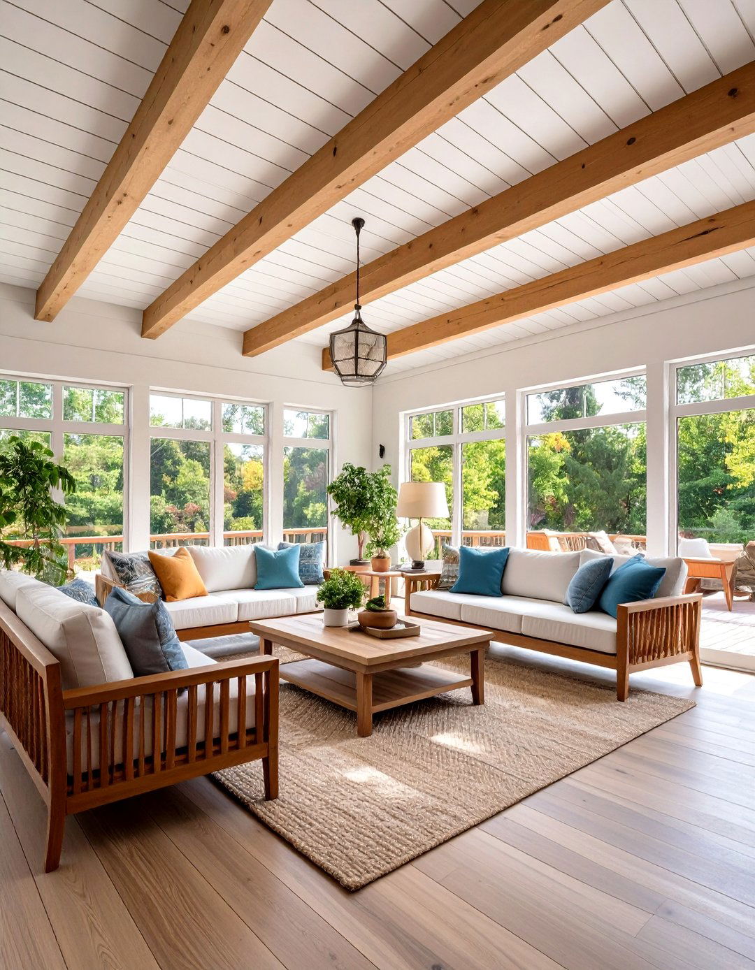
3. Soft Gray
Light gray shades such as Sherwin-Williams Agreeable Gray (SW 7029) serve as a neutral canvas that won’t compete with outdoor greenery, creating a sophisticated setting that feels both serene and modern. Agreeable Gray’s balanced undertones adapt beautifully to varying sunlight conditions throughout the day, ensuring consistent color performance and reducing the risk of unwanted blue or purple casts.
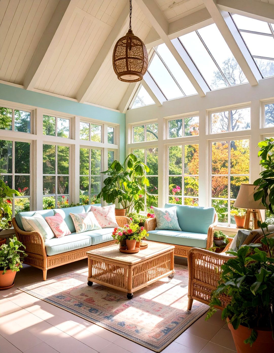
4. Pale Green
Sherwin-Williams Sea Salt (SW 6204) is a muted pale green that evokes the tranquility of coastal landscapes, making it a perfect choice for sunrooms overlooking gardens or water features. Sea Salt’s soft, chalky finish imparts a subtle, restorative vibe, pairing effortlessly with white trim and natural wood furnishings to amplify a spa-like retreat feel.
5. Sage Green
Sage green hues bring a grounded, earthy quality to sunrooms, seamlessly tying indoor spaces to surrounding foliage. These subdued greens work well in both modern and traditional settings, providing a calming atmosphere that highlights potted plants and botanical décor. By choosing a sage shade with gray undertones, homeowners can maintain a chic, understated look that remains fresh and inviting year-round.
6. Light Blue
Powdery light blues—such as Benjamin Moore’s Beach Glass—evoke the serenity of the sky and sea, lending a breezy, airy ambiance to sunrooms. Beach Glass’s soft, versatile tone complements crisp white trim and coastal-inspired décor, creating a tranquil space for relaxation or casual entertaining.
7. French Blue
Dramatic yet soothing, a mid-tone French blue adds depth and character to a sunroom without overwhelming the space. This timeless hue pairs especially well with white wicker furniture and light wood flooring, evoking classic nautical themes while maintaining a refined, elegant aesthetic.
8. Deep Teal

Raging Sea by Sherwin-Williams is a rich, deep teal that brings bold drama to a sunroom, making statement walls or accent cabinetry pop with sophisticated color. Teal’s depth offsets bright sofas and patterned textiles, creating cozy corners perfect for reading or conversation.
9. Sunny Yellow
Farrow & Ball’s Sudbury Yellow is a warm, sunshine-infused shade that radiates optimism and cheer in sunrooms, especially when paired with natural textures like linen and rattan. This golden hue enhances the feeling of sunlight streaming through windows, making any space feel bright and joyful.

10. Vibrant Lime Green
A cheerful lime green, as showcased in House Beautiful’s sunroom designs, introduces a playful yet refined accent that enlivens plant displays and tropical-inspired décor. When balanced with neutral furnishings and jute rugs, lime green walls provide a fresh, contemporary twist on traditional sunroom palettes.
11. Coral
Guava, a sun-kissed pink-orange trending this summer, infuses spaces with warmth and sensory delight, fostering an emotionally uplifting environment. Coral accent walls or painted furniture pieces create focal points in sunrooms, harmonizing beautifully with natural wood and handwoven textiles for a grounded effect.
12. Lavender
Soft lavender walls introduce a serene, whimsical quality to sunrooms, blending well with white trims and pastel-accented décor. This gentle hue captures subtle evening light, making late-afternoon lounging feel especially tranquil and soothing.
13. Blush Pink
Blush pink adds a romantic, delicate touch to sunrooms, pairing exquisitely with wicker furnishings and neutral textiles. As a soft yet inviting color, blush brings warmth and personality without dominating the space, making it ideal for creating a feminine, cozy retreat.
14. Terracotta
Natural terracotta shades bring earthy richness to sunrooms, echoing the warm tones of clay pots and Mediterranean landscapes. These warm reds and oranges complement terracotta floor tiles and lush plants, creating a harmonious indoor-outdoor transition.
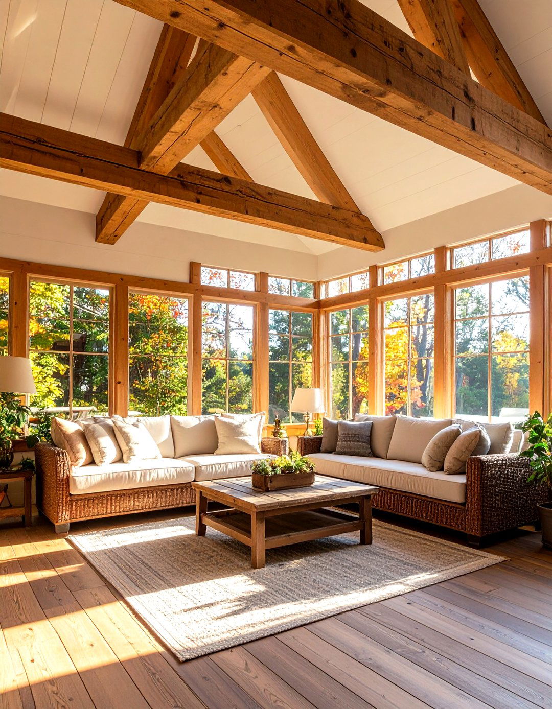
15. Warm Taupe

Taupe hues—with a balance of gray and brown—offer sophisticated neutrality for sunrooms, ideal for those seeking subtle depth beyond plain white. Warm taupes work with a variety of furniture styles and accent colors, ensuring versatile décor options over time.
16. Accessible Beige
Sherwin-Williams Accessible Beige (SW 7036) imparts a cozy glow that reads as a soft neutral, perfectly complementing both light and dark furnishings. Its gentle warmth bridges crisp whites and rich wood tones, creating a balanced backdrop for varied design elements.
17. Naturalist Palette
The Sherwin-Williams ColorSnap® Naturalist Palette features light, airy hues inspired by nature—think soft leaf greens, sandy beiges, and muted sky blues—that harmonize with sunlit spaces. These coordinated shades allow for seamless color transitions between walls, trim, and built-ins, crafting a cohesive, tranquil environment.
18. Sashay Sand

Sashay Sand by Sherwin-Williams is a muted beige with pink undertones that brings subtle warmth and softness to sunrooms, offering a neutral yet inviting canvas for décor. Its delicate blush notes catch afternoon light beautifully, ensuring the room feels both cozy and refined.
19. Charcoal Gray
A charcoal accent wall—such as Sherwin-Williams Peppercorn—adds dramatic contrast in sunrooms, grounding light-filled spaces with bold sophistication. When used sparingly, charcoal highlights architectural features like window frames or built-in shelving without overpowering natural brightness.
20. Deep Navy
Deep navy walls evoke a sense of depth and luxury, making a striking backdrop to white furnishings and metallic accents in sunrooms. This moody hue works best on a single feature wall, balancing the room’s brightness while adding visual interest and an elegant coastal vibe.
Conclusion:
Choosing the right color for your sunroom can transform it into a luminous haven that reflects your personal style and enhances the connection to the outdoors. From classic whites and grays that maintain a timeless appeal to bold corals, teals, and charcoals that inject character, each of these 20 color ideas is selected to perform beautifully in natural light and complement a range of décor themes. Whether you desire a tranquil retreat or a vibrant sun-filled sanctuary, these hues provide the inspiration to create a sunroom that’s as unique as it is inviting.
Related posts:


Leave a Reply