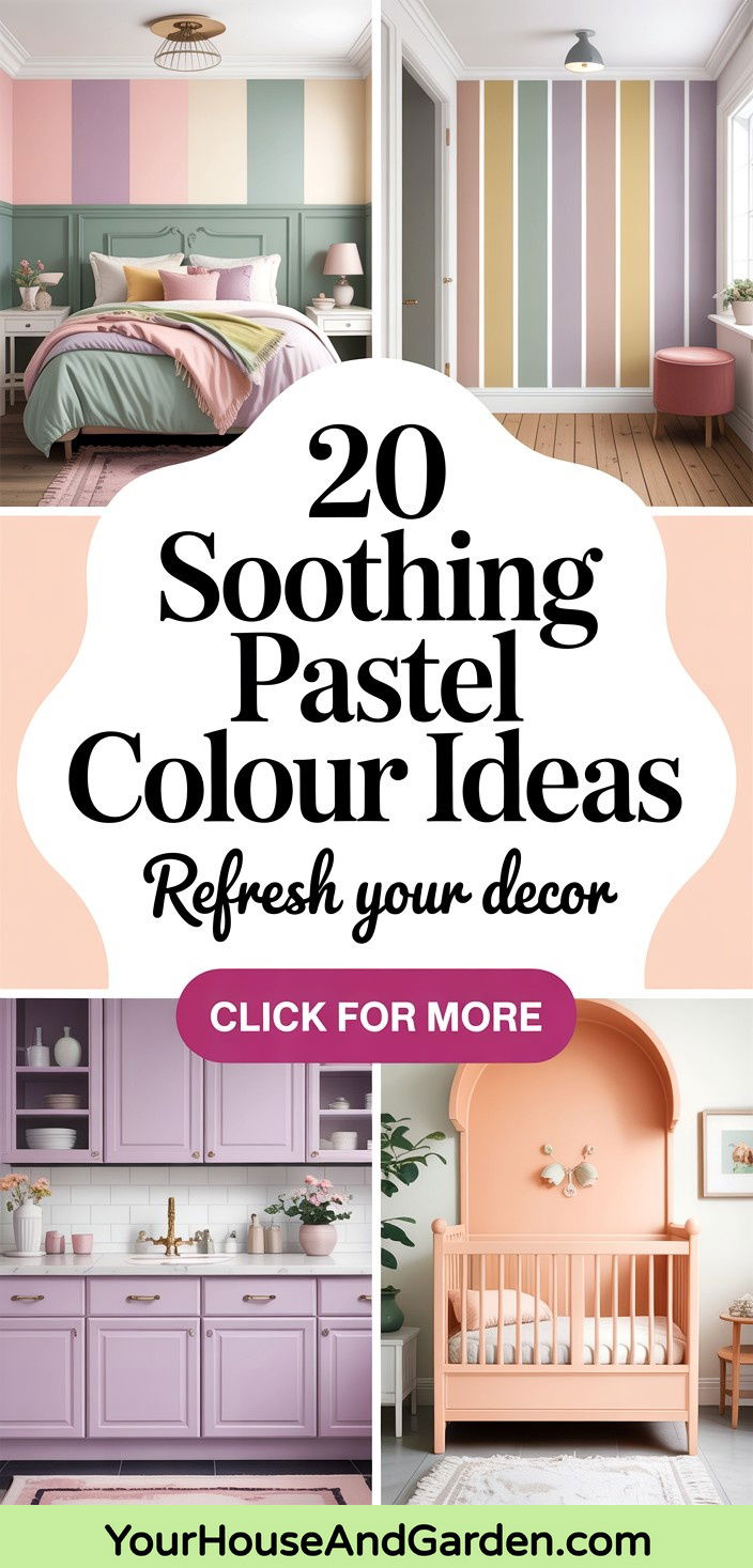
Pastel colors are experiencing a sophisticated renaissance in home design, moving far beyond their traditional association with nurseries and childhood spaces. These soft, muted hues create calming environments that promote wellbeing while adding gentle personality to any room. Unlike the stark whites and cool grays that dominated previous years, today's pastel palette embraces "dirty" pastels with complex undertones that feel more mature and grounded. From sage green with blue whispers to dusty rose with brown undertones, these contemporary pastels offer the perfect balance between color and tranquility, making them ideal for creating spaces that feel both stylish and serene.
1. Pastel Colour Sage Green Bedroom Sanctuary
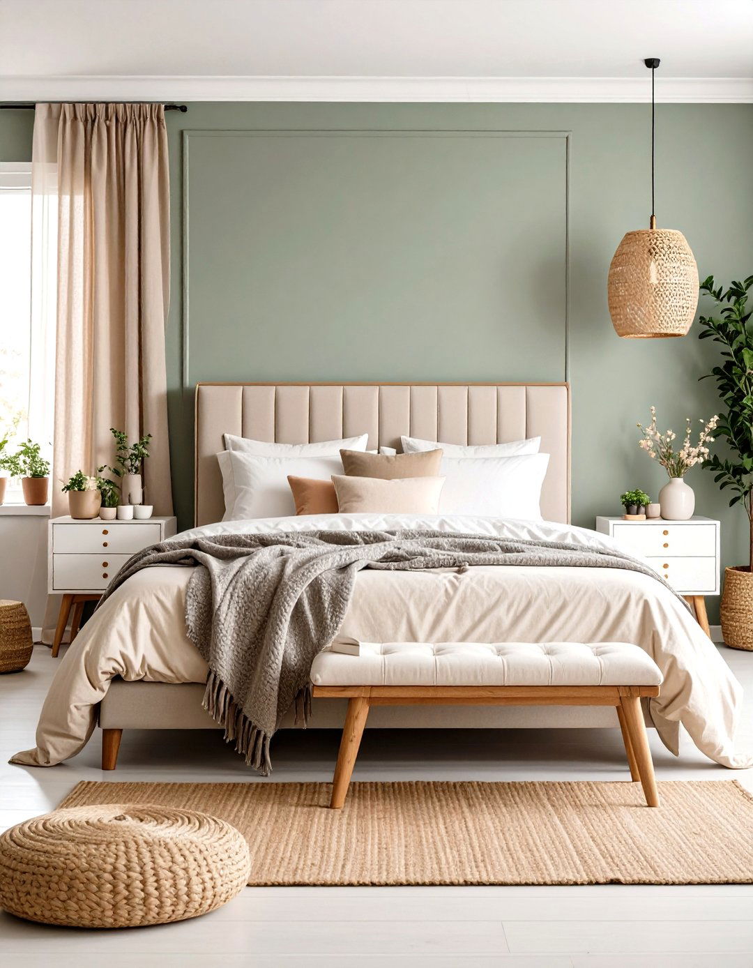
Creating a tranquil bedroom retreat begins with sage green walls that whisper rather than shout. This sophisticated pastel colour scheme pairs beautifully with natural linen bedding in cream and soft white wooden furniture. The sage green creates an instantly calming atmosphere while maintaining enough color interest to prevent the space from feeling sterile. Layer in textured throws in complementary pastels like dusty lavender and pale peach for added depth. Natural materials such as jute rugs and wooden bedside tables enhance the earthy undertones of the sage green. This palette works particularly well in bedrooms with good natural light, where the green undertones create a fresh, garden-like ambiance that promotes restful sleep.
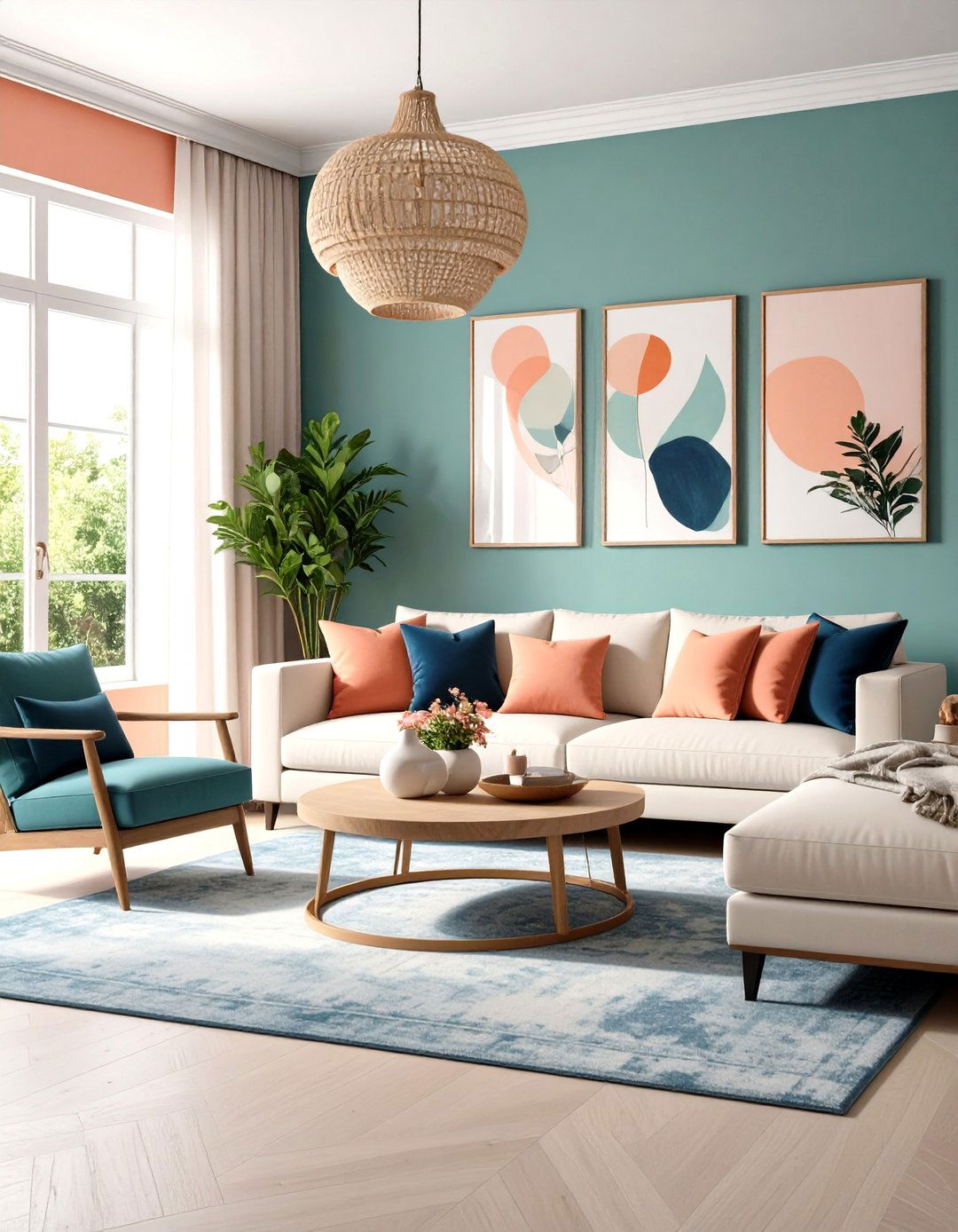
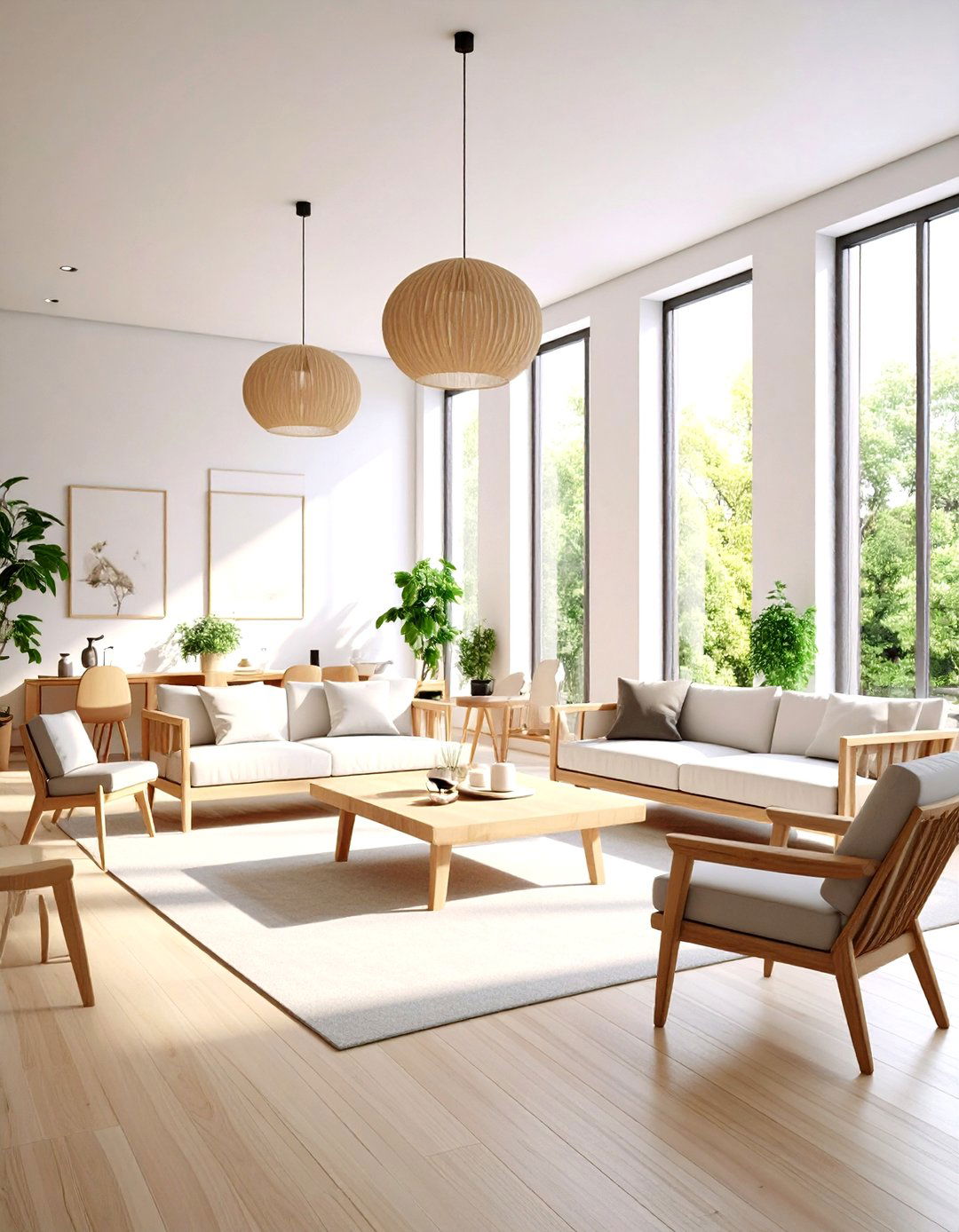
2. Pastel Colour Blush Pink Living Room Elegance
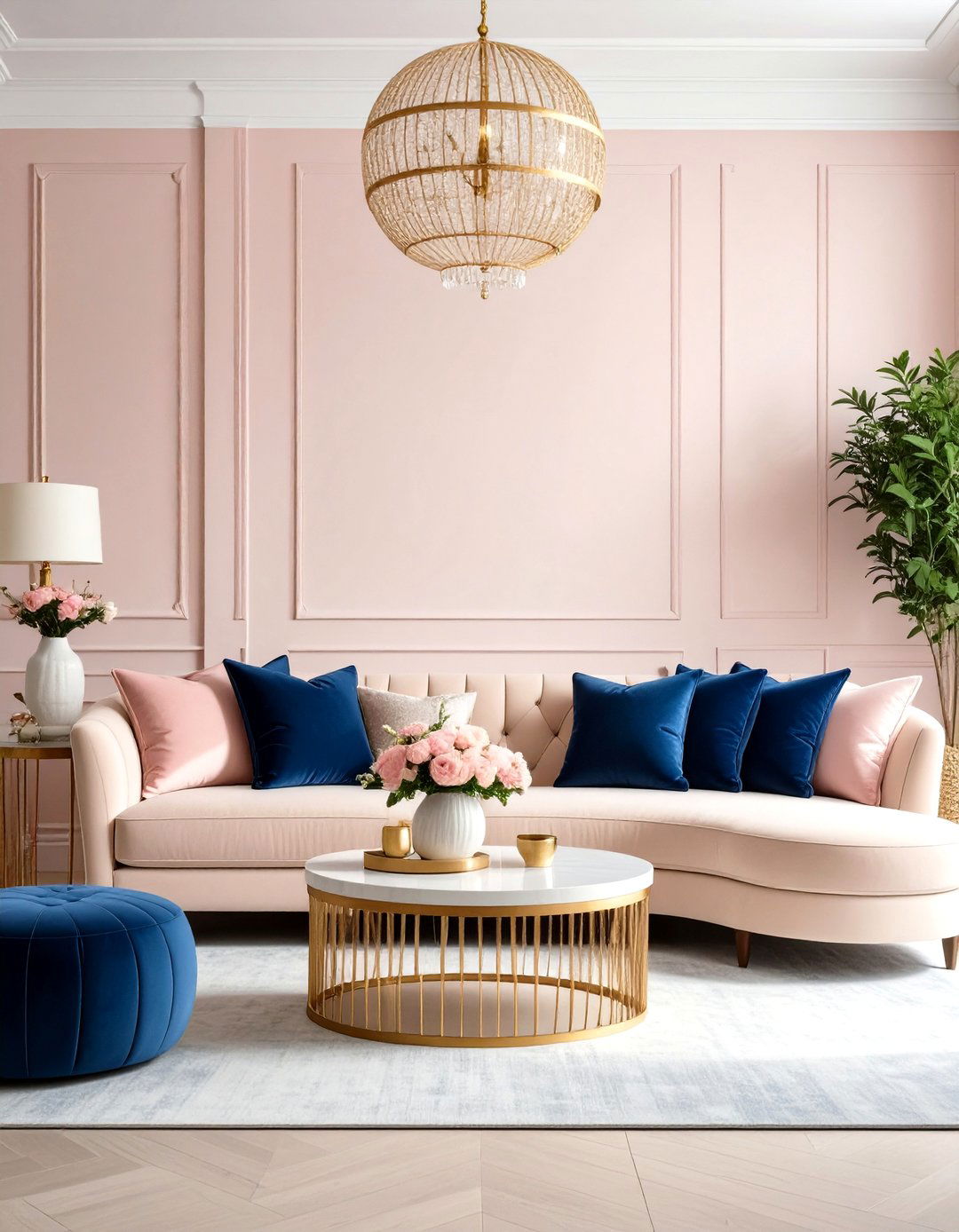
Transform your living room into a sophisticated sanctuary with blush pink walls that radiate warmth without overwhelming the space. This pastel colour palette works exceptionally well when paired with rich neutrals like charcoal gray and warm beige. Choose a curved sectional sofa in soft cream to complement the pink walls, and add contrast with navy blue accent pillows and throws. Brass fixtures and gold-toned picture frames elevate the feminine pink into something more contemporary and refined. The key to success with this palette lies in incorporating plenty of texture through woven baskets, velvet cushions, and natural wood furniture pieces that ground the sweetness of the pink with more substantial elements.
3. Pastel Colour Mint Green Kitchen Refresh
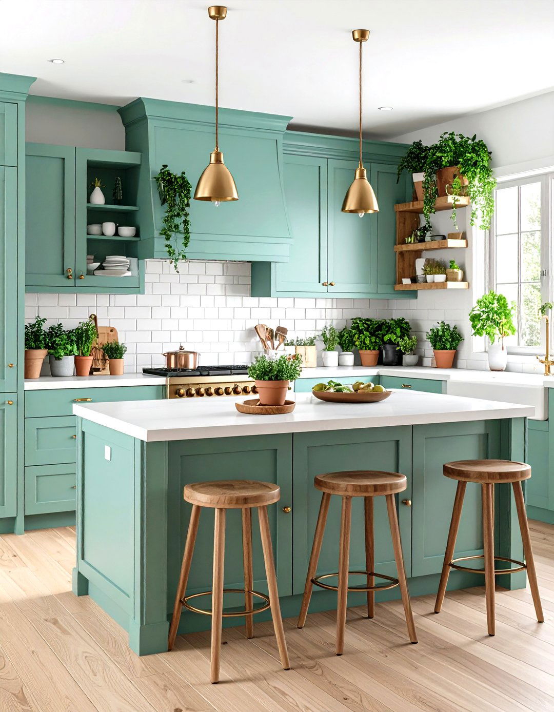
Mint green cabinets create a fresh, invigorating kitchen atmosphere that feels both retro and thoroughly modern. This cool pastel colour choice pairs beautifully with white subway tiles and warm brass hardware for a balanced look. The mint green works particularly well in kitchens with abundant natural light, where it creates a clean, spa-like environment perfect for cooking and entertaining. Add warmth through natural wood open shelving and copper accents in light fixtures or bar stools. White quartz countertops keep the space feeling bright and clean, while terra cotta planters with fresh herbs add life and complement the green tones. This palette creates an uplifting space that encourages both cooking creativity and relaxed conversation.
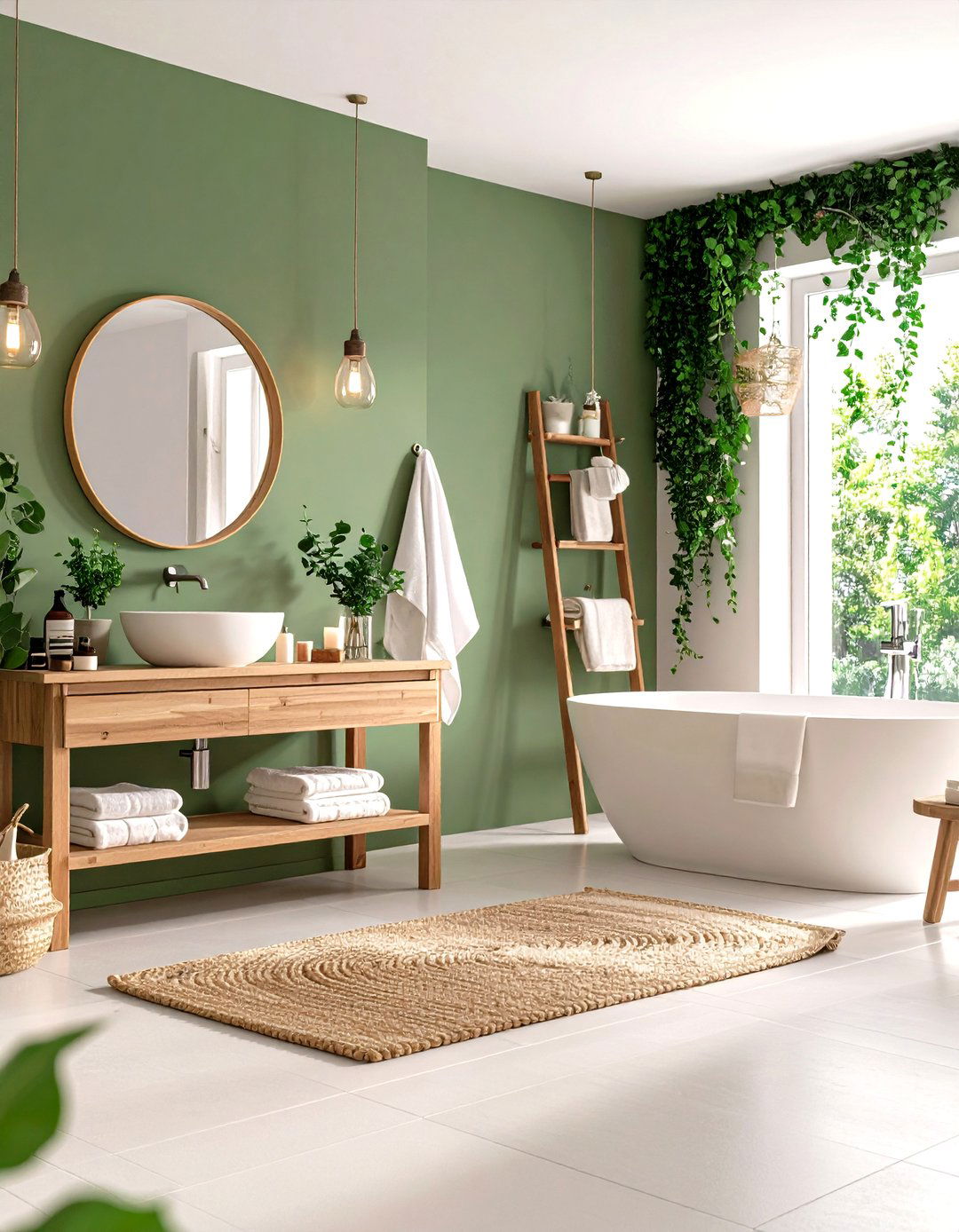
4. Pastel Colour Lavender Bathroom Retreat
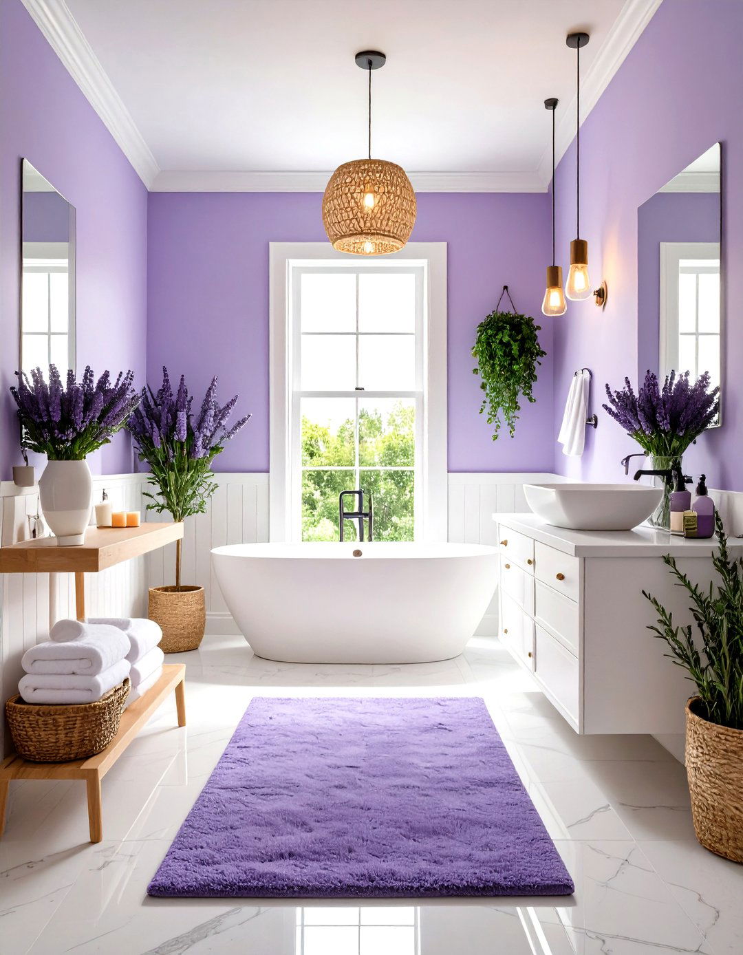
A lavender-washed bathroom creates the ultimate relaxation sanctuary, combining the calming properties of blue with the gentle warmth of pink. This sophisticated pastel colour scheme works beautifully with white fixtures and natural stone accents. Paint the walls in a soft lavender tone and add white wainscoting for visual interest and traditional charm. Natural materials like bamboo towels and wooden bath accessories enhance the spa-like atmosphere while preventing the space from feeling too sweet. Add plants that thrive in humidity, such as eucalyptus or ferns, to bring life to the space. Soft lighting through pendant fixtures with warm bulbs creates an ambiance perfect for unwinding after long days, making this bathroom feel like a personal retreat.
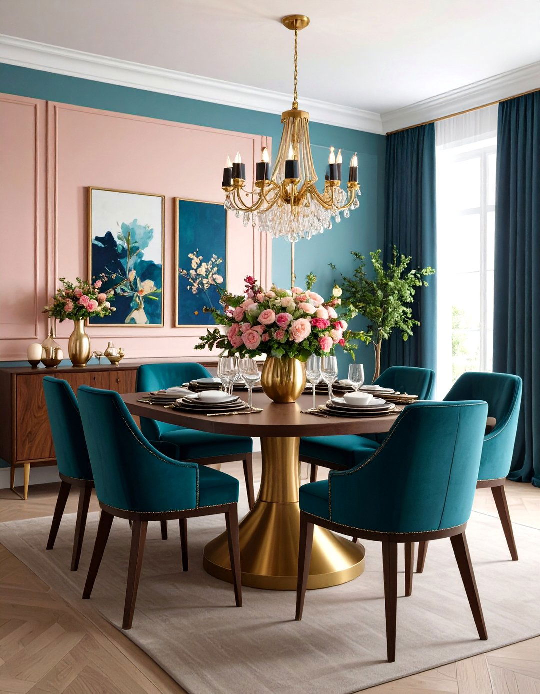
5. Pastel Colour Peach Dining Room Warmth
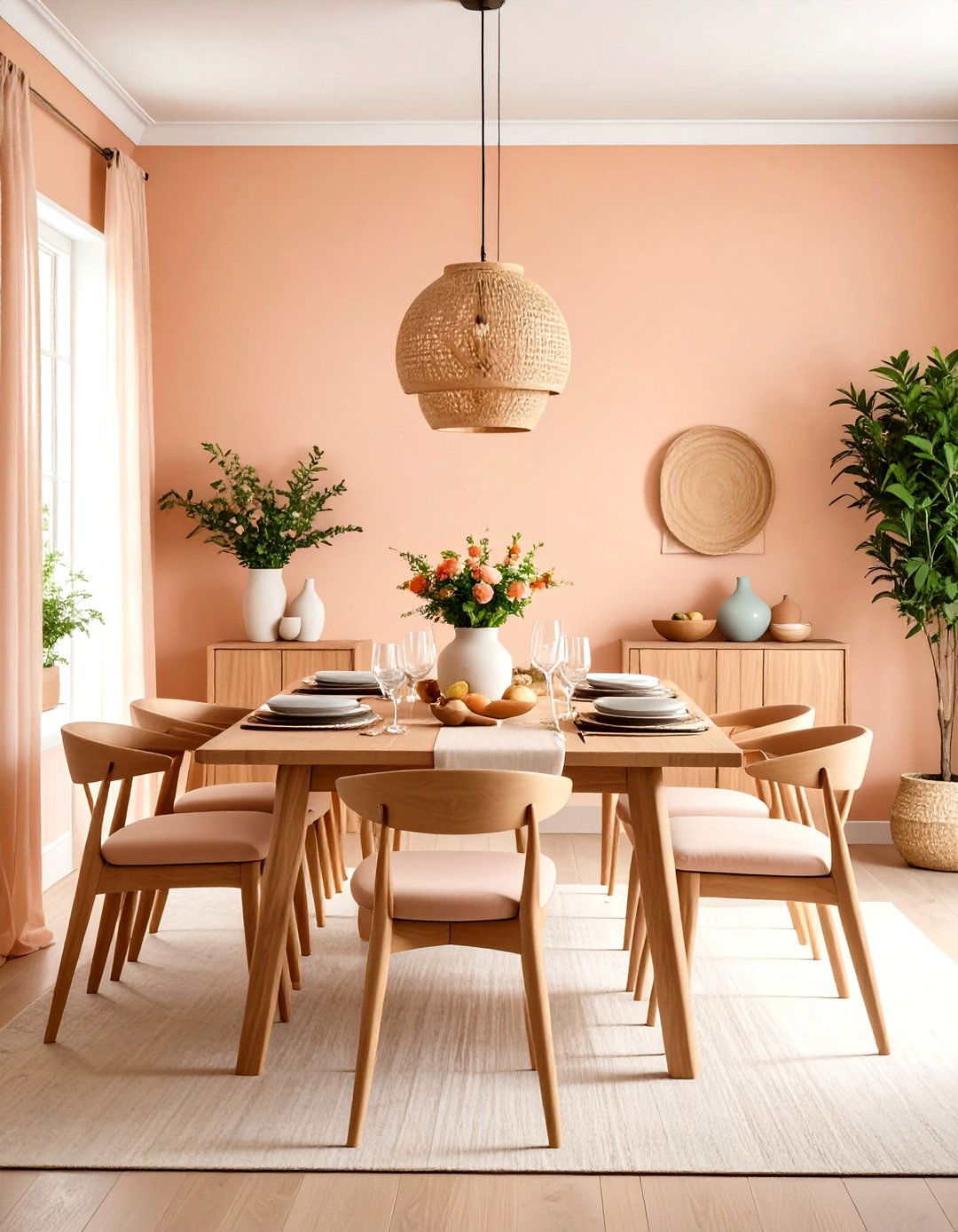
Peach walls create an inviting dining atmosphere that encourages lingering conversations and memorable meals. This warm pastel colour palette works exceptionally well with natural wood furniture and deep green accents. Choose a substantial wooden dining table with matching chairs upholstered in cream or soft sage green fabric. The peach creates a flattering backdrop for both daytime brunches and evening dinner parties, casting a warm glow that makes food and faces look their best. Add personality through artwork featuring complementary colors like dusty blue and sage green. Natural elements such as woven placemats and wooden serving pieces enhance the organic feel of the space while maintaining the sophisticated, welcoming atmosphere that makes dining rooms truly special.
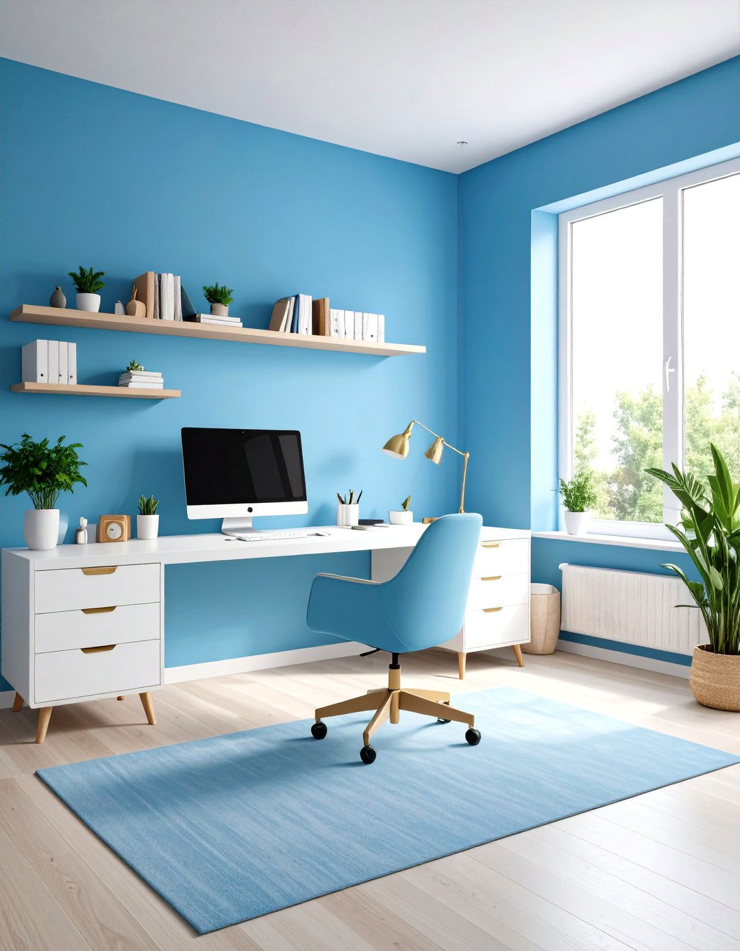
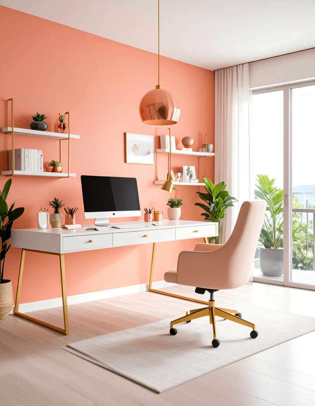
6. Pastel Colour Dusty Blue Home Office Productivity
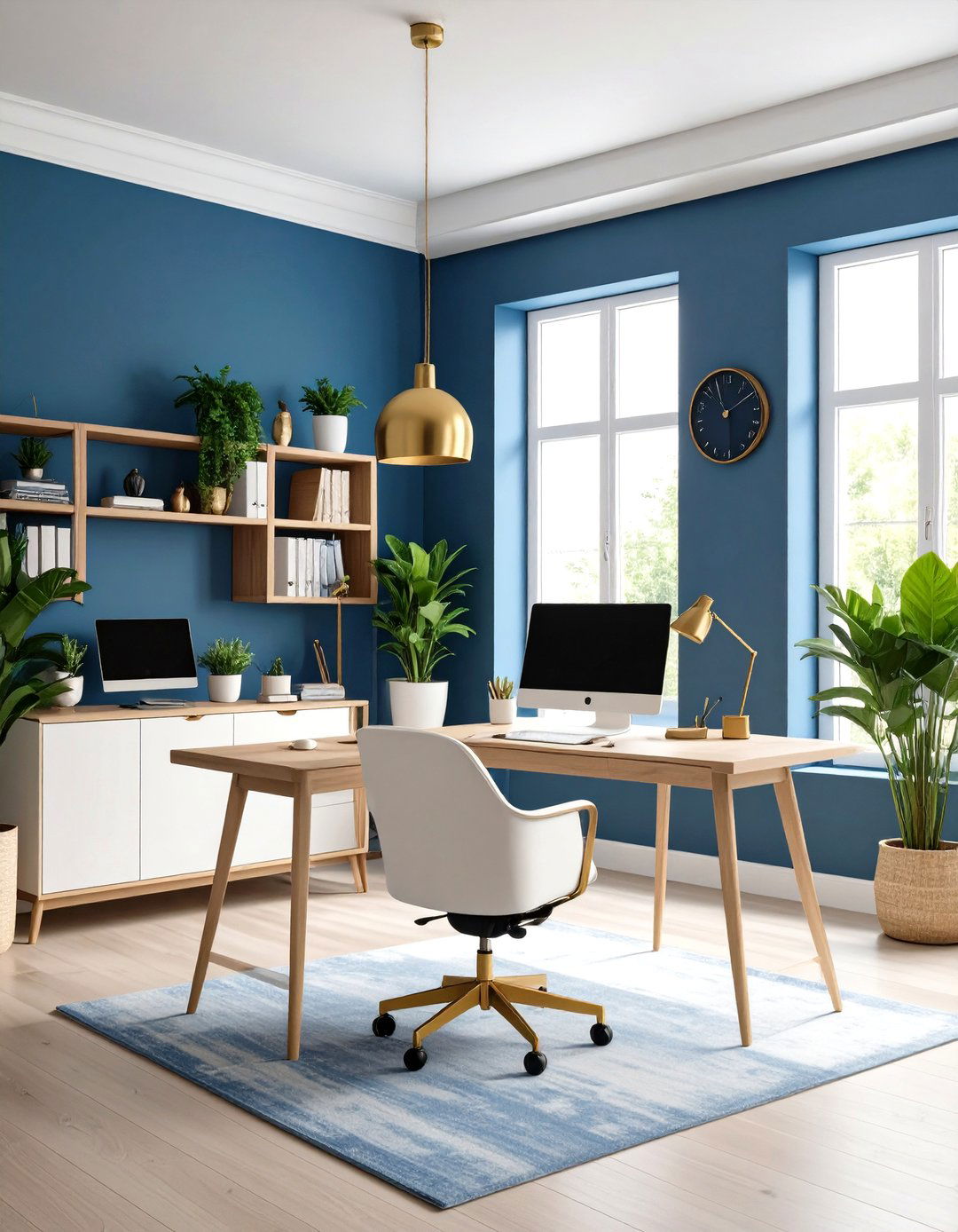
Dusty blue walls create a focused yet calming work environment that enhances productivity without feeling sterile. This sophisticated pastel colour choice combines the calming properties of blue with enough warmth to prevent the space from feeling cold. Pair with white or light wood furniture to keep the space feeling open and organized. Add warmth through brass desk accessories and warm-toned lighting that prevents eye strain during long work sessions. Natural elements like potted plants and wooden organizers bring life to the space while maintaining the professional atmosphere. This color choice works particularly well in spaces with limited natural light, as the blue undertones create a sense of openness and clarity that promotes clear thinking and creative problem-solving.
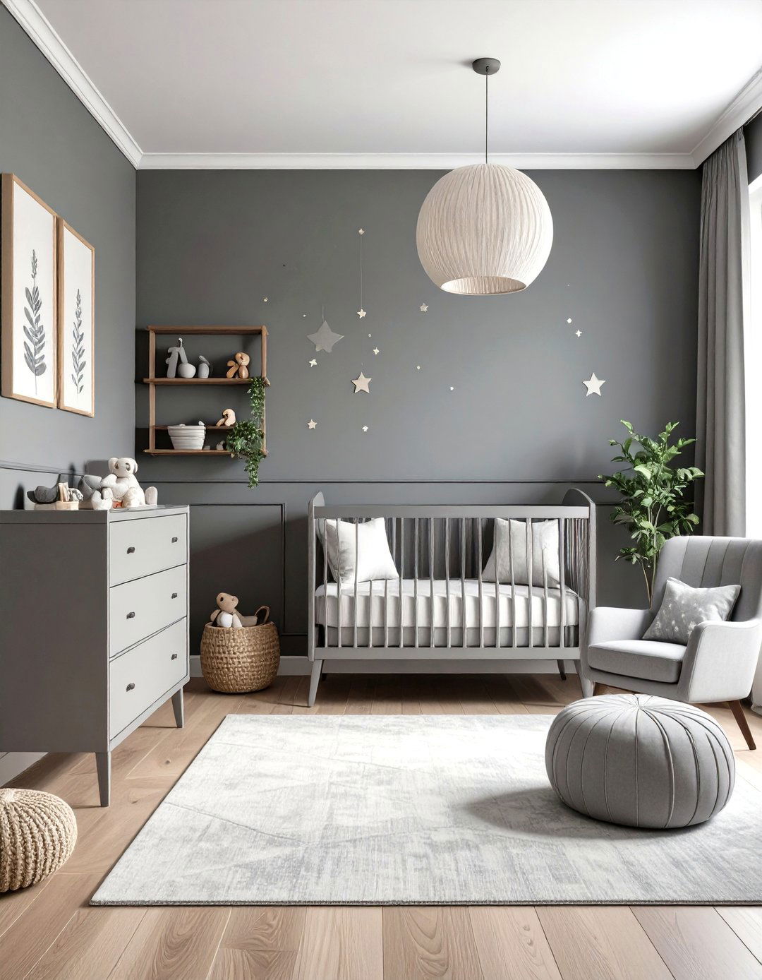
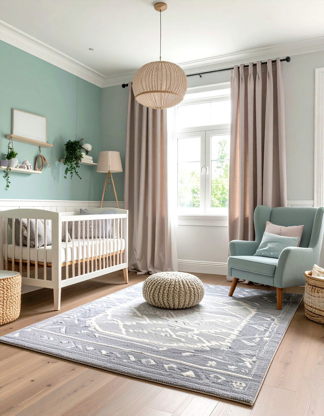
7. Pastel Colour Butter Yellow Nursery Joy
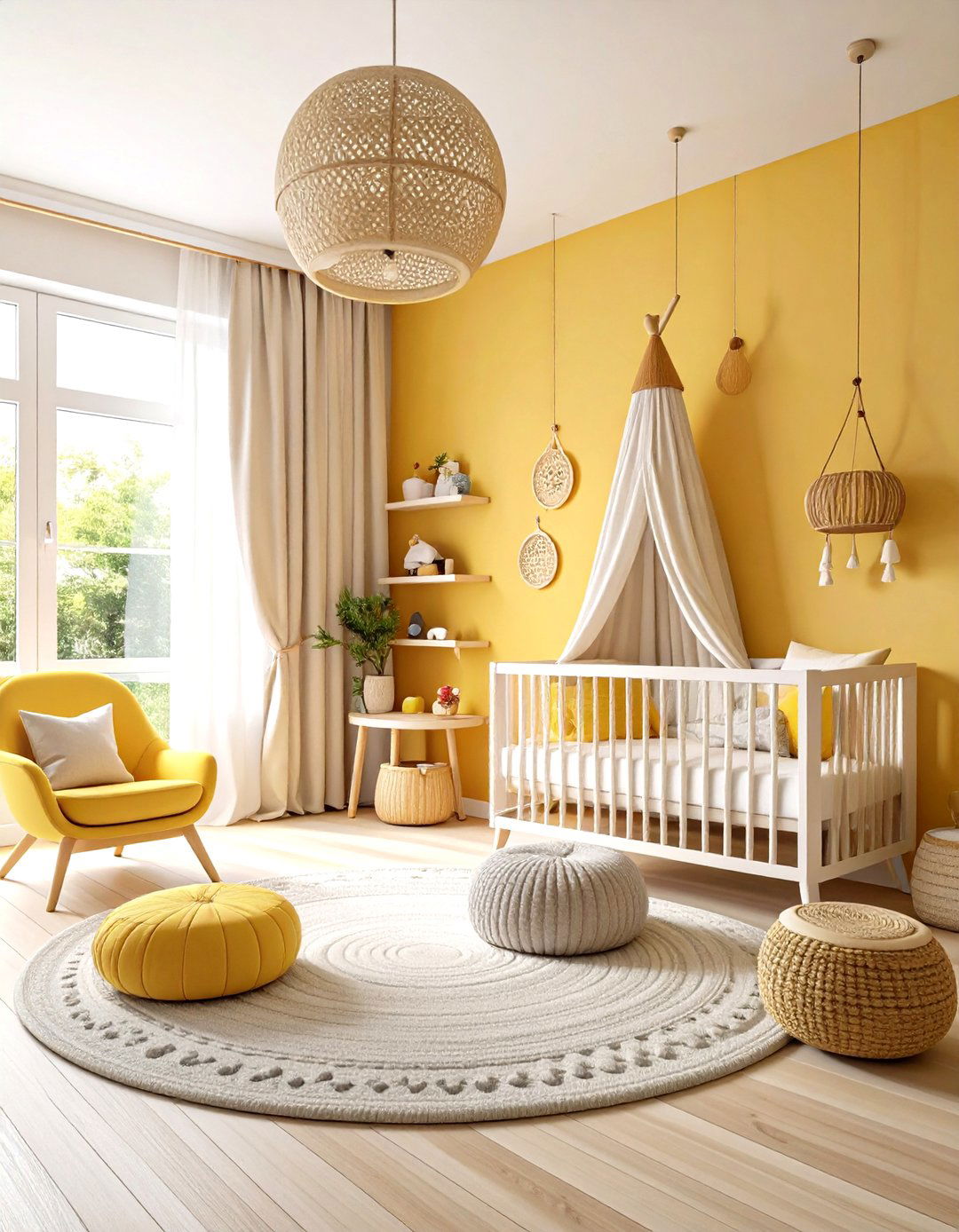
Butter yellow walls create a cheerful, gender-neutral nursery that grows with your child while maintaining a sophisticated aesthetic. This warm pastel colour palette pairs beautifully with white furniture and natural wood accents. The yellow creates an uplifting atmosphere that encourages play and learning while remaining calm enough for peaceful sleep. Add texture through cream-colored curtains and soft gray area rugs that provide comfort underfoot. Natural materials like woven baskets for toy storage and wooden mobiles enhance the organic feel of the space. This palette works particularly well in rooms with northern exposure, where the yellow helps brighten the space and create a warm, welcoming environment that both parents and children will enjoy spending time in.
8. Pastel Colour Coral Accent Wall Drama
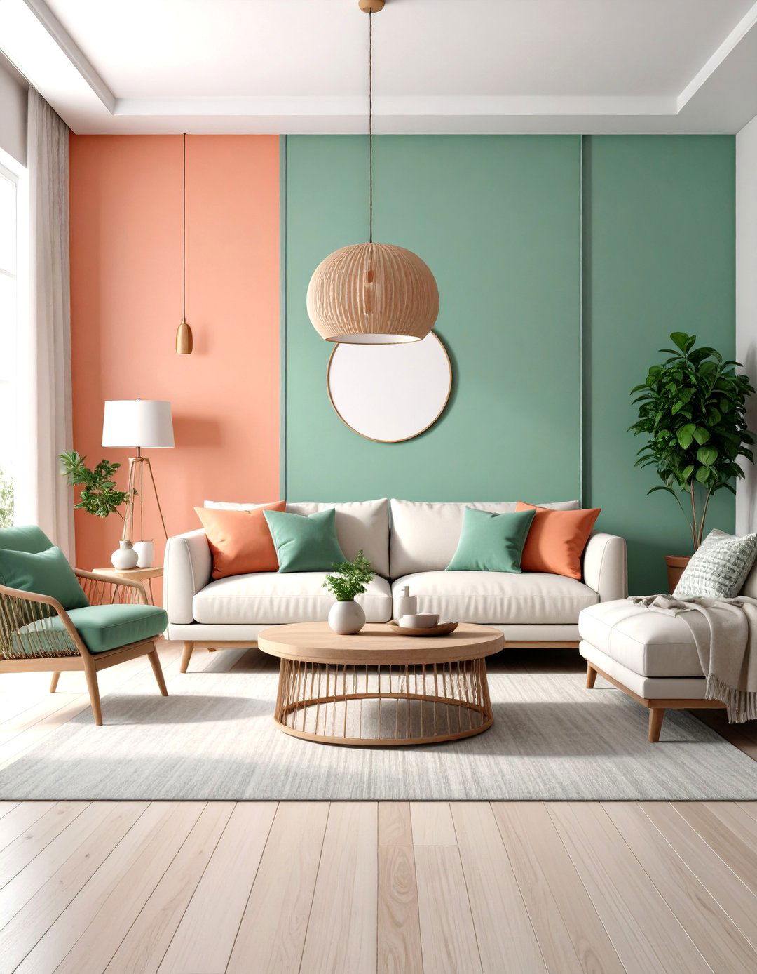
Create striking focal points with coral accent walls that add warmth and personality without overwhelming the space. This vibrant pastel colour works beautifully in living rooms or bedrooms when balanced with neutral furnishings and natural materials. Choose one wall for the coral treatment and keep remaining walls in soft white or cream to prevent the space from feeling too intense. Pair with natural wood furniture and plenty of green plants to create a balanced, sophisticated look. The coral creates an energizing backdrop that works particularly well behind seating areas or bed headboards. Add depth through textured fabrics in complementary colors like sage green and cream, creating a layered look that feels both contemporary and timeless.
9. Pastel Colour Lilac Powder Room Sophistication
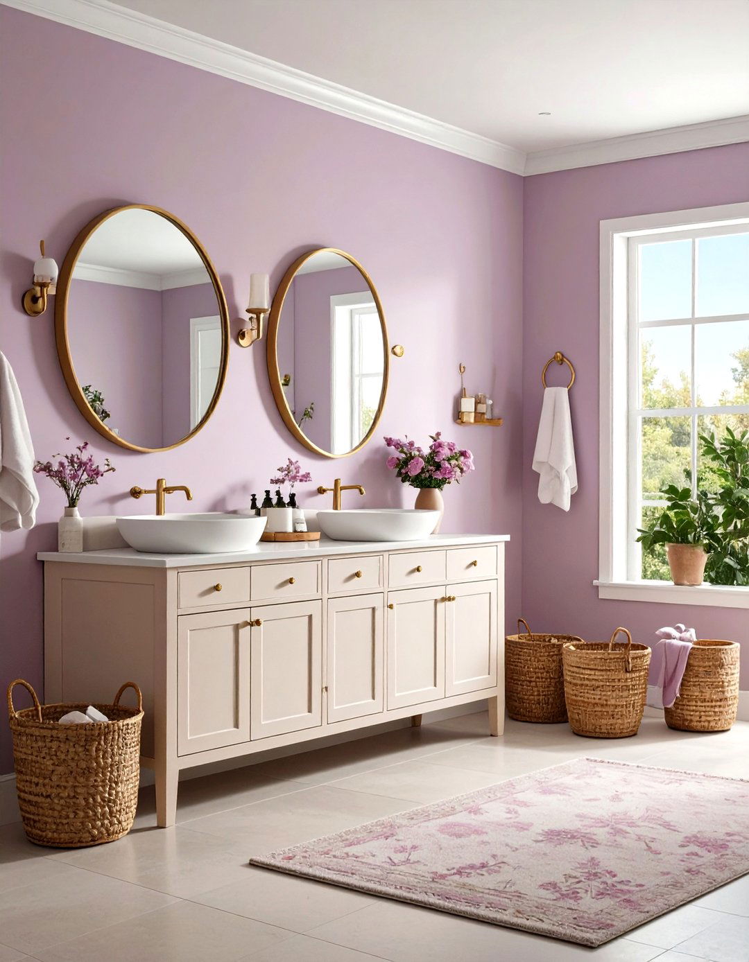
Transform a small powder room into a jewel-like space with lilac walls that create instant sophistication and charm. This cool pastel colour choice works exceptionally well in small spaces where it won't feel overwhelming. Pair with white fixtures and brass accents for a balanced, elegant look that feels both timeless and contemporary. Add personality through patterned wallpaper featuring lilac and green botanical prints, or keep it simple with solid color walls and interesting artwork. The lilac creates a memorable impression for guests while maintaining the calming properties that make powder rooms feel like peaceful retreats. Natural materials like wooden mirrors and woven baskets add texture and warmth to prevent the space from feeling too precious or delicate.
10. Pastel Colour Seafoam Green Coastal Bedroom

Seafoam green walls create a serene coastal bedroom that evokes peaceful oceanside mornings. This cool pastel colour palette works beautifully with white linens and natural materials like jute rugs and driftwood accessories. The seafoam green provides just enough color interest to prevent the space from feeling sterile while maintaining the calming atmosphere essential for restful sleep. Add warmth through cream-colored curtains and wooden furniture with weathered finishes that enhance the coastal theme. Natural elements like seagrass baskets and coral accessories bring the ocean indoors while maintaining the sophisticated, grown-up appeal. This palette works particularly well in master bedrooms where the goal is creating a resort-like retreat that promotes relaxation and peaceful sleep.
11. Pastel Colour Rose Gold Dining Experience
Rose gold pastel walls create an elegant dining room that feels both glamorous and approachable for everyday meals. This sophisticated pastel colour choice combines the warmth of pink with metallic undertones that add depth and richness. Pair with dark wood furniture and brass fixtures for a balanced look that feels both contemporary and timeless. The rose gold creates a flattering backdrop for both casual family dinners and formal entertaining, casting a warm glow that makes food and faces look their best. Add personality through artwork featuring complementary colors like deep green and navy blue. Natural elements such as fresh flowers and wooden serving pieces enhance the organic feel while maintaining the sophisticated atmosphere that makes dining rooms truly special for creating lasting memories.
12. Pastel Colour Powder Blue Kitchen Serenity
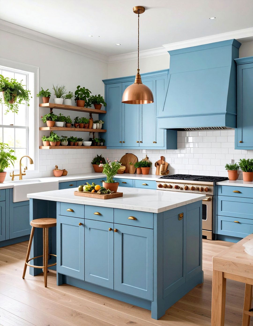
Powder blue cabinets create a calming kitchen atmosphere that feels both fresh and sophisticated. This cool pastel colour choice works exceptionally well with white countertops and warm brass hardware for a balanced, timeless look. The powder blue creates a sense of openness and cleanliness that's perfect for cooking and entertaining spaces. Add warmth through natural wood open shelving and copper accents in lighting fixtures or bar stools. White subway tiles keep the space feeling bright and classic, while fresh herbs in terra cotta planters add life and complement the blue tones. This palette creates an uplifting space that encourages both culinary creativity and relaxed conversation, making the kitchen a true heart of the home where family and friends naturally gather.
13. Pastel Colour Champagne Pink Master Suite
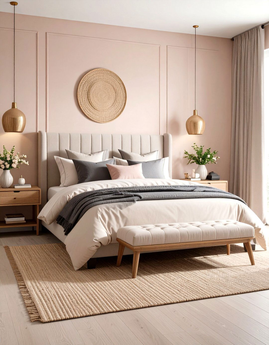
Champagne pink walls create a luxurious master bedroom that feels both romantic and sophisticated. This warm pastel colour palette works beautifully with rich neutrals like charcoal gray and cream for a balanced, elegant look. The champagne pink adds warmth and personality without overwhelming the space, creating a welcoming retreat perfect for relaxation. Pair with high-quality linens in cream and soft gray, and add depth through textured throws and pillows in complementary colors. Natural materials like wooden nightstands and jute rugs ground the feminine pink with more substantial elements. This palette works particularly well in bedrooms with good natural light, where the pink undertones create a warm, inviting atmosphere that promotes both restful sleep and romantic ambiance.
14. Pastel Colour Mint and Lavender Nursery Haven
Combine mint green and lavender for a sophisticated nursery that grows with your child while maintaining timeless appeal. This dual pastel colour scheme creates visual interest through complementary cool tones that feel both calming and stimulating. Use mint green on the lower half of walls and lavender on the upper portion, separated by white chair rail molding for classic appeal. White furniture and natural wood accents balance the colors while maintaining the peaceful atmosphere essential for rest and play. Add texture through cream-colored curtains and soft gray area rugs that provide comfort and safety. This palette works particularly well in rooms with abundant natural light, where the colors create a fresh, garden-like environment that encourages both peaceful sleep and creative play.
15. Pastel Colour Peachy Coral Living Room Energy
Peachy coral walls create an energizing living room that feels both vibrant and welcoming for family gatherings. This warm pastel colour choice works exceptionally well with neutral furnishings and natural materials that prevent the space from feeling overwhelming. Choose cream-colored seating and add contrast through navy blue accent pillows and throws. Natural wood coffee tables and side tables ground the vibrant coral with more substantial elements. The peachy coral creates a flattering backdrop for both daytime relaxation and evening entertainment, casting a warm glow that makes the space feel inviting and lived-in. Add personality through artwork featuring complementary colors like sage green and cream, creating a layered look that feels both contemporary and timeless while encouraging conversation and connection.
16. Pastel Colour Sage and Cream Bathroom Spa
Create a spa-like bathroom retreat with sage green walls and cream accents that promote relaxation and wellbeing. This sophisticated pastel colour combination works beautifully with white fixtures and natural stone elements for a balanced, luxurious feel. The sage green provides just enough color interest to prevent the space from feeling sterile while maintaining the calming properties essential for a bathroom sanctuary. Add warmth through natural materials like bamboo towels and wooden bath accessories that enhance the spa-like atmosphere. Plants that thrive in humidity, such as eucalyptus or ferns, bring life to the space while complementing the green tones. This palette creates a peaceful retreat where you can unwind and recharge, making every bath or shower feel like a mini-vacation.
17. Pastel Colour Dusty Rose Guest Bedroom Welcome
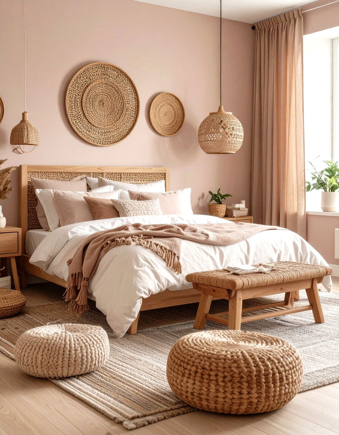
Dusty rose walls create a welcoming guest bedroom that feels both sophisticated and comfortable for overnight visitors. This warm pastel colour palette works beautifully with white linens and natural wood furniture for a balanced, timeless look. The dusty rose adds personality and warmth without overwhelming the space, creating a memorable impression that makes guests feel truly welcome. Pair with cream-colored curtains and soft gray area rugs that provide comfort underfoot. Natural materials like woven baskets and wooden accessories enhance the organic feel while maintaining the sophisticated atmosphere. This palette works particularly well in rooms with good natural light, where the rose undertones create a warm, inviting environment that promotes restful sleep and makes guests feel at home in your space.
18. Pastel Colour Lemon Yellow Reading Nook Inspiration
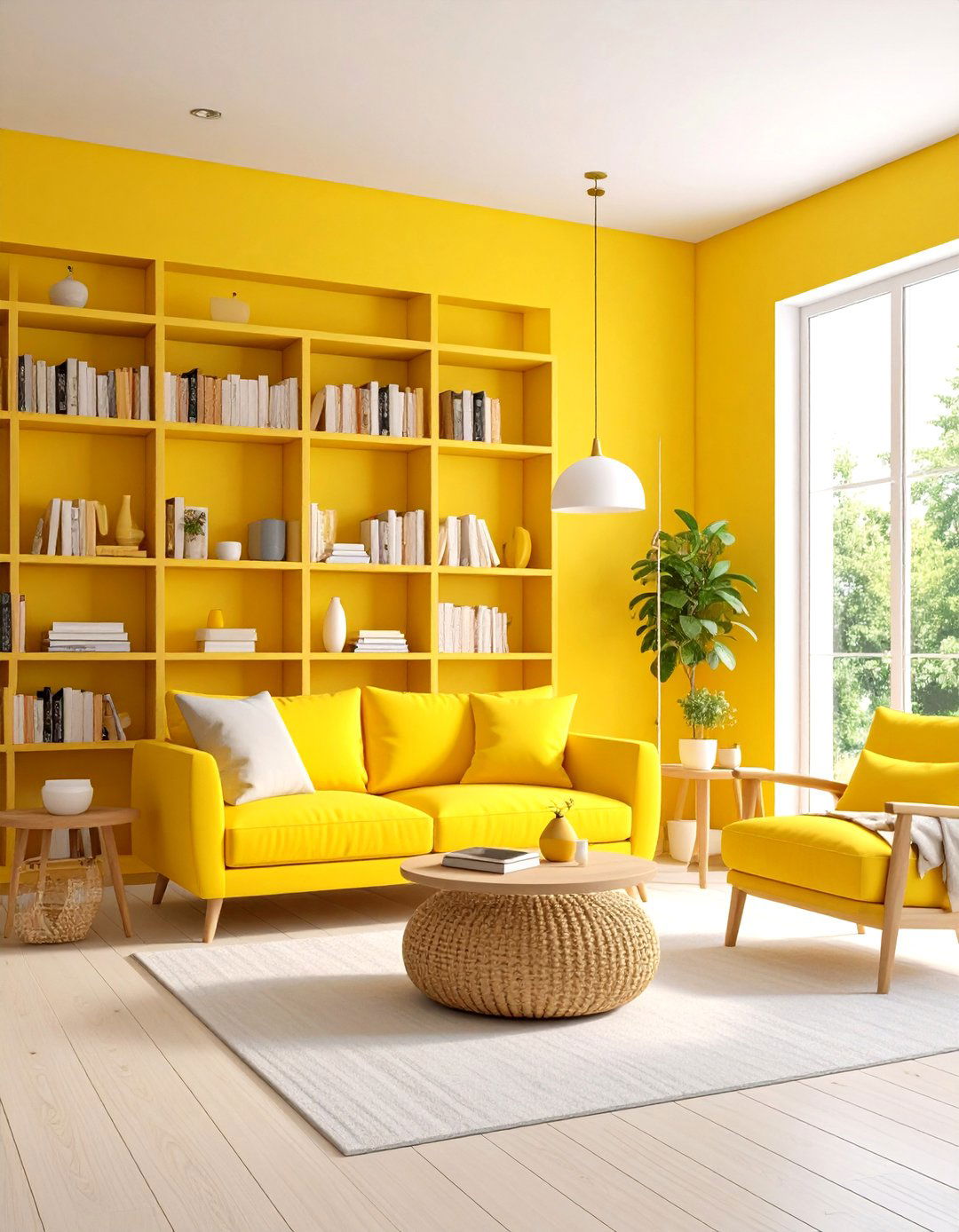
Create an inspiring reading nook with lemon yellow walls that energize and uplift while maintaining a calming atmosphere for focused reading. This cheerful pastel colour choice works exceptionally well with white built-in bookshelves and comfortable seating in neutral tones. The lemon yellow creates an optimistic environment that encourages learning and creativity while remaining gentle enough for extended reading sessions. Add warmth through natural materials like wooden side tables and woven baskets for book storage. Soft lighting through table lamps with warm bulbs creates the perfect ambiance for reading at any time of day. This palette works particularly well in spaces with limited natural light, where the yellow helps brighten the area and create an welcoming environment that makes reading a true pleasure.
19. Pastel Colour Periwinkle Blue Study Tranquility
Periwinkle blue walls create a tranquil study environment that enhances focus and productivity without feeling cold or sterile. This sophisticated pastel colour choice combines the calming properties of blue with enough warmth to create a welcoming workspace. Pair with white or light wood furniture to keep the space feeling open and organized. Add personality through brass desk accessories and warm-toned lighting that prevents eye strain during long study sessions. Natural elements like potted plants and wooden organizers bring life to the space while maintaining the professional atmosphere. This color choice works particularly well in home offices or study spaces where the goal is creating an environment that promotes clear thinking, creativity, and productive work while remaining comfortable for extended periods.
20. Pastel Colour Soft Peach Entryway Warmth
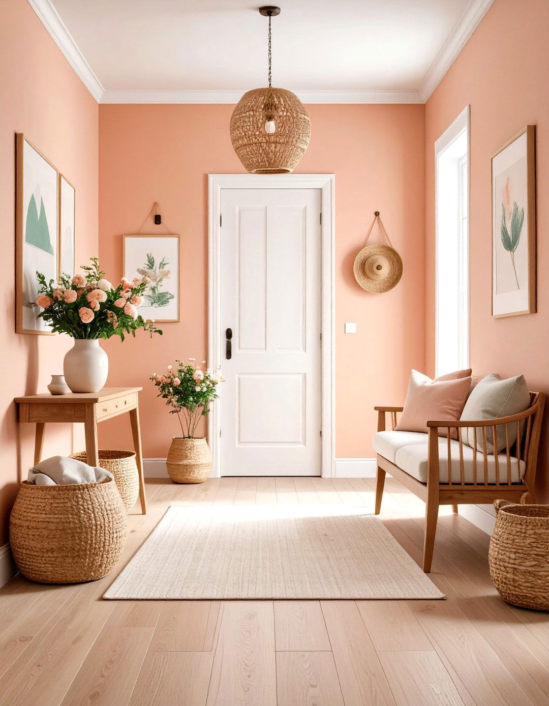
Soft peach walls create a welcoming entryway that makes a memorable first impression while feeling warm and inviting. This sophisticated pastel colour choice works beautifully with white trim and natural wood furniture for a balanced, timeless look. The soft peach adds personality and warmth that welcomes guests while remaining subtle enough not to overwhelm the transition space. Pair with cream-colored area rugs and natural materials like woven baskets for storage. The peach creates a flattering backdrop for both natural and artificial lighting, ensuring the space feels welcoming at any time of day. Add depth through artwork featuring complementary colors like sage green and cream. This palette works particularly well in entryways with limited natural light, where the peach undertones help brighten the space and create the perfect first impression.
Conclusion:
Pastel colors offer endless possibilities for creating sophisticated, calming spaces that reflect personal style while promoting wellbeing. From sage green bedrooms to peachy coral living rooms, these soft hues provide the perfect foundation for homes that feel both stylish and serene. The key to success lies in choosing pastels with complex undertones, balancing them with natural materials, and considering how each color affects the mood and function of your space. Whether you prefer the energy of coral or the tranquility of dusty blue, pastel colors can transform any room into a beautiful, functional haven that you'll love coming home to every day.
Related posts:

Leave a Reply