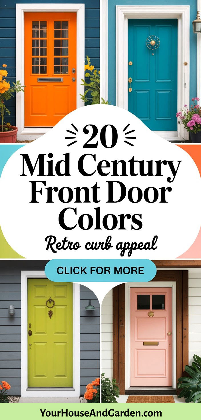
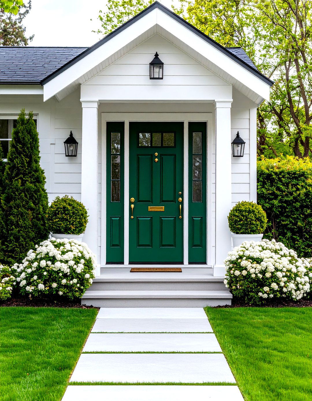
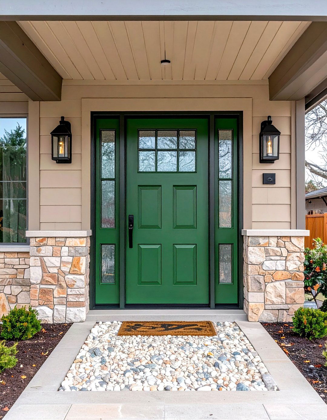
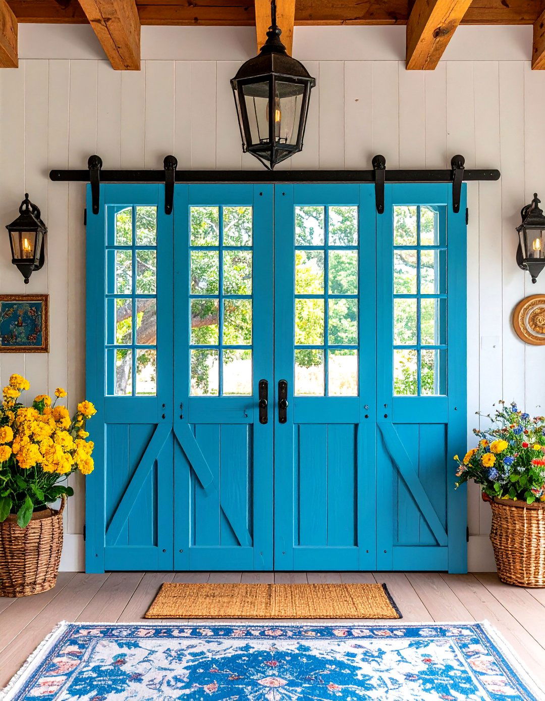
Mid-century modern architecture revolutionized home design with its emphasis on clean lines, natural materials, and bold color statements. The front door serves as a crucial focal point, offering homeowners an opportunity to embrace the era's fearless approach to color. From vibrant oranges that radiate warmth to sophisticated teals that evoke tranquility, mid-century front door colors reflect the period's optimistic spirit and connection to nature. These carefully chosen hues not only enhance curb appeal but also establish the home's personality before guests even step inside.
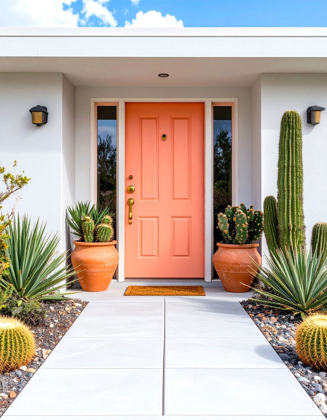
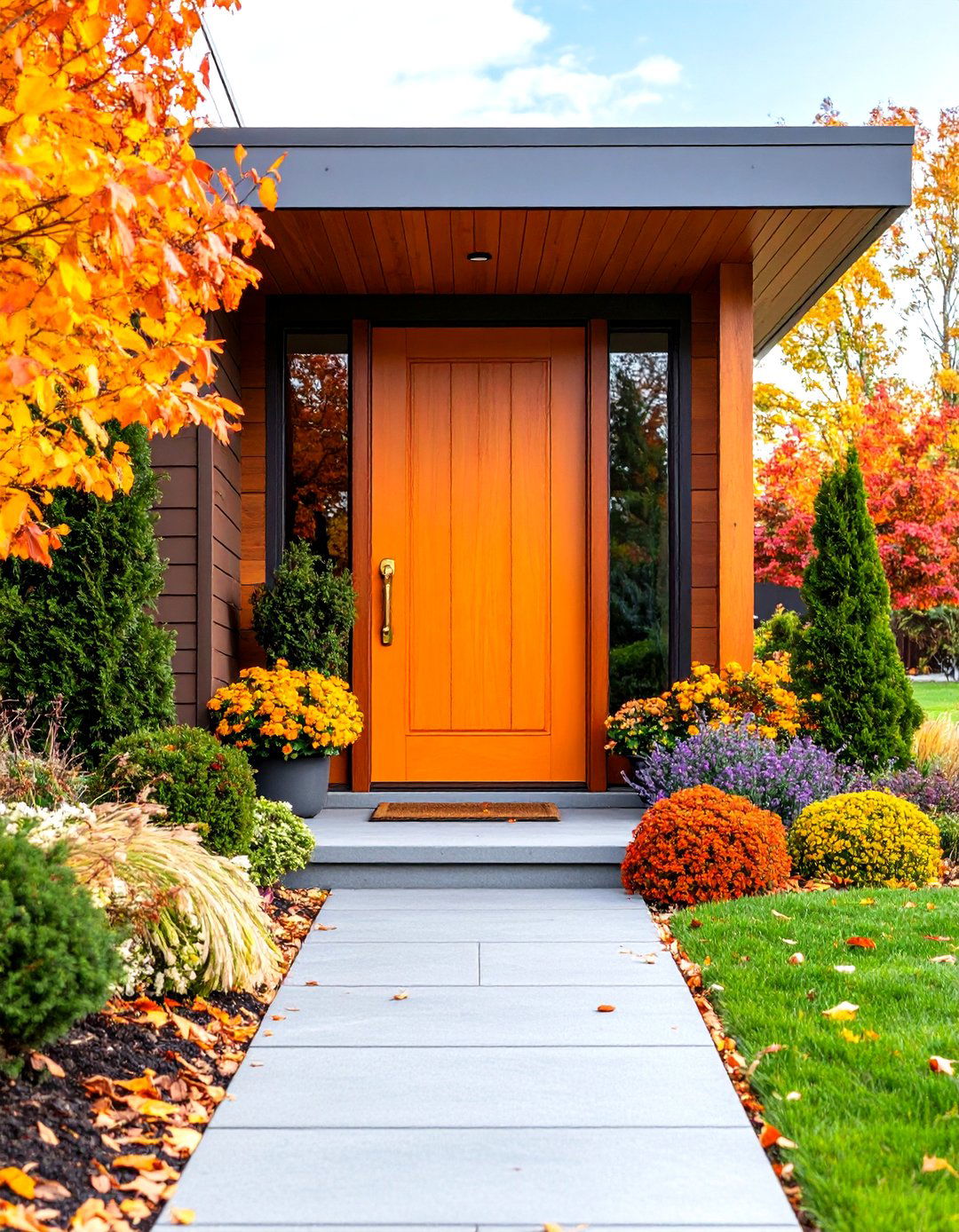
1. Tangerine Orange Mid Century Front Door
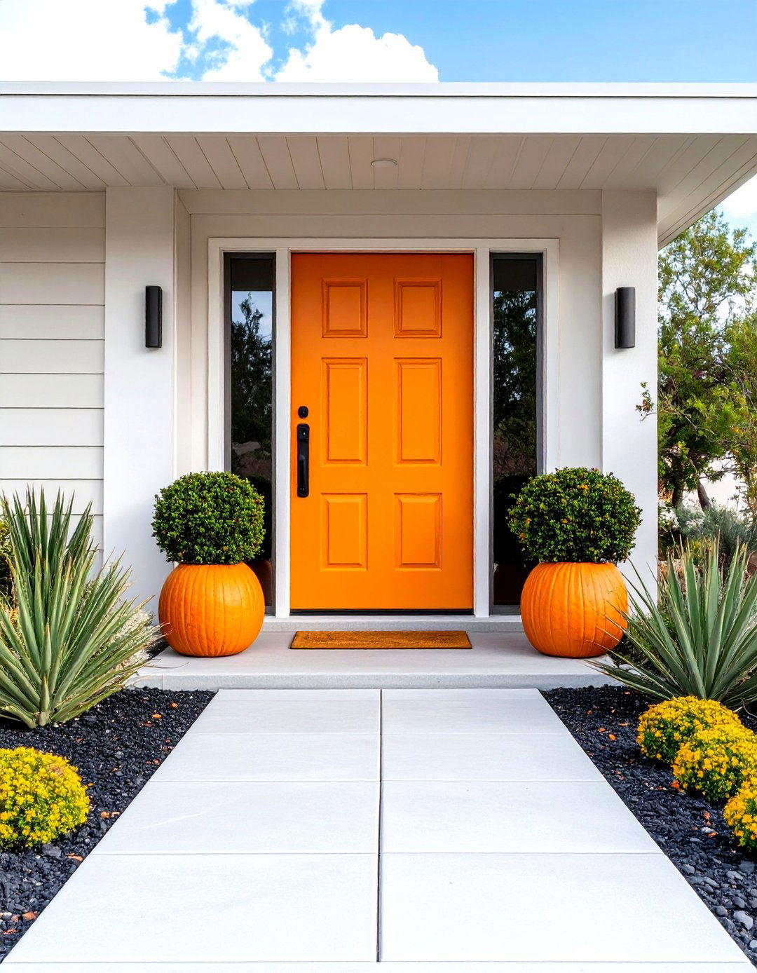
Tangerine orange represents the quintessential mid-century modern front door color, embodying the era's bold and optimistic spirit. This vibrant shade radiates warmth and energy while perfectly complementing neutral exterior palettes like white, gray, or natural wood siding. The color's ability to create visual impact makes it ideal for homes with clean, geometric lines typical of mid-century architecture. When paired with brushed metal hardware and geometric door panels, tangerine orange creates an authentic retro aesthetic. This shade works particularly well against desert landscapes or modern urban settings, offering a cheerful welcome that reflects the homeowner's confident personality and appreciation for classic design elements.
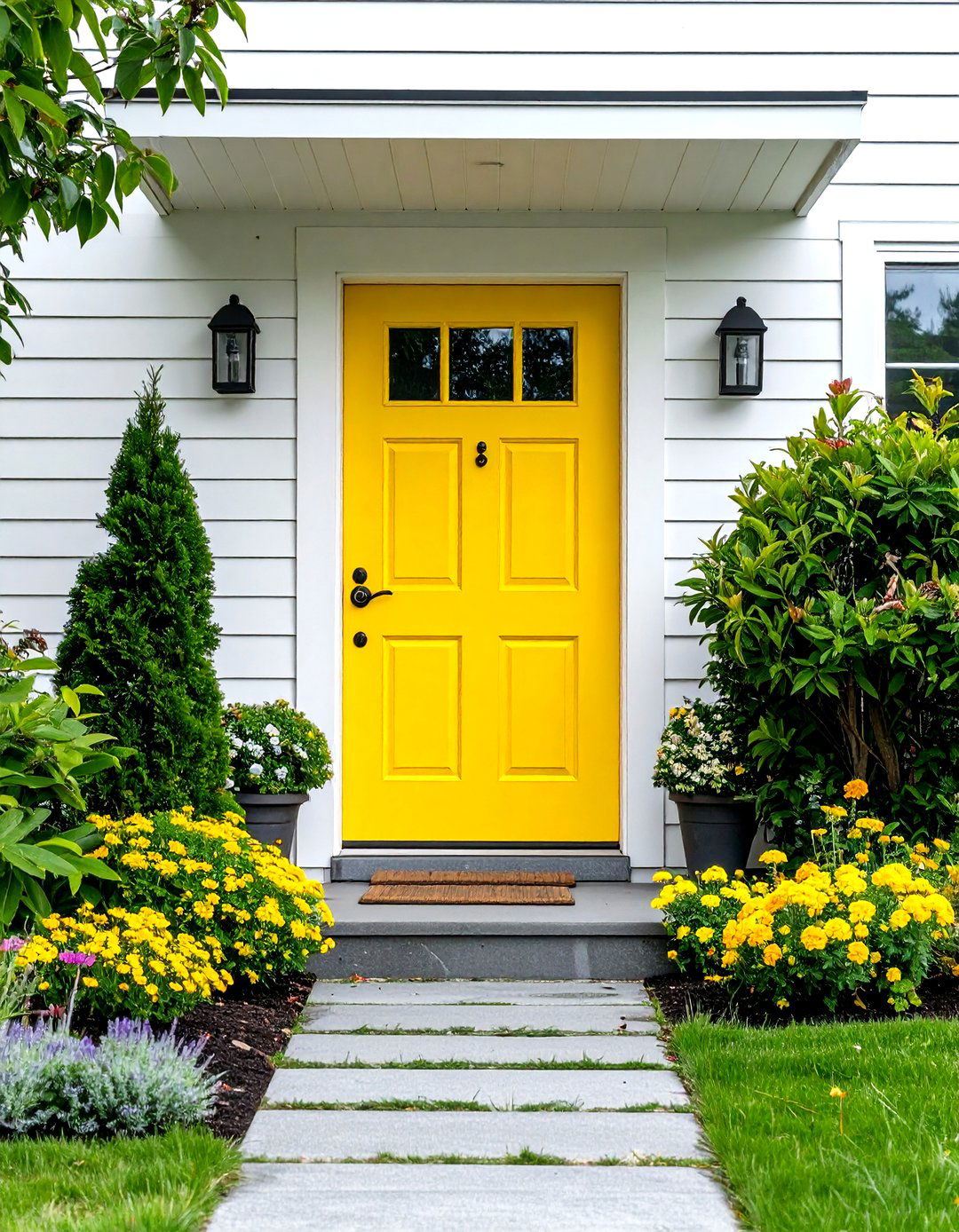
2. Butterscotch Yellow Mid Century Front Door
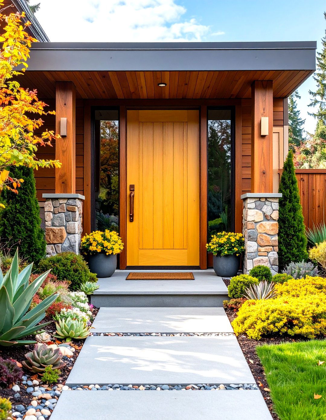
Butterscotch yellow brings sunshine and warmth to mid-century modern entrances, creating an inviting focal point that captures the era's love for cheerful, optimistic colors. This rich, golden-yellow shade pairs beautifully with natural wood tones, stone accents, and neutral siding materials commonly found in mid-century homes. The color's depth prevents it from appearing too bright while maintaining visual interest throughout different lighting conditions. Butterscotch yellow works exceptionally well with copper or brass hardware, enhancing the warm undertones. This sophisticated take on yellow complements landscaping with succulents, ornamental grasses, and desert plants, creating a cohesive outdoor aesthetic that celebrates California modernism and the era's connection to natural environments.
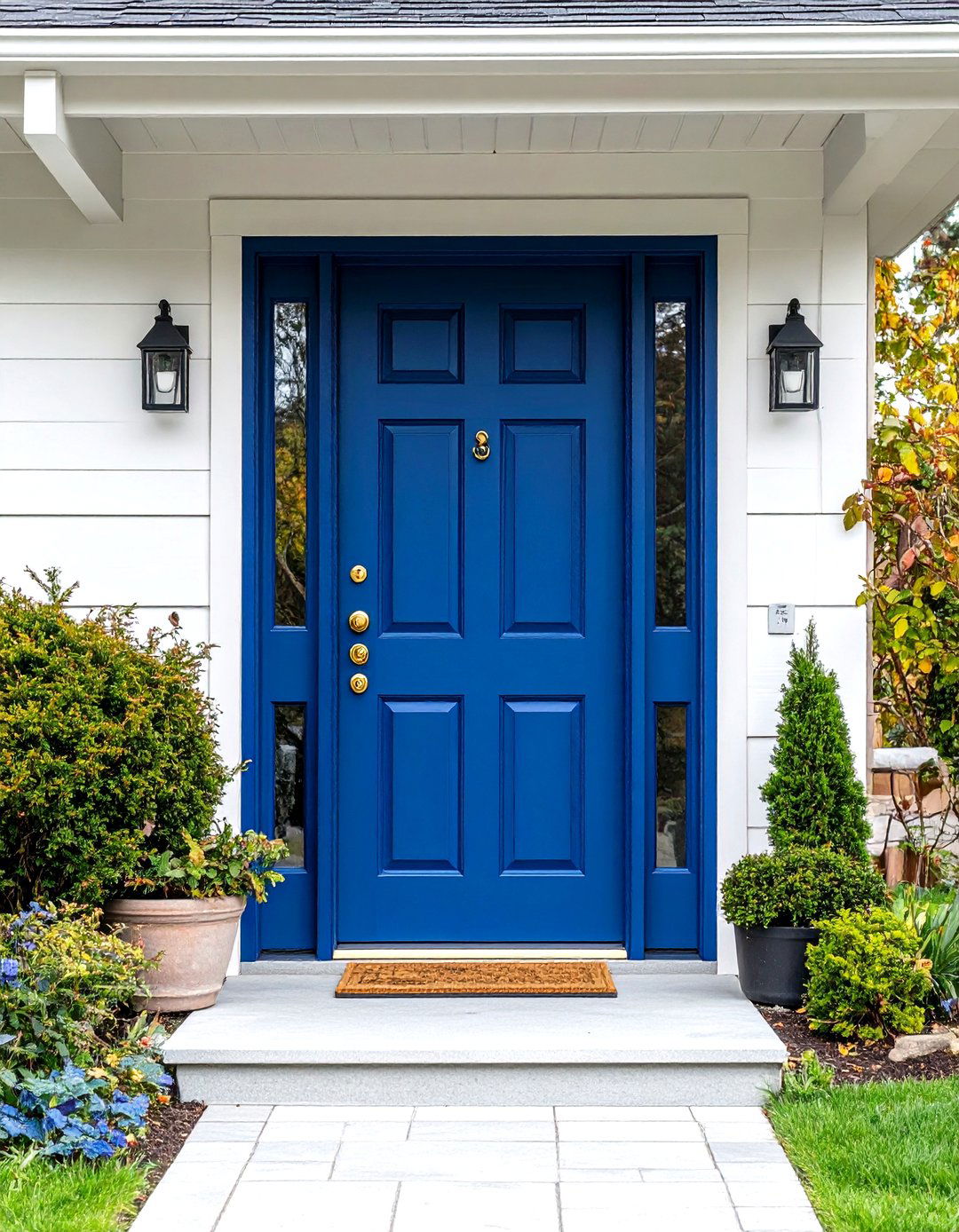
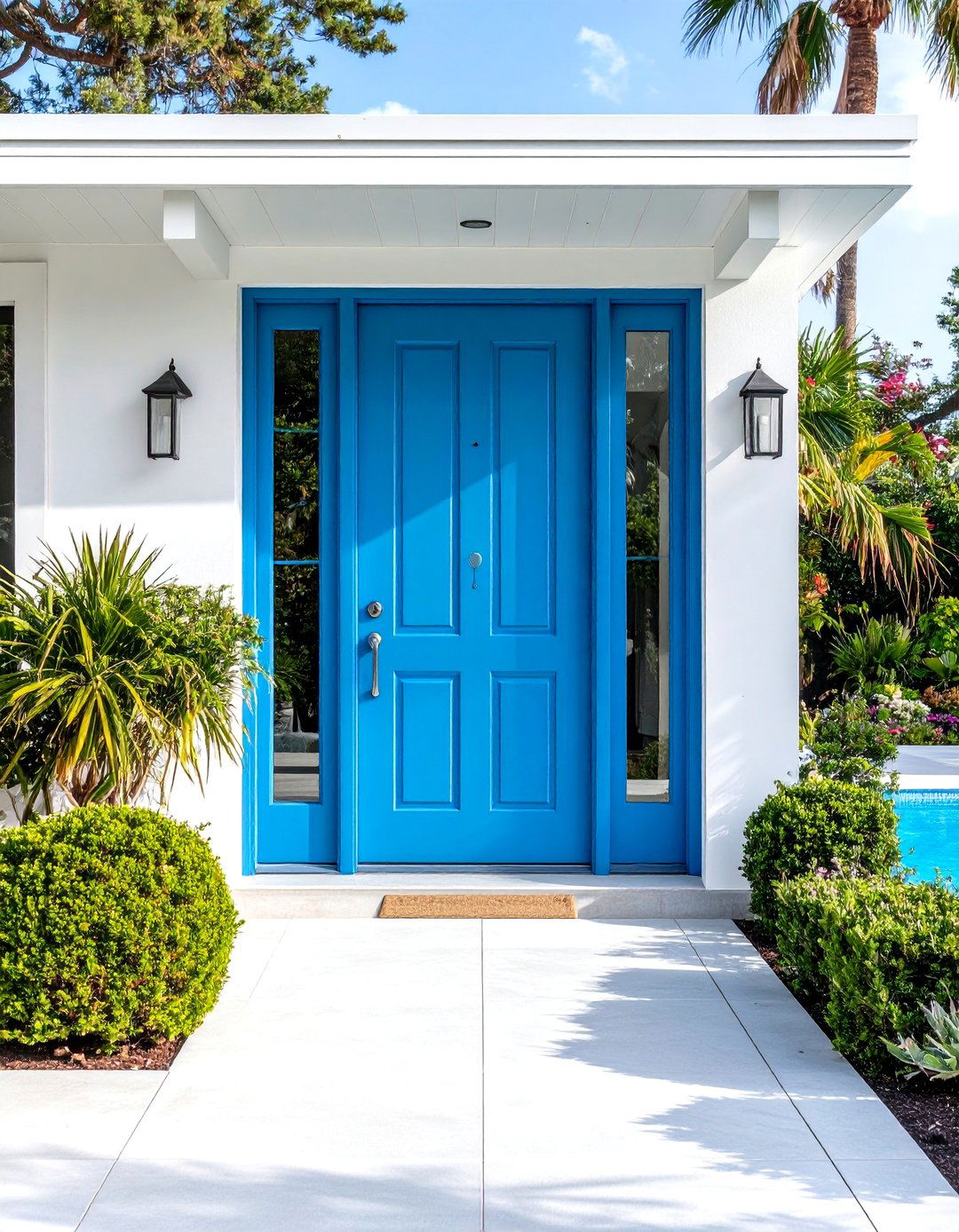
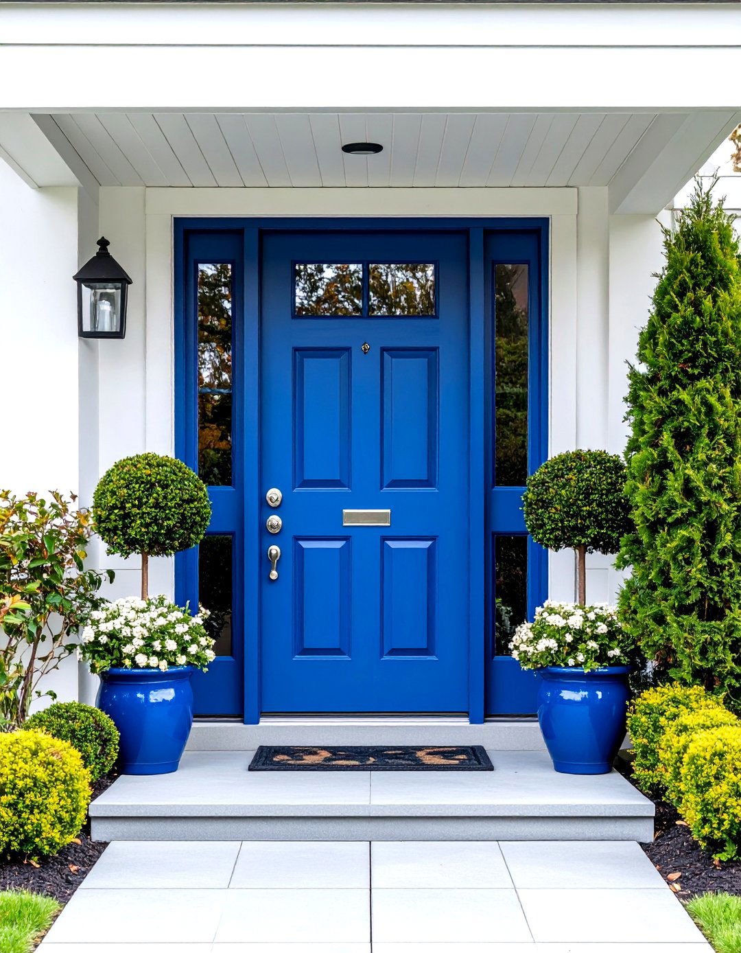
3. Teal Blue Mid Century Front Door
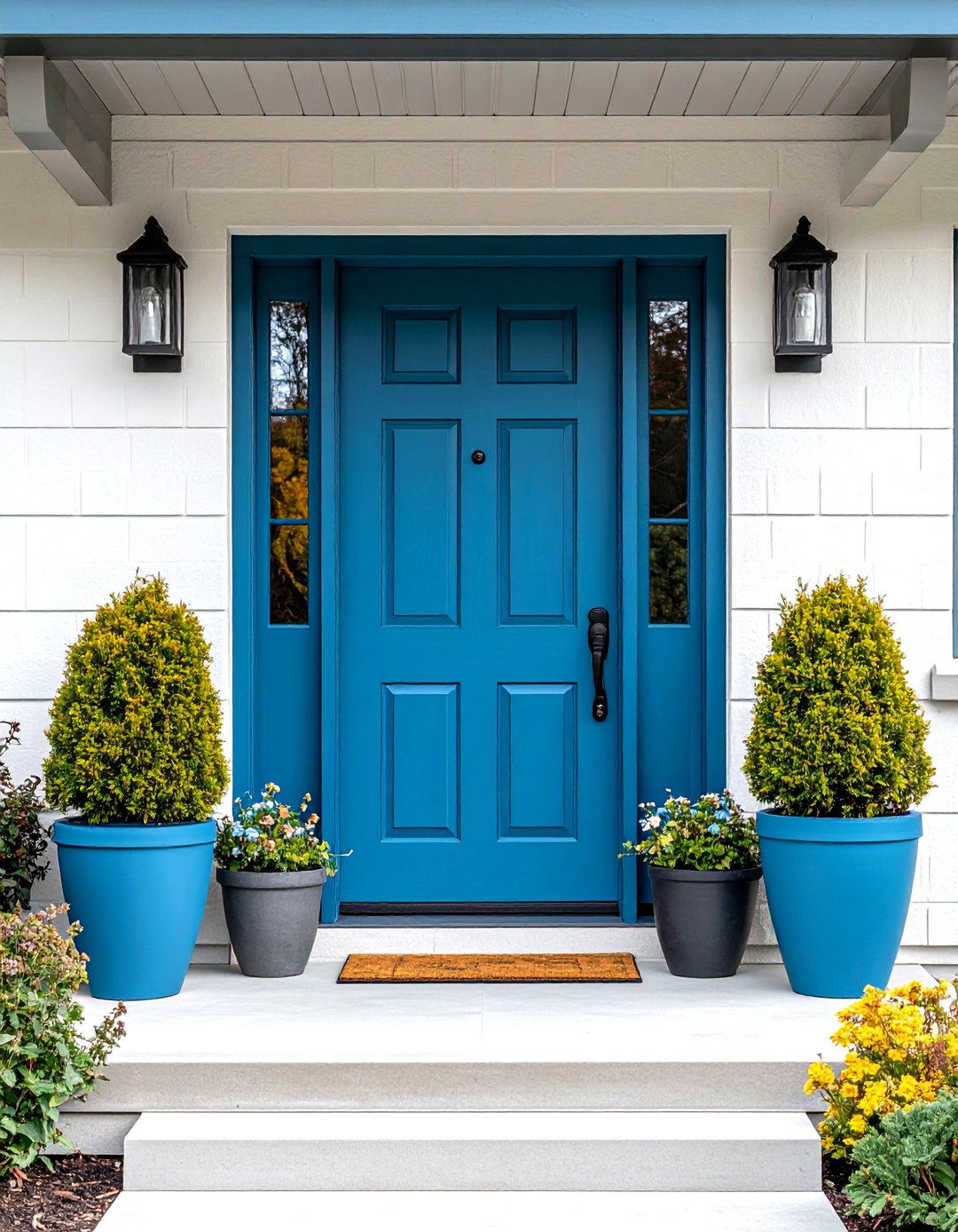
Teal blue offers a sophisticated balance between blue and green, creating a calming yet striking mid-century front door color that evokes both tranquility and confidence. This versatile shade complements various architectural materials including brick, wood, and stucco while providing excellent contrast against neutral backgrounds. Teal's natural connection to water and sky makes it perfect for homes in coastal areas or those seeking to bring natural elements into their design. When combined with clean-lined door panels and minimalist hardware, teal creates an elegant entrance that feels both timeless and contemporary. This color pairs beautifully with warm wood accents and modern landscape elements like geometric planters filled with architectural plants.
4. Lime Green Mid Century Front Door
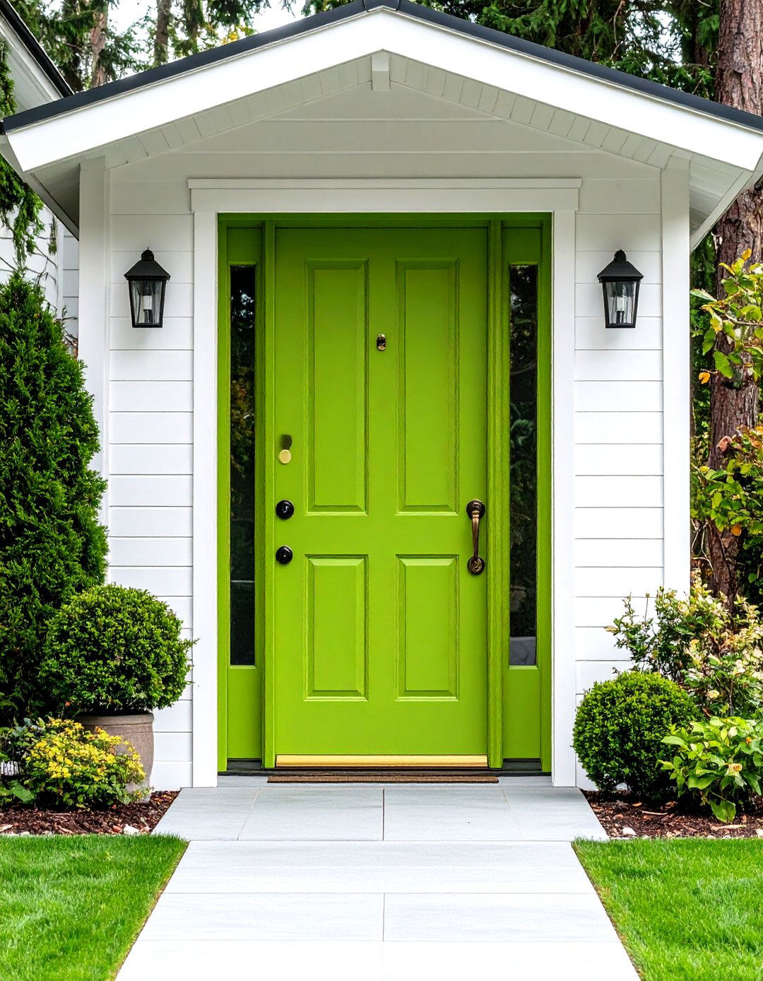
Lime green embodies the playful, experimental spirit of mid-century design, offering a bold statement that reflects the era's embrace of unconventional color choices. This energetic shade works particularly well with white or light gray exteriors, creating a fresh, modern contrast that draws attention without overwhelming the overall design. Lime green's association with nature makes it ideal for homes featuring extensive landscaping or natural materials. The color pairs excellently with sleek metal hardware and glass panels, emphasizing the mid-century preference for mixed materials. This vibrant choice appeals to homeowners who appreciate bold design decisions and want their entrance to reflect creativity and confidence while maintaining the clean, uncluttered aesthetic essential to mid-century modern style.
5. Coral Pink Mid Century Front Door
Coral pink represents a sophisticated approach to mid-century color, offering warmth and femininity while maintaining the bold visual impact characteristic of the era. This unique shade combines pink and orange undertones, creating a color that feels both vintage and contemporary. Coral works beautifully against neutral backdrops, particularly white, cream, or light gray siding, while complementing natural materials like wood and stone. The color's association with desert sunsets makes it perfect for southwestern or California-style mid-century homes. When paired with brass or copper hardware and clean geometric door designs, coral pink creates an entrance that feels welcoming yet distinctive, appealing to those who appreciate subtle sophistication with unexpected color choices.
6. Turquoise Mid Century Front Door
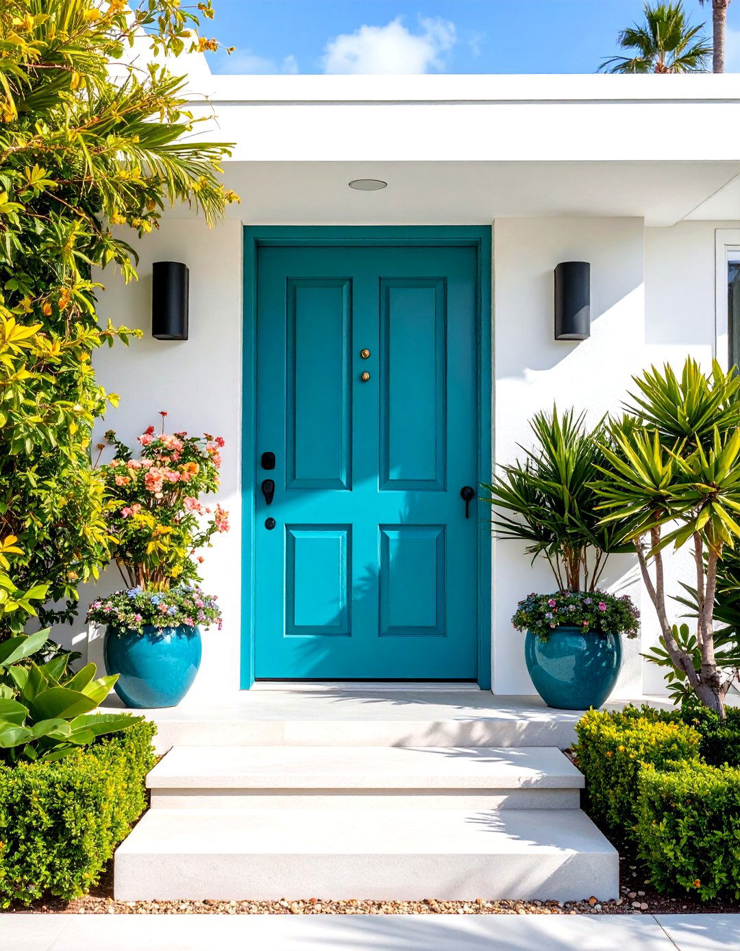
Turquoise captures the essence of mid-century optimism with its vibrant blue-green hue that evokes tropical waters and clear skies. This striking color creates immediate visual impact while maintaining the sophisticated edge essential to mid-century design. Turquoise works exceptionally well with white, cream, or natural wood exteriors, providing dynamic contrast that enhances architectural details. The color's natural associations make it ideal for homes featuring pool areas, desert landscaping, or coastal settings. When combined with sleek hardware and geometric door panels, turquoise creates an entrance that feels both retro and timeless. This bold choice appeals to homeowners who embrace color as a form of personal expression while honoring the era's fearless approach to design.
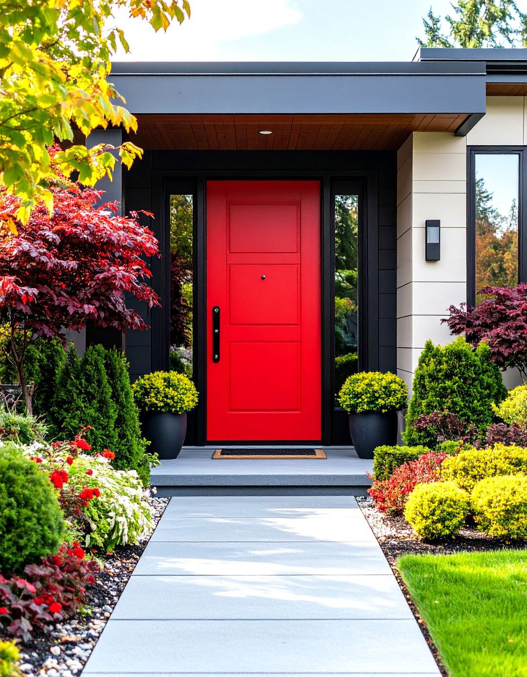
7. Fire Engine Red Mid Century Front Door
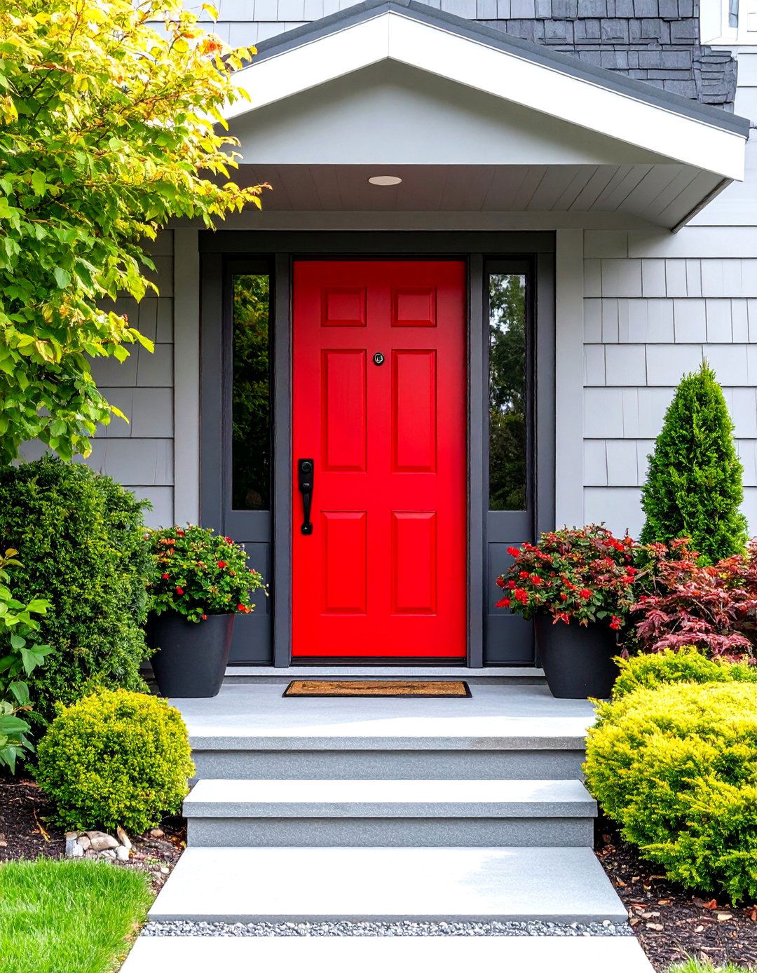
Fire engine red embodies the confident, attention-grabbing spirit of mid-century design, creating a front door that makes an immediate and lasting impression. This classic primary color works beautifully against neutral exteriors, particularly white, gray, or natural materials, while maintaining the bold aesthetic central to the era. Red's psychological associations with energy and passion make it perfect for homeowners who want their entrance to convey warmth and hospitality. The color pairs excellently with modern hardware finishes and clean door designs, emphasizing the mid-century preference for simple yet impactful elements. Fire engine red complements various landscape styles, from desert succulents to modern geometric gardens, creating a cohesive outdoor aesthetic that celebrates bold design choices.
8. Mustard Yellow Mid Century Front Door

Mustard yellow offers a sophisticated alternative to brighter yellows, providing warmth and richness that perfectly captures mid-century modern sensibilities. This earthy shade combines yellow with subtle brown undertones, creating a color that feels both bold and grounded. Mustard yellow works beautifully with natural materials like wood and stone while providing excellent contrast against neutral siding colors. The shade's organic feel makes it ideal for homes featuring desert landscaping or natural garden elements. When paired with brass or bronze hardware and clean geometric door panels, mustard yellow creates an entrance that feels authentically mid-century while remaining current. This color appeals to homeowners seeking warmth and personality without overwhelming their home's architectural features.
9. Deep Navy Mid Century Front Door
Deep navy provides sophisticated elegance while maintaining the bold color tradition of mid-century design, offering a rich alternative to black that feels both classic and contemporary. This versatile shade works with virtually any exterior color scheme while providing striking contrast against light backgrounds. Navy's associations with stability and trust make it appealing for homeowners seeking a confident yet refined entrance statement. The color pairs beautifully with brass, copper, or chrome hardware, adapting to various metal finishes while maintaining its sophisticated appeal. When combined with clean door designs and minimal decorative elements, deep navy creates an entrance that honors mid-century principles while appealing to contemporary tastes, making it perfect for updated modern homes.
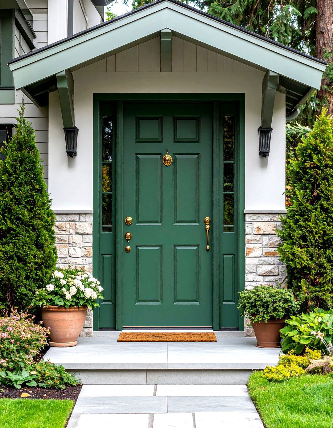
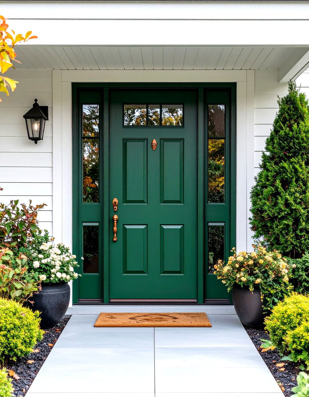
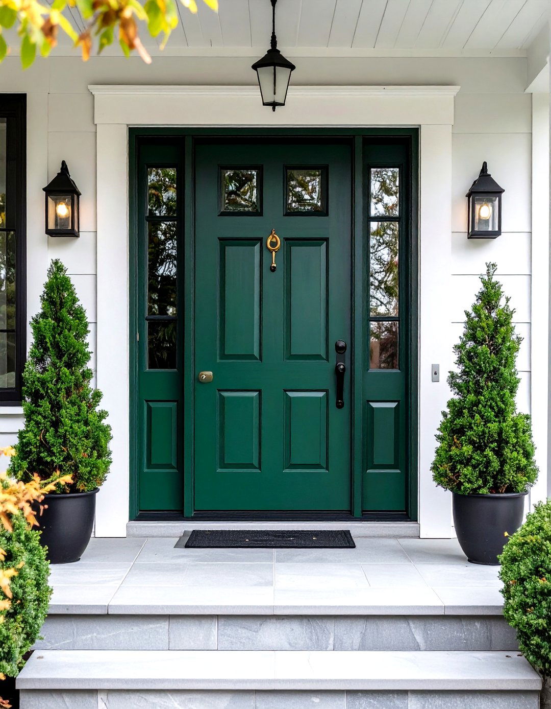
10. Forest Green Mid Century Front Door
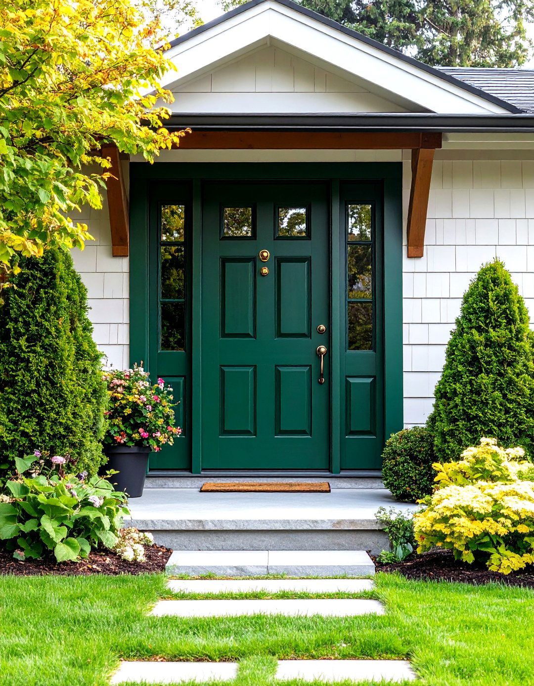
Forest green brings natural sophistication to mid-century entrances, offering a rich color that connects indoor and outdoor spaces in the tradition of the era's emphasis on nature integration. This deep, organic shade works exceptionally well with wood siding, stone accents, and natural landscape elements commonly featured in mid-century design. Forest green's versatility allows it to complement both warm and cool color schemes while providing excellent contrast against neutral backgrounds. The color pairs beautifully with brass or bronze hardware, enhancing its natural warmth. When combined with geometric door panels and clean lines, forest green creates an entrance that feels grounded and sophisticated, appealing to homeowners who appreciate the mid-century connection to natural environments.
11. Burnt Orange Mid Century Front Door
Burnt orange captures the earthy sophistication of mid-century design, offering a deeper, more complex alternative to brighter orange shades while maintaining the era's bold color tradition. This rich shade combines orange with brown undertones, creating a color that feels both warm and grounded. Burnt orange works beautifully with natural materials like wood and stone while providing striking contrast against neutral exteriors. The color's association with autumn and natural elements makes it perfect for homes featuring desert landscaping or natural garden settings. When paired with copper or bronze hardware and clean geometric designs, burnt orange creates an entrance that feels authentically mid-century while remaining sophisticated and current for today's design preferences.
12. Aqua Blue Mid Century Front Door
Aqua blue embodies the refreshing, optimistic spirit of mid-century design with its light, airy quality that evokes swimming pools and tropical destinations popular during the era. This cheerful shade provides excellent contrast against white, cream, or natural wood exteriors while maintaining a sophisticated edge. Aqua's association with water and relaxation makes it ideal for homes featuring pool areas or coastal settings. The color pairs beautifully with chrome or brushed aluminum hardware, emphasizing the mid-century preference for sleek metal finishes. When combined with geometric door panels and clean lines, aqua blue creates an entrance that feels both retro and contemporary, appealing to homeowners who appreciate the era's emphasis on leisure and outdoor living.
13. Magenta Pink Mid Century Front Door
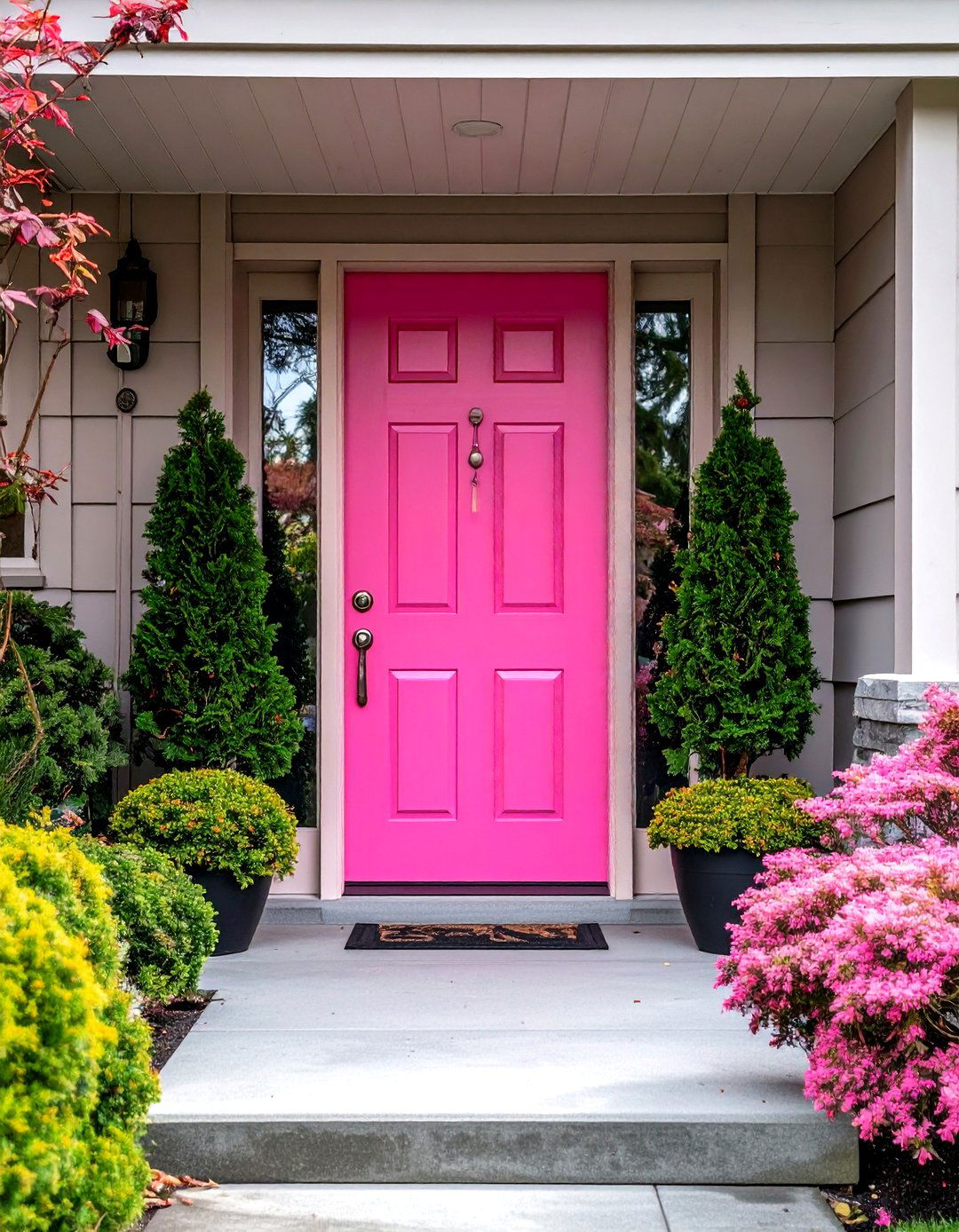
Magenta pink represents the bold, experimental side of mid-century color, offering a vibrant statement that reflects the era's willingness to embrace unconventional design choices. This striking shade works particularly well against neutral backdrops, creating dramatic contrast that draws attention while maintaining sophistication. Magenta's intensity makes it perfect for homeowners who want their entrance to reflect creativity and confidence. The color pairs excellently with sleek metal hardware and minimalist door designs, emphasizing the mid-century preference for clean, uncluttered aesthetics. When combined with modern landscape elements and architectural plants, magenta pink creates an entrance that feels both vintage and contemporary, appealing to those who appreciate bold design statements and unique color combinations.
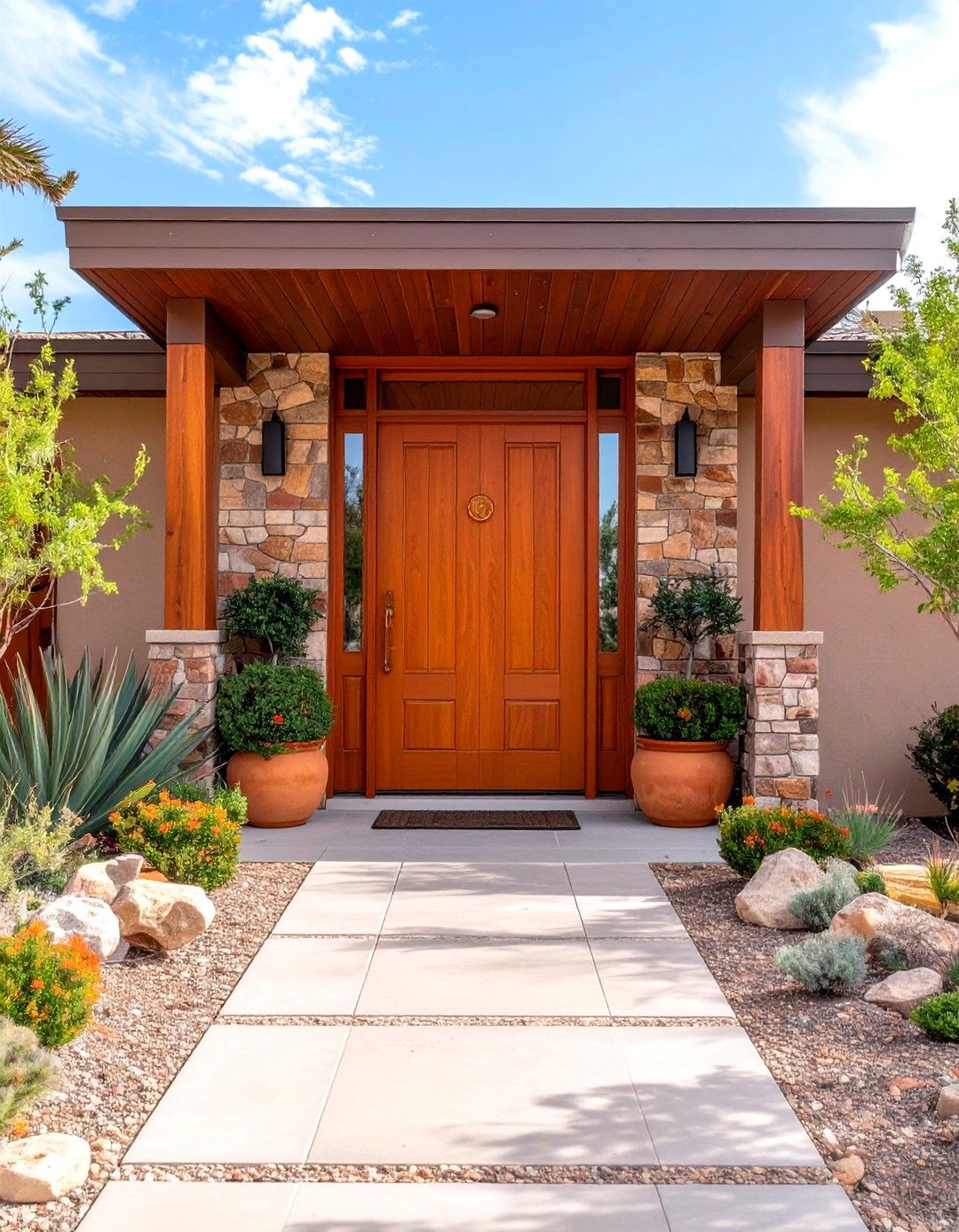
14. Chocolate Brown Mid Century Front Door
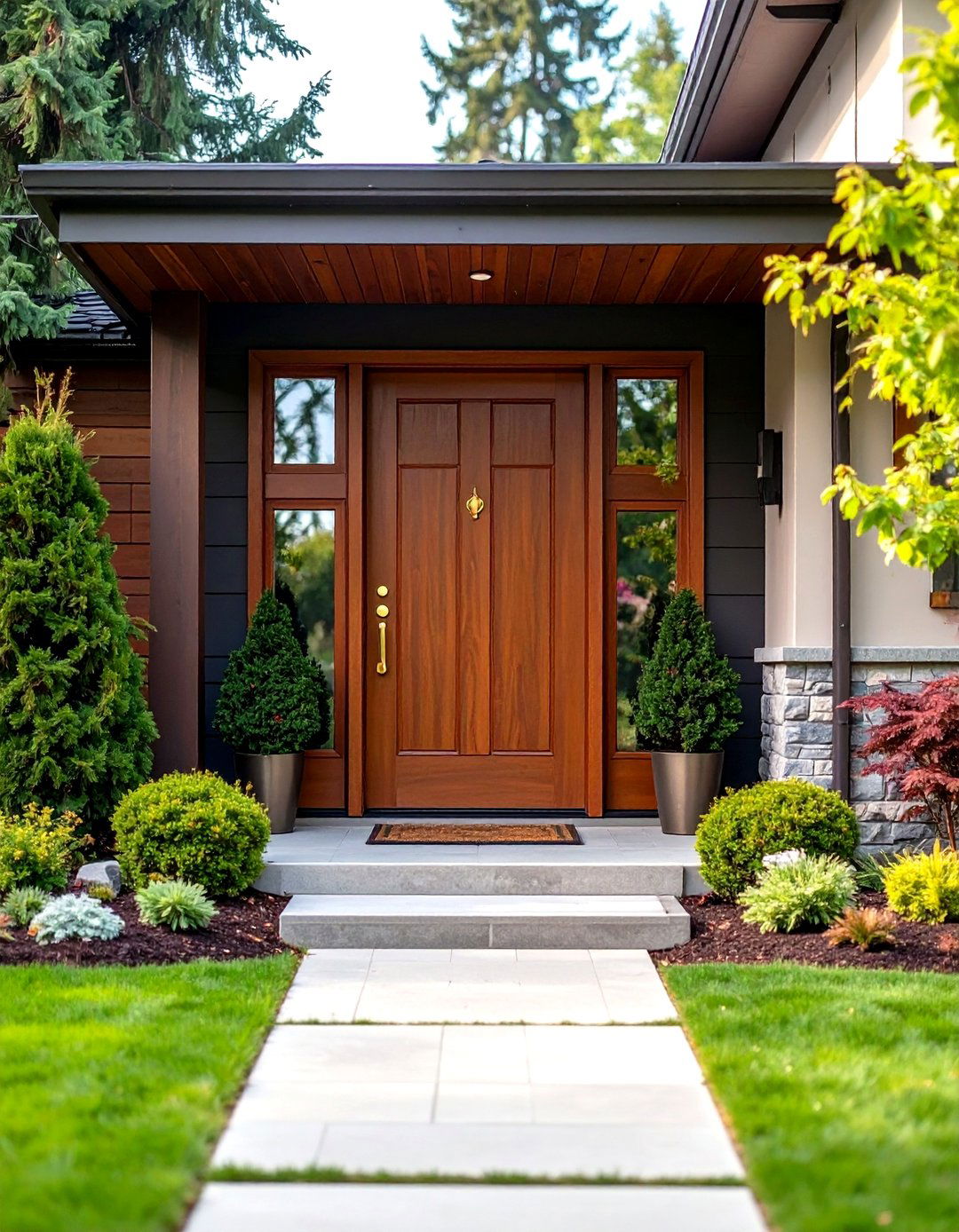
Chocolate brown offers sophisticated warmth and natural elegance, perfectly aligning with the mid-century emphasis on organic materials and earth-toned color palettes. This rich, grounding shade works beautifully with various exterior materials including wood, stone, and brick while providing elegant contrast against lighter backgrounds. Brown's association with natural elements makes it ideal for homes featuring extensive landscaping or rustic accents. The color pairs excellently with brass, copper, or bronze hardware, enhancing its warm undertones. When combined with clean geometric door designs and natural materials, chocolate brown creates an entrance that feels both sophisticated and welcoming, appealing to homeowners who appreciate the mid-century connection to nature and organic design elements.
15. Lemon Yellow Mid Century Front Door
Lemon yellow brings bright, cheerful energy to mid-century entrances, embodying the era's optimistic outlook and bold color philosophy. This vibrant shade creates immediate visual impact while maintaining the sophisticated edge essential to good design. Lemon yellow works exceptionally well against neutral exteriors, particularly white or gray siding, while complementing natural materials like wood and stone. The color's association with sunshine and positivity makes it perfect for homeowners seeking an uplifting entrance statement. When paired with sleek hardware and geometric door panels, lemon yellow creates an authentic mid-century aesthetic that feels both retro and contemporary. This bold choice appeals to those who embrace color as personal expression while honoring the era's fearless design approach.
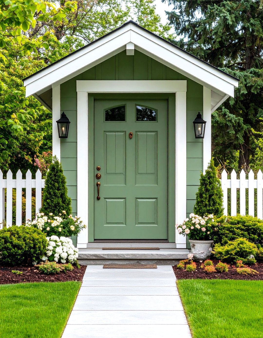
16. Sage Green Mid Century Front Door
Sage green provides subtle sophistication with its muted, organic quality that perfectly captures the mid-century emphasis on natural color palettes and connection to the outdoors. This versatile shade works beautifully with various architectural materials while providing gentle contrast against neutral backgrounds. Sage's calming qualities make it ideal for homeowners seeking a serene yet distinctive entrance statement. The color pairs excellently with brass or bronze hardware, enhancing its natural warmth and organic feel. When combined with clean door designs and minimal decorative elements, sage green creates an entrance that feels both sophisticated and approachable, appealing to those who appreciate the mid-century balance between bold design and natural harmony while maintaining contemporary relevance.
17. Crimson Red Mid Century Front Door
Crimson red delivers dramatic sophistication while maintaining the bold color tradition central to mid-century design, offering depth and richness that commands attention without overwhelming. This luxurious shade works beautifully against neutral exteriors while providing striking contrast that enhances architectural details. Crimson's association with elegance and confidence makes it perfect for homeowners seeking a refined yet impactful entrance statement. The color pairs excellently with brass or black hardware, adapting to various metal finishes while maintaining its sophisticated appeal. When combined with geometric door panels and clean lines, crimson red creates an entrance that honors mid-century principles while feeling timeless and elegant, appealing to those who appreciate classic sophistication with contemporary execution.
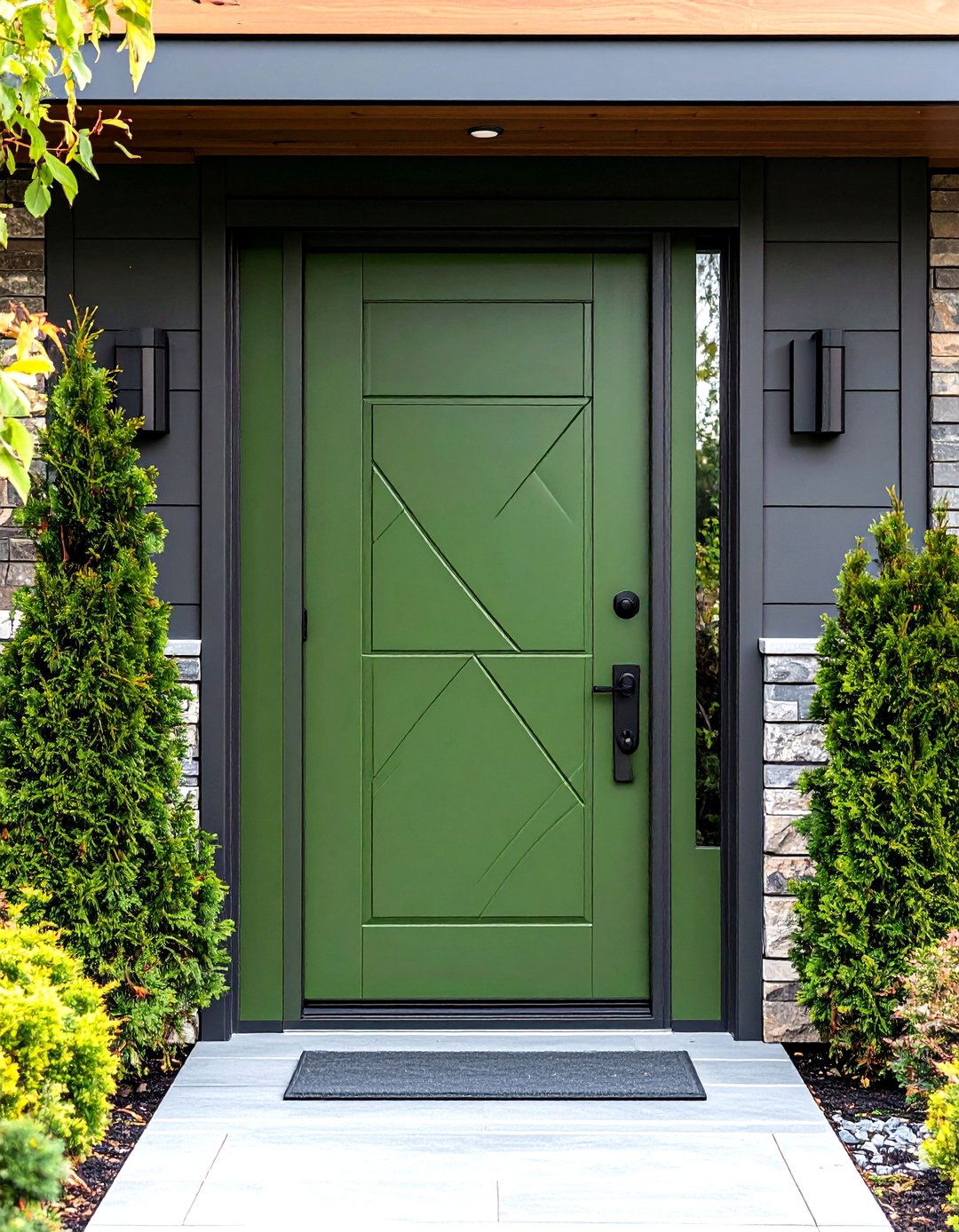
18. Avocado Green Mid Century Front Door
Avocado green captures the earthy, organic essence of mid-century design with its rich, natural quality that perfectly embodies the era's connection to nature and outdoor living. This distinctive shade works exceptionally well with wood siding, stone accents, and natural landscape elements commonly featured in mid-century architecture. Avocado green's unique character makes it ideal for homeowners who appreciate unconventional color choices that still feel sophisticated and grounded. The color pairs beautifully with copper or bronze hardware, enhancing its warm undertones. When combined with geometric door designs and clean lines, avocado green creates an entrance that feels authentically vintage while remaining current, appealing to those who value the mid-century emphasis on natural materials and organic color palettes.
19. Cobalt Blue Mid Century Front Door
Cobalt blue provides rich, sophisticated depth while maintaining the bold visual impact essential to mid-century design, offering a color that feels both classic and contemporary. This striking shade works beautifully against various exterior materials while providing dramatic contrast that enhances architectural features. Cobalt's intensity and elegance make it perfect for homeowners seeking a confident entrance statement that reflects appreciation for sophisticated color choices. The shade pairs excellently with chrome, brushed aluminum, or black hardware, adapting to different metal finishes while maintaining its sophisticated appeal. When combined with clean geometric door panels and minimalist design elements, cobalt blue creates an entrance that honors mid-century boldness while feeling timelessly elegant and refined.
20. Persimmon Orange Mid Century Front Door
Persimmon orange offers sophisticated warmth with its rich, complex hue that combines orange with subtle red undertones, creating a color that feels both bold and refined. This distinctive shade works beautifully with natural materials like wood and stone while providing excellent contrast against neutral exteriors. Persimmon's association with autumn and natural elements makes it perfect for homes featuring desert landscaping or organic garden settings. The color pairs excellently with brass or copper hardware, enhancing its warm, inviting character. When combined with geometric door panels and clean lines, persimmon orange creates an entrance that feels authentically mid-century while remaining sophisticated and current, appealing to homeowners who appreciate the era's bold approach to color with contemporary refinement.
Conclusion:
Mid-century front door colors continue to inspire homeowners seeking to make bold, sophisticated statements while honoring architectural heritage. These vibrant hues transform entrances into focal points that reflect personality and design confidence. From energetic oranges to calming blues, each color choice offers unique benefits while maintaining the era's emphasis on clean lines and natural harmony. The key lies in selecting shades that complement your home's materials and surroundings while expressing individual style. Whether embracing classic tangerine or exploring contemporary interpretations, mid-century colors ensure your entrance remains both timeless and distinctively personal.
Related posts:
Leave a Reply