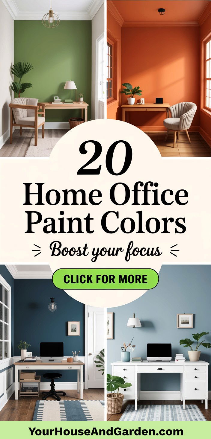
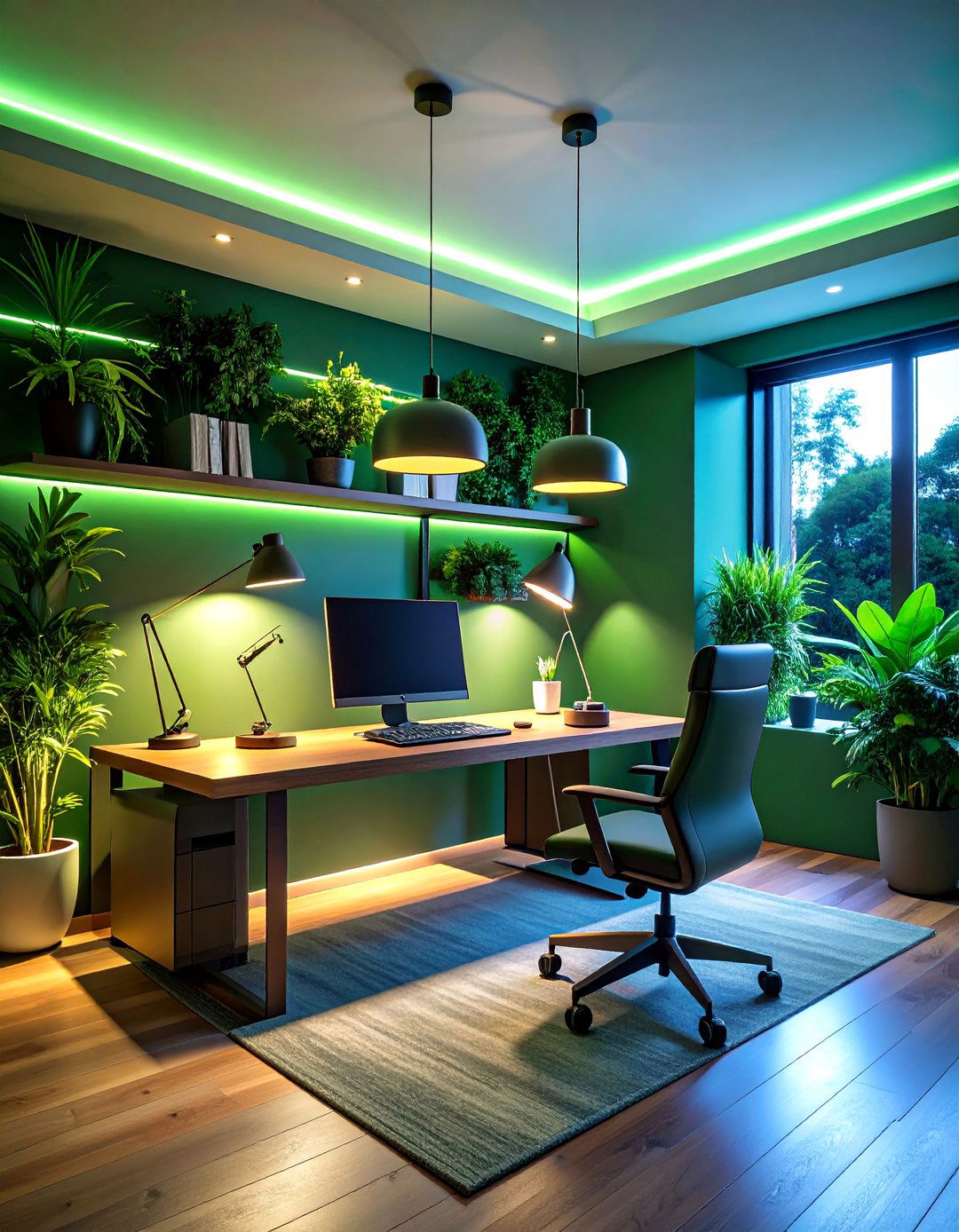
Creating a productive home office often begins with the power of paint. Choosing the right home office paint color can transform a simple workspace into a dynamic hub of creativity and focus. Over the years, I’ve seen how subtle shifts in hue—from warm taupes to bold blues—can influence mood, energy, and efficiency. Whether you crave a calm, grounding vibe or a burst of inspiration, a strategic paint choice sets the stage for success. Dive into 20 Home Office Paint Colors that blend functionality with style, each selected to help you craft a personalized atmosphere where concentration thrives and creativity flows.
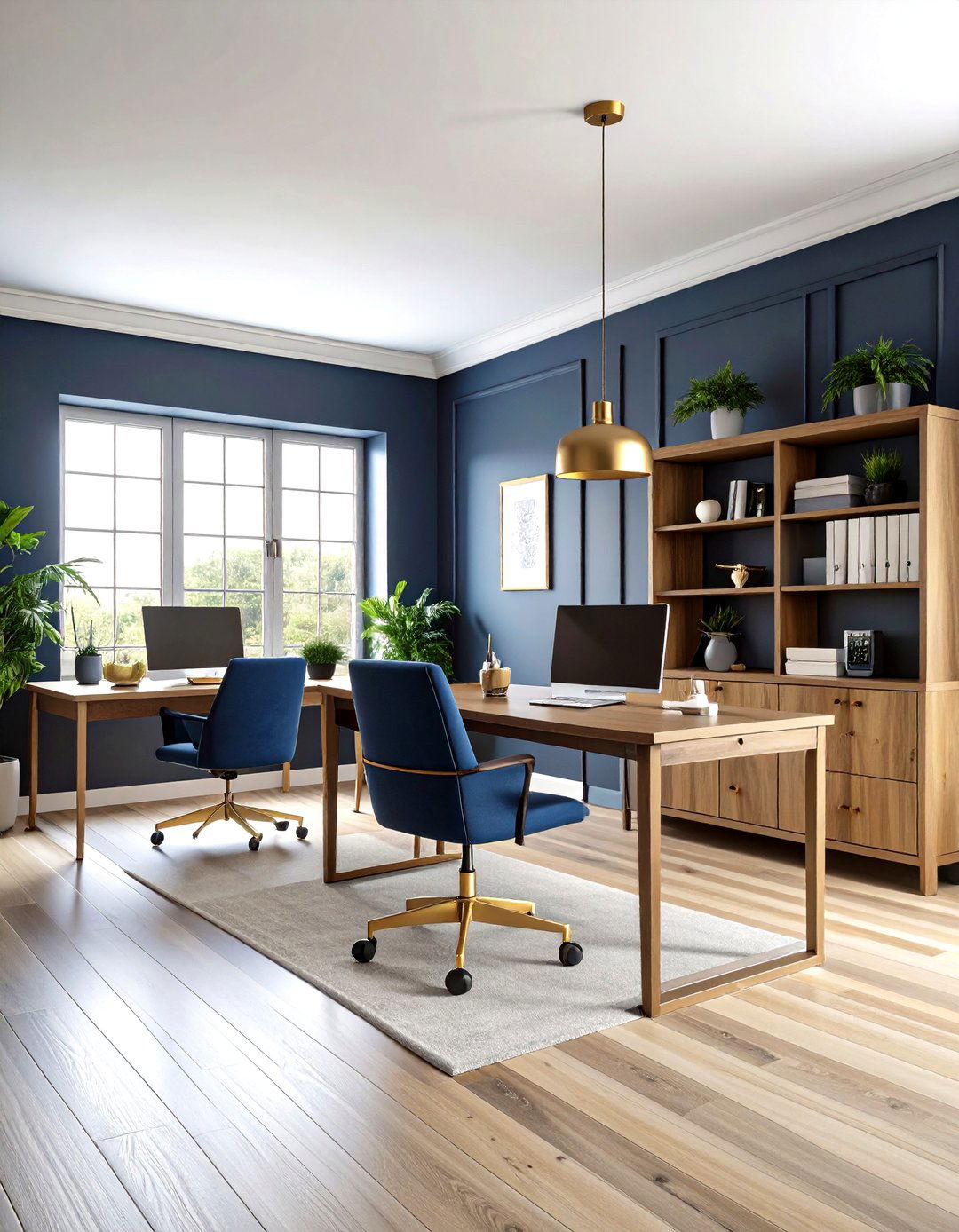
1. Granite Peak (SW 6250): Calming Home Office Paint Color
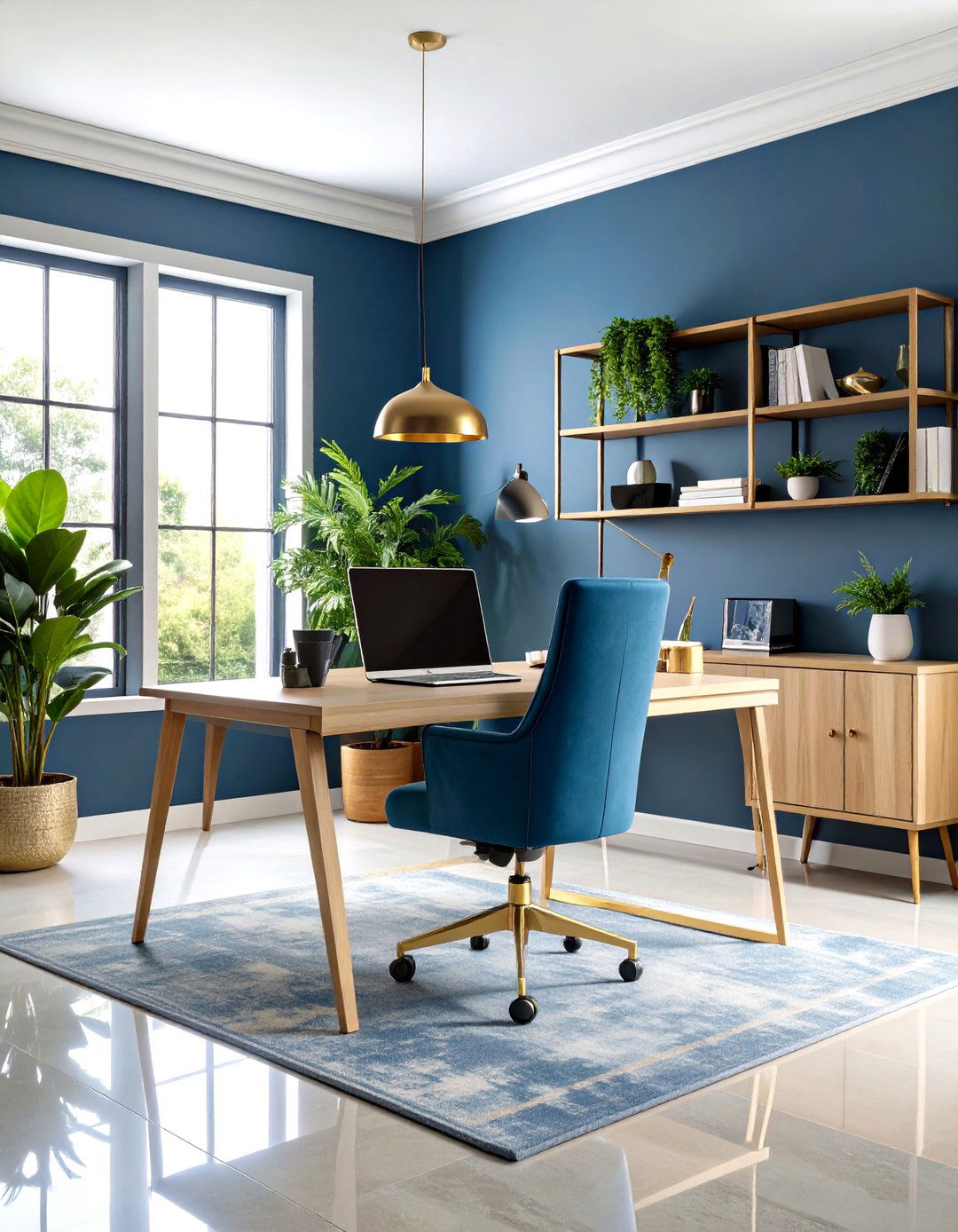
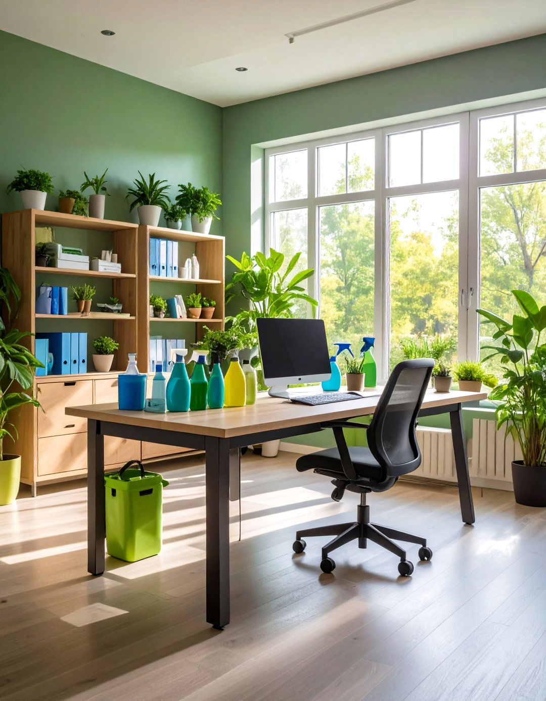
With its rich slate-blue hue, Granite Peak SW 6250 by Sherwin-Williams fosters focus and calm, ideal for home offices. This shade pairs seamlessly with crisp white trims and light wood furniture to create an airy, balanced workspace. For enhanced productivity, accent a single wall in Granite Peak and complement with brass or matte-black hardware for a touch of elegance. Introduce natural greenery and potted plants to contrast the muted blue, reducing eye strain and boosting creativity. To ensure the perfect hue, test sample pots under both morning and afternoon light, as Granite Peak’s undertones can shift from cool slate to warm periwinkle depending on natural illumination.
2. Uber Umber (SW 9107): Warm Rustic Home Office Paint Color
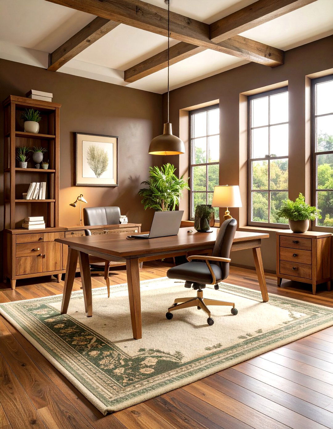
An earthy chocolate vibe radiates from Uber Umber SW 9107 by Sherwin-Williams, making it a warm, rustic paint color ideal for home offices. This rich brown brings depth and a sense of comfort to any workspace. Pair it with soft ivory accents and natural wood furnishings to avoid a heavy atmosphere. Introduce brass lighting fixtures or leather desk chairs to complement the warmth and add a luxe touch. To prevent a space from feeling enclosed, balance Uber Umber walls with plenty of natural light and reflective surfaces like glass desktops or mirrored accessories. A concentrated area rug in cream or olive green completes the cozy, grounded environment.
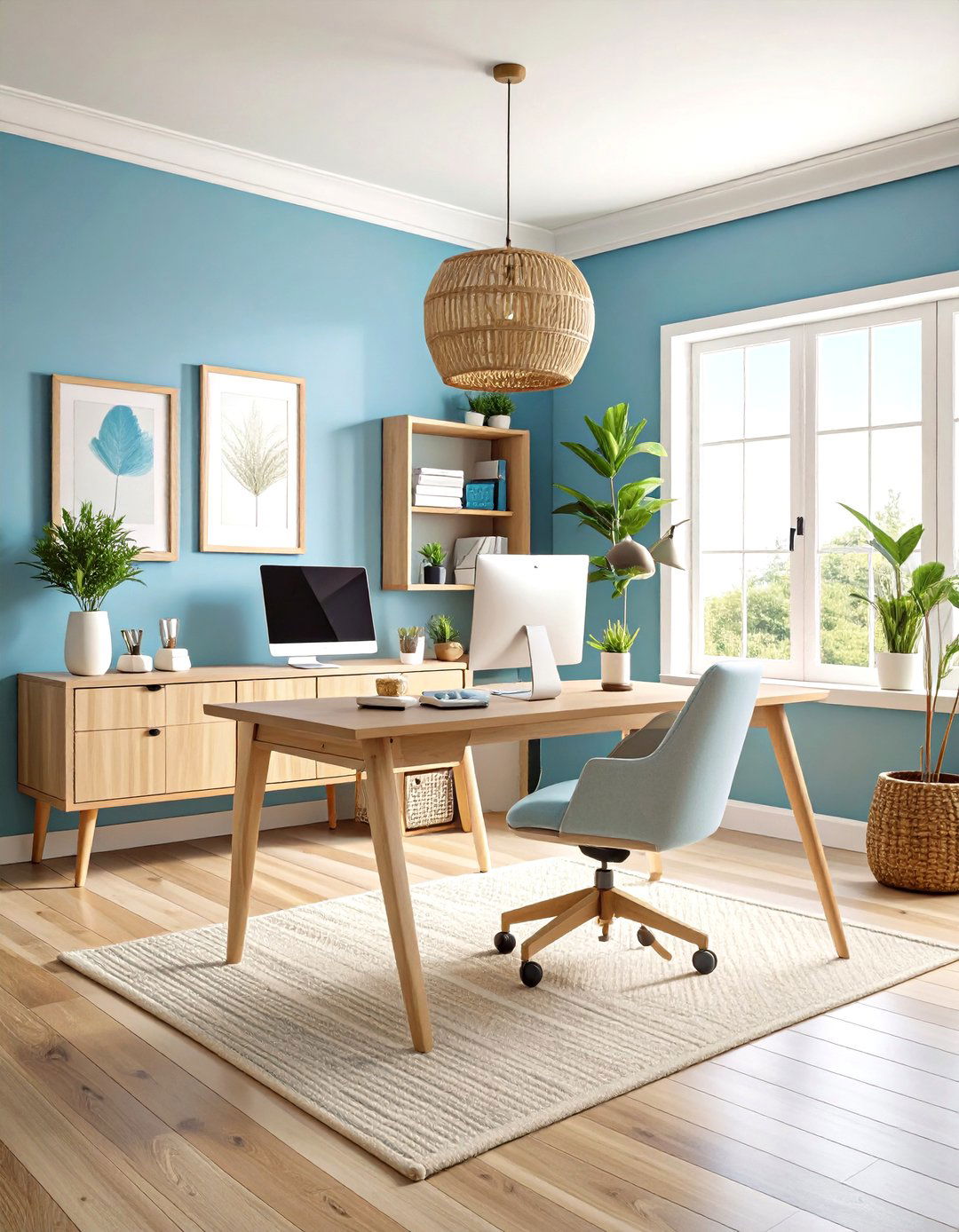
3. Slate Teal (2058-20): Vibrant Home Office Paint Color
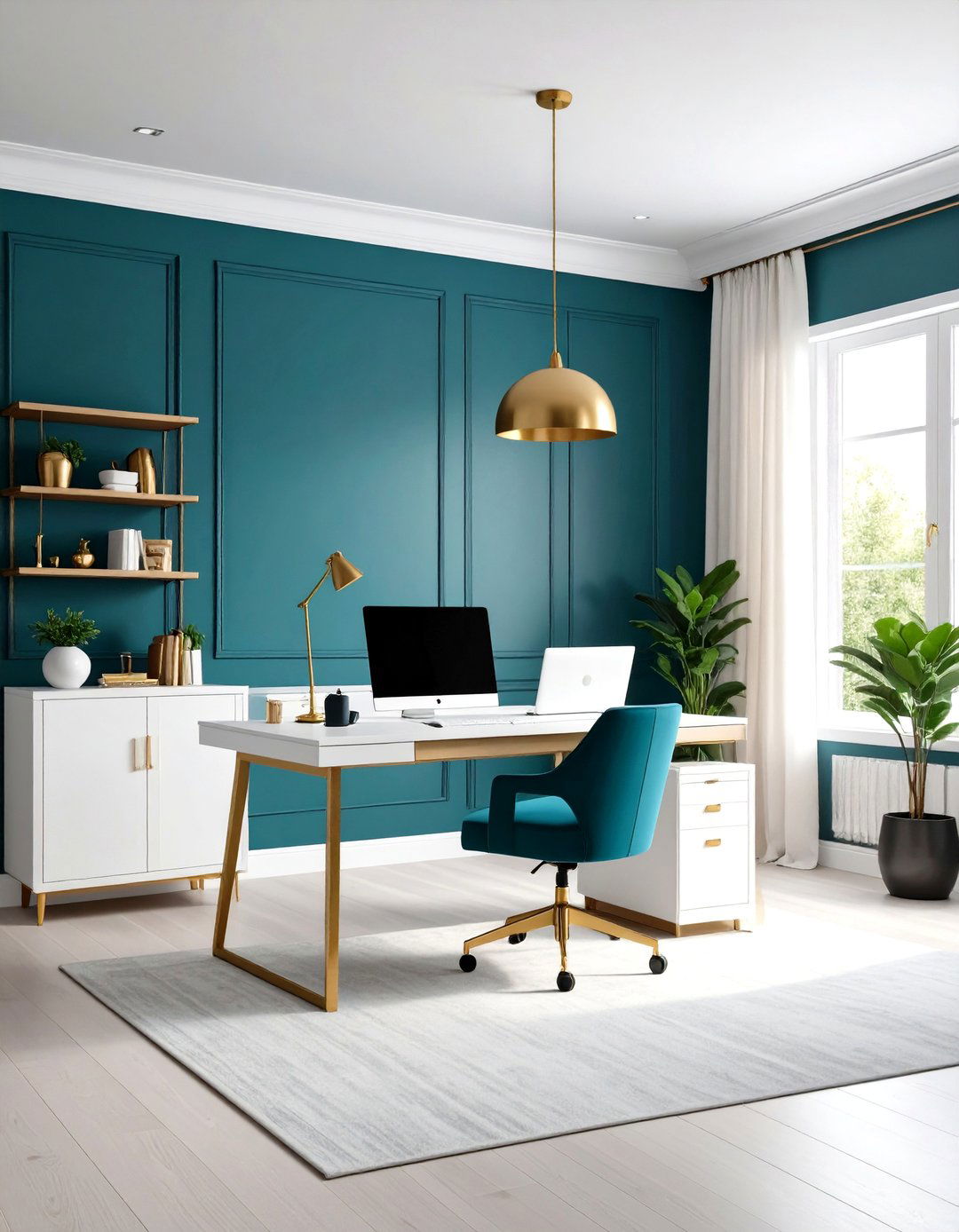
A smooth fusion of blue and green, Slate Teal 2058-20 by Benjamin Moore energizes a home office with balanced vibrancy, making focused work feel refreshed. Pair with crisp white millwork and natural wood desks to highlight the hue’s depth without overwhelming the room. Introduce brass or matte-gold accessories, such as desk lamps or hardware, to accentuate warmth and add sophistication. To prevent visual fatigue, balance Slate Teal walls with neutral textiles—think linen curtains or a wool rug in cream tones. For a bold feature, paint only one accent wall in Slate Teal and surround with complementary art or shelving in soft gray for a cohesive, inspiring workspace.
4. Wenge (AF-180): Sophisticated Home Office Paint Color
This deep, inky brown-black of Wenge AF-180 by Benjamin Moore brings drama and sophistication to home offices, creating a focused, intimate setting. Use Wenge sparingly as a feature wall or backdrop behind shelving and artwork to avoid overwhelming the space. Pair with crisp white trim, warm brass hardware, and light oak furniture to highlight the shade’s richness. Incorporate soft textures like wool rugs or velvet cushions in muted jewel tones to balance intensity and maintain comfort. To prevent the room from feeling too dark, ensure ample natural or layered lighting—consider adjustable desk lamps and floor uplights with warm LED bulbs for a cozy yet productive workspace.
5. Eagle Rock (1469): Elegant Neutral Home Office Paint Color
Another option, Eagle Rock 1469 by Benjamin Moore, offers a sophisticated greige tone that adapts to any home office palette. Its subtle warmth provides a neutral backdrop that enhances both modern and traditional furniture styles. Pair Eagle Rock with black metal accents, glass desktops, and marble accessories for a chic, minimalist feel. Introduce pops of color through botanical prints or colorful office accessories to create visual interest. To test its versatility, apply sample patches in multiple spots, as Eagle Rock can appear cooler in shaded corners and warmer near sunny windows. This adaptable paint color helps maintain focus without sacrificing style.
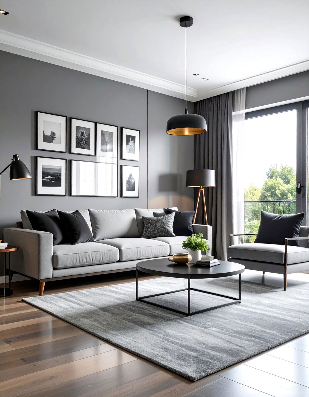
6. Nimbus Gray (2131-50): Versatile Home Office Paint Color
One versatile neutral, Nimbus Gray 2131-50 by Benjamin Moore, provides a balanced gray backdrop perfect for home offices. Its cool undertones create a serene environment conducive to concentration. Pair Nimbus Gray with bright white trims and brushed nickel hardware to maintain a crisp, modern feel. Introduce vibrant accent pieces—such as a mustard-yellow chair or teal desk lamp—to break the monotony and add energy. For an organized look, complement walls with built-in shelving painted in the same gray hue for seamless integration. Always test a 2×2-foot sample, as natural and artificial lighting can shift Nimbus Gray’s tone from warm pebble to cool slate.
7. Ballet White (OC-9): Soft Home Office Paint Color
Consider Ballet White OC-9 by Benjamin Moore for a soft, luminous home office paint color that brightens any workspace. Its subtle warmth prevents starkness while reflecting natural light to make smaller offices feel more open. Pair with sleek black or navy accents to ground the lightness and add visual contrast. Introduce wood elements—like a walnut desk or rattan chair—to bring organic texture and warmth. To enliven the office, add artwork featuring bold hues, such as emerald or coral, which pop against Ballet White walls. Test swatches in the corner of the room to ensure the undertones complement your lighting throughout the day.
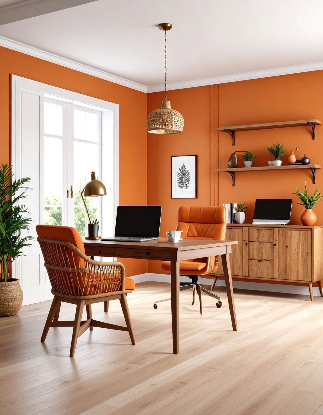
8. Sunlit Coral (2170-60): Energizing Home Office Paint Color
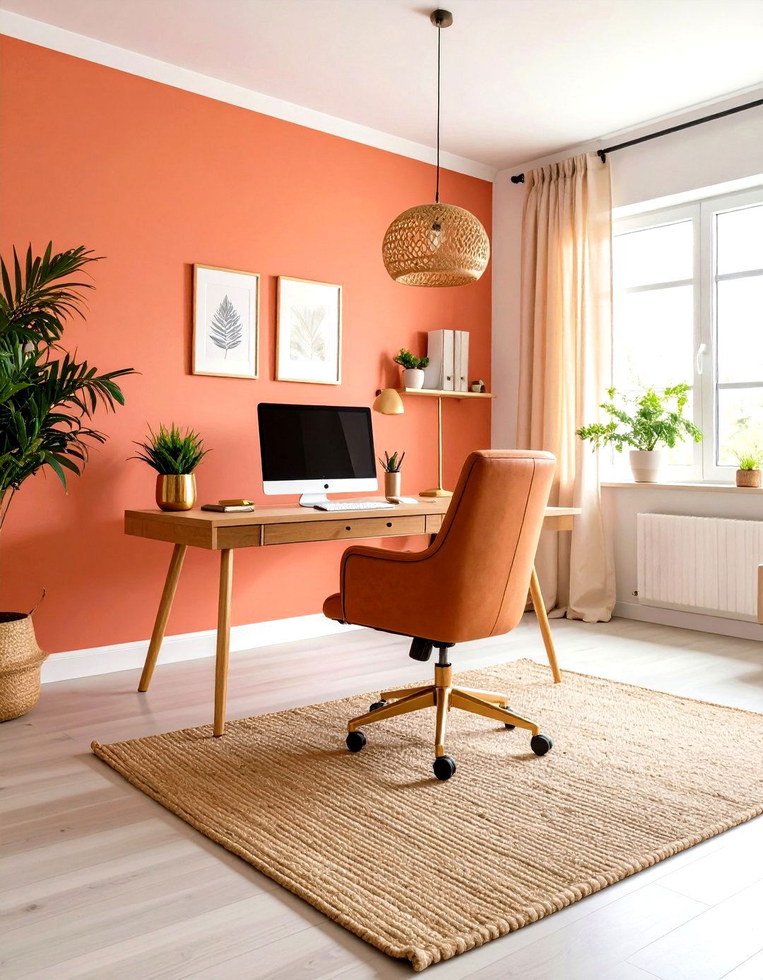
For a burst of energy, Sunlit Coral 2170-60 by Benjamin Moore brings cheerful warmth to home offices without overwhelming. This vibrant coral balances pink and orange undertones, promoting a lively, creative atmosphere. Pair with neutral grays or soft whites to prevent the hue from dominating the room. Incorporate natural textures like a woven jute rug and linen curtains to add depth and ground the intensity. To avoid over-stimulation, limit Sunlit Coral to an accent wall or niche behind a desk. Complement with gold or brass accessories, such as picture frames and pencil cups, to reflect light and create a cohesive, sunshine-infused workspace.
9. Cushing Green (HC-125): Natural Home Office Paint Color
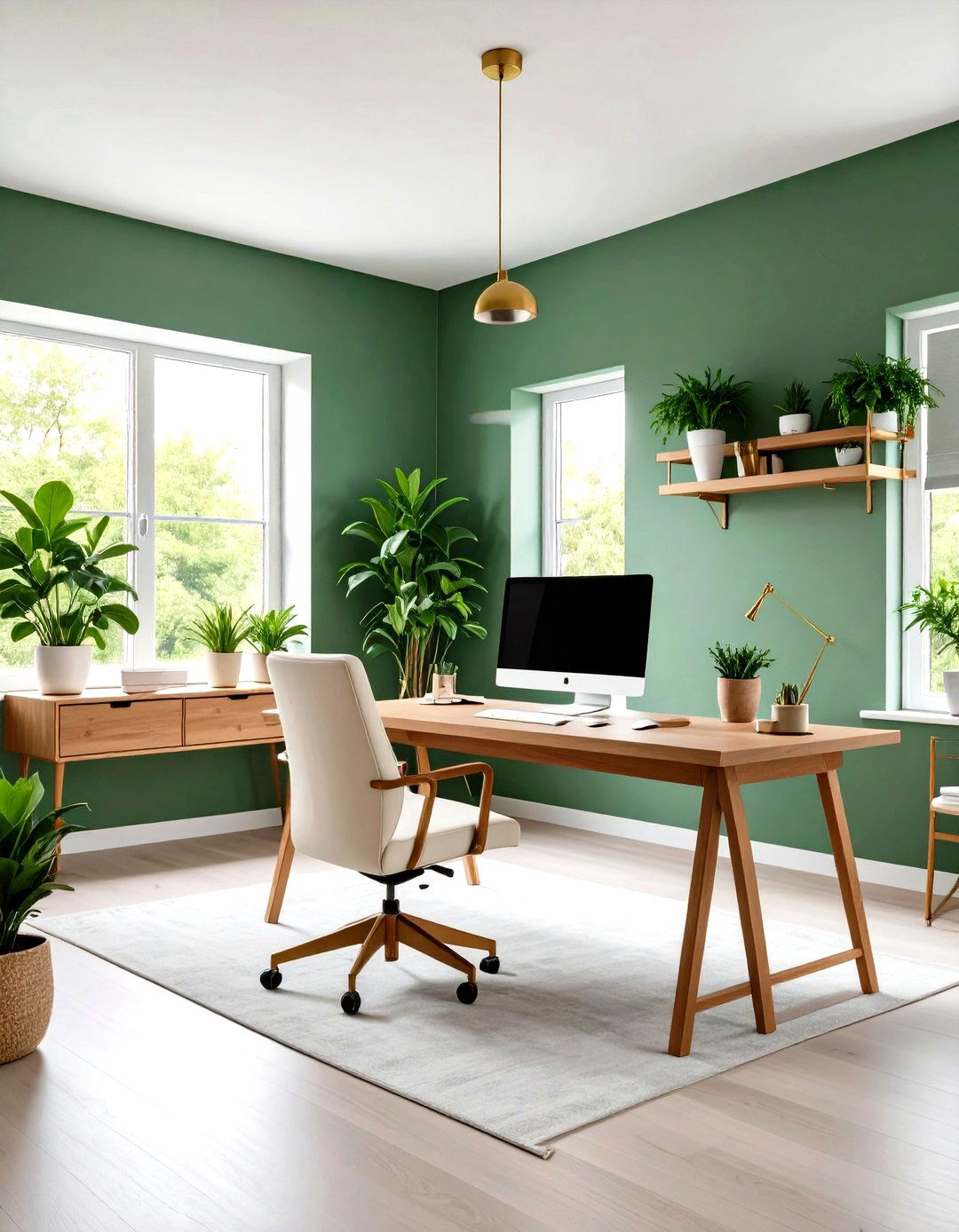
Looking to bring nature indoors? Cushing Green HC-125 by Benjamin Moore channels leafy tranquility, making it a natural home office paint color choice. This muted sage-green infuses spaces with a calming, organic vibe that promotes productivity. Pair Cushing Green walls with white or cream furnishings and brass accents for a balanced, airy look. Introduce woven baskets, potted plants, and botanical prints to amplify the indoor-outdoor connection. For contrast, add deep walnut or espresso wood furniture pieces to anchor the light green hue. Always sample Cushing Green in various light scenarios, as its green undertones can appear more olive in low light and more minty under bright sunlight.

10. Light Truffle (PPU5-06A): Neutral Home Office Paint Color
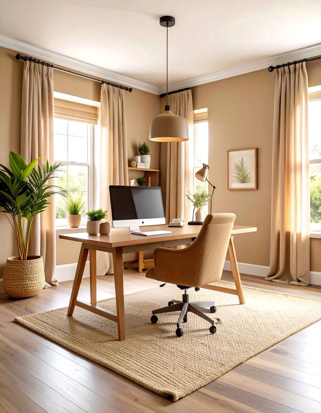
To establish a distraction-free backdrop, Light Truffle PPU5-06A by Behr offers a warm taupe hue perfectly suited for home offices. This neutral tone creates subtle depth without drawing attention, making it easier to focus on tasks. Pair with woven textures like jute rugs and linen curtains for a soft, inviting feel. Incorporate pops of color through artwork or accent pillows in navy or terra-cotta to enliven the space. Ensure adequate lighting—both overhead and task-specific—so Light Truffle doesn’t read too dark. For customization, consider an accent wall in muted olive or muted blush that complements the warm undertones of this calming paint color.
11. White Heron (OC-57): Crisp Home Office Paint Color

The crisp, clean hue of White Heron OC-57 by Benjamin Moore offers a bright, neutral paint color perfect for home offices. Its cool white tone reflects natural light to enlarge and refresh the workspace. Pair with black or chrome office furniture for a sleek, modern look, adding contrast to crisp walls. Introduce subtle textures—like a gray wool rug or soft faux-fur throw—to prevent starkness. For a splash of personality, add geometric art prints or a colorful desk organizer. Test with sample jars at different times of day, as White Heron can shift toward cool blue in morning light and warmer white in afternoon sun.
12. Bosc Pear (SW 6390): Organic Home Office Paint Color
By introducing Bosc Pear SW 6390 from Sherwin-Williams’ Wellspring palette, you can envelop a home office in a warm, organic shade that feels both fresh and grounded. This golden-green hue evokes nature’s calm while adding a hint of vintage charm. Pair Bosc Pear walls with white paneling or millwork to create crisp contrast. Incorporate rattan furniture and terracotta accessories for an earthy touch that complements the pear-like tone. For accent details, consider dark bronze hardware or matte-black picture frames. Always sample Bosc Pear in both morning and evening light, as its undertones can lean more yellow in bright daylight and more green under softer lighting.
13. Quietude: Serene Home Office Paint Color

These tranquil moods are exemplified by Quietude, a soft, muted green from HGTV Home by Sherwin-Williams that brings serenity to home offices. Its gentle hue promotes relaxation without sacrificing focus, making it perfect for long workdays. Pair Quietude walls with white or cream accents and natural wood tones to maintain an airy, uplifting environment. Introduce matte-black or brushed-bronze fixtures for subtle contrast. For visual interest, layer in succulent plants and woven storage baskets that echo Quietude’s organic vibe. Always test a sample first, noting that Quietude can appear more sage in indirect light and shift toward a pale gray-green under cooler lighting.
14. York Gray: Neutral Home Office Paint Color
That balanced greige of York Gray from Benjamin Moore offers a versatile home office paint color that complements a variety of décor. Its warm gray undertones adapt to both warm and cool furnishings, making styling effortless. Pair York Gray walls with deep navy accents and natural wood desks for a sophisticated contrast. Introduce brass hardware or gold picture frames to highlight the warm undertones. To maintain brightness, balance with crisp white trim and light flooring. Always test York Gray swatches in different lighting conditions, as its undertones can read more brown in lower light and more gray when exposed to sunlight.
15. Lime White: Bright Home Office Paint Color
What a fresh backdrop, Lime White by Benjamin Moore serves as a warm, neutral home office paint color that brightens spaces without starkness. Its subtle yellow undertones add gentle warmth, preventing a clinical feel. Pair Lime White walls with matte-black or bronze fixtures for modern contrast. Incorporate natural elements—like a wooden desk and woven chair—for organic texture. To inject personality, add colorful desk accessories such as vibrant planners or patterned stationery. Keep window treatments light and airy, allowing sunlight to enhance Lime White’s inviting glow. Always evaluate swatches at various times, as its undertones can appear more creamy under warm light and cooler under fluorescent bulbs.
16. Excalibur Gray: Subtle Home Office Paint Color
Those muted purple undertones of Excalibur Gray by Benjamin Moore create a sophisticated, subtle home office paint color that enhances creativity. Its gentle gray-lavender cast adds personality without overwhelming the room. Pair Excalibur Gray walls with light wood furniture and white cabinetry to balance warmth and coolness. Introduce blush-pink or deep plum accents through cushions or artwork to echo the undertones. To maintain brightness, add layered lighting, including desk lamps and overhead fixtures with warm LED bulbs. For accent areas, consider painting bookshelf interiors or a doorway frame in Excalibur Gray to create depth and draw focus within the workspace.
17. Pearl Gray: Cool Home Office Paint Color

Finally, Pearl Gray by Benjamin Moore offers a light, cool gray home office paint color that imparts a clean, minimalist vibe. Its soft silver undertones reflect light beautifully, making small offices feel more expansive. Pair Pearl Gray walls with charcoal-gray furniture and white shelving for a refined, contemporary look. Introduce accent pieces in navy blue or blush pink to provide subtle warmth and contrast. To avoid a sterile feel, incorporate natural materials such as a live-edge wood desk or jute storage baskets. Always observe Pearl Gray at various times of day, as its undertones can shift toward blue in bright sunlight and toward taupe under incandescent lighting.
18. Windy Sky: Tranquil Home Office Paint Color
Take a breath of fresh air with Windy Sky by Benjamin Moore, a soft, airy blue that creates a tranquil home office paint color ideal for maintaining calm focus. Its light, sky-inspired hue reflects natural daylight to evoke an open, uplifting atmosphere. Pair Windy Sky walls with white trim and warm wood furniture to balance the cool tone. Incorporate rattan accents and patterned textiles in sandy neutrals to enhance the serene vibe. To add depth, paint the ceiling in Windy Sky for a subtle, enveloping effect. Always view samples under both natural and artificial light, as the shade’s cool undertones can shift in different settings.
19. Bavarian Forest: Deep Home Office Paint Color
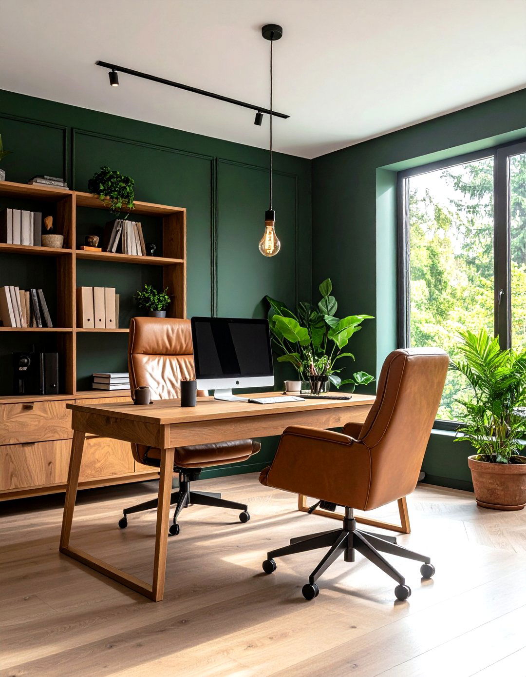
One potent choice, Bavarian Forest, cloaks home offices in a rich forest-green paint color that encourages introspection and focus. This deep hue fosters a sense of calm confidence, perfect for creative or analytical work. Pair Bavarian Forest walls with light oak or birch furniture to create balanced contrast. Introduce leather accents—such as a cognac armchair or desk blotter—to complement the green and enrich texture. To prevent the space from feeling too dark, maintain ample layered light sources including adjustable desk lamps and soft overhead fixtures. Adding potted plants and natural wood shelves amplifies the organic vibe, making your workspace feel like a cozy retreat.
20. Green Whisper: Calming Home Office Paint Color
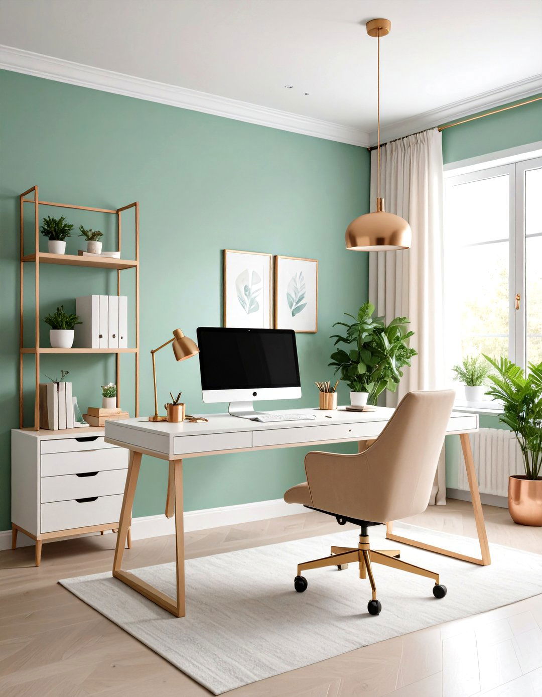
A gentle note of pastel green emerges in Green Whisper, a soothing home office paint color that breathes calm into your workspace. Its soft, muted tone evokes subtle nature-inspired tranquility, helping reduce stress during busy work hours. Pair Green Whisper walls with blonde wood furniture and white accents to maintain a light, airy feel. Introduce bronze or copper hardware for a warm metallic contrast. For depth, incorporate texture through woven baskets and linen drapes. Always sample Green Whisper under different lighting conditions, as its undertones can appear more sage in shaded areas and more minty in direct sunlight for an authentic, fresh aesthetic.
Conclusion:
Bringing the right home office paint colors into your space is more than a design choice; it’s a way to shape your daily workflow and wellbeing. From grounding neutrals like Nimbus Gray to invigorating hues such as Sunlit Coral or the deep introspection of Bavarian Forest, these selections offer both aesthetic appeal and functional benefits. Embrace sample testing, consider natural lighting, and don’t hesitate to blend accent walls for dynamic contrast. Whether you aim to boost focus, spark creativity, or simply enjoy a serene retreat, these home office paint color ideas provide a versatile palette to elevate your work-from-home experience.
Related posts:

Leave a Reply