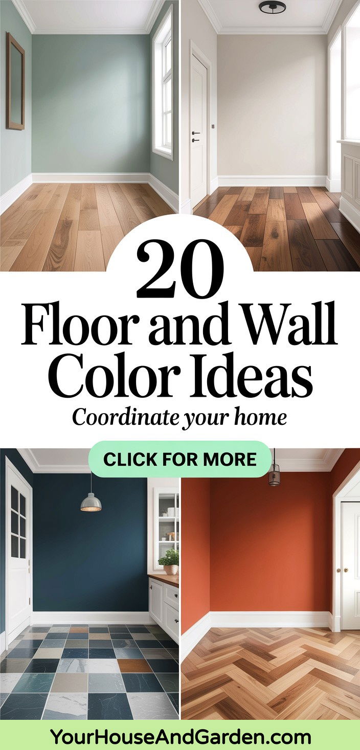
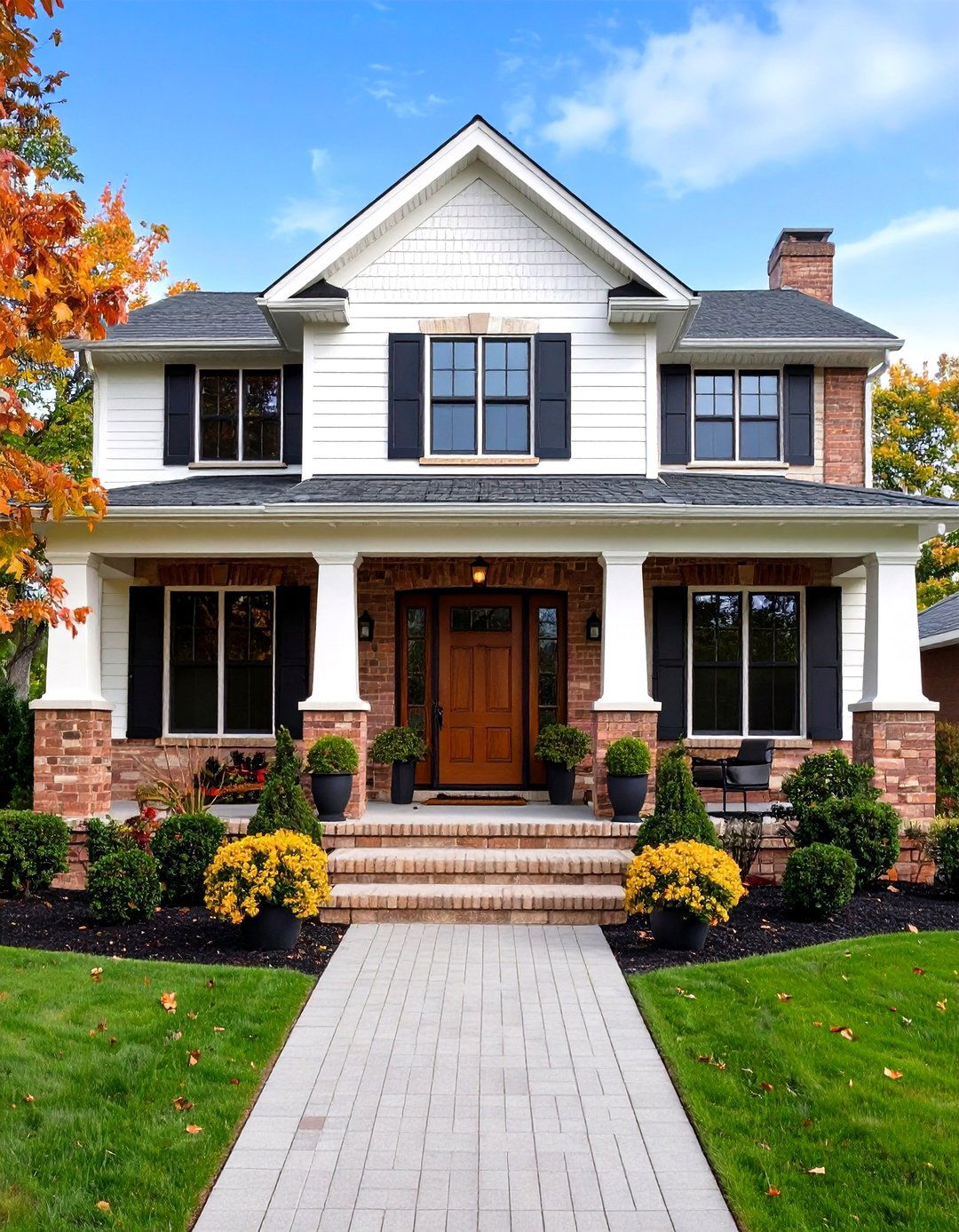
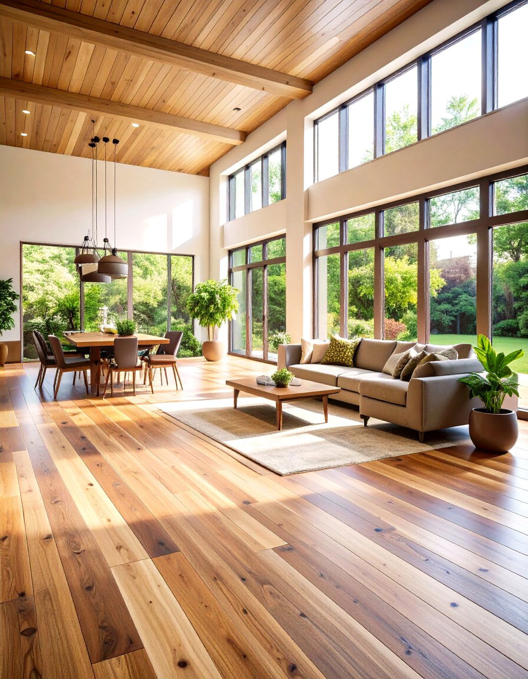
Warmth, contrast, and mood-boosting palettes dominate interiors in 2025, and the right marriage of floor and wall colors can make a room feel instantly larger, cozier, or more refined. Earth-inspired neutrals, buttery pastels, saturated jewel tones, and graphic black-and-white patterns appear again and again in expert forecasts, while lighter wood stains and classic checkerboard tiles balance today’s bolder paint choices. The twenty pairings that follow translate those trends into practical, ready-to-use combinations—each one crafted to solve a common design challenge, from brightening a windowless hallway to grounding an open-plan living space. Explore them and discover which mix of texture, tone, and color chemistry speaks to your own style goals.
1. Earthy Clay Walls & Dark Walnut Floors
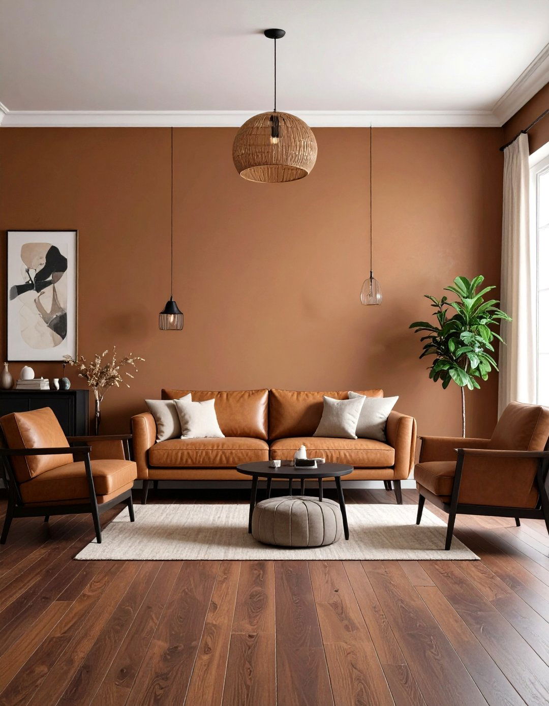
A mellow clay wall color—think sun-baked adobe or muted terracotta—immediately grounds a room in nature, echoing the surge in earth-tone palettes for 2025. Pair it with deep-stained walnut floors to amplify warmth while adding luxurious depth underfoot. The dark floor visually anchors furniture and art, allowing the wall hue to glow softly in daylight and feel cocoon-like at night. Because both shades lean warm, you get seamless flow, yet the chromatic difference delivers subtle contrast that stops the scheme from feeling flat. Accent with matte black hardware and unbleached linen textiles to keep the look fresh and modern.
2. Soft Sage Walls with Light Oak Floors
Soft sage remains a designer favorite for its calming, versatile quality, especially when teamed with pale oak planks that bounce natural light around a room. The green tint echoes outdoor foliage, while the blond floor stain enhances an airy vibe—perfect for small spaces that need visual breathing room. Together they create a gentle biophilic backdrop that flatters both contemporary minimalism and cottage-core décor. Add aged-brass accents or rattan to pull out the organic notes, and rely on off-white trim to maintain crisp edges between subtle hues.
3. Charcoal Accent Walls & Bleached Pine Floors
For drama without darkness, coat one feature wall in rich charcoal, then lighten the base plane with bleached or pickled pine flooring. The cool, desaturated gray adds a gallery-like focus that highlights artwork and upholstered pieces, while the nearly white wood boards reflect daylight to prevent the space from feeling cave-like. Because pine’s grain stays visible under a pale finish, the floor introduces needed texture against the matte wall. Tie the palette together with mid-tone gray textiles and black metal lighting for a cohesive, modern mood.
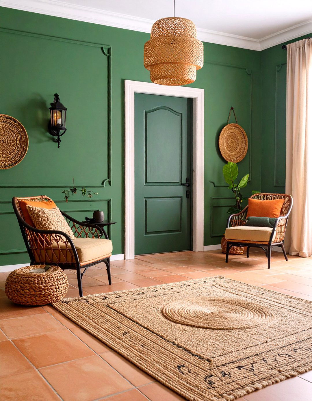
4. Guava Walls with Neutral Ceramic Floors
An uplifting guava hue—somewhere between sun-kissed peach and soft coral—sparks joy and conversation according to color psychologists. Anchor its energy with discreet, large-format ceramic tiles in oatmeal or warm greige. The neutral floor stops the pink-orange walls from veering too sweet, and its subtle stone texture adds an earthy counterpoint that keeps the palette sophisticated. Stick to white oak or cane furniture so the saturated wall color remains the hero, and layer in woven jute rugs for extra tactile comfort.
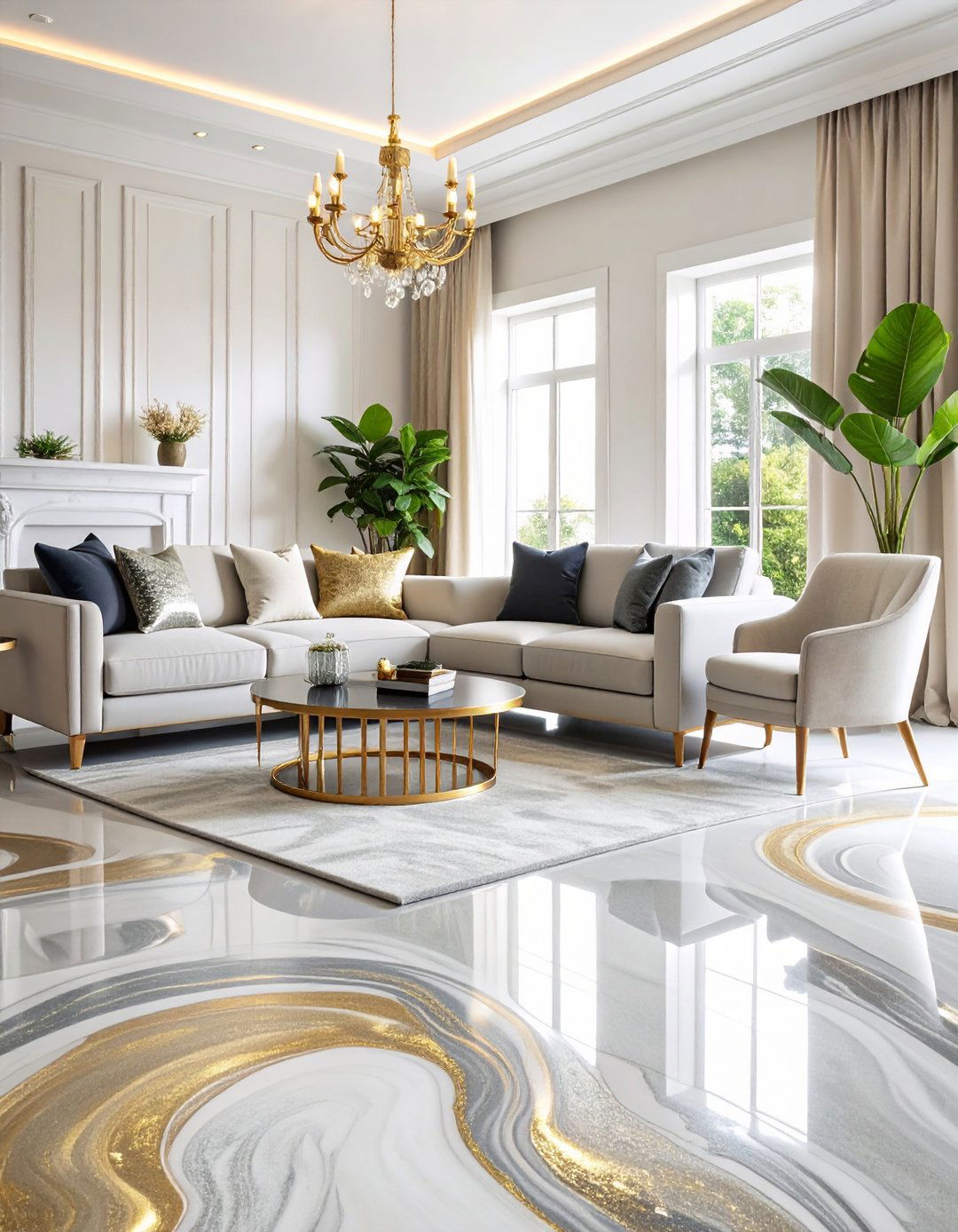
5. Crisp All-White Walls and Painted Floors
Monochromatic schemes shrink visual clutter and make tight rooms feel expansive. Painting both walls and floorboards the same soft, gallery white eliminates horizon lines, allowing light to bounce freely. Slightly differing sheens—eggshell on walls, satin on floors—ensure durability and gentle contrast without breaking the color spell. Use sculptural furniture, oversized art, or bold greenery to supply focal points that pop against the serene backdrop. This is a particularly smart palette for attic conversions or rental refreshes where architectural quirks need to recede.
6. Emerald Walls & Warm Honey Wood Floors
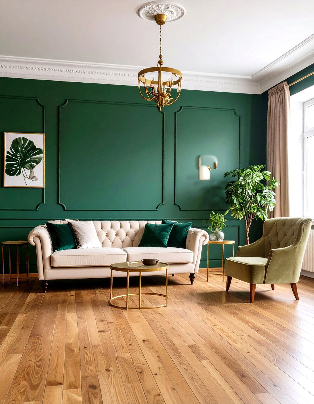
Rich emerald walls bring luxe, jewel-box intensity that’s forecast to remain strong through 2025. Balance that opulence with honey-stained hardwood, one of the year’s most versatile floor tones. The golden undertones prevent the deep green from feeling heavy, while emerald’s coolness tempers the floor’s inherent warmth, creating harmony. Metallic brass fixtures and cream upholstery keep the scheme timeless; introduce velvet cushions or botanical prints to lean into maximalist charm without overwhelming.
7. Terracotta Floors with Creamy Taupe Walls
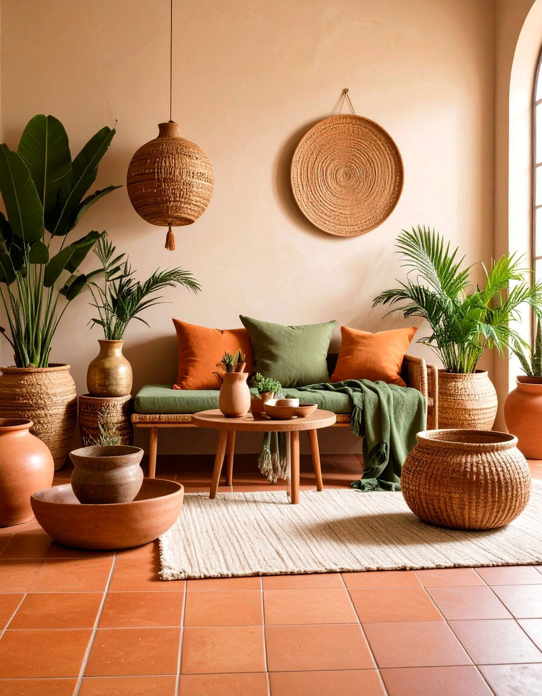
Traditional burnt-orange terracotta tiles radiate Mediterranean comfort, but they shine brightest when walls shift to soft taupe rather than matching warm reds. The creamy wall color quiets the floor’s natural variation and subtly modernizes rustic surfaces. Because both hues share warm undertones, the transition feels effortless, yet the lighter vertical plane prevents the room from reading overly dark. Accent with aged brass, hand-thrown ceramics, and olive-green linens for a relaxed vacation-home vibe year-round.
8. Checkerboard Floors & Bright White Walls
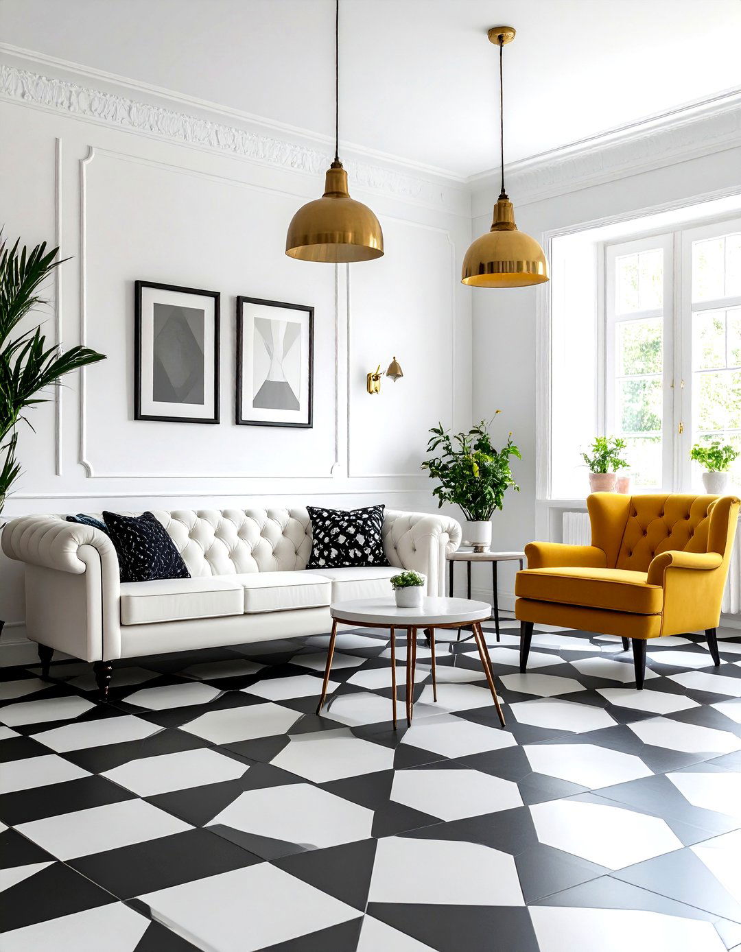
Classic black-and-white checkerboard tiles have roared back, praised for their ability to bridge traditional and contemporary styles. Keep walls a pristine chalk white so the high-contrast pattern remains the star while the room still feels open. This restrained envelope lets you play with colorful furniture or vintage art without visual noise. In foyers, a chair-rail height wainscot in gloss black can reinforce the pattern vertically, while brass pendant lighting adds warmth that softens the monochrome punch.
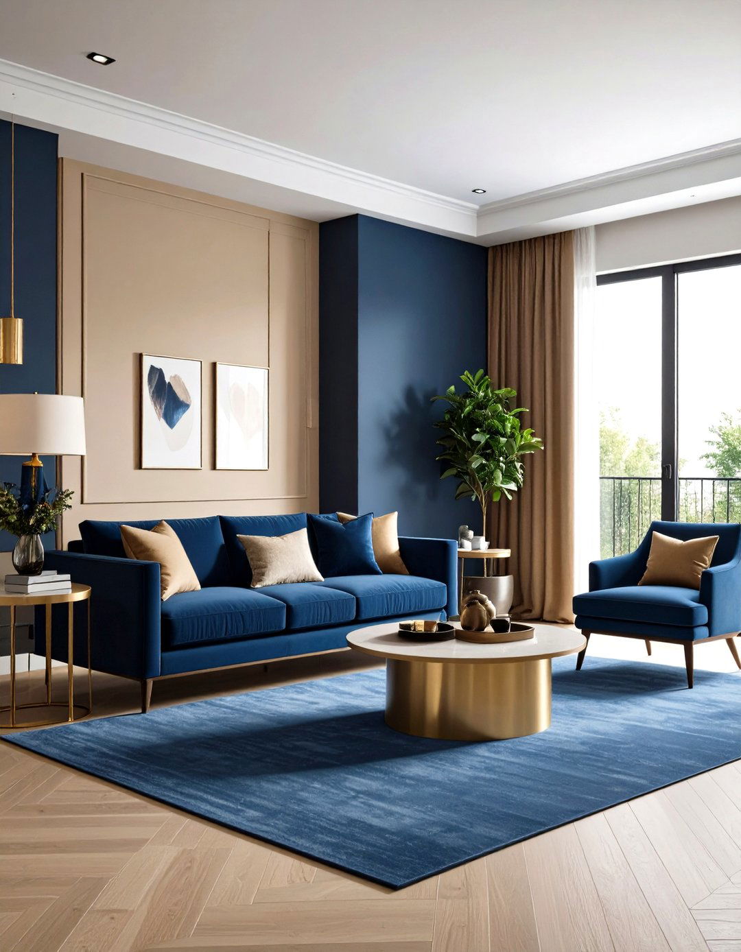
9. Deep Navy Walls with Natural Bamboo Floors
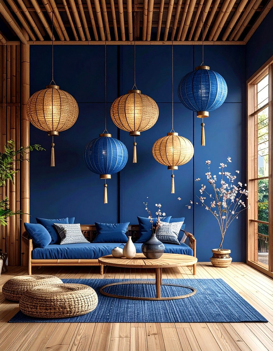
In rooms craving coziness, drenching walls in deep, almost-inky navy delivers cocooning elegance, and pairing it with sustainable bamboo planks introduces a light, eco-friendly counterbalance. Bamboo’s blond tone and tight grain lift the heavy pigment, stopping the space from feeling claustrophobic. The cool-meets-warm contrast also makes metallic hardware gleam. Keep baseboards the same navy for seamless height and rely on woven grass shades or paper lanterns to connect the palette’s organic roots.

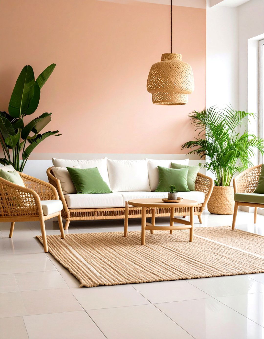
10. Sunrise Peach Walls & Cool Concrete Floors
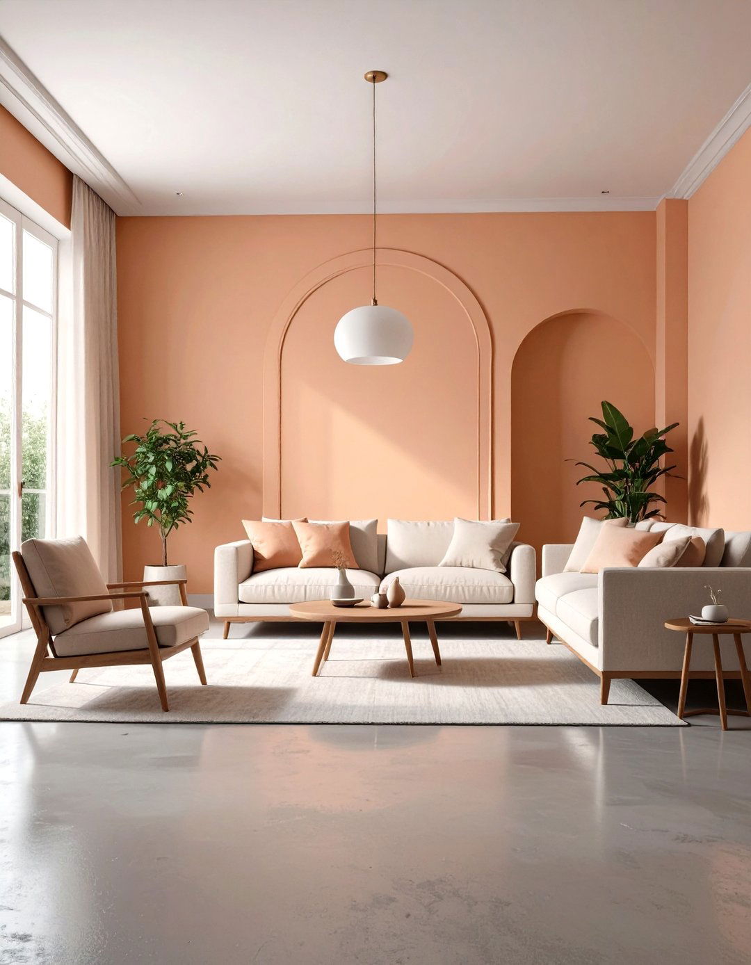
Muted sunrise peach—halfway between blush and beige—falls into the “quietly colorful” family of 2025 paints. Offset its gentle warmth with polished gray concrete or micro-cement floors for an industrial edge that reads chic, not cold. The subtle orange undertone of the wall color reflects softly onto the cool floor, preventing it from feeling stark, while concrete’s silky sheen adds light play. Furnish with walnut accents and linen in off-white or rust to bridge the tonal gap effortlessly.
11. Dusty Lavender Walls & Walnut Floors
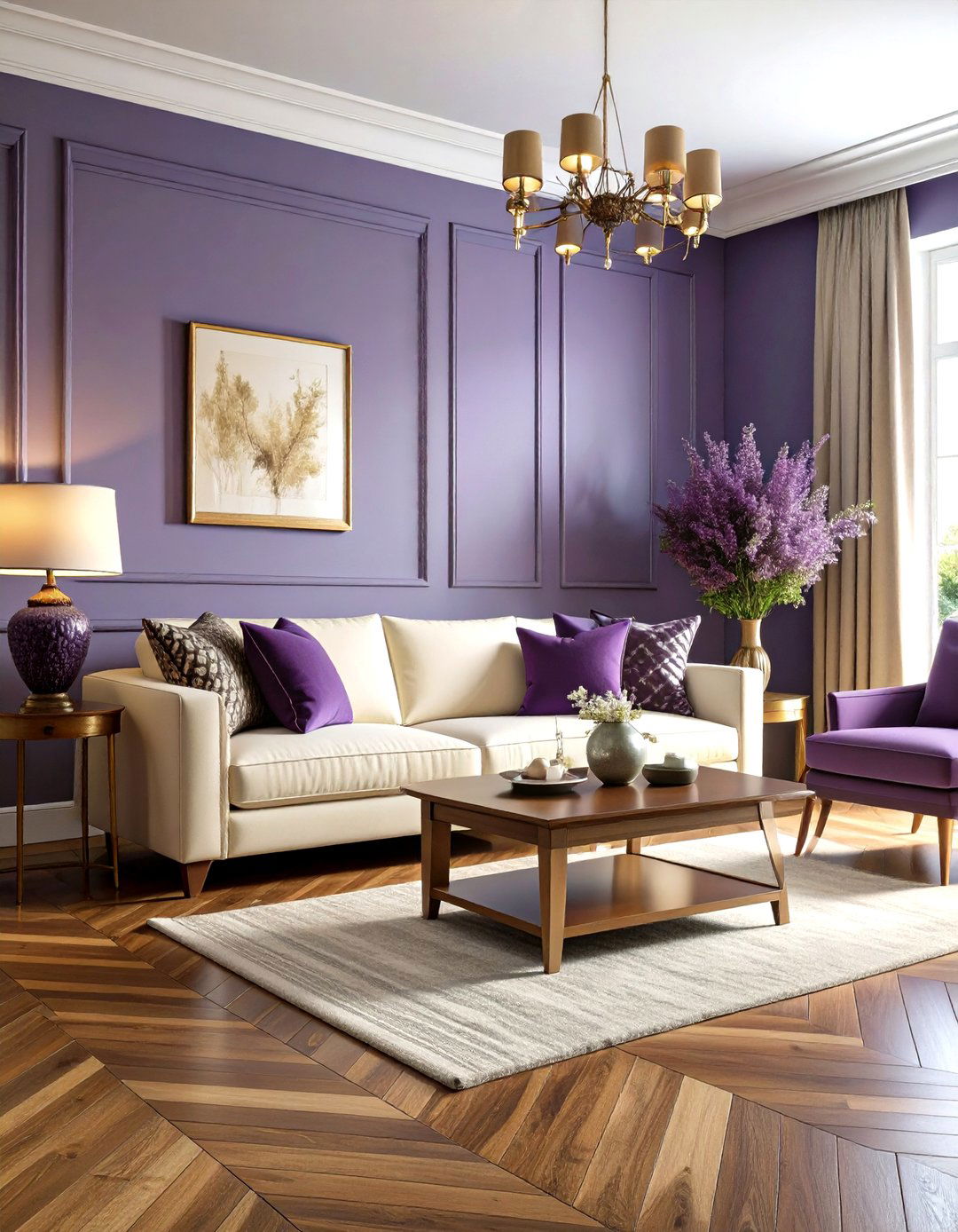
Designers tout dusty lavender as the soothing, grown-up purple that’s edging into mainstream interiors this year. Layer it over medium-toned walnut boards to inject stabilizing richness beneath the ethereal hue. Walnut’s brown undertone echoes lavender’s gray base, ensuring cohesion without leaning monochrome. The unexpected match works beautifully in bedrooms and libraries where calm focus is key. Accent with aged bronze, ivory boucle upholstery, and mauve throw pillows for depth.
12. Moody Charcoal Walls & Pale Maple Floors
Charcoal paint instantly conjures modern sophistication, and pale maple planks slice through the darkness with clarity. Maple’s subtle pink undertone pairs surprisingly well with deep gray, warming the overall temperature while emphasizing grain patterns. Opt for matte finishes on walls to avoid glare and satin on floors for durability. Add smoked-glass light fixtures and blackened steel hardware to keep the palette layered yet restrained.
13. Butter Yellow Walls & Driftwood Beige Floors

Butter yellow is the soft, nostalgic hue interior forecasters call “the new neutral,” thanks to its light-amplifying glow and easy pairing power. Install driftwood-beige wood or laminate floors underneath to create a quiet, sandy base that lets the walls radiate cheer without tipping into citrus brightness. Together they evoke a sun-washed beach cottage, making dim rooms feel brighter. Accent with sage throw blankets or striped navy cushions for breezy coastal flair year-round.
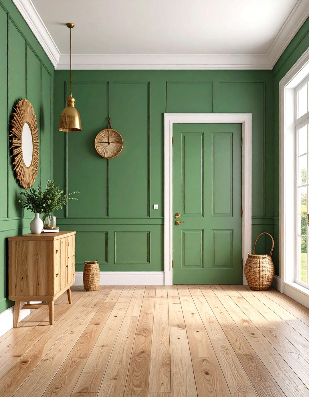
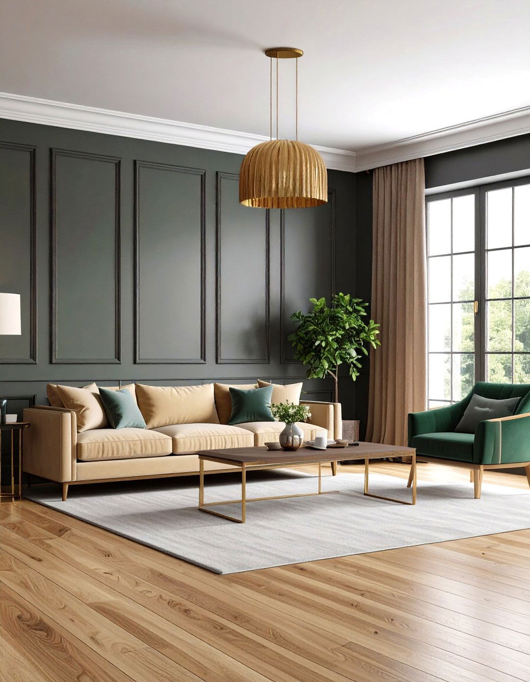
14. Forest Green Walls with Reclaimed Oak Floors
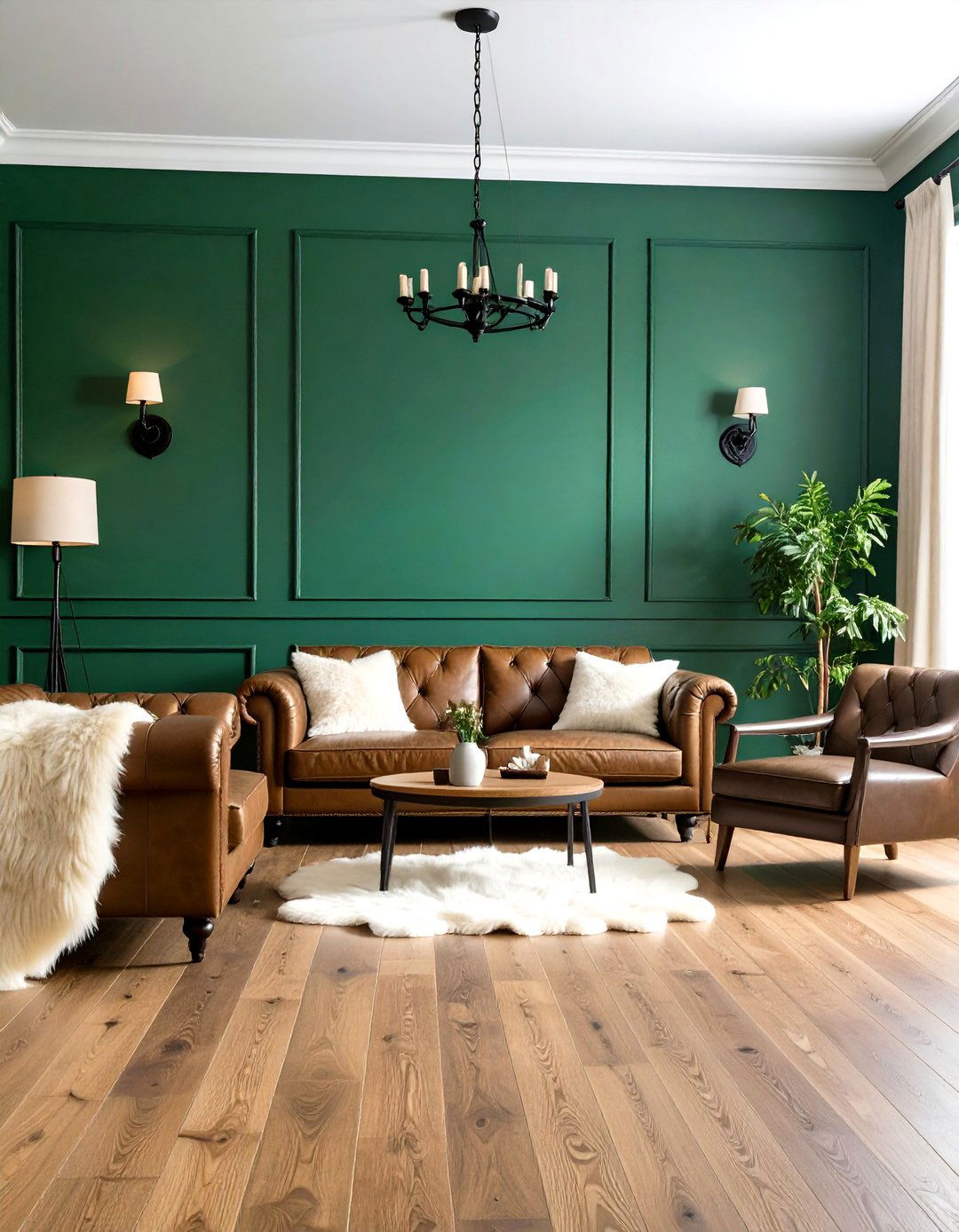
Designers moving beyond millennial sage are embracing richer, moodier greens that channel the forest canopy. Counterpoint the depth with reclaimed oak boards—knots, nail holes, and all—which introduce texture and sustainable storytelling. The oak’s varied tawny notes warm up the shadowy walls, creating cabin-like intimacy that still feels sophisticated. Iron sconces, leather seating, and cream sheepskins reinforce the natural narrative while adding tactile comfort.
15. Warm Beige Walls & Charcoal Slate Floors
Warm beige walls—darker than classic greige but lighter than adobe—offer a forgiving backdrop for high-traffic spaces. When teamed with large-format charcoal slate tiles, the combo feels spa-like yet practical; the floor hides scuffs, while the wall hue keeps the room serene. Because slate carries subtle blue-gray veining, introduce indigo textiles or brushed-nickel hardware to pick up the cooler notes and create deliberate contrast.
16. Soft Blush Walls & Light Ash Floors
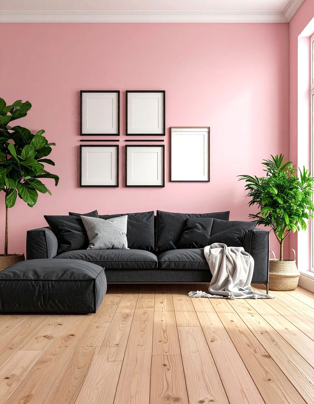
Blush pink, when tempered with a whisper of beige, reads sophisticated rather than sweet and continues to pop up in “dopamine décor” palettes. Lay it over light ash floorboards, whose faint gray cast sharpens the pastel and prevents visual sugar overload. Add matte black picture frames or charcoal linen cushions for edge, and rely on plenty of greenery—the green complements both hues and injects life into the subtle scheme.
17. Medium Gray Walls with Golden Oak Floors
Medium, cement-like gray remains a failsafe neutral, and pairing it with golden-oak boards revives the once-maligned stain that is enjoying a 2025 comeback. Oak’s caramel undertone warms the cool wall color, striking balance while still feeling modern. Choose satin finishes on both surfaces to enhance light reflection, and pepper the space with charcoal metals and cream textiles for a layered look that withstands trend cycles.
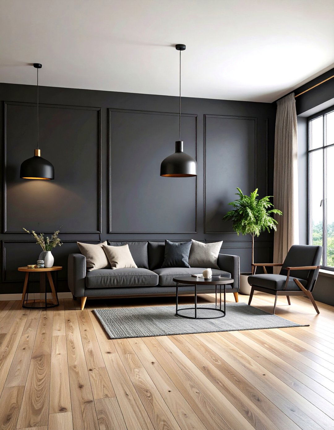
18. Soft Black Walls & Whitewashed Floors
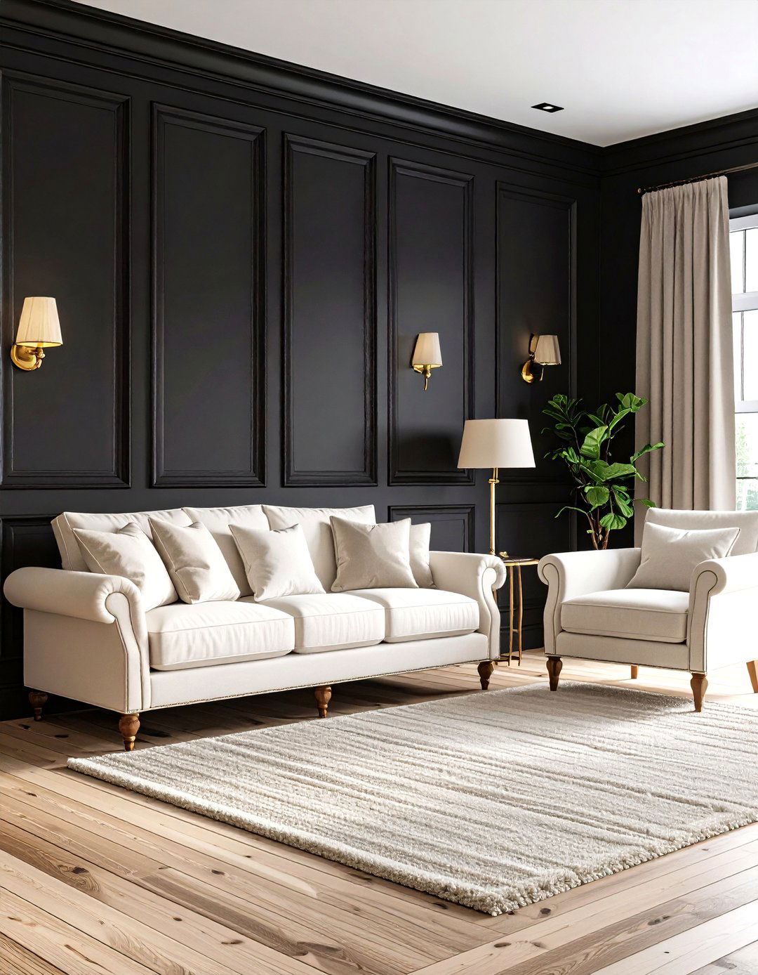
Soft, chalky black paint—richer than charcoal but less formal than jet—creates instant intimacy, especially in dining rooms or media lounges. Offset the shadow with whitewashed oak or pine planks that showcase visible grain. The high-contrast pairing elongates wall height and floor width simultaneously, making compact rooms feel architecturally sharper. Brass picture lights and ivory boucle seating prevent the scheme from tipping into monotone.
19. Sage Walls with Fired Terracotta Floors
Flip the usual equation by keeping walls a restful sage while allowing handmade terracotta tiles underfoot to supply rustic punch. Sage’s cool clarity soothes the orange-red tones, creating a balanced palette that still nods to Mediterranean warmth. Use matte black wrought-iron hardware and cream plaster accents to meld the two hues, and layer jute or sisal rugs where extra softness is needed without hiding the tile.
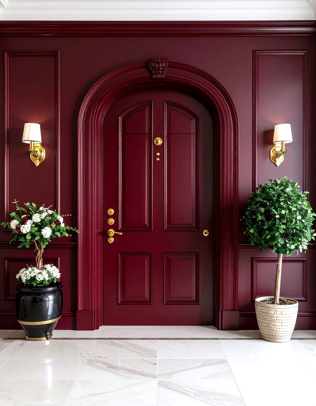
20. Deep Burgundy Walls & Herringbone Light Wood Floors
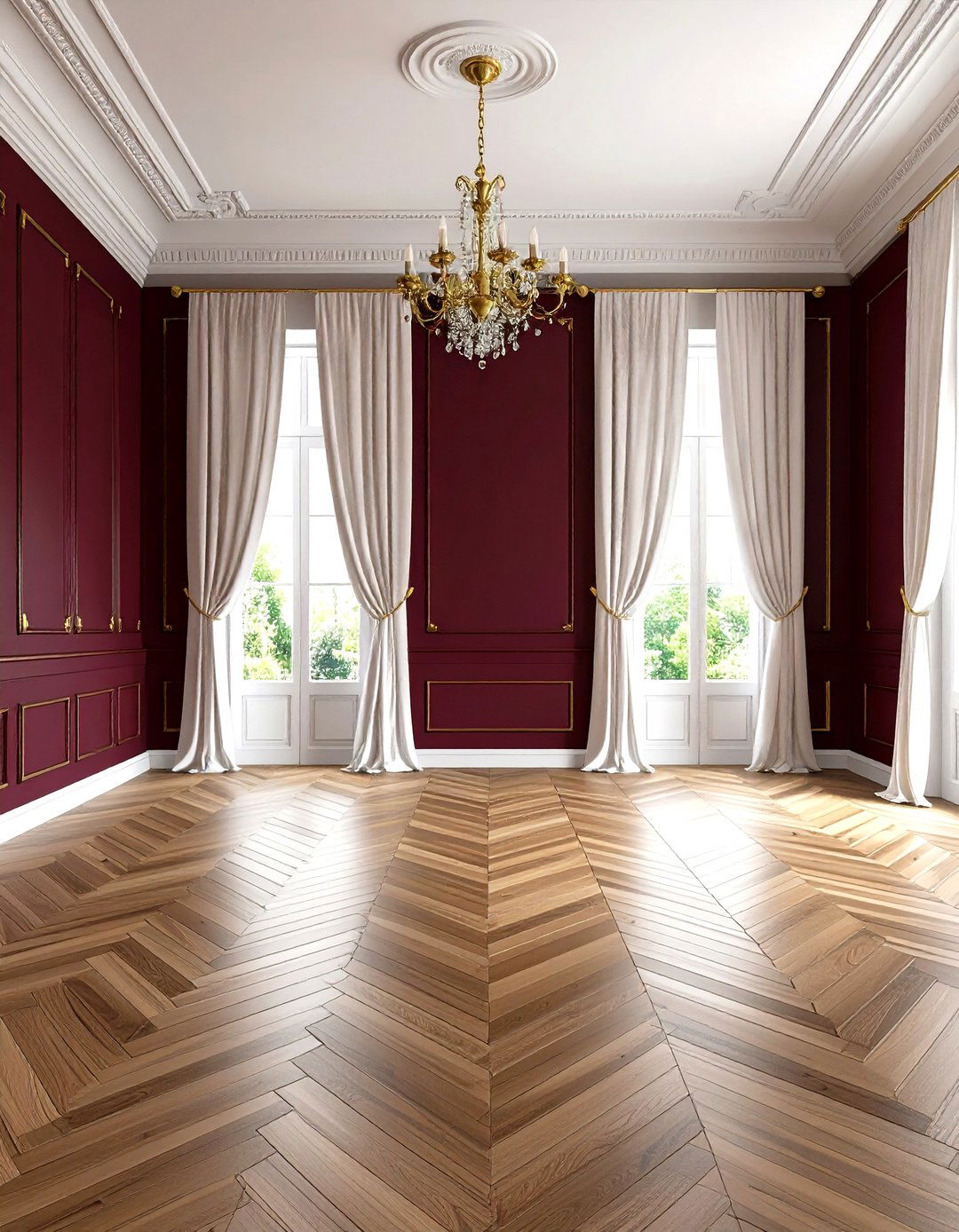
Moody burgundy, now grouped with 2025’s “quiet maximalist” color wave, injects instant elegance into libraries, dining rooms, or entryways. Lay the foundation with light, herringbone-patterned oak or ash to modernize the rich hue and keep the room from feeling dated. The patterned floor adds movement that prevents dark walls from closing in, and its pale tone highlights burgundy’s subtle brown undertones. Finish with aged-gold accents and crisp white drapery for a look that feels heritage-rich yet current.
Conclusion:
Pairing floor and wall colors is more than matching swatches; it’s about orchestrating light, texture, and mood so every square meter works harder. Earth-derived palettes offer timeless calm, jewel tones wake up formal rooms, and high-contrast patterns add graphic swagger, especially when balanced by softer neutrals. Whether you gravitate toward sun-washed butter yellow, daring charcoal, or lush emerald, remember that the floor provides the grounding note that lets your chosen wall hue sing. Use these twenty combinations as springboards, adjusting undertones and finishes to suit your architecture, and you’ll create interiors that feel intentional, welcoming, and unmistakably yours.
Related posts:
Leave a Reply