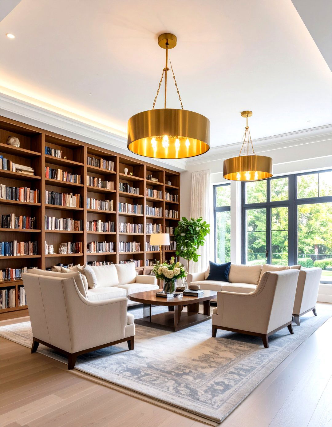
The allure of a dark green home library lies in its power to slow time: the color’s association with nature calms the nervous system, supports focus, and adds a whisper of quiet luxury that feels scholarly rather than showy. Whether you have an expansive study begging for floor-to-ceiling built-ins or a shallow nook ripe for reinvention, the twenty ideas below explore paint finishes, furniture pairings, lighting tricks, and clever storage that harness 2025’s most coveted hue without sacrificing practicality. From high-gloss emerald lacquer to closet-sized reading dens, each suggestion balances atmosphere with function so your personal retreat remains as ergonomic as it is evocative.

1. Fully Forest-Green Home Library Cocoon
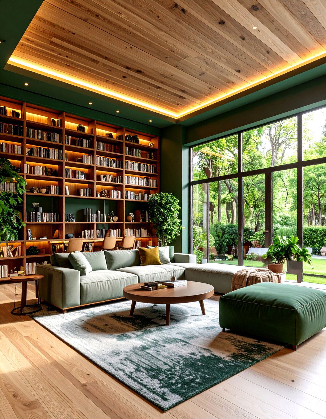
A blanket of forest-green paint turning walls, shelves, and even the ceiling into one continuous backdrop instantly wraps a home library in a restful hush. The saturated hue absorbs glare, reducing eye strain during marathon reading sessions and encouraging deep focus, a benefit researchers repeatedly link to green interiors. Painting cabinetry and trim the same color blurs boundaries so books seem to hover in shadowed alcoves—an illusion that makes small rooms feel both intimate and elevated. Add warm LED bulbs in sconces or a shaded chandelier to stop the palette from becoming cave-like while still preserving that cozy, midnight-in-the-woods ambience.
2. Two-Tone Green Home Library Layers
Unlike painting every surface the same shade, splitting the palette lets you weave sophistication through a home library by using a near-black pine on lower cabinets and a smoke-sage above picture-rail height. The darker base grounds the room and echoes antique desk legs, while the paler upper walls reflect slivers of daylight so spines remain easy to read. Color consultants note that subtle value shifts in green keep eyes relaxed because they sit together on the spectrum, preventing visual fatigue during study marathons. Finish the transition with a slim chair-rail molding to disguise the seam and give the scheme an intentionally tailored look.
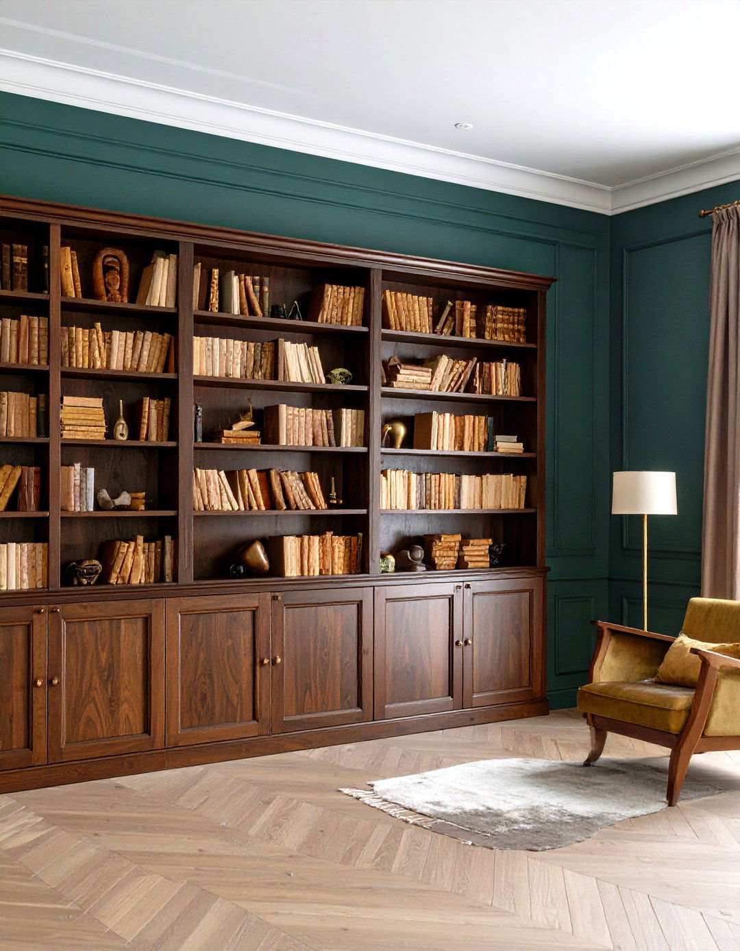
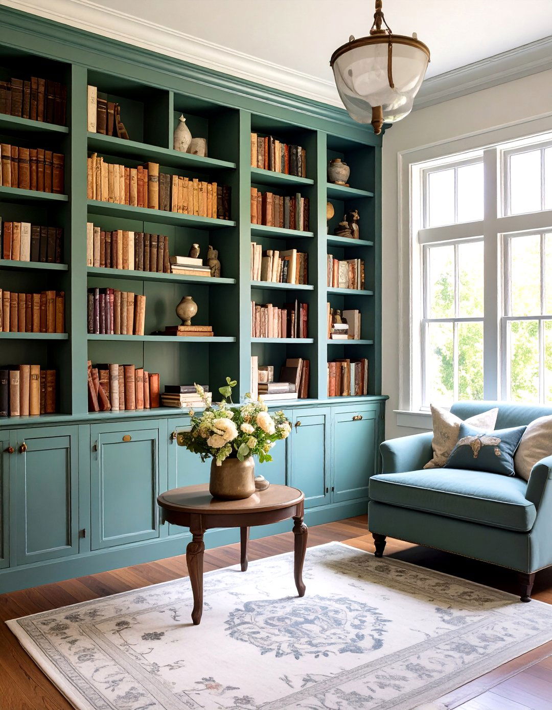
3. Oak-Trimmed Olive Home Library Warmth
Aging oak shelves set against deep olive walls channel the calm of a mossy forest and bring textural warmth to a home library. Designers tracking 2025’s “colorful quiet luxury” trend cite earthy greens paired with wood as a route to longevity because the pairing feels timeless rather than trendy. The subtle golden grain lifts the darker paint so the room never feels heavy, while the neutral wood tone bridges to tan leather chairs or woven baskets. Seal shelves in a clear matte varnish; the low sheen prevents distracting reflections and keeps paper edges visually crisp.
4. High-Gloss Emerald Home Library Sheen
This high-gloss lacquer treatment turns bookshelves into gleaming jewelry boxes, bouncing pinpricks of light across every spine and giving a small home library undeniable “wow.” The mirror-like finish works best with colors that already skew dramatic—think emerald or blackened juniper—because sheen magnifies pigment depth. Wipeable surfaces are practical too; fingerprints fade with a quick cloth, a plus for households with kids. To temper potential glare, install dimmable picture lights so readers can dial brightness down after dusk without losing that intoxicating sparkle. Pair the shine with matte linen curtains to ground the room.
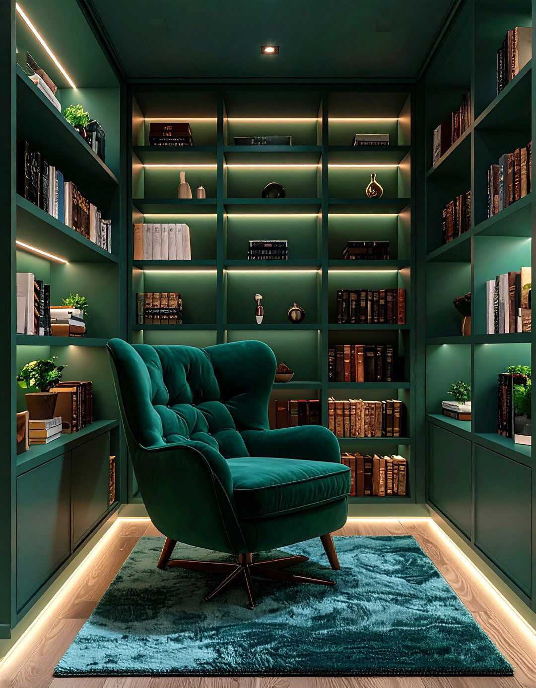
5. Botanical Ceiling for a Green Home Library Canopy
Consider papering the ceiling with a tonal botanical print—ferns, ivy, or abstract vines rendered in charcoal on green—so your gaze meets a quiet canopy each time you lean back with a novel. Designers explain that pattern overhead can trick the brain into perceiving extra height, handy for libraries carved out of basements. Choosing a motif just one or two shades lighter than the wall color maintains the enveloping vibe without visual chaos. Because wallpaper absorbs more light than paint, supplement with a row of slim LED uplights atop the shelves to keep titles legible and highlight that unexpected fifth wall beautifully.
6. Brass-Lit Dark Green Home Library Glow
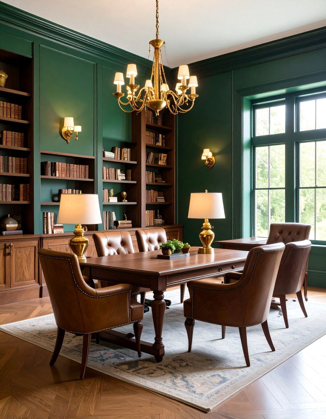
To introduce a whisper of heritage glamour, frame the dark green envelope with aged-brass sconces and picture lights. Metal in warm tones balances the color’s cool undertone and reflects amber highlights over timber desks and leather club chairs, making the whole home library glow like dusk in an old study. Designers now recommend pairing unlacquered finishes with deep greens because both age gracefully; fingerprints evolve into a mellow patina rather than smudges needing constant polish. Keep bulb temperatures around 2700–3000 K—research shows warmer light supports relaxation while preserving contrast on printed pages, and the subtle sheen also draws the eye vertically, accentuating joinery.
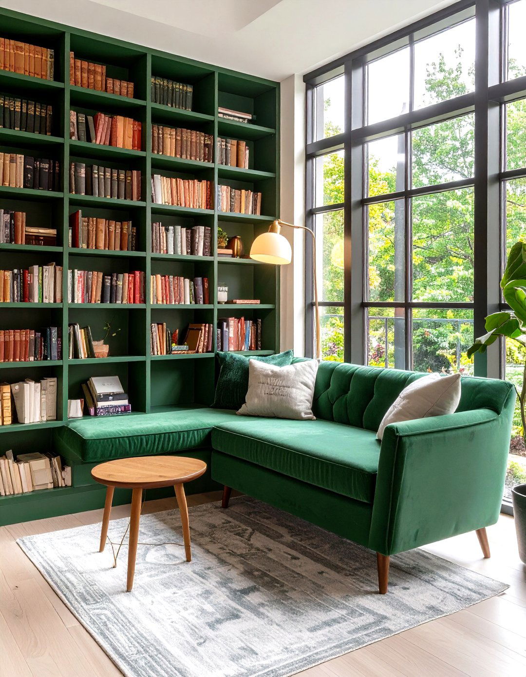
7. Velvet Seating for a Jewel-Box Home Library
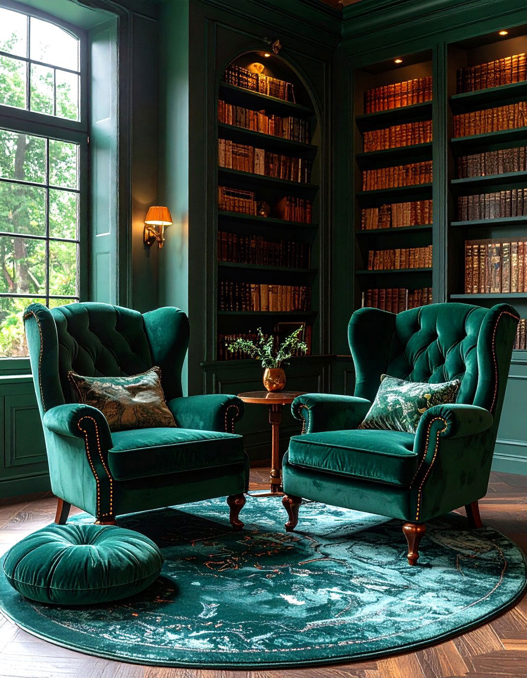
A plush emerald-velvet wing chair set against hunter walls feels like tucking into a jewel box, offering tactile delight that slows the pulse and invites long reading binges. Color psychologists note that pairing green in both sight and touch further amplifies the soothing effect, activating the brain’s association with moss and fabric softness simultaneously. Choose upholstery with a performance finish so stray crumbs or ink marks wipe away easily. For visual rhythm, repeat the velvet on a floor cushion or lumbar pillow; a trio of similar textures sprinkled throughout the home library unifies the scheme without monotony.
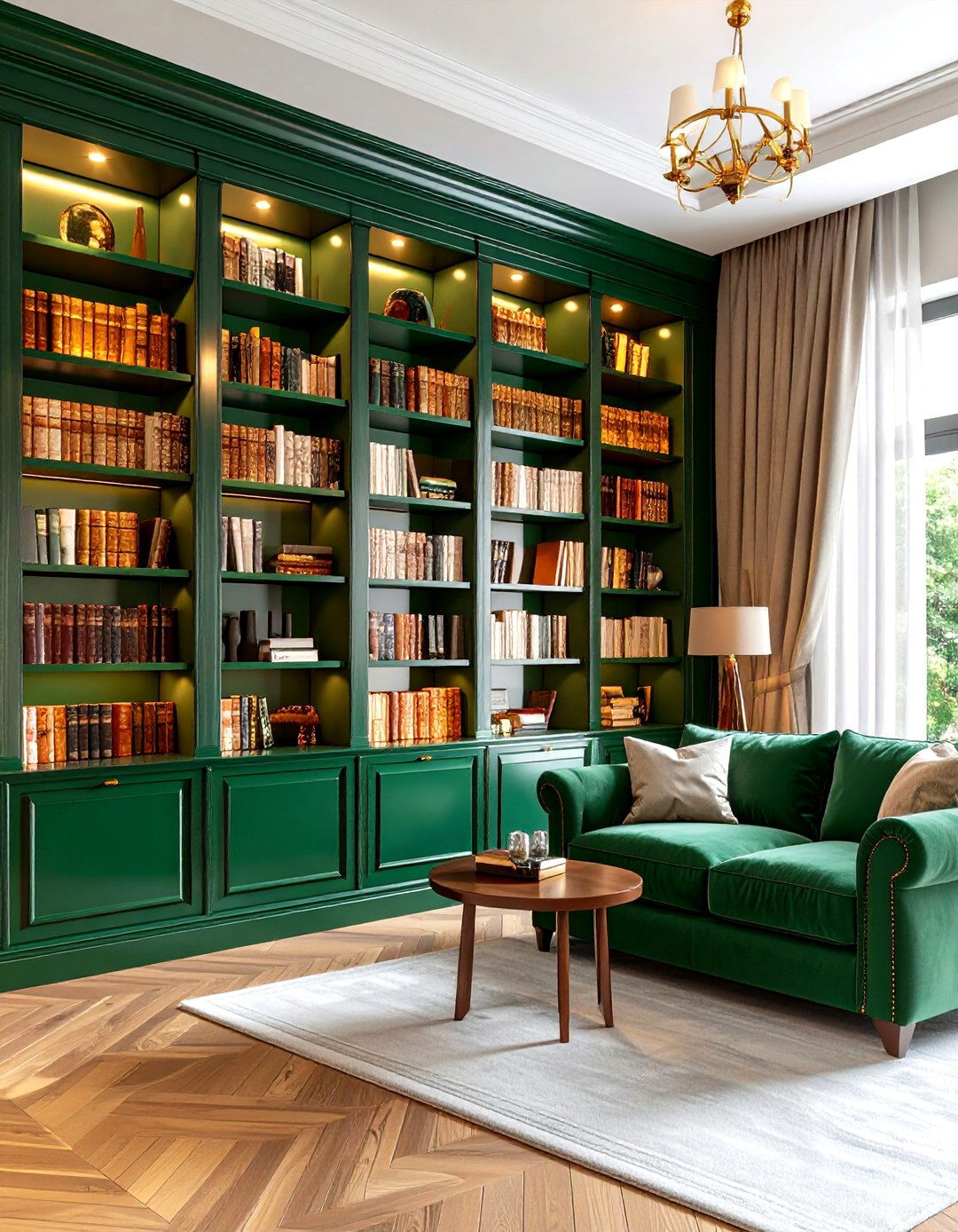
8. Color-Drenched Obsidian Green Home Library
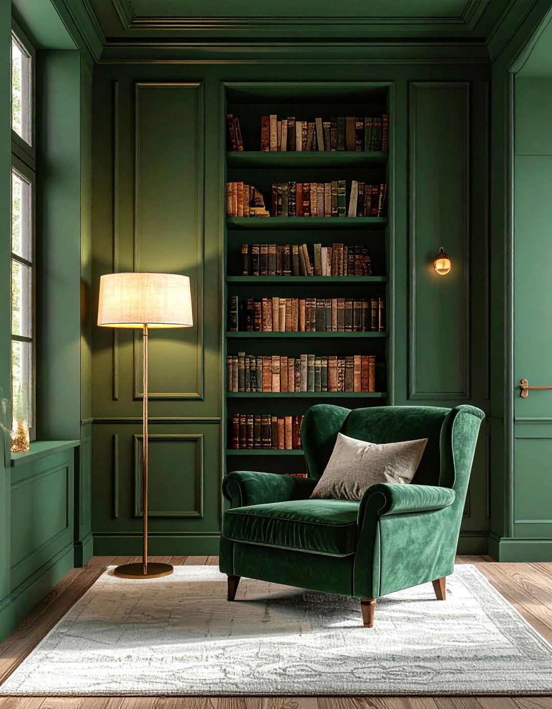
By coating walls, trim, door frames, and even switch plates in the same obsidian-green, you practice “color drenching,” a technique dominating design feeds in 2025 for its enveloping calm. Without contrasting mouldings the eye has no hard stops, allowing shelves, art, and patterned rugs to step forward. If your home library is windowless, this approach avoids the dingy effect stark white trim can create in low light. Designers suggest using a matte scrub-resistant formula so scuffs disappear, preserving the seamless look. A linen-shade floor lamp set to medium intensity offers a gentle halo that prevents oppression.
9. Paneled Contrast in a Sophisticated Home Library

Although picture-frame paneling is typically highlighted with lighter paint, reversing the rule—deep green panels framed by almost-black molding—adds cinematic depth to a home library. The darker outlines sharpen edges and subtly guide eyes toward shelf contents, much like a mat directs focus within a photo. Maintaining both hues in the green family keeps contrast sophisticated rather than jarring, which color-theory research links to lower cognitive load while reading. Finish panels in eggshell for softness and use semi-gloss only on trims, adding slim brass picture lights above each frame for precise task illumination.

10. Window-Seat Nook in a Bottle-Green Home Library
For homes blessed with a bay window, turning the apron into a built-in bench covered in bottle-green upholstery creates the perfect reading nest. The seat drops visitors straight into the surrounding color, reinforcing the sense that the home library is a world apart. Storage drawers beneath hide blankets and magazines, a trick shown to reduce mental fatigue and help readers sustain attention. Flank the nook with open shelving and add adjustable swing-arm sconces on either side to deliver directed light that won’t bounce off windows at night. Choose a high-density foam cushion for posture-friendly marathons.
11. Gemstone Accents Energizing the Home Library
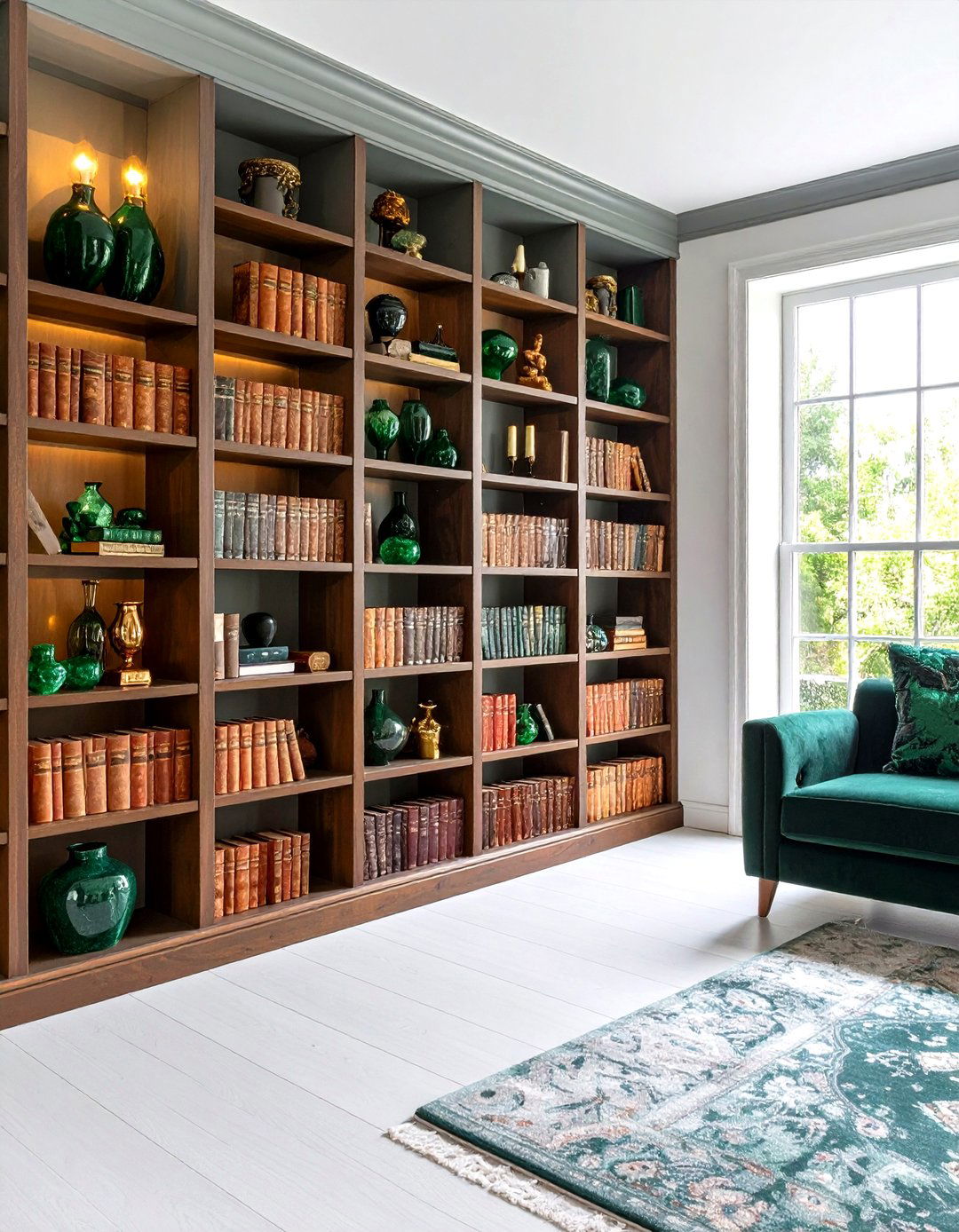
Looking for a dash of drama? Scatter gemstone accents—malachite bookends, emerald glass vases, or a peacock-green silk throw—through shelves so the dark green envelope feels intentional rather than accidental. Experts advocating “color layering” argue that micro-variations in hue keep the eye engaged without breaking relaxation, a phenomenon tied to increased creativity. Limit the palette to two or three saturation levels so the room stays cohesive; too many tones can tip toward clutter. Reflect sparkle with antiqued mirror panels at the back of a niche to bounce gentle glimmers across the home library at evening.
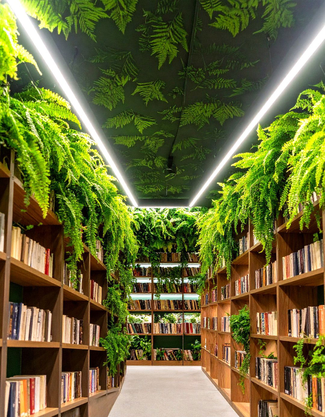
12. Living Greenery in the Biophilic Home Library
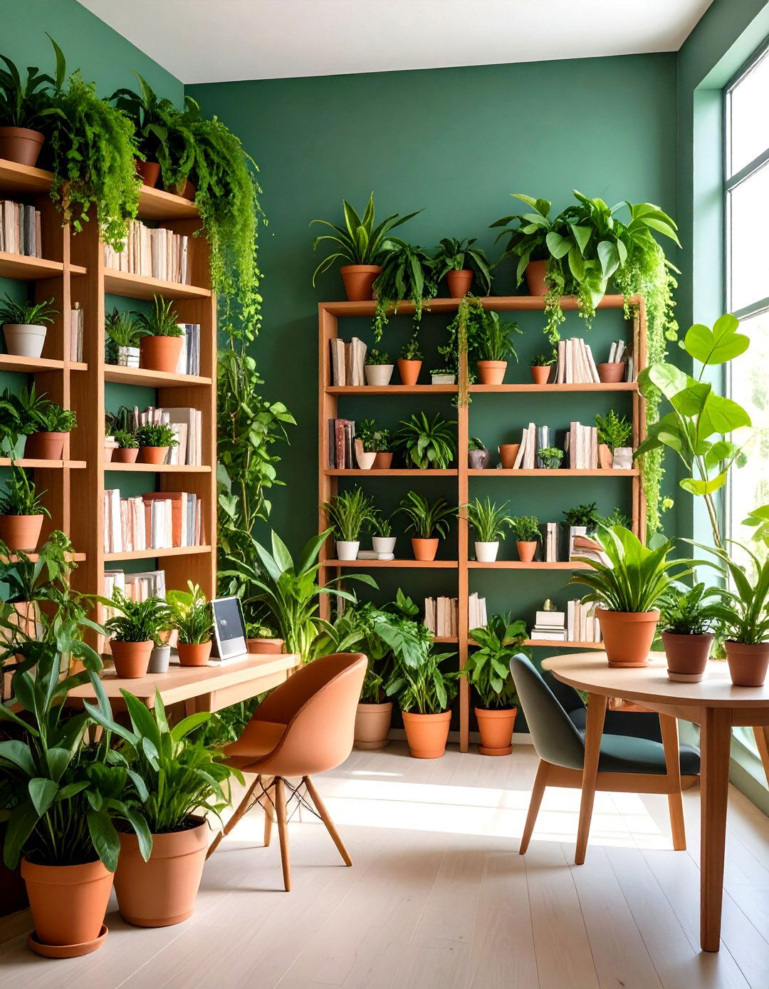
Certainly, living greenery belongs in a green room. A trailing philodendron cascading from a top shelf or a potted ZZ plant on the desk supercharges the home library’s biophilic vibe and purifies air in the bargain. Researchers associate even small doses of foliage with lower heart rates and boosted concentration—advantages tailor-made for study spaces. Choose species that thrive in lower light and release oxygen at night, such as snake plants, to simplify care. Terracotta pots echo tannin tones in leather bindings, while discreet saucers prevent moisture from marring those dark green built-ins. Mist leaves weekly with filtered water to maintain sheen.
13. Layered Lighting Strategy for the Home Library
Despite the allure of statement chandeliers, the most reader-friendly strategy is layering light: ambient ceiling spots paired with brass swing-arm sconces and slim picture lights mounted on the bookcase. Lighting specialists emphasize that targeted task beams at eye level minimize glare and help prevent fatigue during prolonged reading. Select fixtures with adjustable arms so the beam can follow you from armchair to desk, and fit them with 90 + CRI LED bulbs to keep page colors true. Dimmers on every circuit let the home library shift from studious brightness to moody retreat with a fingertip. Remember to aim picture lights at a 30-degree angle to avoid hot spots.
14. Rolling Ladder for Vertical Home Library Storage
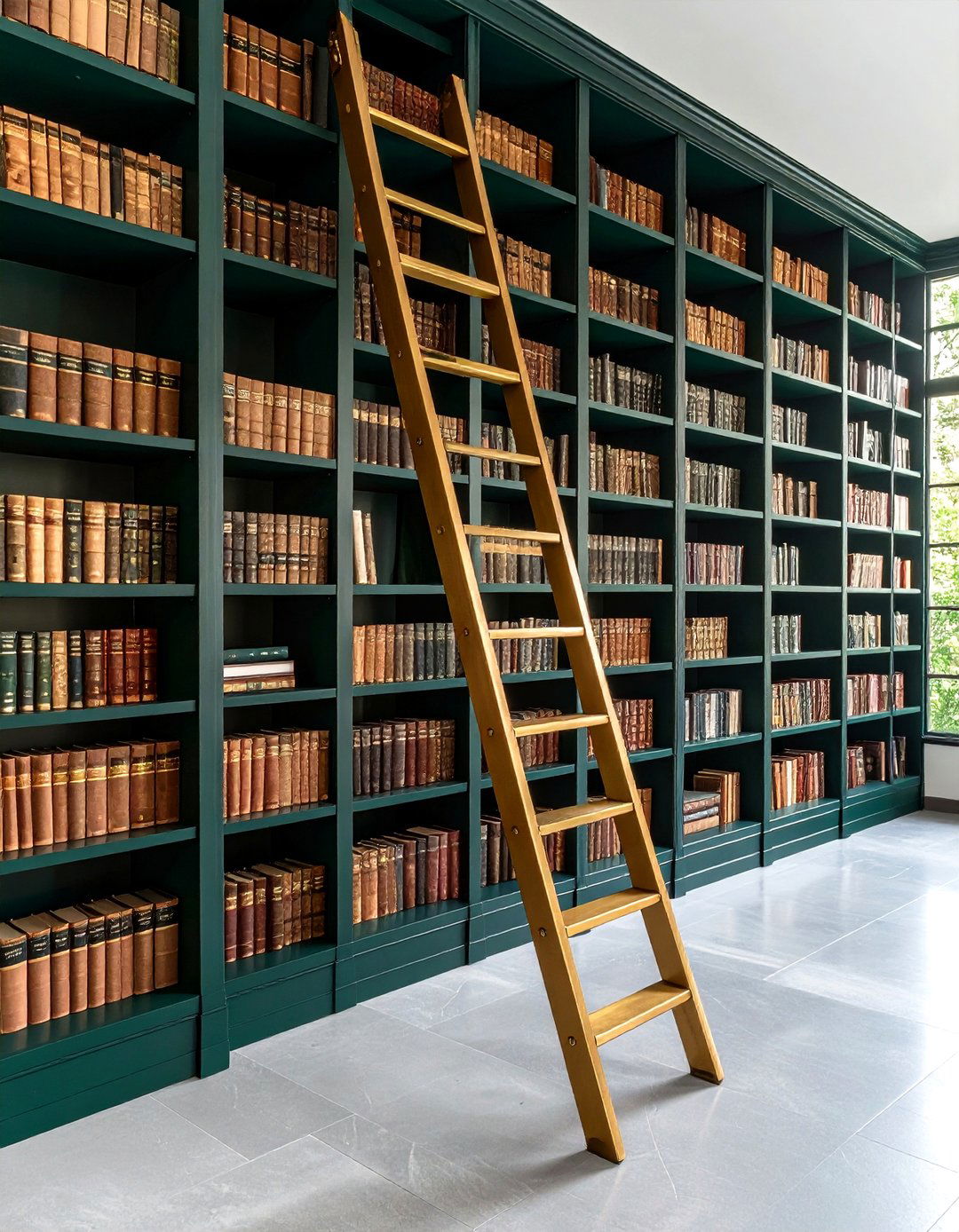
One awe-inducing trick is installing a rolling ladder stained the same dark green as the shelves so hardware appears to float in midair. Beyond the visual delight, ladders encourage vertical storage, meaning your home library can accommodate more volumes without expanding its footprint. Safety guidelines advise keeping rail heights proportional to ceiling height and adding non-slip rungs, features modern ladder systems readily include. Integrate a brass or matte-black rail for subtle gleam, and remember to clear top-shelf air vents to prevent dust buildup. Guests will relish sliding the ladder slowly up during quiet evenings inside.


15. Textural Tartan Home Library Comfort
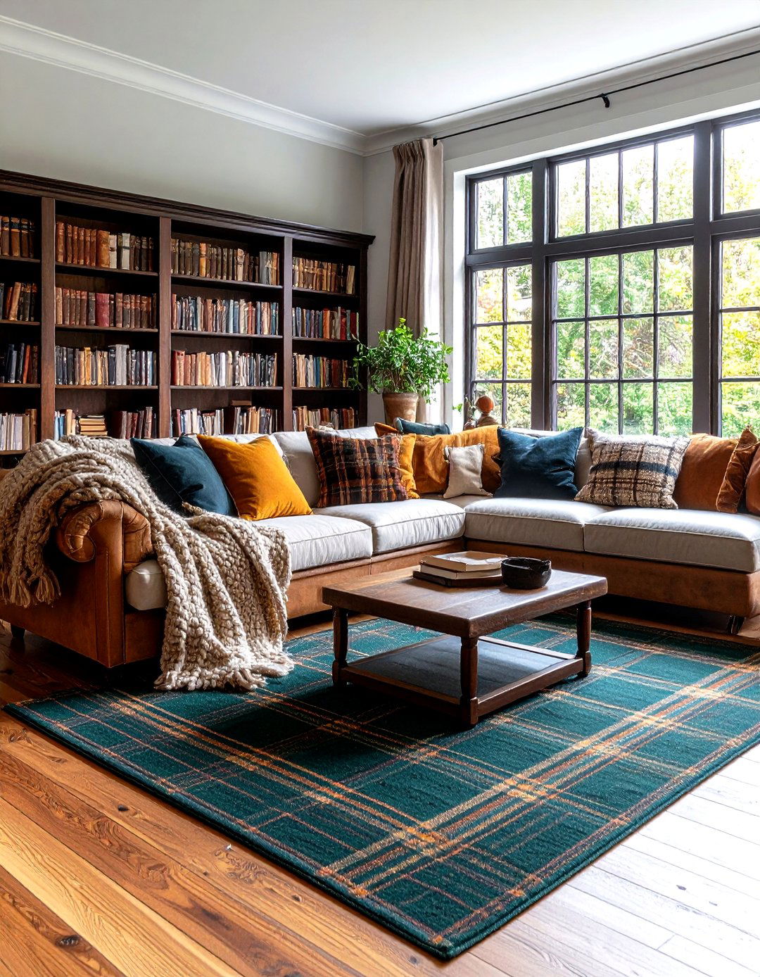
By layering a dark green tartan wool rug atop warm hardwoods, draping a chunky cable-knit throw over the sofa, and peppering tweed cushions across the window seat, you create a multisensory cocoon that makes the home library feel like a Scottish lodge. Textile experts say mixing at least three textures within the same color family deepens perception of warmth even if the thermostat stays steady. Keep patterns in a similar scale so they harmonize rather than compete. A leather pouf in cognac adds just enough contrast to stop the palette drifting into monochrome fatigue. Finish with lined drapes that pool slightly to echo the rug’s richness.
16. Green-and-Black Graphic Home Library Contrast
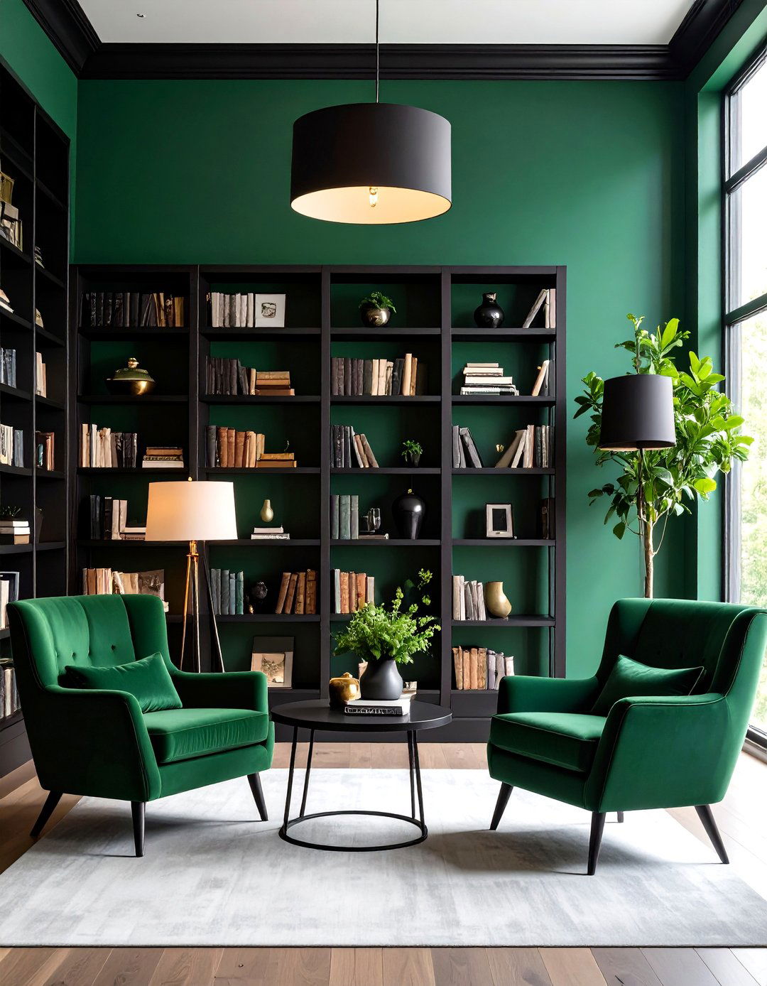
Despite fears that dark-on-dark will feel oppressive, combining deep green walls with matte charcoal hardware, lamp shades, and picture frames sharpens every silhouette, giving the home library a crisp graphic quality. Color-blocking studies show high-contrast edges improve object recognition and reduce visual confusion in spaces packed with information such as bookshelves. Keep the ratio around eighty-percent green to twenty-percent black so the palette remains grounded in nature rather than gothic. A slim black metal reading table beside the chair completes the look, and soft white pages pop all the brighter against the subdued backdrop.
17. Chalk-Finish Vintage Home Library Makeover
Owing to its ultra-low sheen, a chalk-finish paint in moody sage instantly grants bookcases the velvety appearance of antique cabinets rescued from an old university. Restoration pros argue that matte surfaces scatter light broadly, making scratches or future touch-ups virtually invisible. Wax-seal the paint to add subtle protection without raising gloss. Complement the texture with aged-bronze bin pulls labeled by genre—you’ll navigate the home library like an archivist rather than just a reader. Because chalk paint sticks to most substrates, weekend DIYers can refresh thrifted shelves without heavy sanding, saving time and budget. Finish by stenciling a discreet crest on the kickboard for bespoke charm.
18. Hidden Door Mystery in the Home Library

Take inspiration from mystery novels by concealing a doorway behind floor-to-ceiling green shelves. A continuous kickplate and push-to-open latch keep lines unbroken, so visitors only realize the secret when the unit swings open. Beyond whimsy, hidden doors provide acoustic privacy, useful if the home library doubles as a remote-work studio. Craftspeople recommend using lighter MDF cores inside the door panel to reduce strain on pivot hardware while allowing deep paint absorption for a flawless finish. Fit an automatic light cut-off switch so bulbs extinguish when the panel closes, preventing heat buildup. Seal perimeter gaps with felt to muffle tell-tale creaks.
19. Hybrid Home Library and Work Hub

With work-from-anywhere mainstream, carving a leather-topped partner’s desk into the center of your dark green library turns the room into a focus engine. Studies tracking color and productivity find deeper greens improve sustained attention better than stark white because they lower arousal without inducing drowsiness. Position the desk so the sightline meets shelves, not a blank wall; psychologists link such micro-rewards to heightened motivation. A desktop-mounted task lamp with articulating arm guards against shadow from overhead fixtures, and a locking file drawer keeps work clutter at bay. Choose a chair in complementary spruce leather for ergonomic comfort that echoes the palette.
20. Closet-Sized Midnight-Green Home Library Retreat
Finally, remember that scale is negotiable: a spare walk-in closet transformed with midnight-green paint, wall-to-wall shelves, and a lone slipper chair can scratch the library itch even in small homes. Compact rooms benefit most from dark tones because the color blurs edges, tricking the brain into perceiving depth, according to optical-illusion research. Install a motion-sensor LED strip under each shelf so every book spine lights up as you enter, and tuck a lidded ottoman under the chair for hidden storage. Add a battery fan for airflow and noise masking. The result is a secret retreat just steps from everyday bustle.
Conclusion:
Dark green’s chameleon-like range—from subtle sage to nearly black spruce—means there is a shade and finish for every square foot, taste, and budget. By pairing the color with layered lighting, tactile textiles, strategic wood tones, and clutter-taming storage, you can forge a home library that fosters deep focus while doubling as an elegant escape. Embrace color-drenched walls for immersive calm or let oak shelves and brass sconces deliver balanced warmth; either way, these ideas prove the nature-infused hue remains a timeless, wellness-forward choice that will carry your reading sanctuary well beyond the 2025 trend cycle.
Related posts:

Leave a Reply