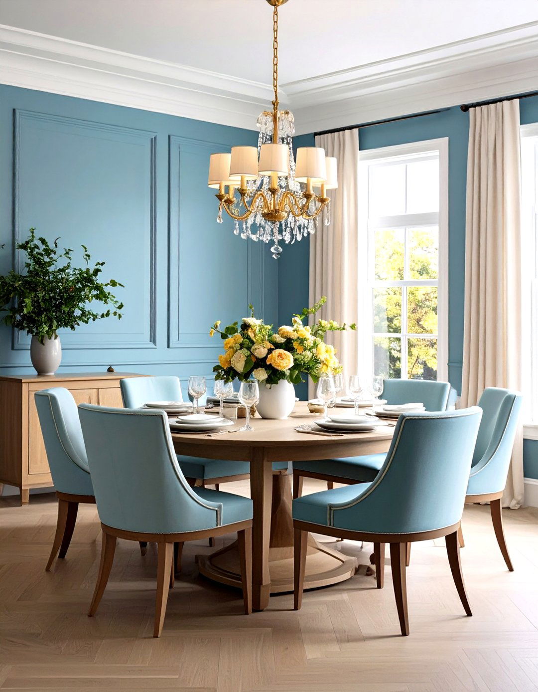
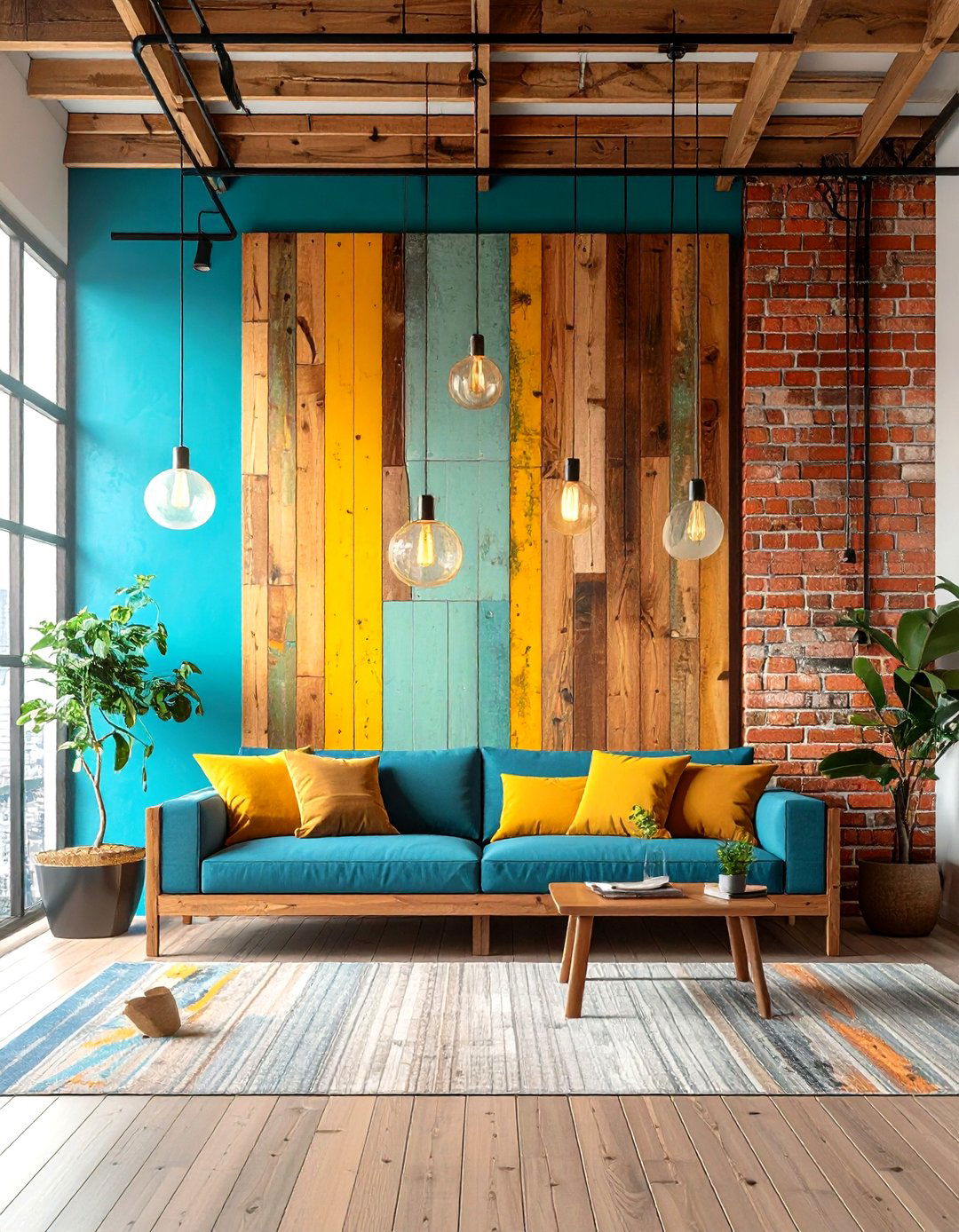
Two-tone wall painting is a versatile design technique that can dramatically transform any room by introducing visual interest, emphasizing architectural features, and manipulating perceptions of space. By combining complementary or contrasting hues—whether through classic horizontal splits, bold color blocks, or creative geometric patterns—you can tailor the mood and style of your interiors to suit anything from serene minimalism to vibrant maximalism. Designers increasingly favor two-tone schemes to draw the eye upward (making ceilings feel higher), define distinct functional zones, or inject a playful accent without overwhelming the senses. Below are 20 inspiring two-tone wall paint ideas—each blending two colors in a unique way to elevate your decor.
1. Classic Half-and-Half Split
Divide your wall exactly in half with a horizontal line, painting the lower section a deeper tone (like slate gray) and the upper section a lighter shade (such as crisp white). This timeless approach grounds the room visually while keeping the atmosphere bright and airy. It’s particularly effective in living rooms and hallways, where the two-tone split can accentuate panel molding or create the illusion of taller ceilings. The key is selecting colors with sufficient contrast to delineate the sections, yet close enough in value to maintain cohesion.
2. Bold Navy Base with Off-White Top
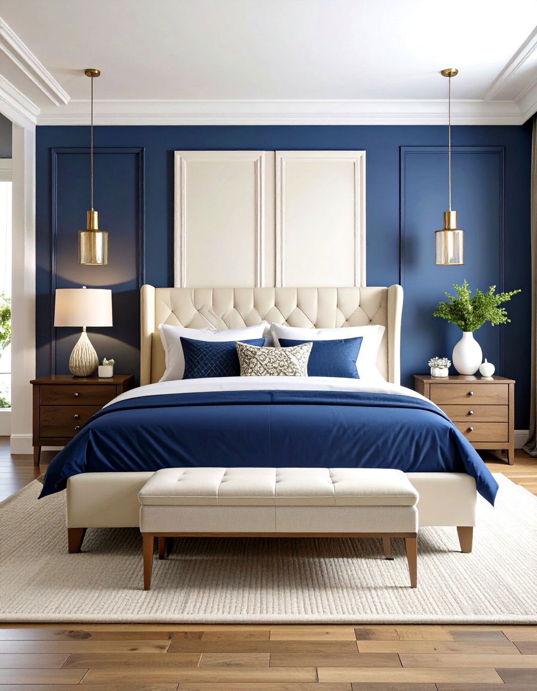
For a sophisticated nautical vibe, paint the bottom two-thirds of the wall in deep navy and cap the top third in a creamy off-white. The darker lower portion anchors furniture and décor, while the pale upper area reflects light and makes the ceiling feel elevated. This pairing works well in bedrooms and dining rooms, imparting both coziness and brightness, and pairs beautifully with brass or natural wood accents.
3. Pastel Mint Bottom, Blush Pink Top
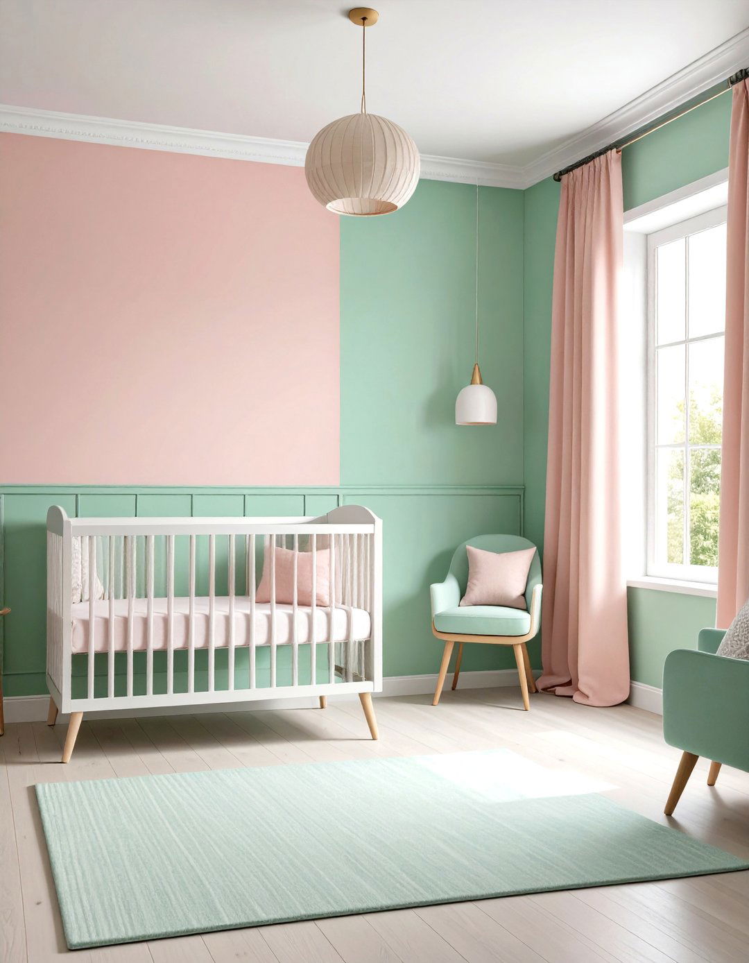
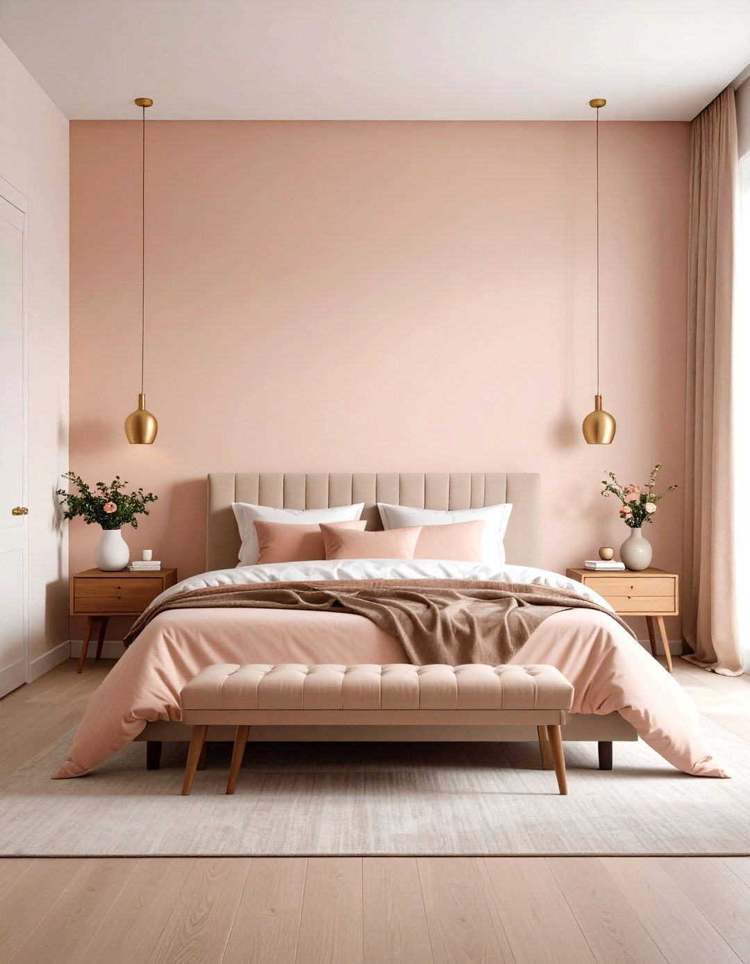
Create a soft, romantic setting by combining a minty green lower half with a blush pink upper half. The pastel duo evokes a fresh, spring-like ambiance, ideal for nurseries or powder rooms. Mint at the base injects cool tranquility, while blush at the top adds subtle warmth and charm. Keep trim and ceilings white to enhance the sweetness of this palette.
4. Monochromatic Blue Shades
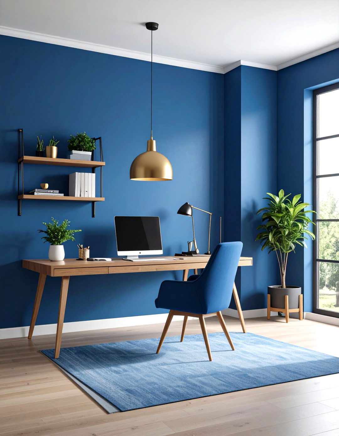
Layer two tints of the same color—such as sky blue above and steel blue below—to achieve depth without harsh contrast. The lighter hue up top opens the space, while the darker tone below provides grounding and sophistication. This approach is perfect for creating a cohesive, serene atmosphere in bedrooms or home offices, where calm focus is desired.
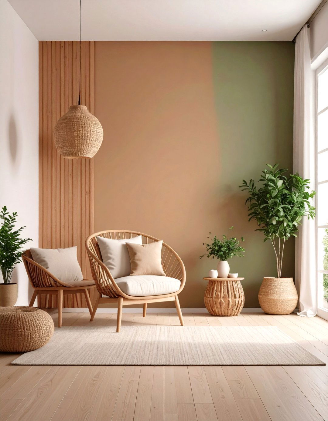
5. Earthy Terracotta Base, Beige Upper
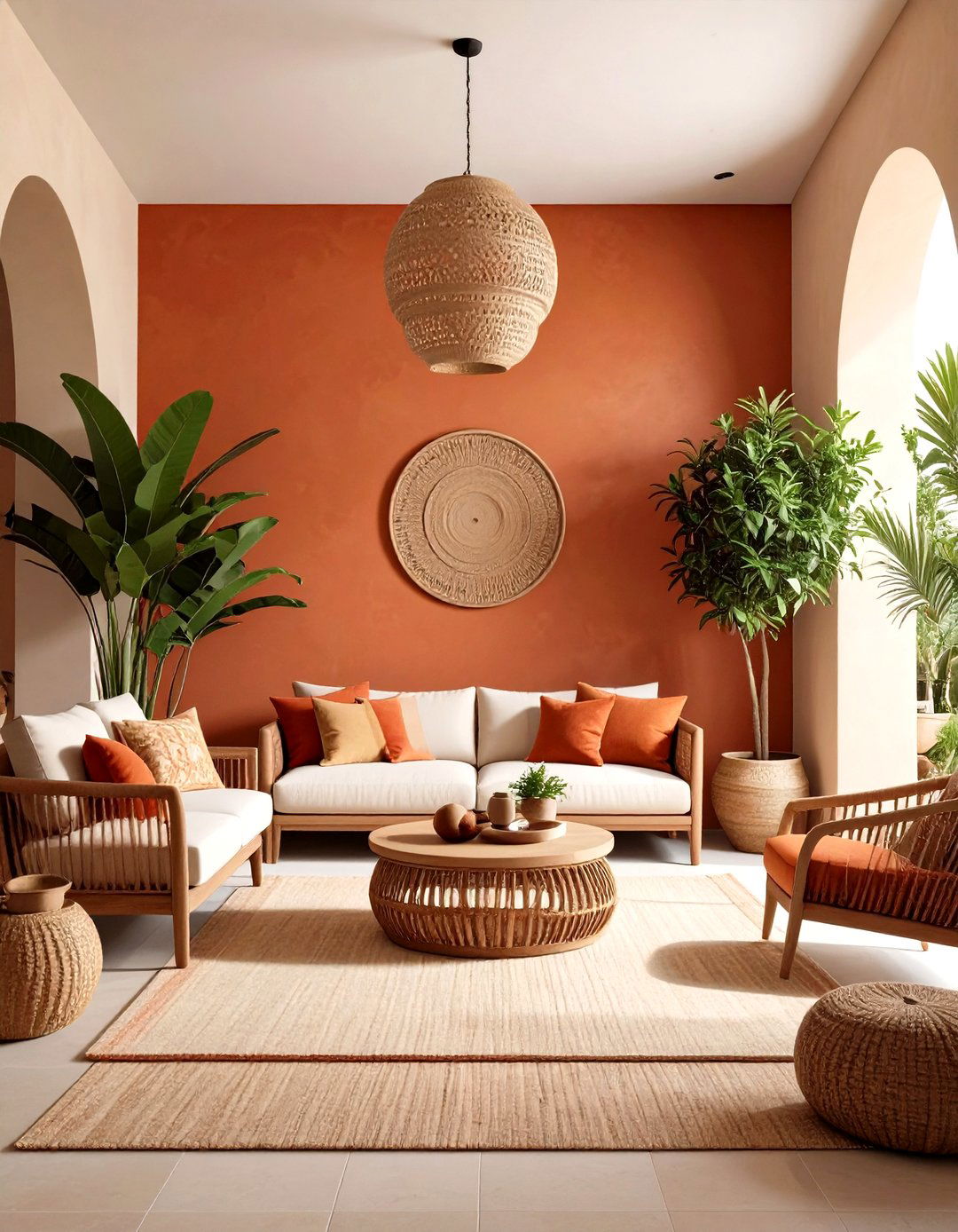
Bring warmth and organic character by painting the lower section a rich terracotta and the upper section a soft beige. Terracotta’s earthy undertones suggest a Mediterranean aesthetic, while beige keeps the room feeling spacious and neutral. This combination enhances wooden furniture and green plants, making it ideal for living areas or sunrooms.
6. Dramatic Black-and-White Contrast
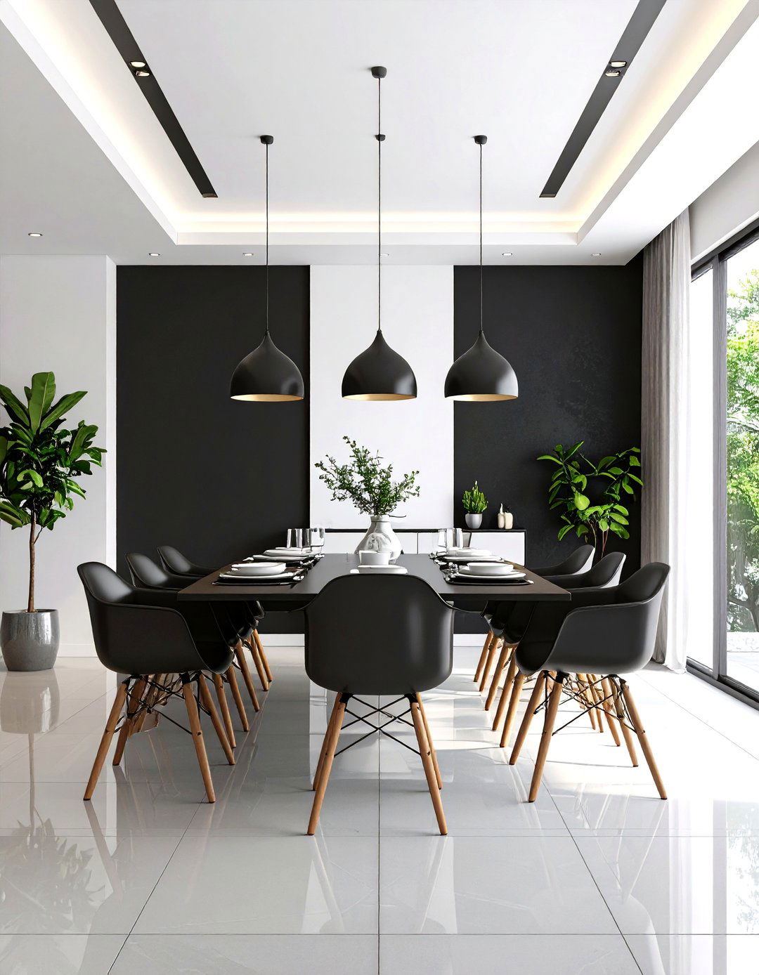
For a high-impact, modern look, pair a matte black lower half with a stark white upper half. The bold contrast commands attention and creates a sleek, gallery-like backdrop for artwork. Use this in dining rooms or entryways to make a strong design statement. Balance the drama with minimalist furnishings and metallic accents.
7. Jewel-Tone Emerald with Pale Gray
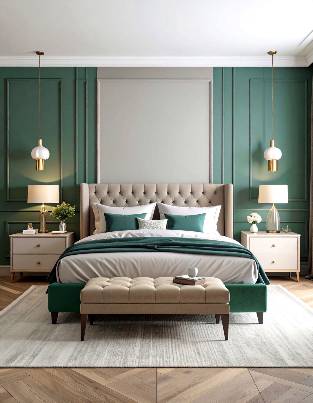
Combine an emerald green lower section with a pale gray upper section for a luxe, cocooning feel. Emerald’s depth adds richness, while gray maintains brightness and prevents the room from feeling too heavy. This duo is ideal for reading nooks or master bedrooms seeking a sophisticated, tranquil atmosphere.
8. Soft Ombre Gradient
Instead of a hard line, blend two shades of the same color in a gradient from bottom to top. For example, transition from dusty rose at the base to blush at the ceiling. This ombre effect feels airy and artistic, lending a sense of movement to the walls. It’s perfect for feature walls in bedrooms or creative studios.
9. Horizontal Banding in Three-Quarter Proportions
Paint the lower three-quarters of the wall one color (e.g., warm gray) and reserve the top quarter for a contrasting shade (e.g., mustard yellow). This slight variation from a half-and-half split draws the eye upward, visually raising the ceiling height. It works well in narrow spaces like hallways or over wainscoting.
10. Vertical Two-Tone Division
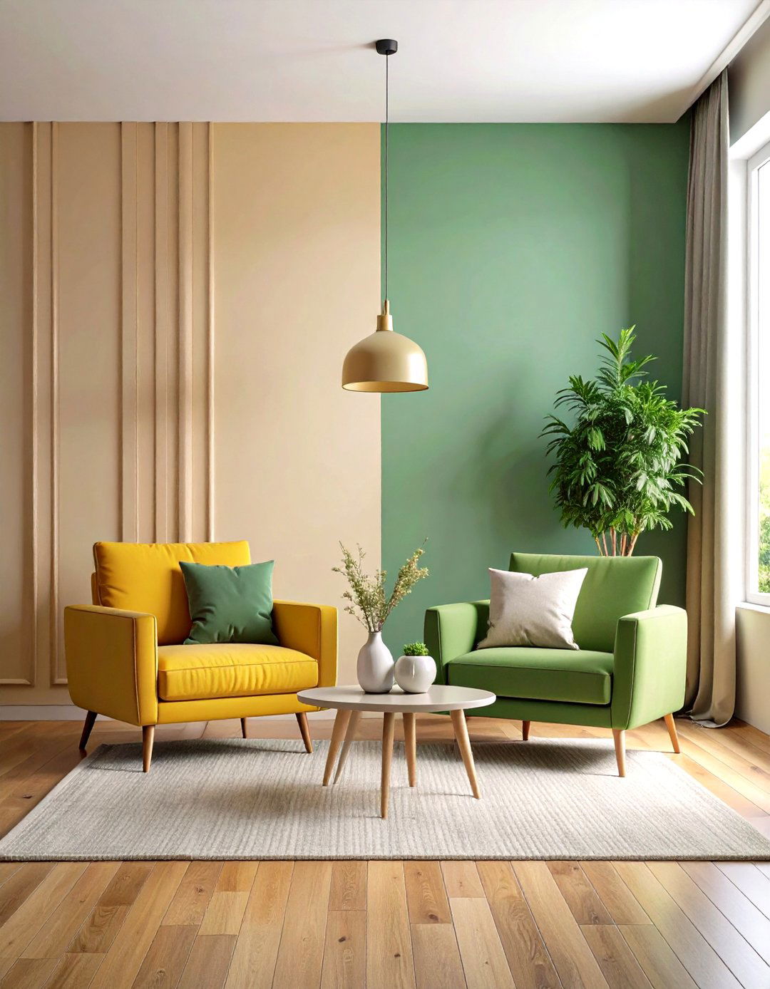
Split the wall vertically into two equal halves—one side painted a bold hue, the other a neutral. This sharp division adds a dynamic, modern edge and can define multi-functional rooms, such as combining a workspace and lounge area. It’s particularly striking behind sofas or beds as an asymmetrical headboard effect.
11. Diagonal Two-Tone Cut
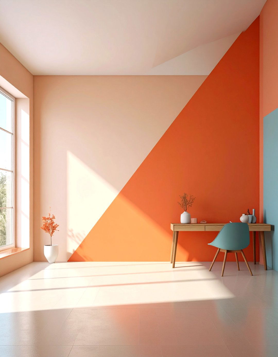
Cut the wall at a diagonal line from one corner to another, painting each resulting triangle a different color. A slanted division like terracotta below and cream above lends an unexpected architectural twist and energizes the space. Use it in creative studios or children’s rooms for playful flair.
12. Ceiling Carryover
Extend the upper color of your two-tone wall onto the ceiling to blur the boundary and make the room feel more expansive. For instance, paint both the top half of the walls and the ceiling a soft dove gray, with a contrasting charcoal gray below. This unifies ceiling height and creates cohesive drama.
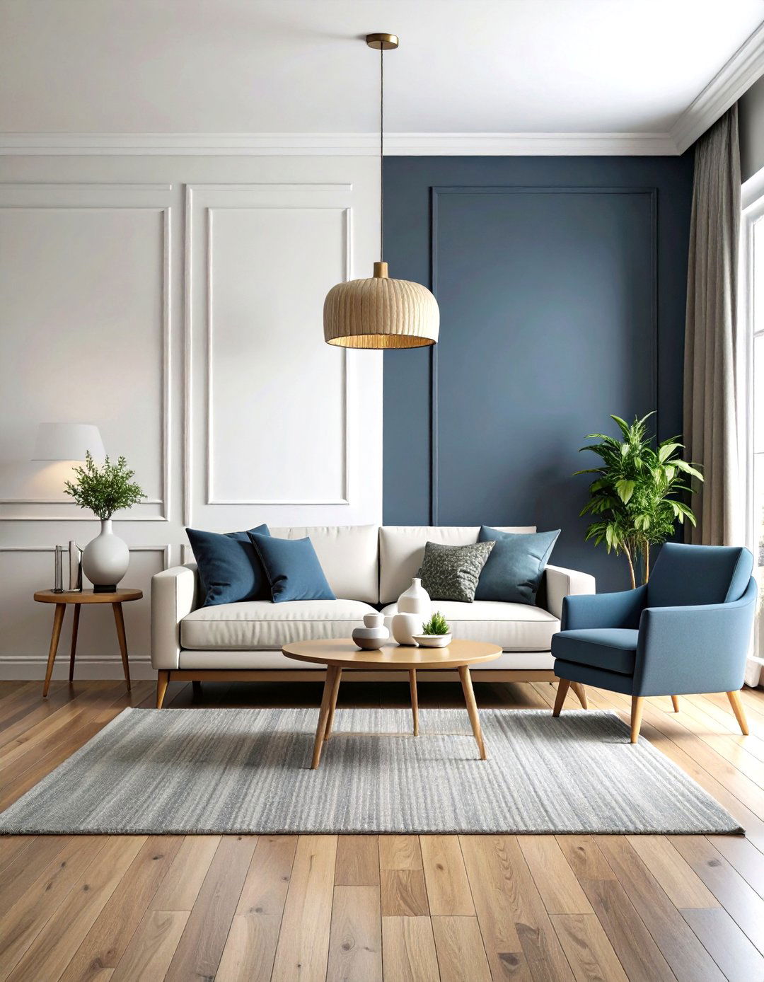
13. Accent Wall Two-Tone
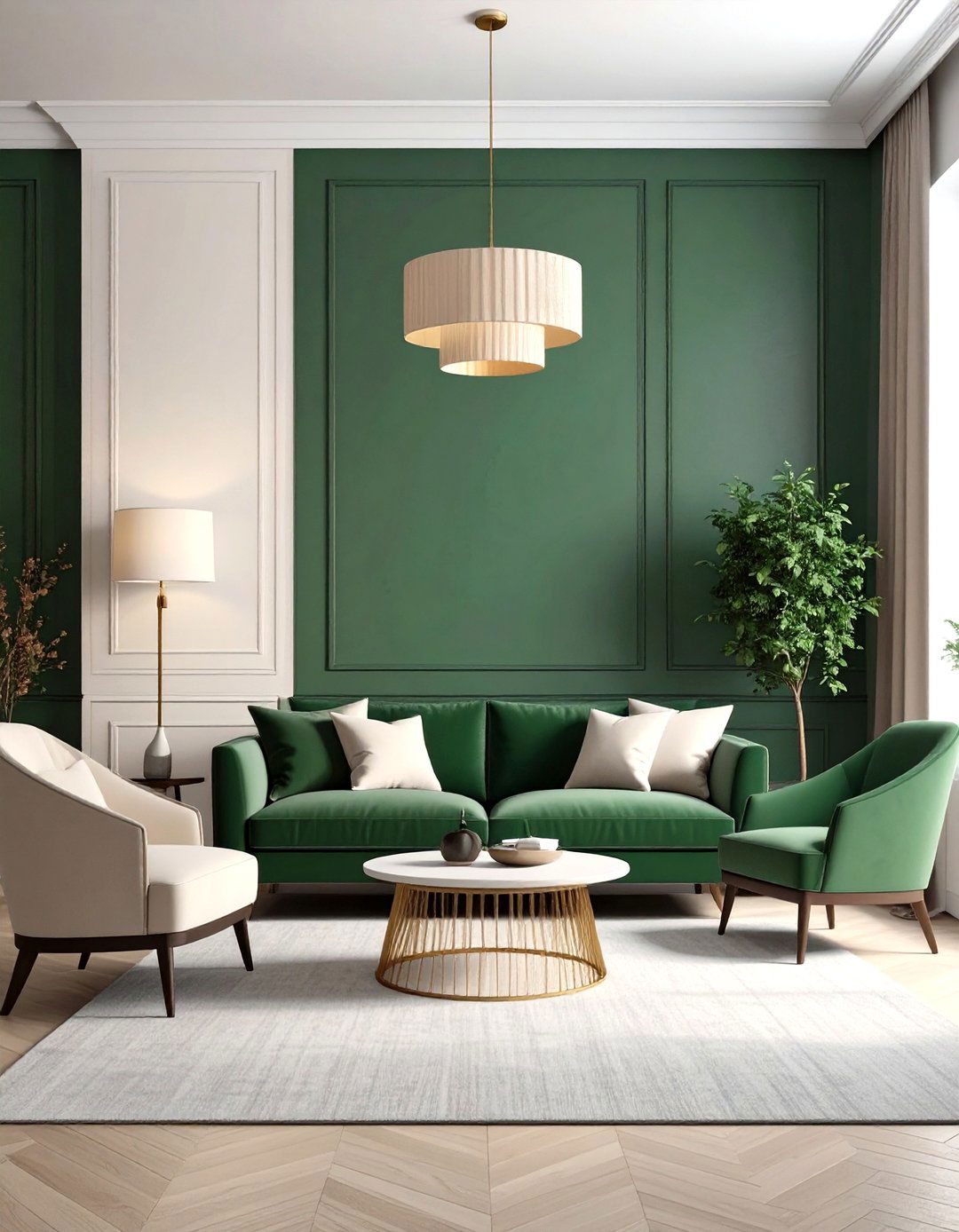
Rather than painting all walls, apply a two-tone scheme to a single accent wall. For example, use hunter green on the bottom and ivory above. This localized treatment draws focus to the chosen wall—ideal behind a fireplace or headboard. The surrounding walls remain neutral, allowing the accent to pop without overwhelming.
14. Wainscoting Style Paint
Mimic traditional wainscoting by painting the lower third of the wall in a mid-tone hue (such as dusty blue) and the upper two-thirds in off-white. This approach combines the elegance of panel molding with the simplicity of paint. It’s a cost-effective way to achieve a classic, refined look in dining rooms or foyers.
15. Geometric Color Blocking
Incorporate two tones in geometric shapes—rectangles, triangles, or abstract forms—across the wall. Pair a mustard base with a muted teal top, intersecting shapes for an artistic mural effect. This bold design suits living rooms or entryways where you want to make a creative statement.
16. Coastal Pastel Duo
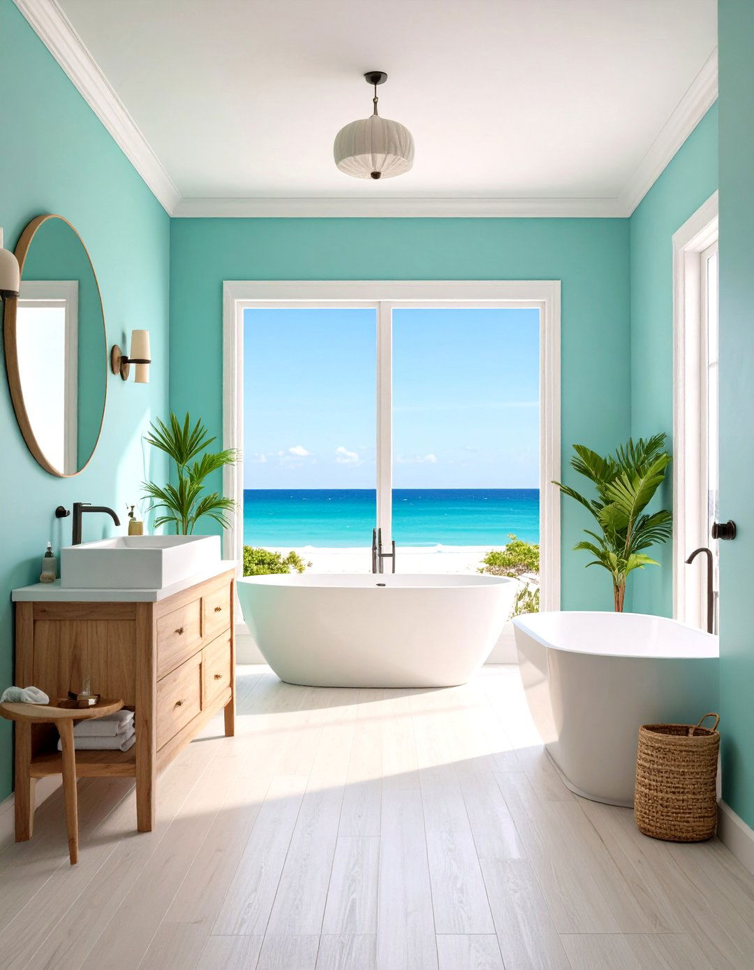
For a beachy vibe, paint the lower half in seafoam green and the upper half in sky blue. The soft pastel duo evokes the sea and sky, perfect for bathrooms or casual living spaces. White trim and natural fibers in furnishings complete the coastal theme.
17. Warm Minimalism with Taupe and Cream
Combine a warm taupe base with a creamy white top for a minimalist yet cozy atmosphere. The neutral pairing provides a serene backdrop that complements Scandinavian or Japandi interiors. Use this versatile scheme in any room for a balanced, stylish look.
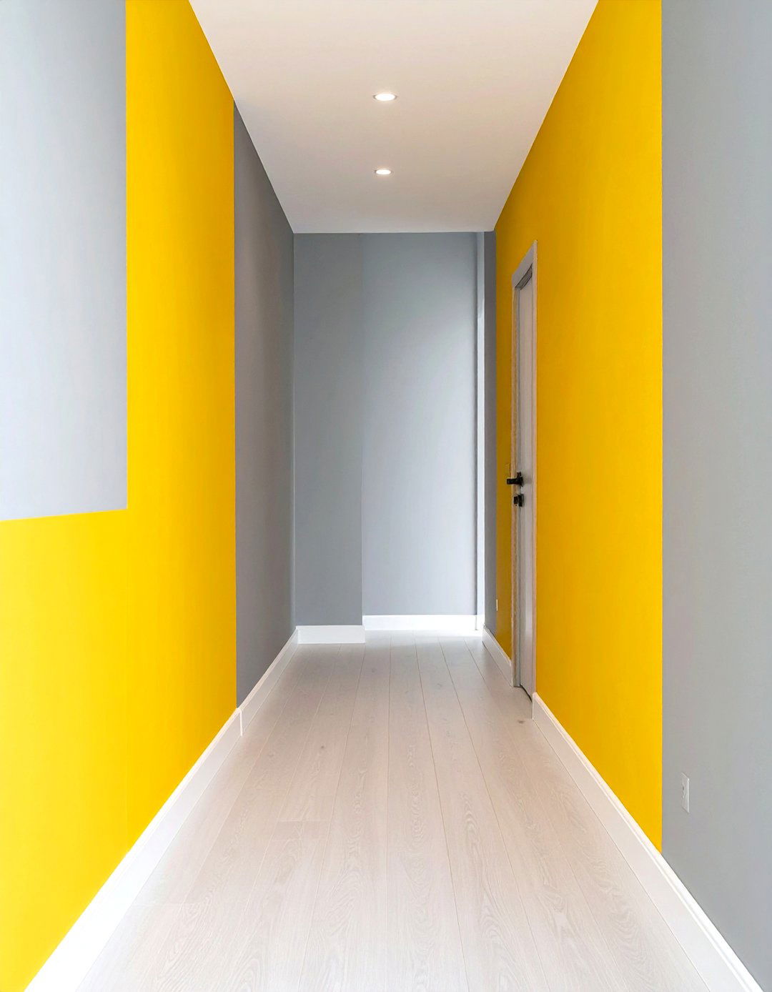
18. Bold Primary Color Block
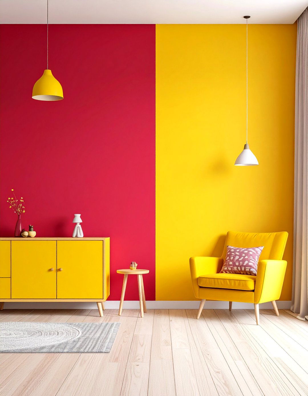
Embrace playfulness by pairing bold primary colors—such as a crimson lower half with a sunny yellow upper half. This energetic combination energizes kids’ rooms or creative workspaces. Balance with simple furniture and neutral accents to prevent visual overload.
19. Subdued Naturals: Olive and Stone
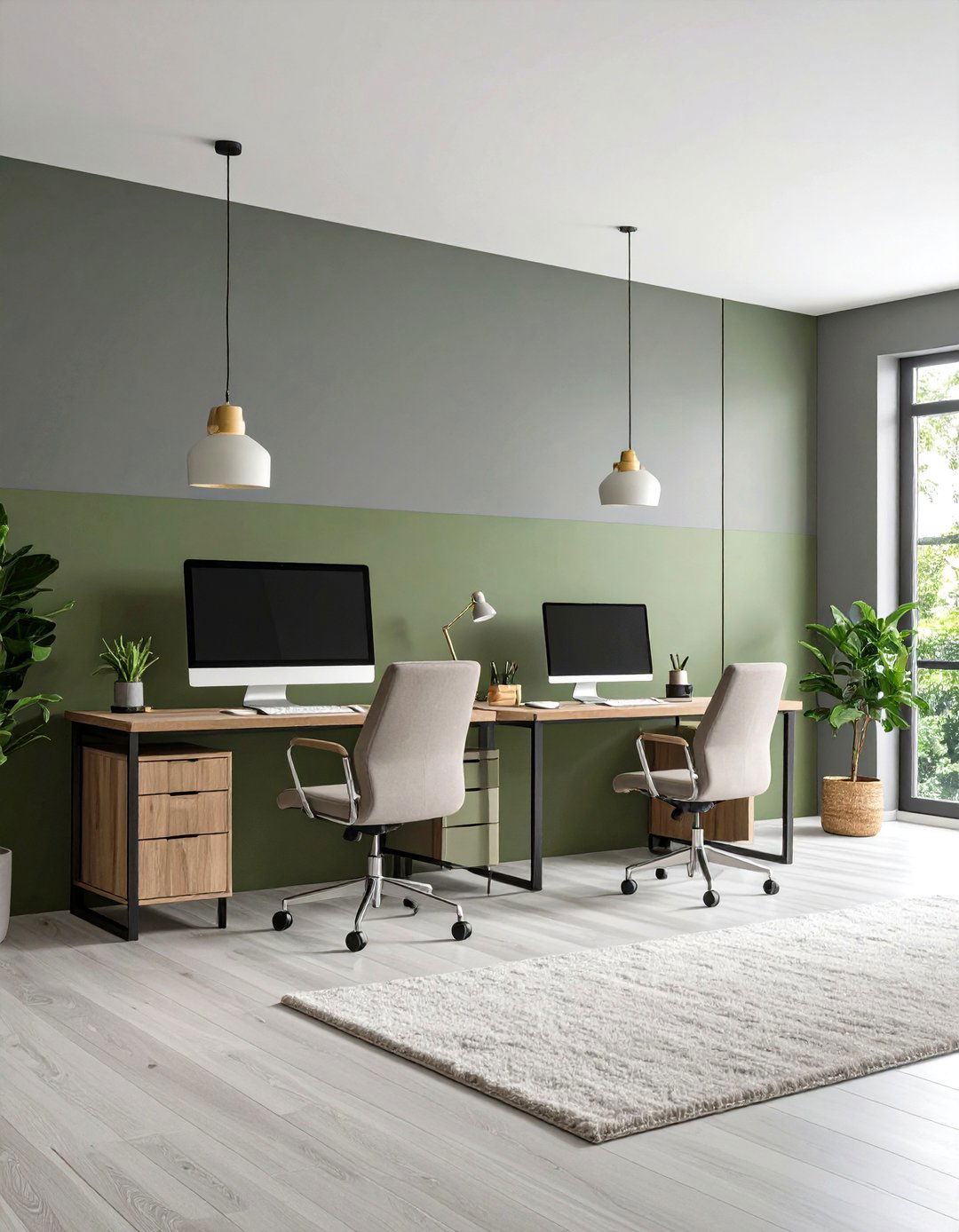
Pair a muted olive green lower portion with a stone gray upper portion for an organic, grounded feel. The natural palette fosters calm and connects indoor spaces with nature. It’s especially suitable for home offices or zen-inspired reading corners.
20. Metallic Accent with Silver and White
For a touch of glamour, paint the lower half in a pearlescent silver and the upper half in bright white. The metallic sheen adds subtle luxury without being overly flashy. This chic two-tone combo works wonderfully in entryways or powder rooms, reflecting light and elevating small spaces.
Conclusion:
Two-tone wall painting offers endless opportunities to infuse personality, depth, and architectural interest into your home. Whether you prefer classic splits, bold contrasts, or creative patterns, selecting the right color pair and proportion can transform any room from ordinary to extraordinary. Use these 20 ideas as inspiration to experiment with your space—mix and match hues, play with proportions, and don’t be afraid to push the boundaries of traditional wall treatments. With thoughtful color choices and precise execution, two-tone walls will become your new favorite design tool.
Related posts:
Leave a Reply