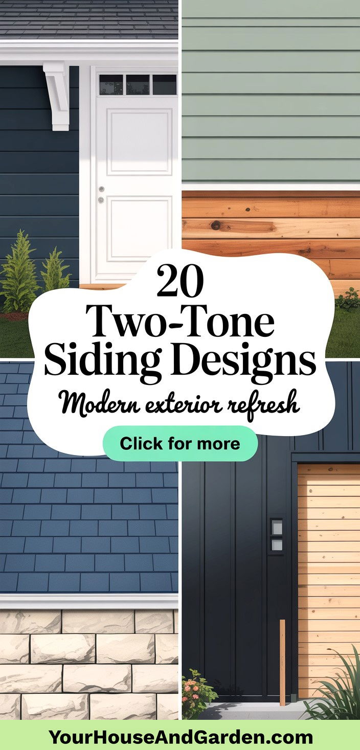
Two-tone siding is a versatile approach to refresh a home’s exterior by combining two distinct colors or materials, creating visual interest and accentuating architectural features. It draws on cladding and siding design principles that include mixing materials such as timber and stone to improve insulation and aesthetic appeal. Utilizing two-tone siding can enliven plain exteriors, highlight focal points like bump-outs or gables, and boost curb appeal across architectural styles. In this article, we explore 20 innovative two-tone siding designs—from bold modern statements to timeless harmonious palettes—sourced from leading industry insights.
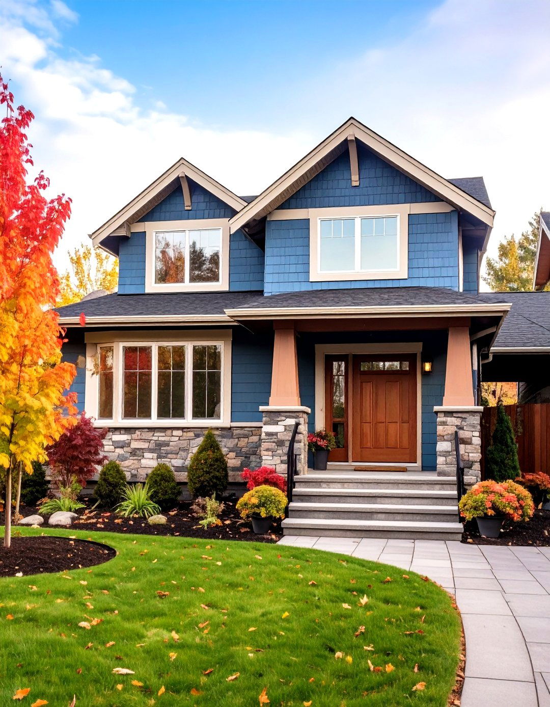
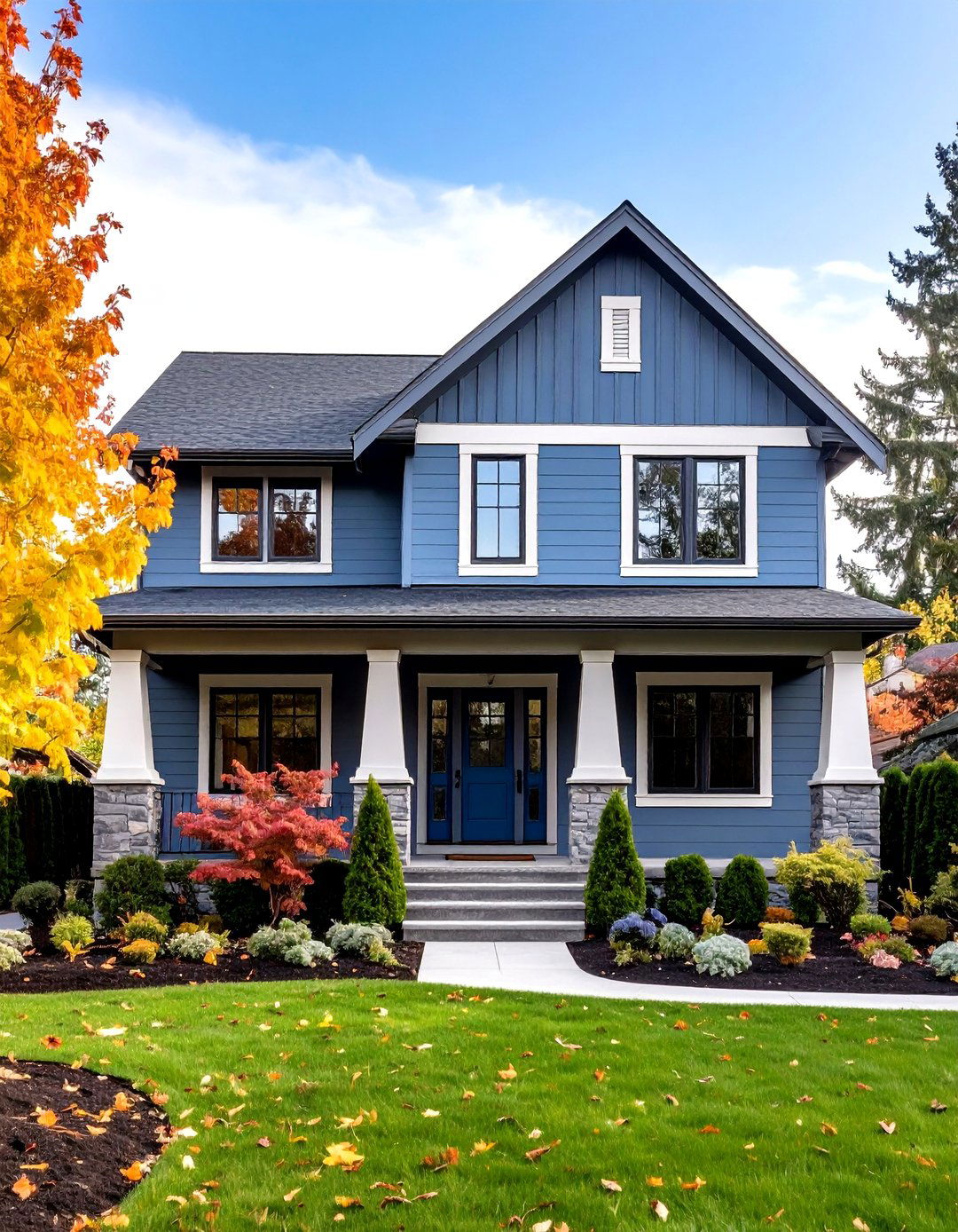
1. Contrasting Modern Facade
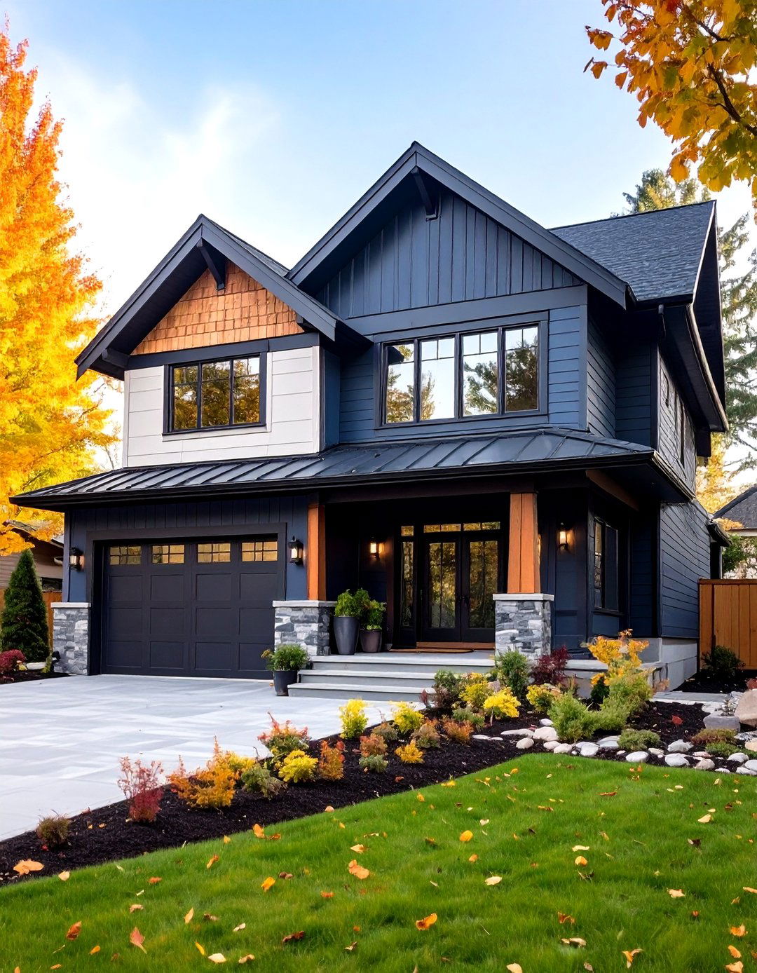
The Contrasting Modern Facade approach harnesses bold interplay between darker accent tones and lighter base colors to emphasize structural elements such as window surrounds, trim, or gables. By strategically applying a deep shade—often charcoal, navy, or espresso—on secondary siding features against a pale or neutral background, this design creates a crisp, geometric look that draws the eye and adds depth. This dual-tone technique not only highlights architectural forms but also balances visual weight, ensuring neither tone overpowers the other. Homeowners seeking a sleek, contemporary exterior often choose contrasting facades to make a memorable statement while maintaining harmony across materials.
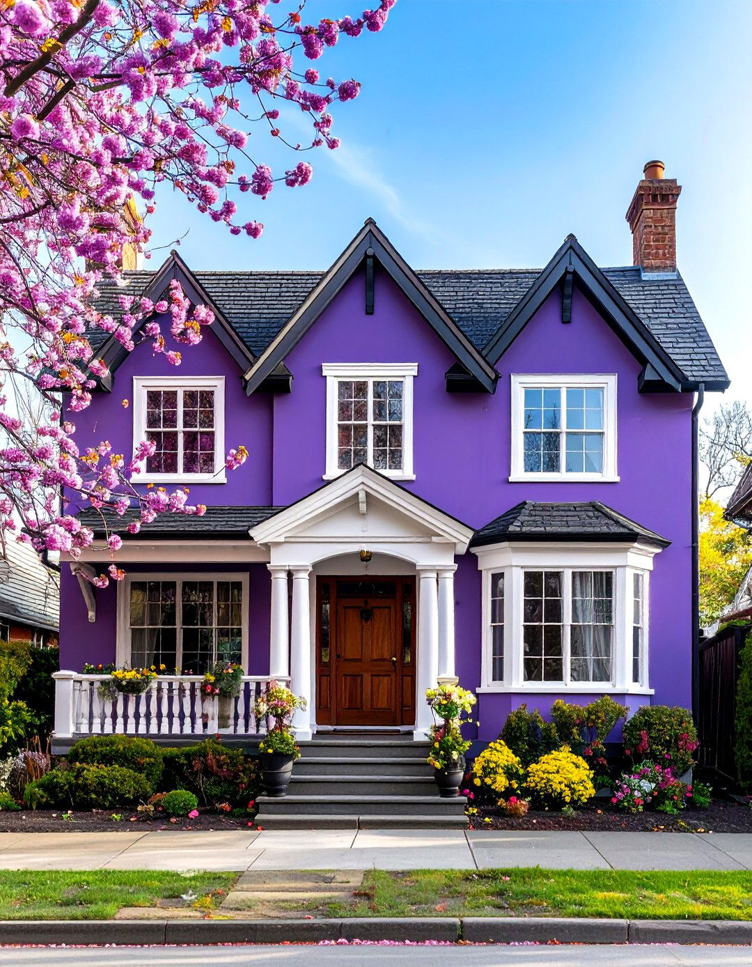
2. Bold Color Partnerships
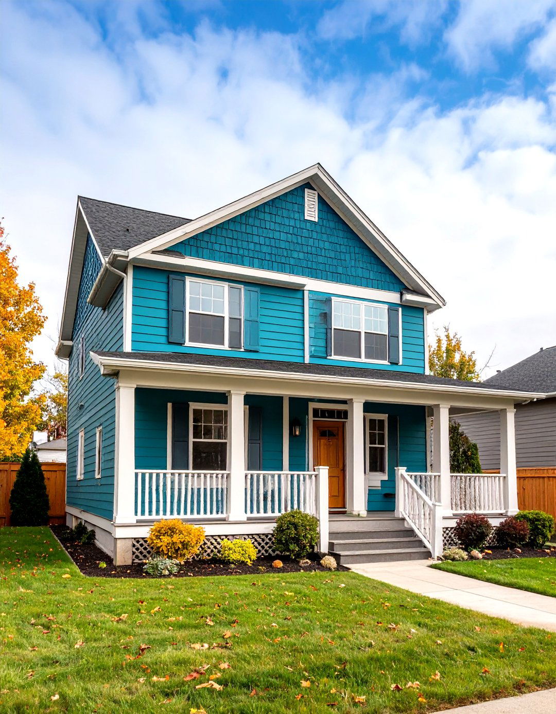
Bold Color Partnerships inject vitality into home exteriors through pairing high-energy hues with more reserved neutrals. For example, combining a vibrant accent—such as a saturated teal or fiery red—on a prominent gable or entryway with a softer, complementary neutral on the main siding creates a focal point that is both dynamic and balanced. This two-tone strategy adds personality and dimension without overwhelming the eye, allowing distinct architectural details to stand out. By thoughtfully selecting colors based on complementary or analogous relationships on the color wheel, homeowners can create a visually arresting facade that remains cohesive and elegant.
3. Subtle Contemporary Two-Tone
Subtle Contemporary Two-Tone designs favor nuanced variations in shade rather than stark contrasts, achieving an understated yet refined exterior. This approach might involve selecting two hues from the same color family—like muted sage and stone gray—and applying them to different siding sections. The minimal tonal difference enables the home to blend seamlessly with its surroundings while still offering visual interest and texture. Architectural features such as bump-outs, dormers, or trim elements are ideal candidates for the lighter or darker tone, guiding the gaze naturally across the facade. This quiet elegance appeals to modern and traditional tastes alike, providing a versatile backdrop for landscaping and outdoor accents.
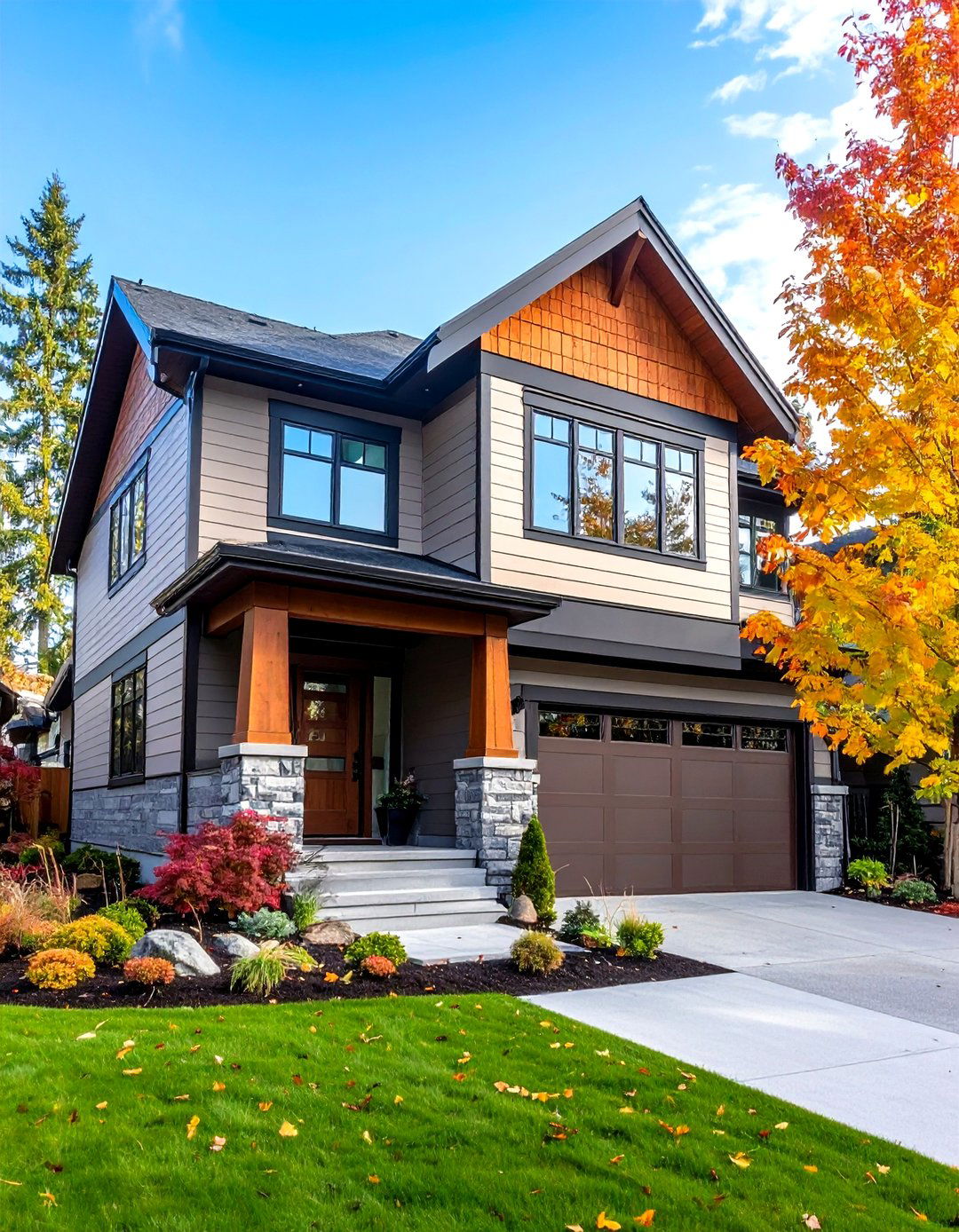
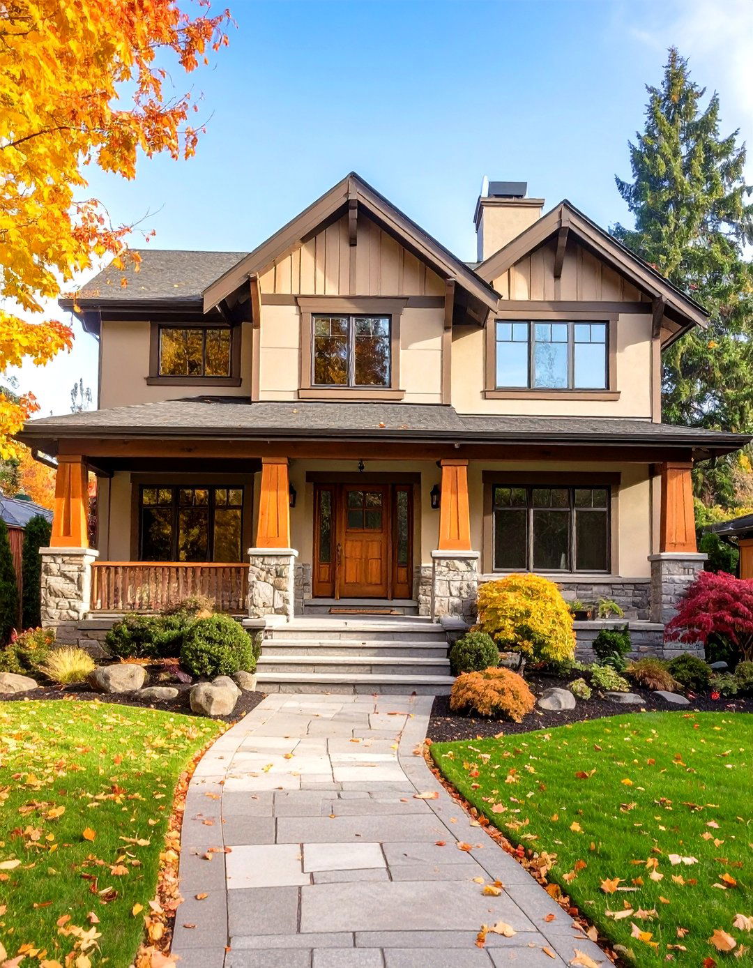
4. Classic and Modern Blend
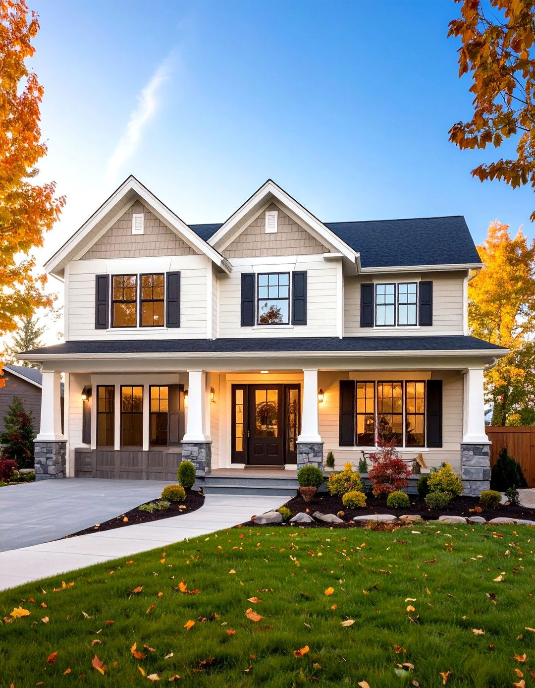
Classic and Modern Blend marries enduring color palettes with contemporary accents to evoke both heritage and innovation. By applying timeless neutrals—like ivory, taupe, or warm beige—on the primary siding and pairing them with bold modern tones on select elements, homeowners create a dynamic visual narrative. This technique respects traditional architectural forms while introducing fresh energy through unexpected color placements. Whether highlighting window surrounds, entry porches, or architectural brackets, the secondary hue breathes new life into period-inspired facades. The result is an exterior that feels both anchored in history and eager for the future, appealing to enthusiasts of transitional design.
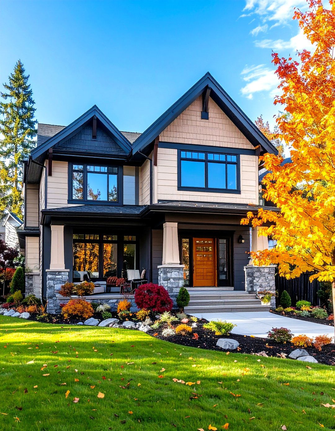
5. Architectural Contrast Detailing
Architectural Contrast Detailing emphasizes precise color placement to draw attention to intricate siding details such as trim moldings, corner boards, and fascia. A high-contrast two-tone palette—often pairing dark charcoal or black accents with a light backdrop—sculpts the eye along linear and geometric features, accentuating craftsmanship. This technique can transform an otherwise standard installation into a curated display of form and function, turning moldings and trim into focal art pieces. It is particularly effective on homes with abundant decorative trim or on modern builds seeking a sculptural aesthetic. By calibrating contrast levels, designers ensure that each element is visible and impactful without visual clutter.
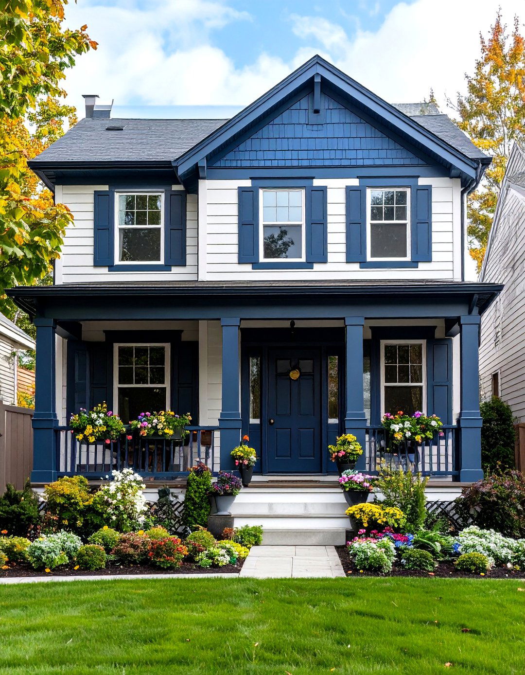
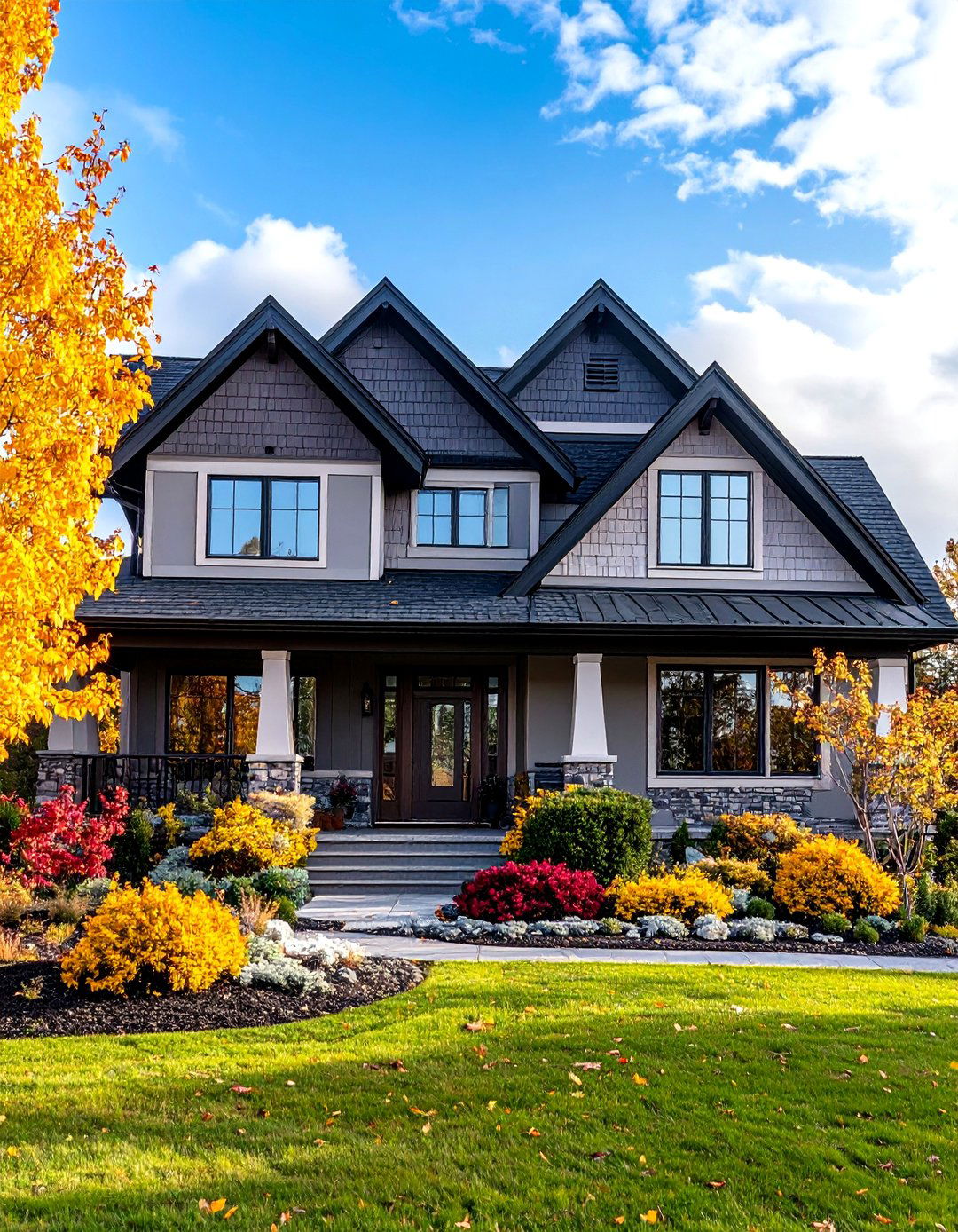
6. Sophisticated Light and Dark Contrast
Sophisticated Light and Dark Contrast elevates two-tone exteriors by pairing airy, luminous shades with deep, dramatic hues. This approach brings rhythm and balance—light tones illuminate broad siding fields, while rich dark hues on accents like entryways or window frames ground the design. The fluid interplay between light and dark refracts natural light throughout the day, highlighting textures and profiles. Whether using soft cream and graphite or pale gray and navy, this palette creates depth and sophistication without resorting to overly bold colors. Homeowners benefit from a timeless aesthetic that adapts gracefully to evolving styles and stands up to environmental wear.
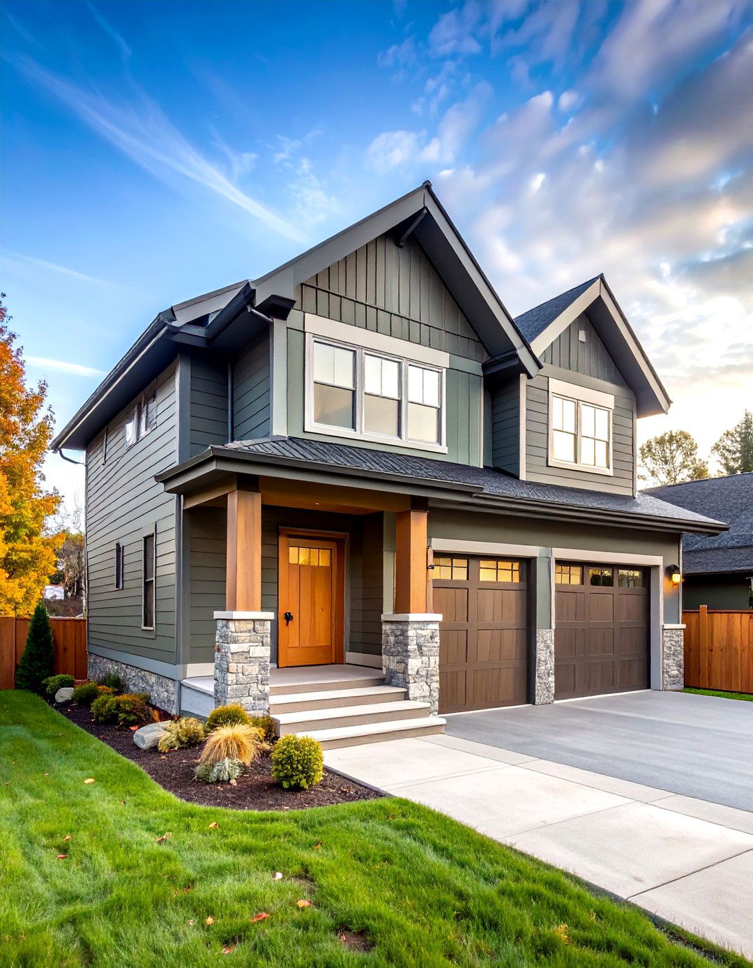
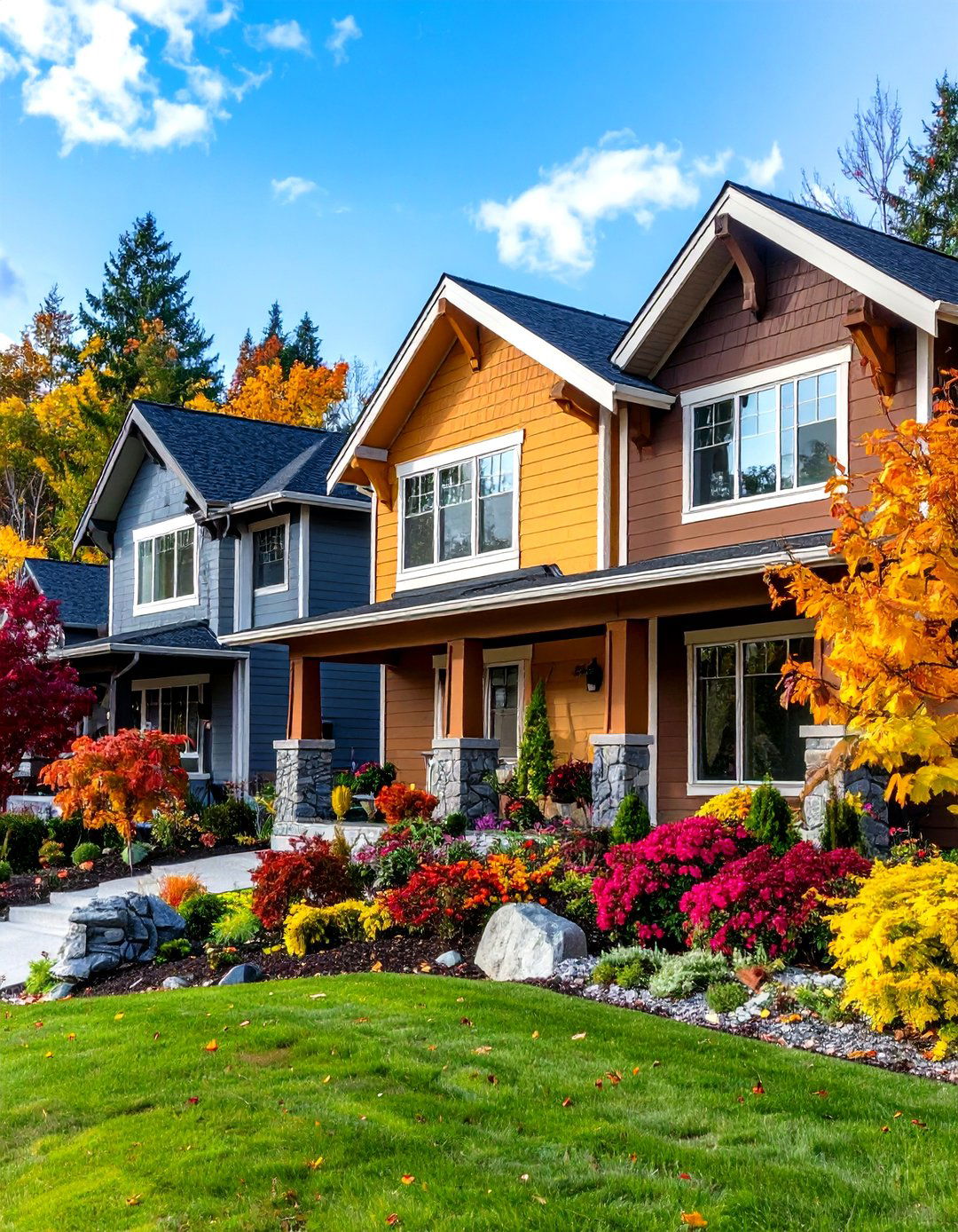
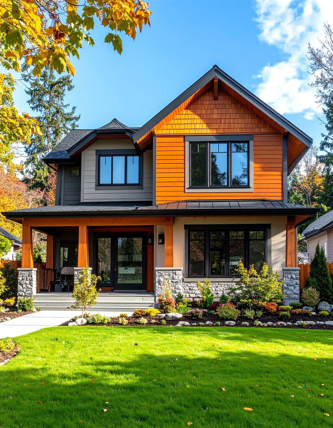
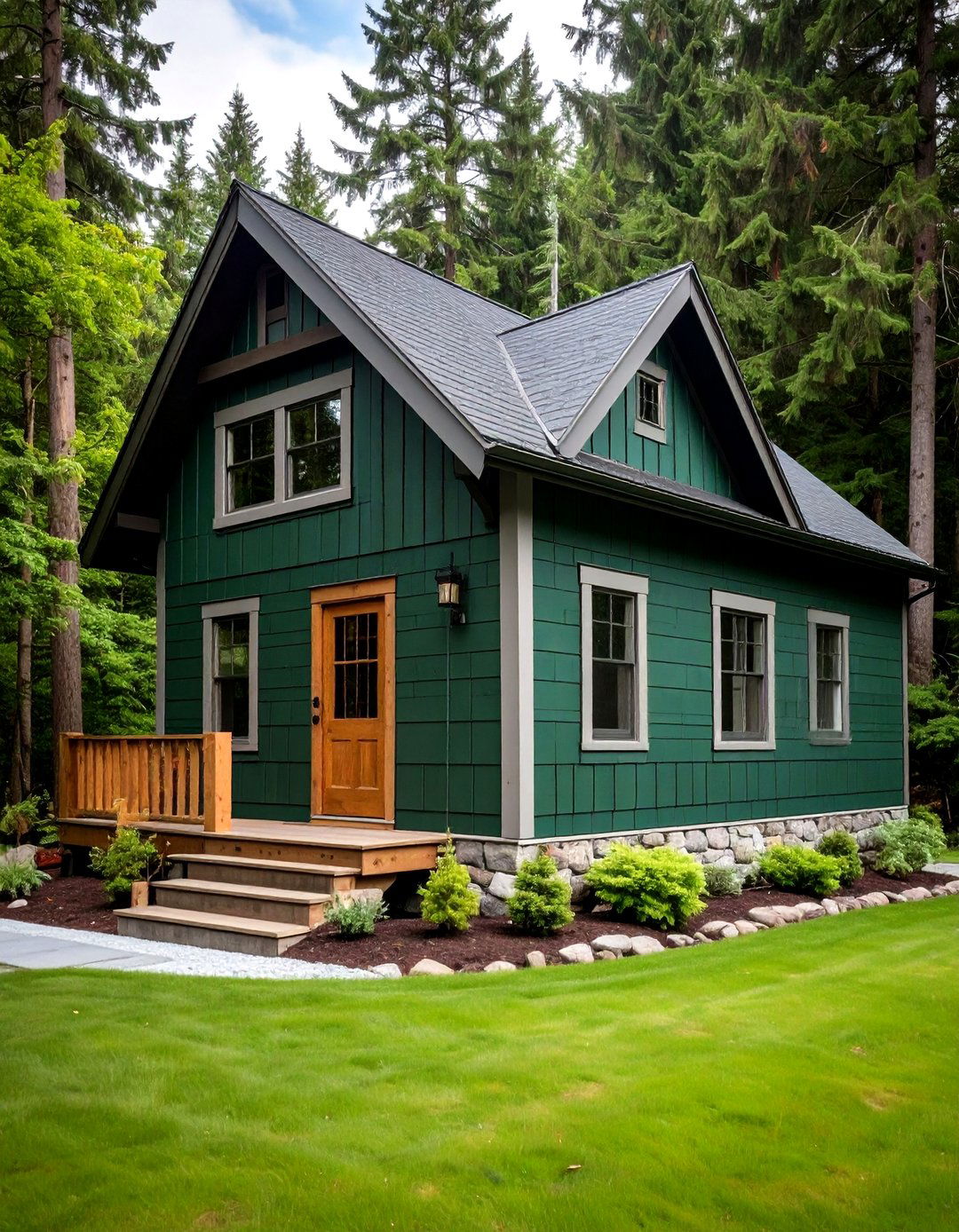
7. Vibrant and Earthy Combo
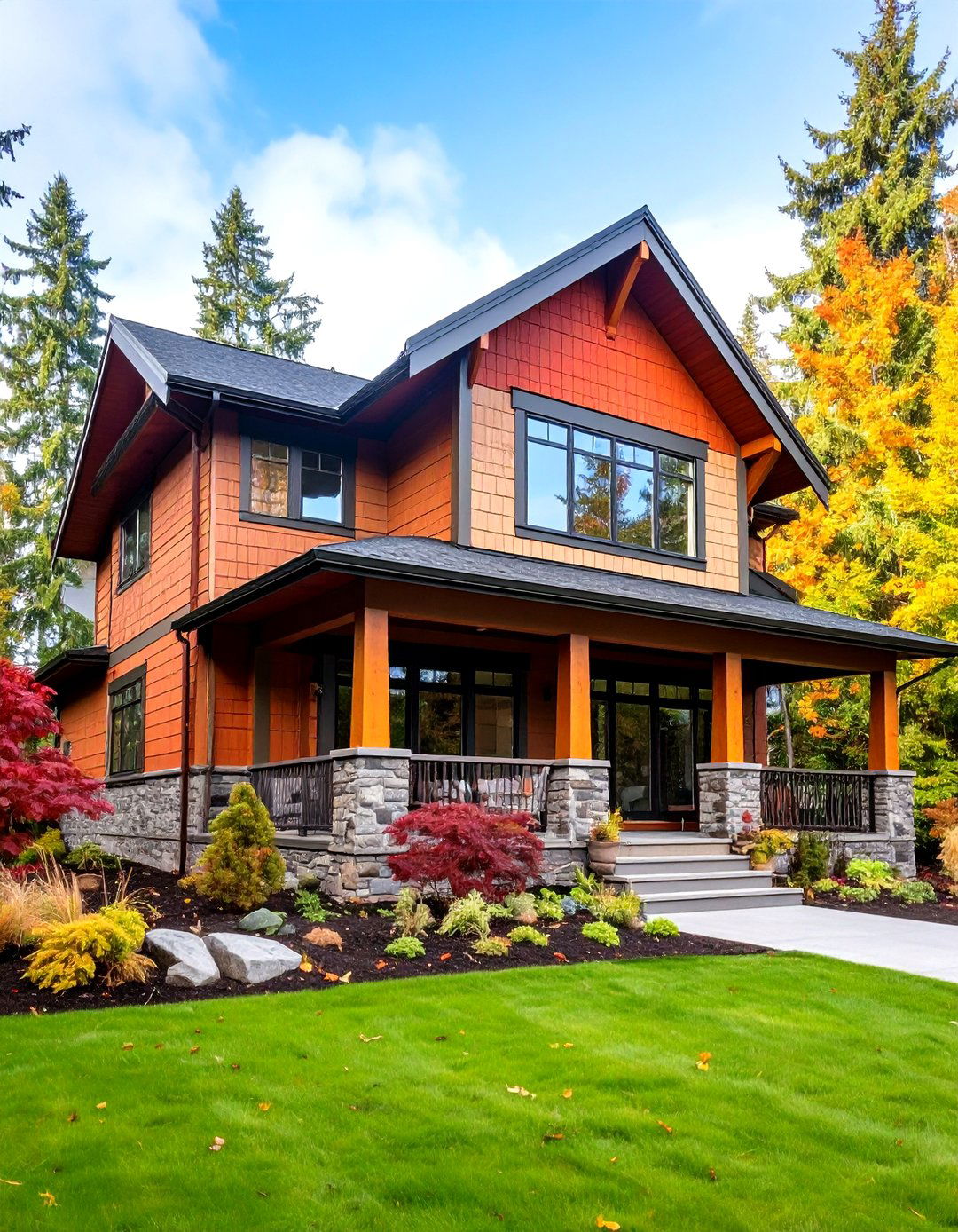
Vibrant and Earthy Combo fuses energetic accent colors with grounding, natural tones to form an inviting, earth-inspired exterior. For instance, a terracotta or mustard accent on a gable or dormer can pop against an olive or sand-colored base siding. This contrasting fusion evokes material beauty—akin to terracotta pottery rising from sandy landscapes—while tying visually to natural surroundings. The inherent warmth of earthy neutrals ensures the design remains approachable, even with vibrant highlights. By balancing color temperature and saturation, homeowners achieve a facade that feels lively yet harmonious, ideal for settings with abundant greenery or rugged terrain.
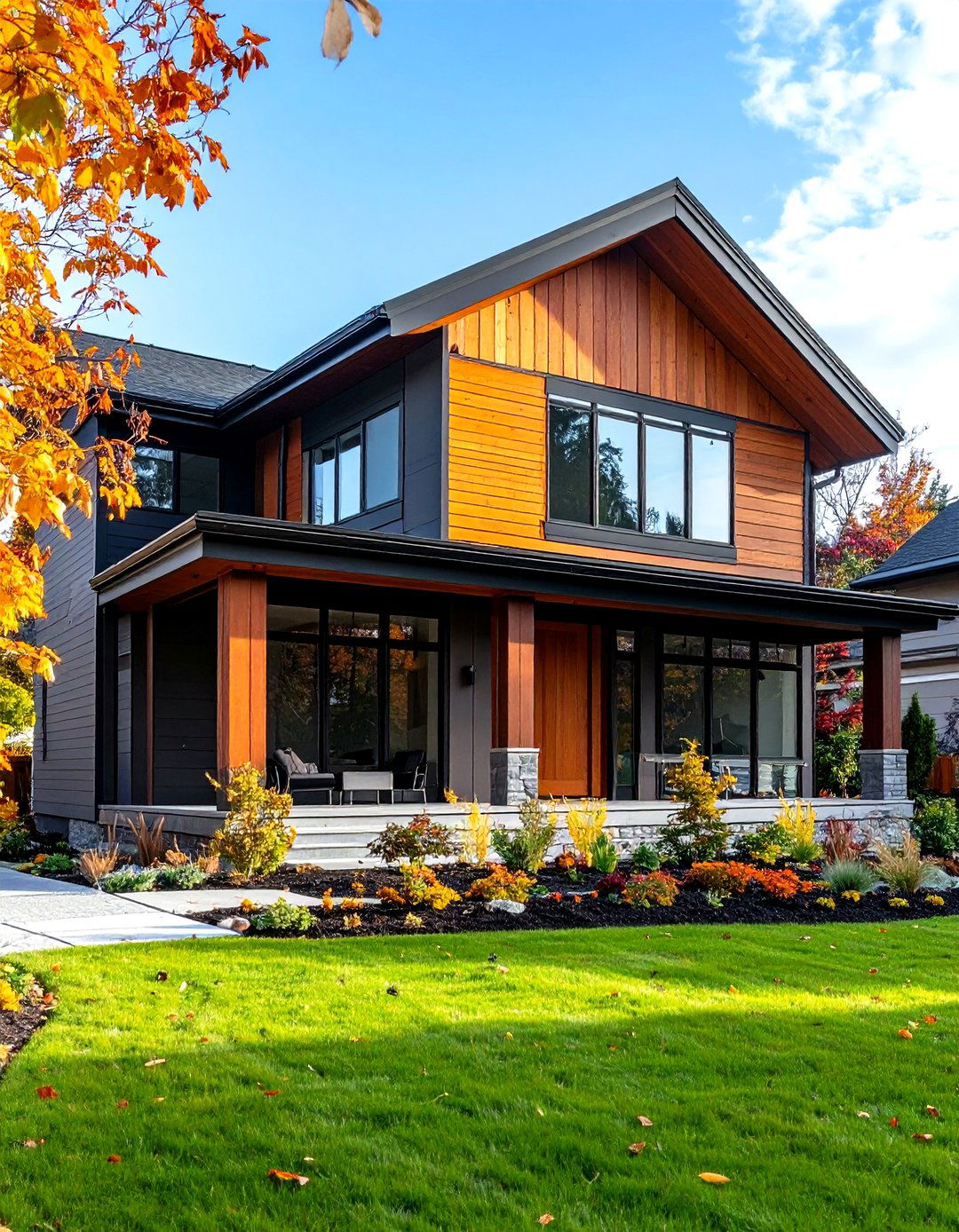
8. Enhanced Texture Definition
Enhanced Texture Definition leverages the interplay between color and material finish by applying contrasting hues across differently textured siding. A darker tone might cloak smooth lap siding, while a lighter shade highlights shingle or board-and-batten sections, enhancing perceived depth. This method accentuates the tactile qualities of each material, making transitions between textures more pronounced. It is especially useful on multi-material exteriors, where stone, wood, and engineered siding meet. By matching color contrast to texture lines, designers can choreograph dynamic visual paths that lead the eye along façades, doorways, and rooflines, enriching both form and function.
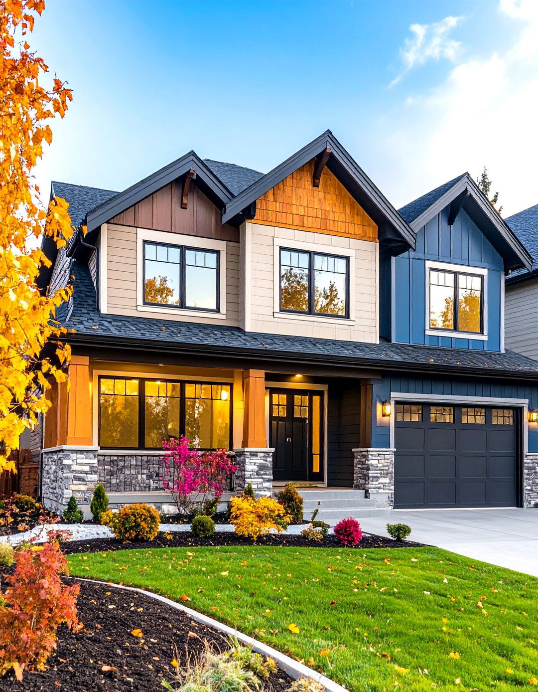
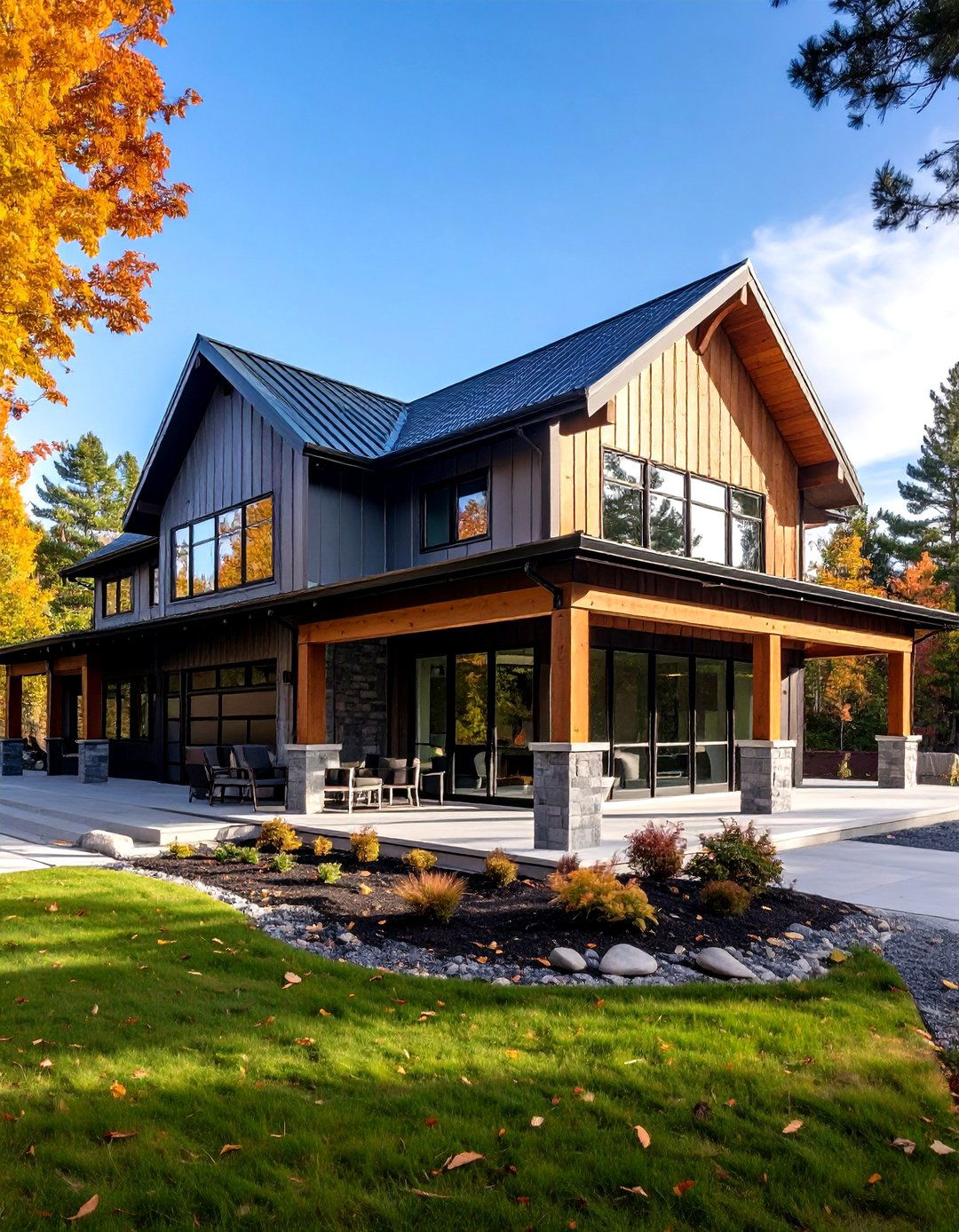
9. Dynamic Visual Layers
Dynamic Visual Layers introduce complexity through a structured layering of multiple tones within a two-tone scheme. Starting with a neutral or base color on the main field, slightly darker or lighter hues are then applied to secondary elements like oversize trim boards, shutters, or foundation sections. The subtle gradations create a sense of movement, as though colors are drifting across the building surface. This technique blends minimalism with depth, producing a lively yet disciplined aesthetic. Homeowners drawn to modernist principles often choose this design to accentuate horizontal and vertical lines, crafting compositions that feel both intentional and fluid.

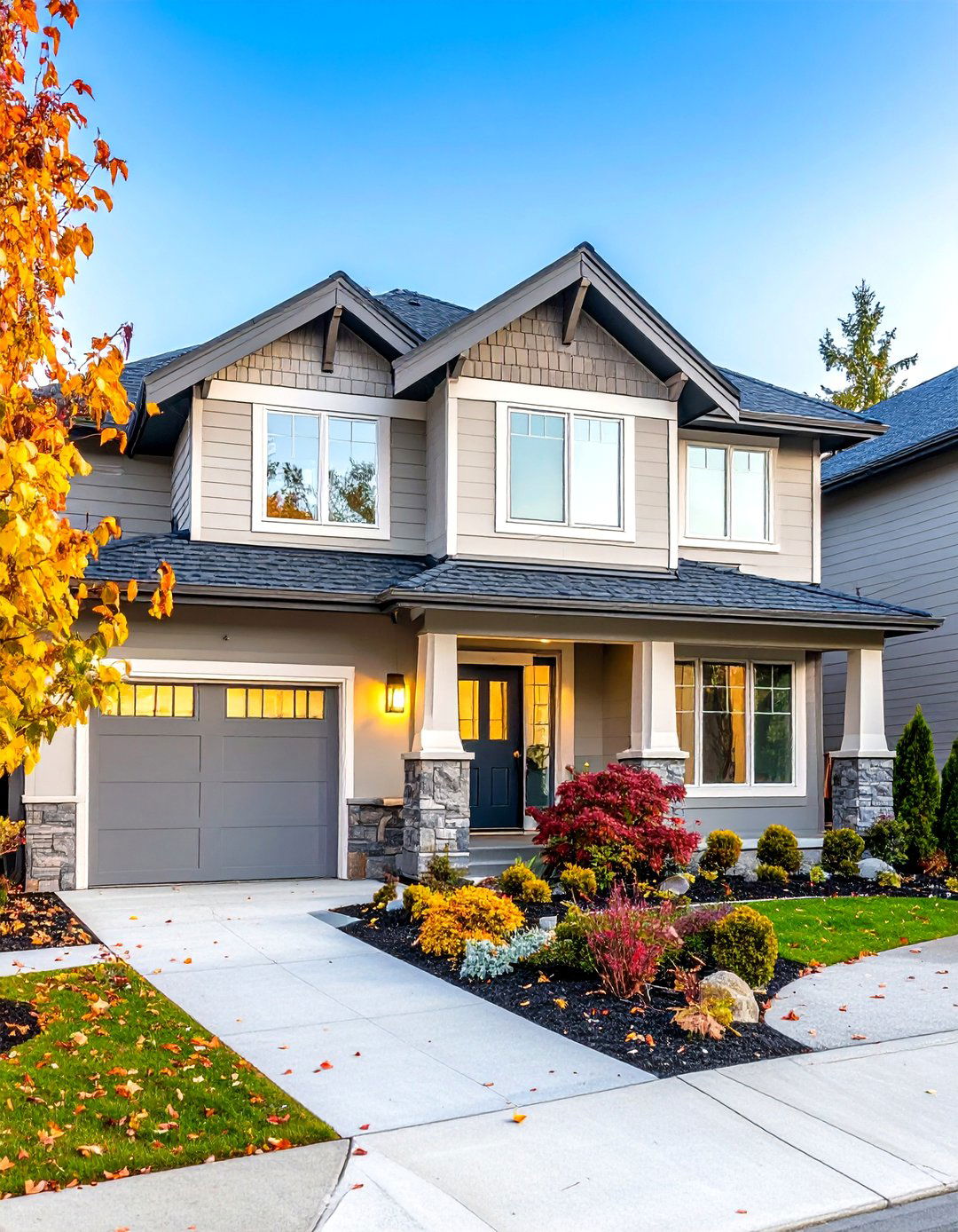
10. Timeless Dual Tone Charm
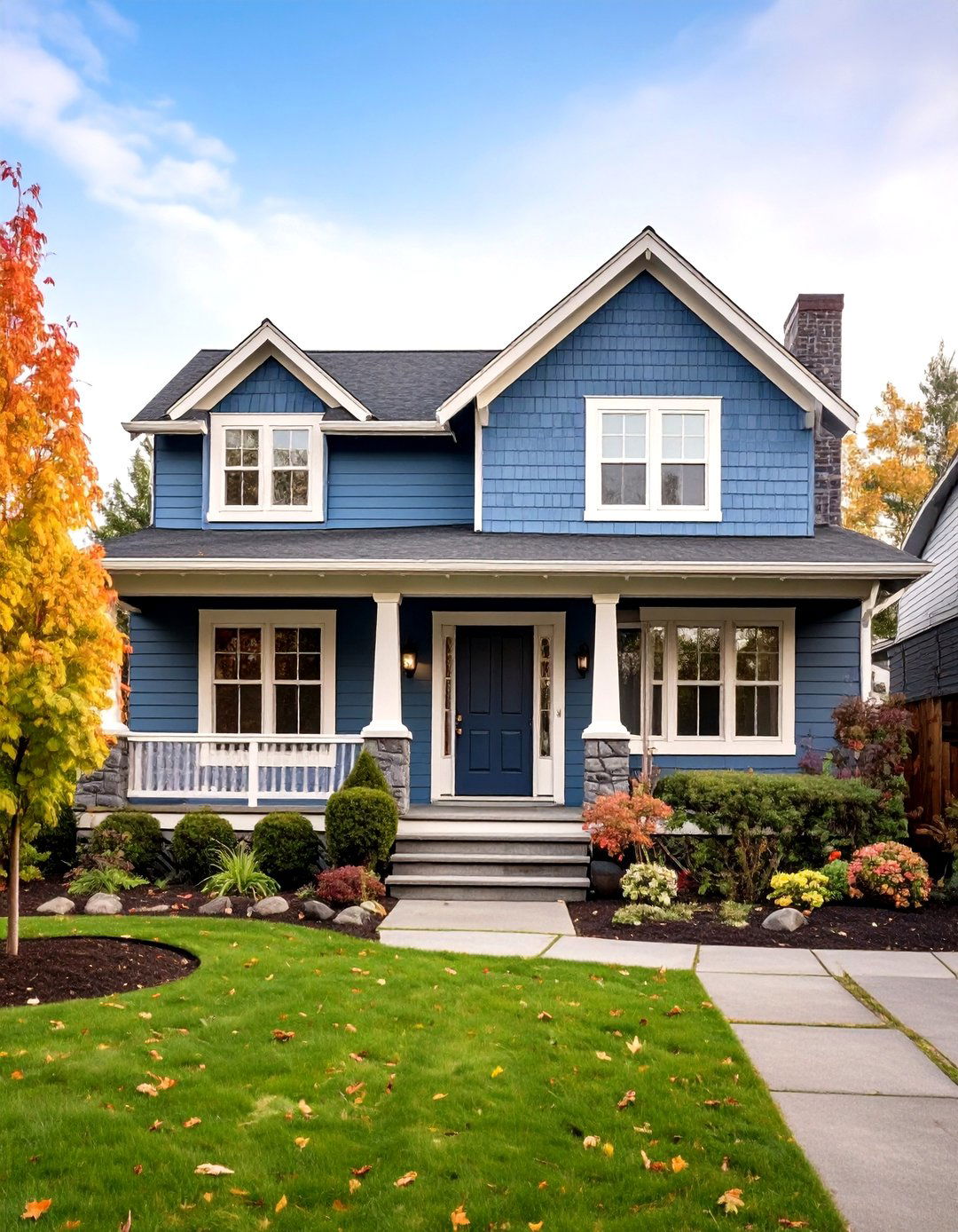
Inspired by enduring classics, Timeless Dual Tone Charm relies on soft, balanced contrasts—like ivory paired with slate or cream against taupe—to deliver a serene and welcoming facade. The moderate difference in hue is enough to define architectural features without creating high drama, making this design well-suited for traditional and coastal homes. By placing the lighter tone on larger, sun-facing elevations and reserving the deeper shade for sheltered or subordinate areas, homeowners optimize reflection and absorption of daylight. This thoughtful spatial distribution yields a luminous exterior that remains visually consistent throughout the day.
11. Sleek Urban Exterior
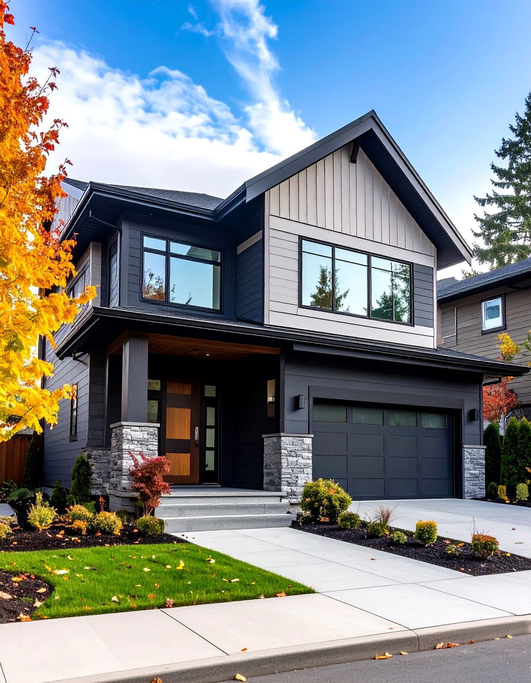
Sleek Urban Exterior channels metropolitan sophistication through crisp lines and a disciplined two-tone overlay. Common pairings include charcoal or graphite with off-white or light gray, emphasizing angular rooflines and box formations. This palette echoes urban materials like concrete and steel, positioning siding panels as architectural statements. Perfect for townhomes, loft conversions, and modern infill projects, the design enhances visual coherence within dense streetscapes, allowing each element—trim, panel orientation, and fenestration—to be accentuated. The result is a facade that feels both current and contextually respectful.
12. Crisp Color Coordination
Crisp Color Coordination streamlines selections by using complementary yet restrained hues that reinforce symmetry and balance. A popular choice is pairing cool neutrals such as soft gray with muted blue, or warm grays with dusty rose accents. Trim, fascia, and soffits receive the secondary tone, creating consistent visual punctuation around openings. This method requires minimal variation in brightness between colors, ensuring a subtle but elevated effect. By controlling contrast levels, homeowners can highlight specific architectural clues—window mullions or porch railings—without overshadowing the primary siding field.
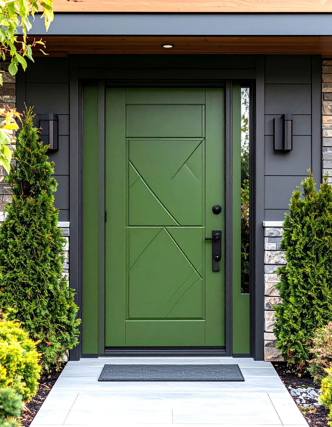
13. Refined Accented Details
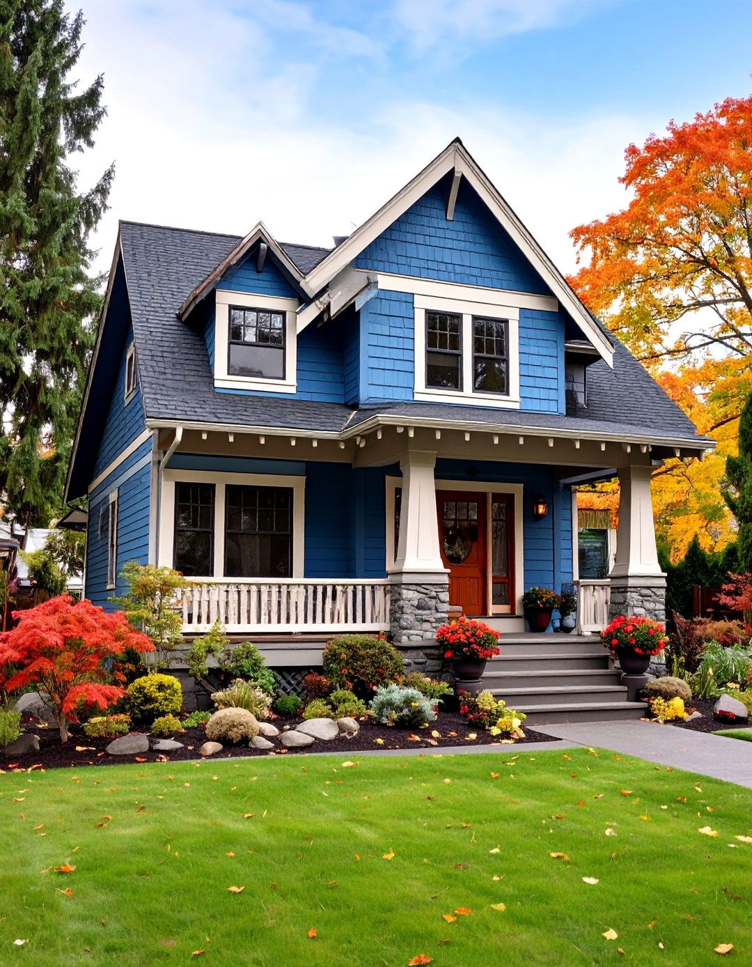
Refined Accented Details focus color treatments on small-scale architectural components like corner boards, gable vents, and entry porticos. A darker accent provides definition, while a lighter primary color forms a gentle backdrop. This approach is akin to spotlighting jewelry: the accent shade frames each detail, making it more noticeable and aesthetically pleasing. Ideal for craftsman and cottage styles, it underscores artisanal features—brackets, corbels, and decorative trusses—without overwhelming the overall composition. The precision of application is key: clean, sharp lines ensure that accents anchor the design.
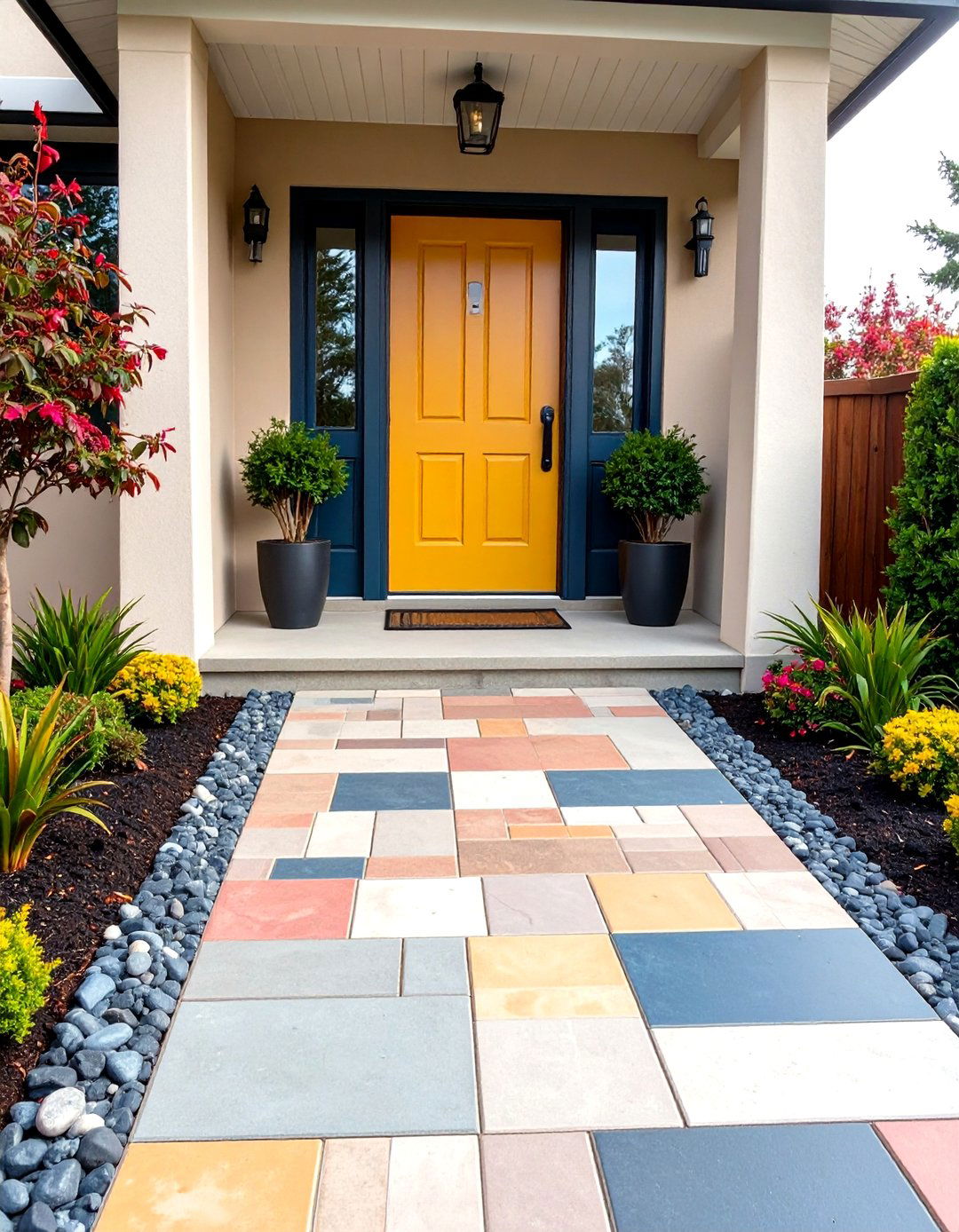
14. Effortless Curb Appeal Upgrade
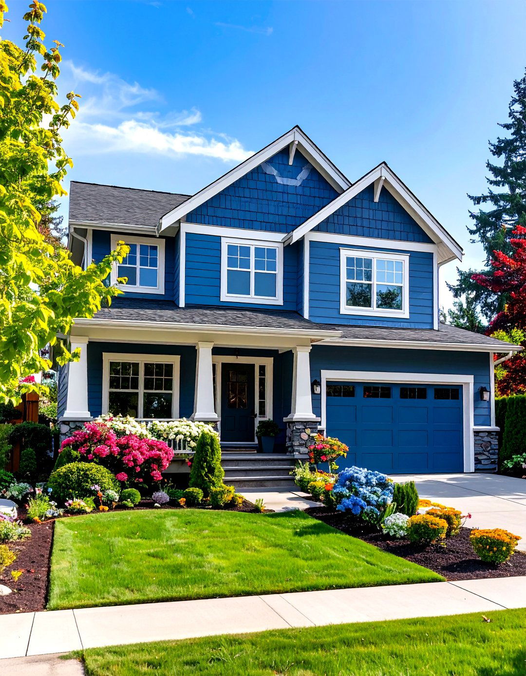
Effortless Curb Appeal Upgrade delivers a quick yet impactful facelift by applying contrasting hues to emphasize focal areas—such as the entryway and garage facade—while leaving the bulk of siding in a neutral base. This limited palette reduces decision fatigue and limits painting labor. Homeowners can achieve a fresh look by repainting only a few sections, like overhangs or porch columns, in a secondary color while retaining the original siding. The result feels intentional and coordinated without a full exterior overhaul, making it an accessible option for budget-conscious updates.
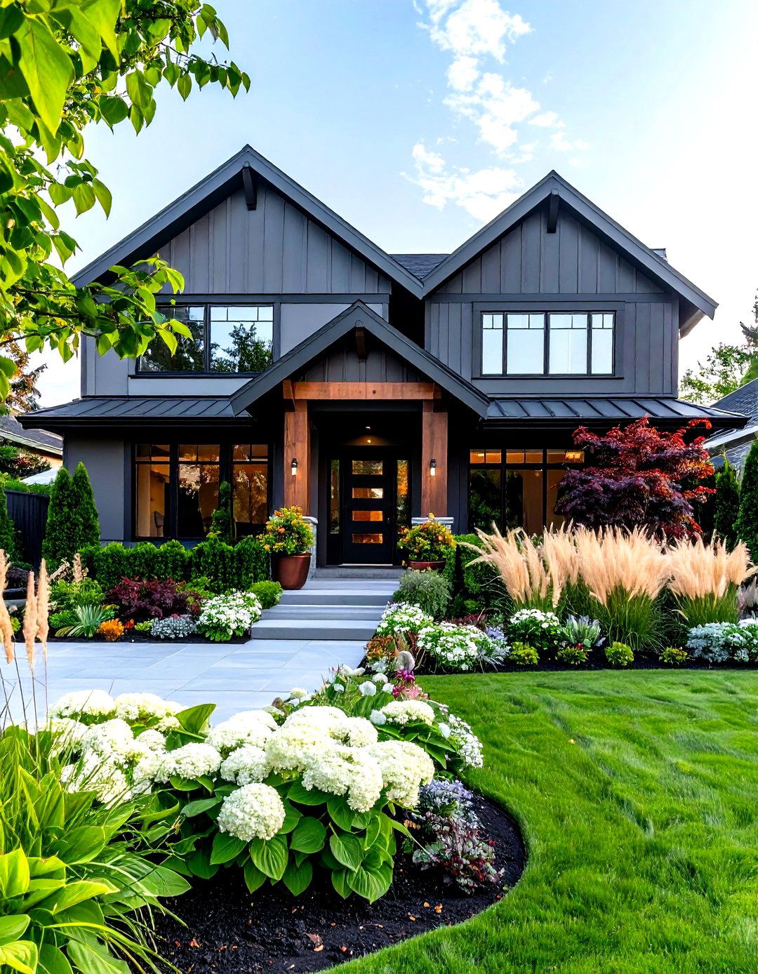
15. Dramatic Exterior Makeover

Dramatic Exterior Makeover is for the bold homeowner seeking a theatrical transformation. By choosing peak-contrast pairs—think jet black with crisp white or deep navy with pale gray—across large siding fields, the facade instantly commands attention. Key architectural features are highlighted with the accent tone, often around windows and corners, further intensifying the effect. This approach can redefine the perception of a home’s scale and form, making modest structures appear more expansive. While maintenance-intensive due to stark color differences revealing wear, the visual payoff can be extraordinary for those desiring maximum impact.
16. Harmonious Color Transitions
Harmonious Color Transitions soften the divide between tones by employing gradual shifts rather than abrupt separations. Techniques include using intermediary shades at transition points—like sloping eave lines or stepped siding returns—to ease the eye from one hue to the next. This gradient-like effect retains two-tone interest while fostering a cohesive flow. Suitable for hillside homes or designs with complex rooflines, it ensures that each elevation complements the others, even as light conditions change. This gentle gradation can increase perceived size and openness, making spaces feel expansive and connected.
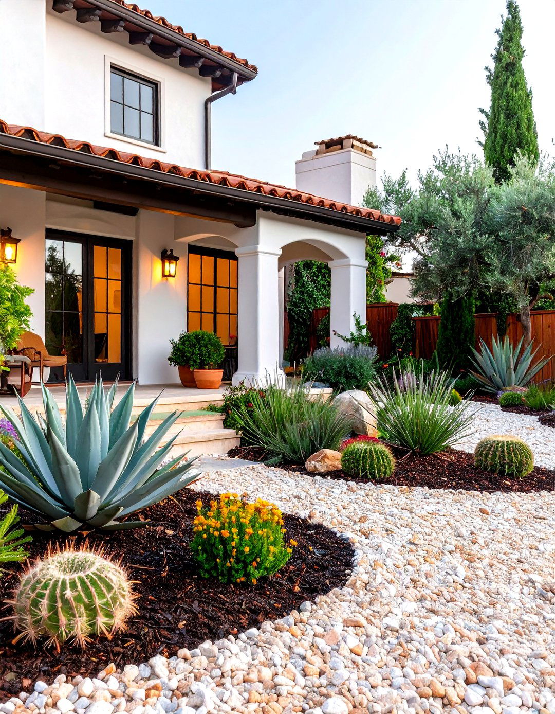
17. Sustainable and Stylish Choice
Combining environmental mindfulness with aesthetic flair, Sustainable and Stylish Choice integrates eco-friendly siding materials—such as recycled composite laps or responsibly sourced cedar—with two-tone color strategies. Homeowners can select non-toxic, low-VOC finishes in complementary shades, ensuring both longevity and environmental stewardship. Strategic color placement on solar-facing elevations can also aid in passive heating or cooling, optimizing energy performance. This design demonstrates that sustainable practices need not compromise style, offering a facade that is both beautiful and conscientious.
18. Customizable Design Options
Customizable Design Options empower homeowners to tailor every aspect of their two-tone siding, from color proportions to accent placements. Visualizers—often provided by manufacturers—allow experimentation with dozens of palette combinations before committing to a final scheme. This digital planning process can help coordinate with existing brickwork, stone, or roofing materials. By adjusting hue balance, one can emphasize either the primary tone or the accent, achieving looks ranging from subtly salted-thumb to boldly graphic. The key is testing variations until the desired mood and architectural emphasis emerge.
19. High-Impact Linear Designs
High-Impact Linear Designs harness crisp horizontal and vertical lines, accentuating panel orientation and structural geometry through color contrast. For instance, applying a darker tone to vertical board-and-batten elements against a lighter lap-siding background creates dramatic stripes that draw the eye upward or sideways, amplifying perceived height or length. This interplay celebrates linearity, and it works exceptionally well on homes with elongated profiles or pronounced roof pitches. The approach echoes board-and-batten strategies, where alternating textures and tones define planar relationships.
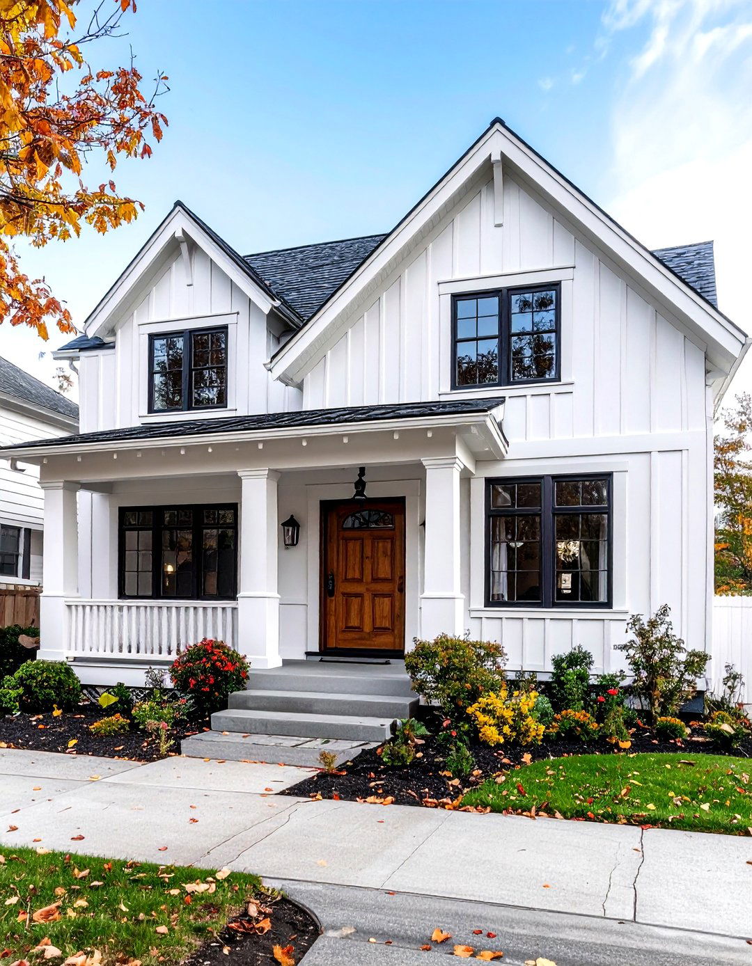
20. Timeless Sophistication and Simplicity
Timeless Sophistication and Simplicity celebrate minimalist elegance by pairing two complementary neutrals—such as soft greige and muted ivory—to accentuate architectural purity. The restrained palette enhances shadows and highlights, bringing forward the clean lines and volumetric forms of a home’s design. This two-tone approach is inherently low-maintenance, as neutrals tend to age gracefully and show wear minimally. It is especially suitable for modern farmhouse and Scandinavian-inspired structures, where the emphasis is on form and function with minimal ornamentation.
Conclusion:
From bold, eye-catching transformations to understated palettes that emphasize texture and form, these 20 two-tone siding designs showcase the versatility and impact of combining colors and materials on residential exteriors. Whether opting for dramatic contrast, subtle transitions, or sustainable material pairings, homeowners can find a design that resonates with their personal style and architectural context. By leveraging visual planning tools and adhering to color theory principles, it’s possible to craft a facade that not only elevates curb appeal but also endures through changing trends and environmental conditions. May these ideas inspire your next siding project, turning your home into a masterpiece of color and design.
Related posts:
Leave a Reply