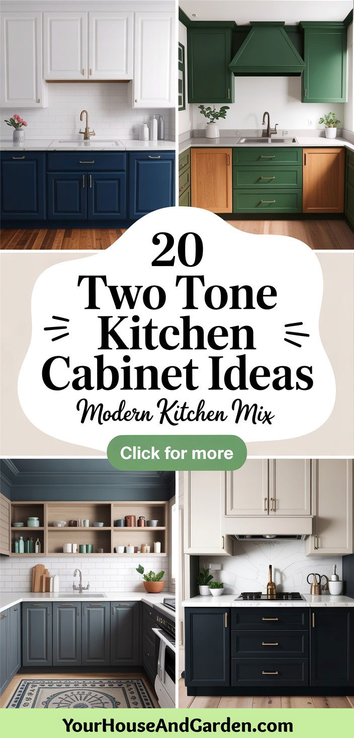
Two-tone kitchen cabinets have surged in popularity as a dynamic way to introduce depth, contrast, and personality into cooking spaces. By pairing two complementary hues—whether through contrasting upper and lower cabinets or by highlighting an island—homeowners can achieve a custom, layered look that draws the eye and defines zones within an open-plan layout. Beyond aesthetics, two-tone schemes can help balance natural and artificial light: lighter shades reflect brightness upward, while darker tones ground the design and add warmth. From classic monochromes to bold color-blocking, the possibilities are endless. Thoughtful selection—guided by the color wheel, room size, and personal style—ensures a harmonious outcome that elevates both form and function. Whether you’re aiming for timeless elegance or contemporary flair, these 20 inventive ideas will inspire your next kitchen refresh.
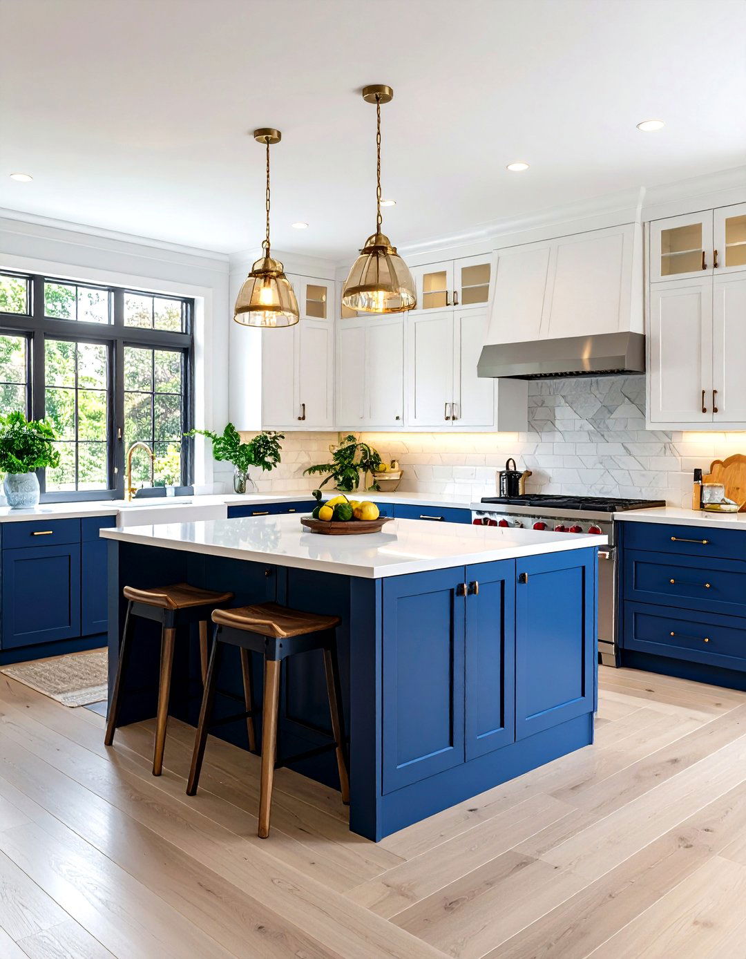
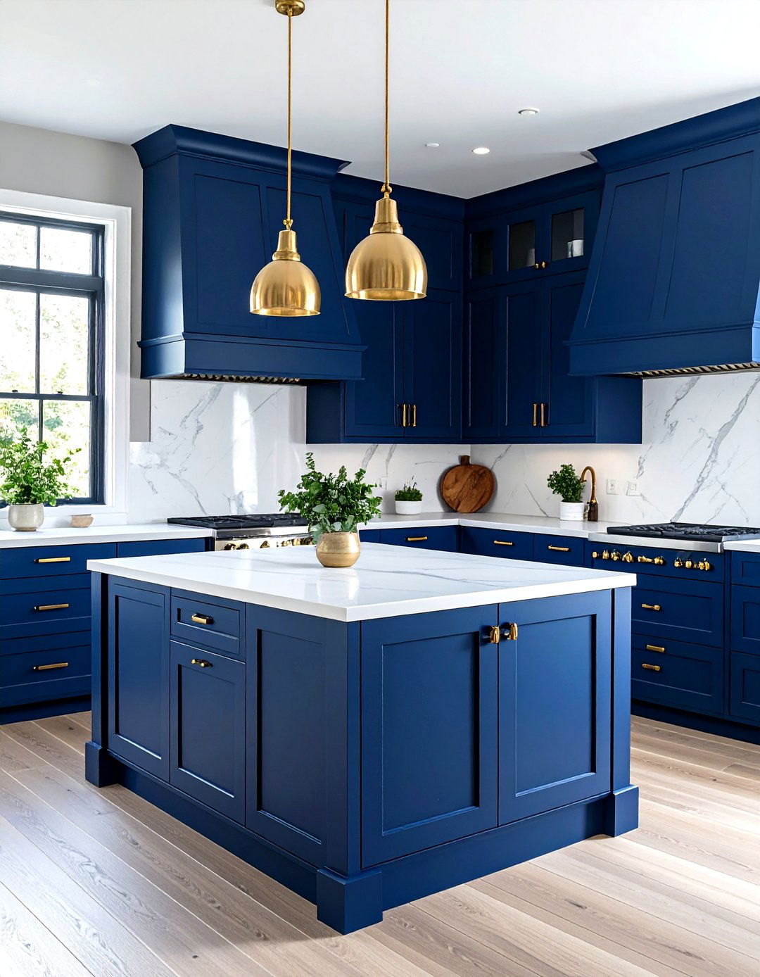
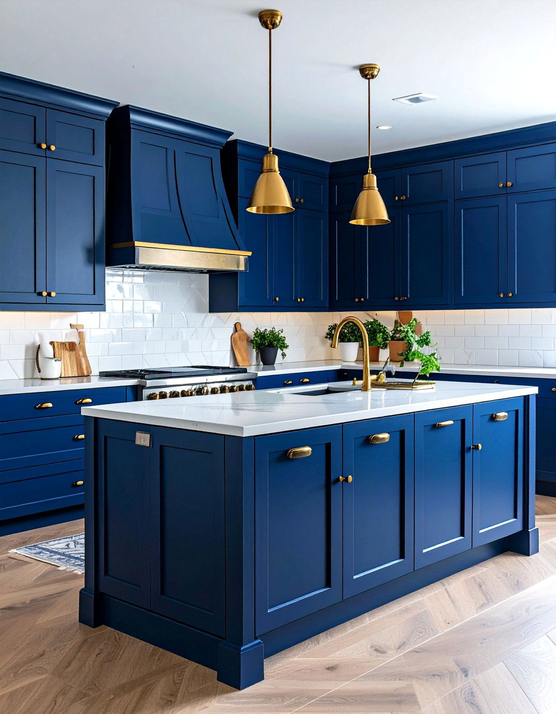
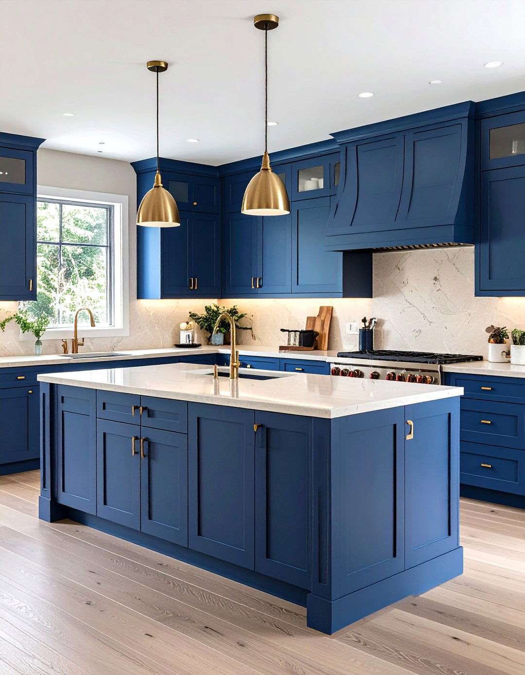
1. Classic White and Navy Blue
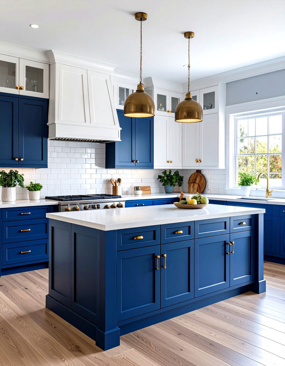
Pairing crisp white uppers with deep navy lowers creates a nautical-inspired, yet enduring aesthetic. The white cabinetry uplifts the room by reflecting ambient light, while the navy base lends an anchor-like presence that’s rich and sophisticated. This combo works especially well in coastal or transitional kitchens, where the contrast accentuates architectural details like shaker-style doors or fluted panels. To complete the look, incorporate brass hardware and warm wood accents—such as a butcher-block countertop or open shelving—to bridge the white-and-blue palette with organic textures. This balance of hues fosters a fresh, balanced environment that feels both timeless and invigorating.
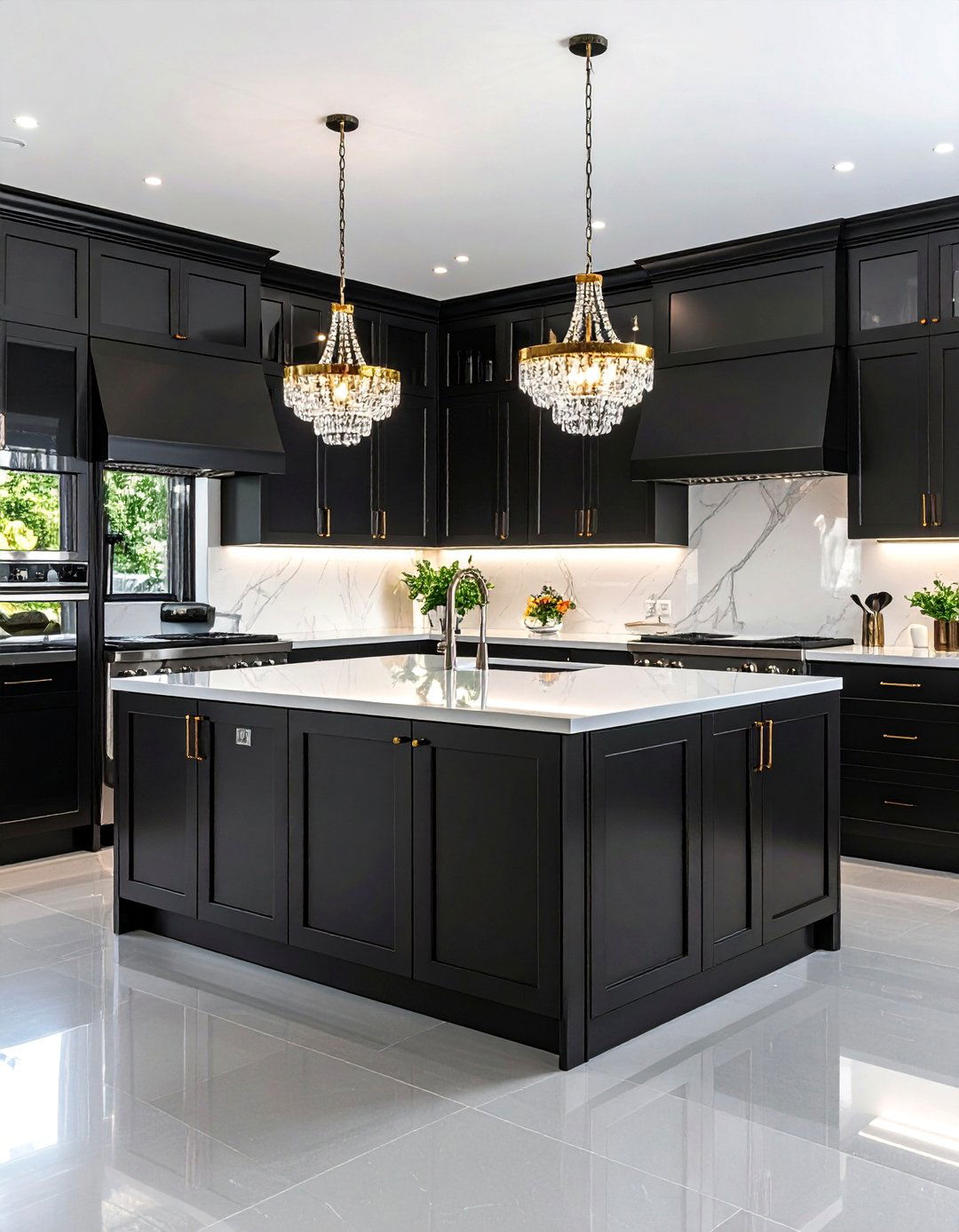
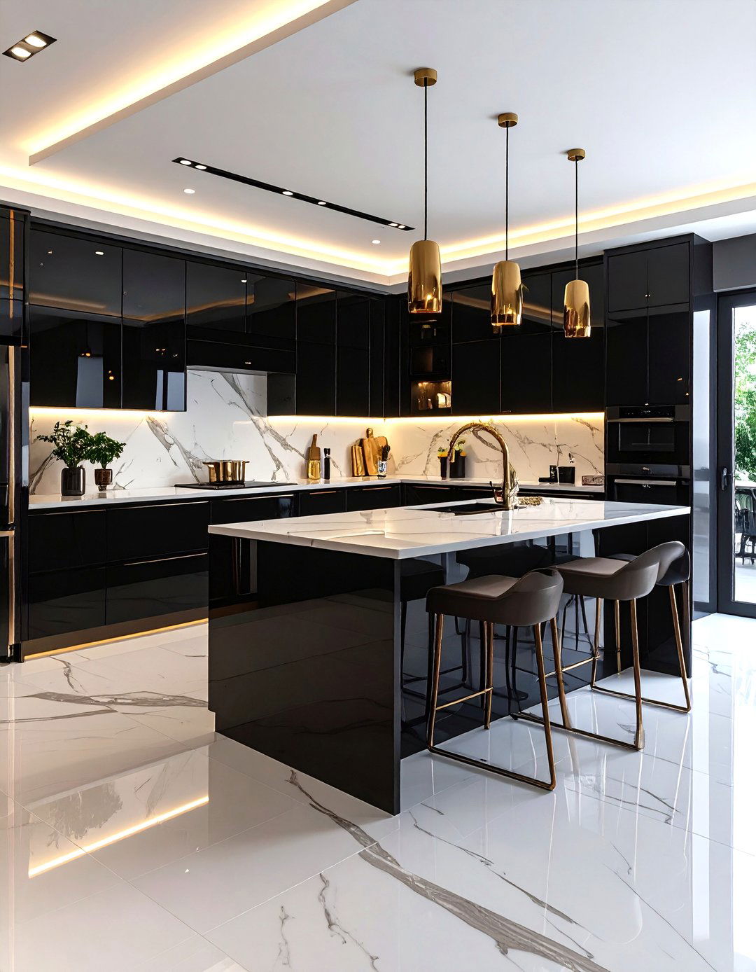
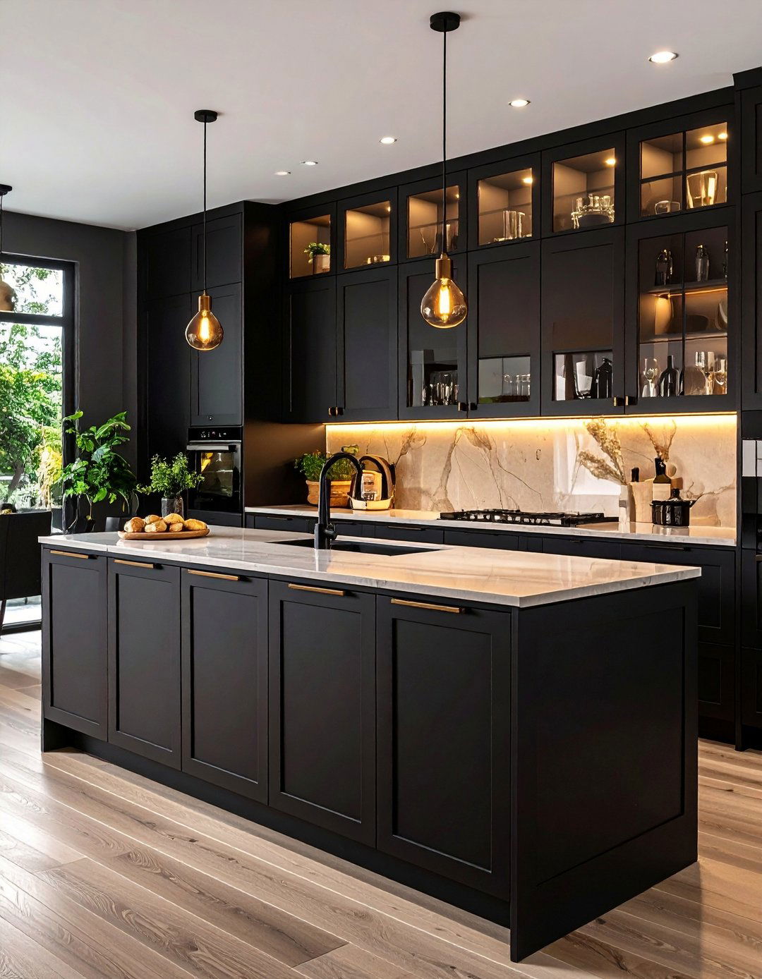
2. Timeless Black and White Tuxedo

The “tuxedo” kitchen features white uppers juxtaposed against black lower cabinets, yielding a striking, high-contrast silhouette. This refined approach emphasizes cleanliness and sharp lines, making it perfect for modern or minimalist interiors. Glossy black lowers add a subtle sheen that contrasts matte whites above, creating visual interest without overwhelming the senses. Pair with marble or quartz countertops in white with dark veining to tie the two tones together. Accentuating elements—such as black-framed glass doors or patterned floor tiles—can further highlight the tuxedo effect, ensuring your kitchen feels both classic and cutting-edge.
3. Soft Gray and Bright White
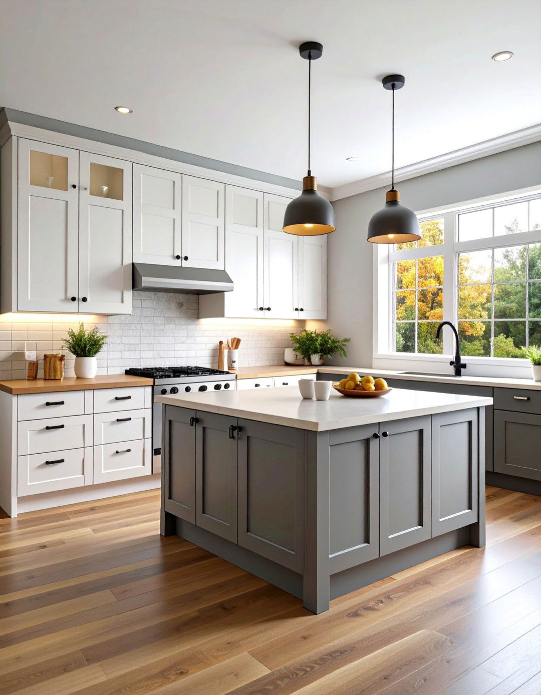
A gentle gray-and-white palette offers understated elegance and versatility. Light gray lowers set a serene foundation, while bright white uppers maximize perceived space and luminosity. This pairing is ideal for small kitchens or those with limited natural light, as the white top cabinets reflect what little light is available, and the gray base grounds the design without darkening it excessively. To infuse warmth, introduce materials such as wood countertops or woven pendant lamps. Subtle gray veining in countertops or backsplashes can reinforce the palette’s cohesion, resulting in a calm, harmonious setting that adapts to both traditional and contemporary décor.
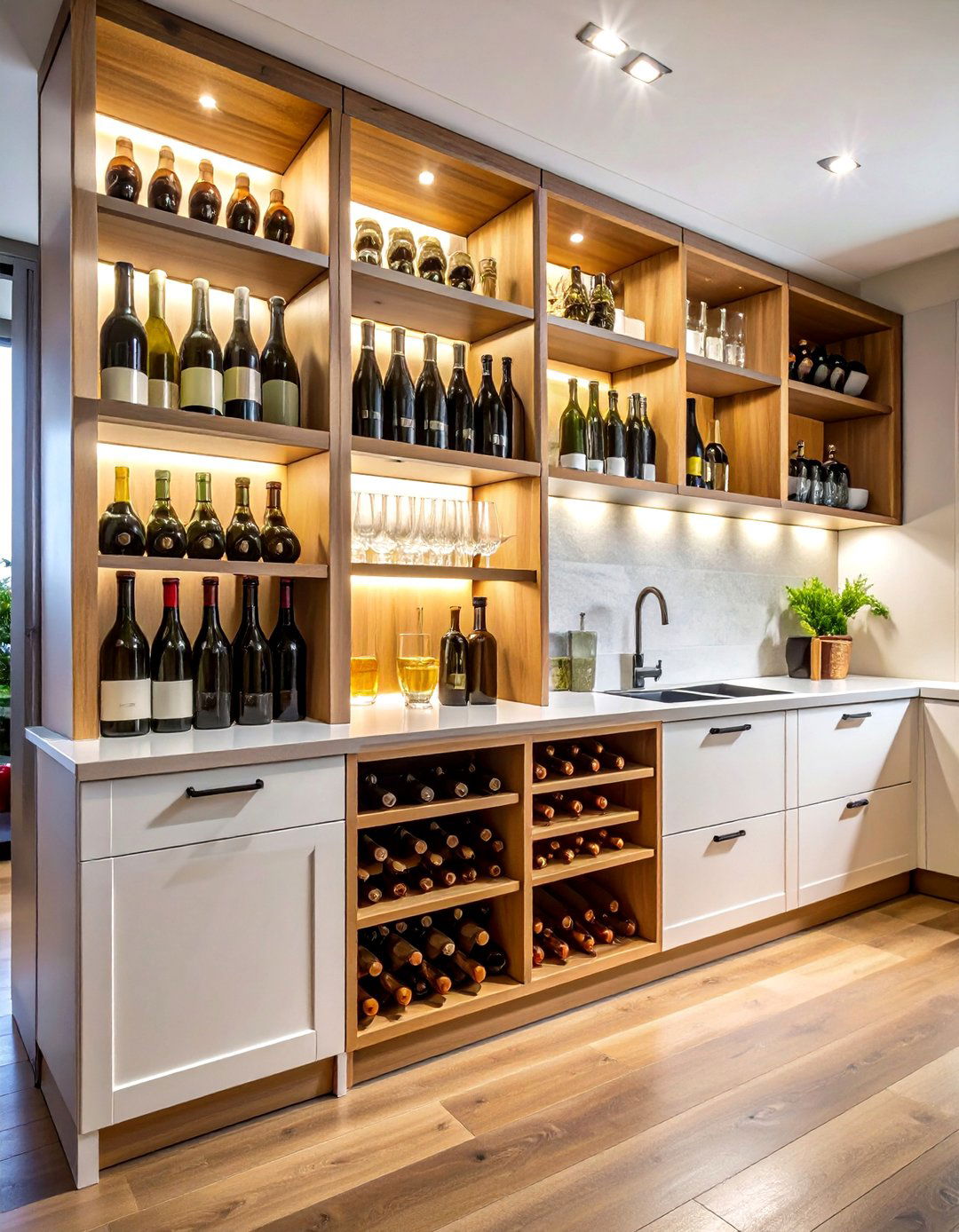
4. Warm Wood and Crisp White
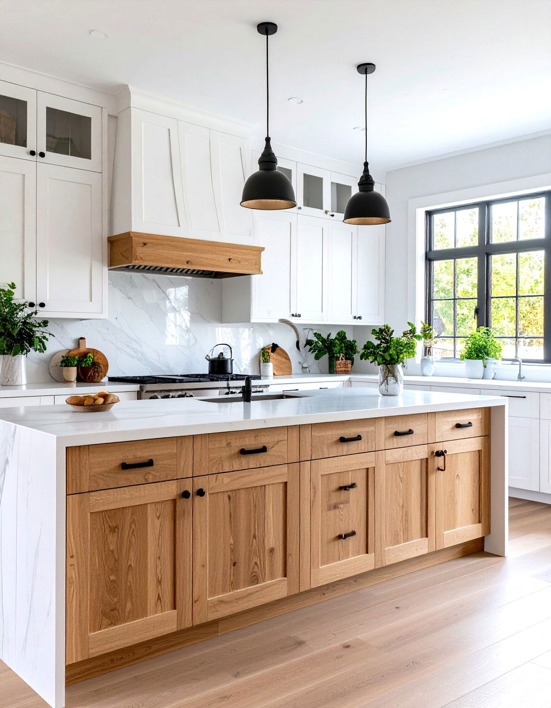
Combining natural wood lowers with white upper cabinets brings a Scandinavian-inspired warmth to any kitchen. The wood introduces texture and organic richness, while white uppers enhance brightness and openness. Opt for a lighter wood tone—like oak or maple—paired with a matte white finish to preserve a clean, modern aesthetic. This ensemble works brilliantly when paired with simple black or leather handles, and a quartz or concrete countertop that complements both materials. The result is a cozy yet airy atmosphere, ideal for homeowners seeking a balance between minimalist design and inviting comfort.
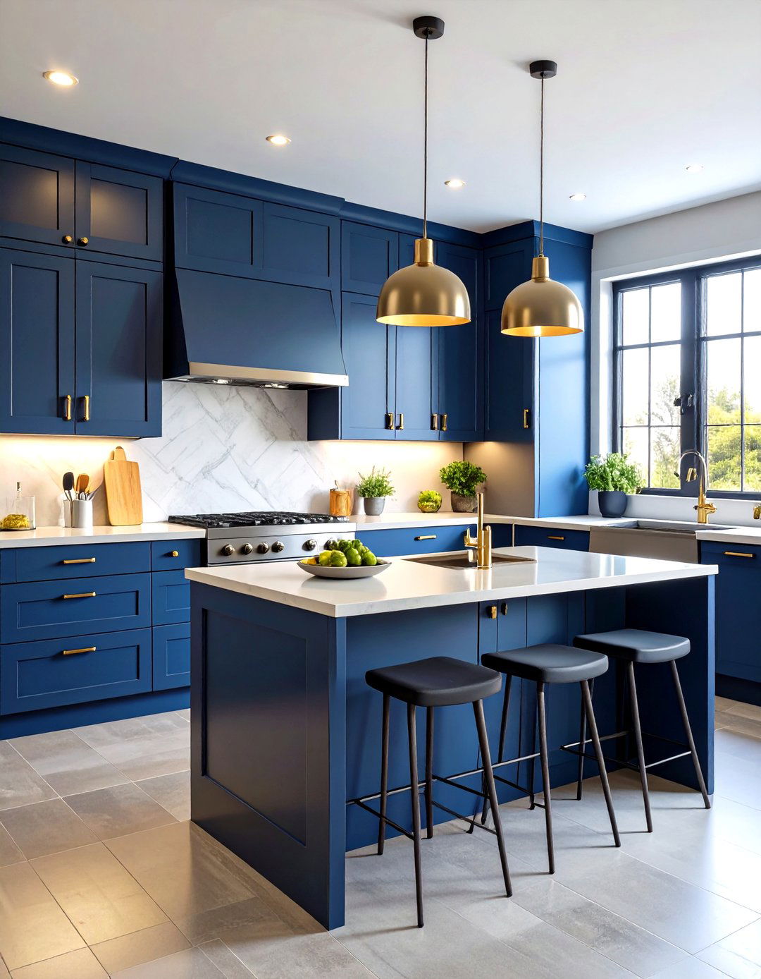
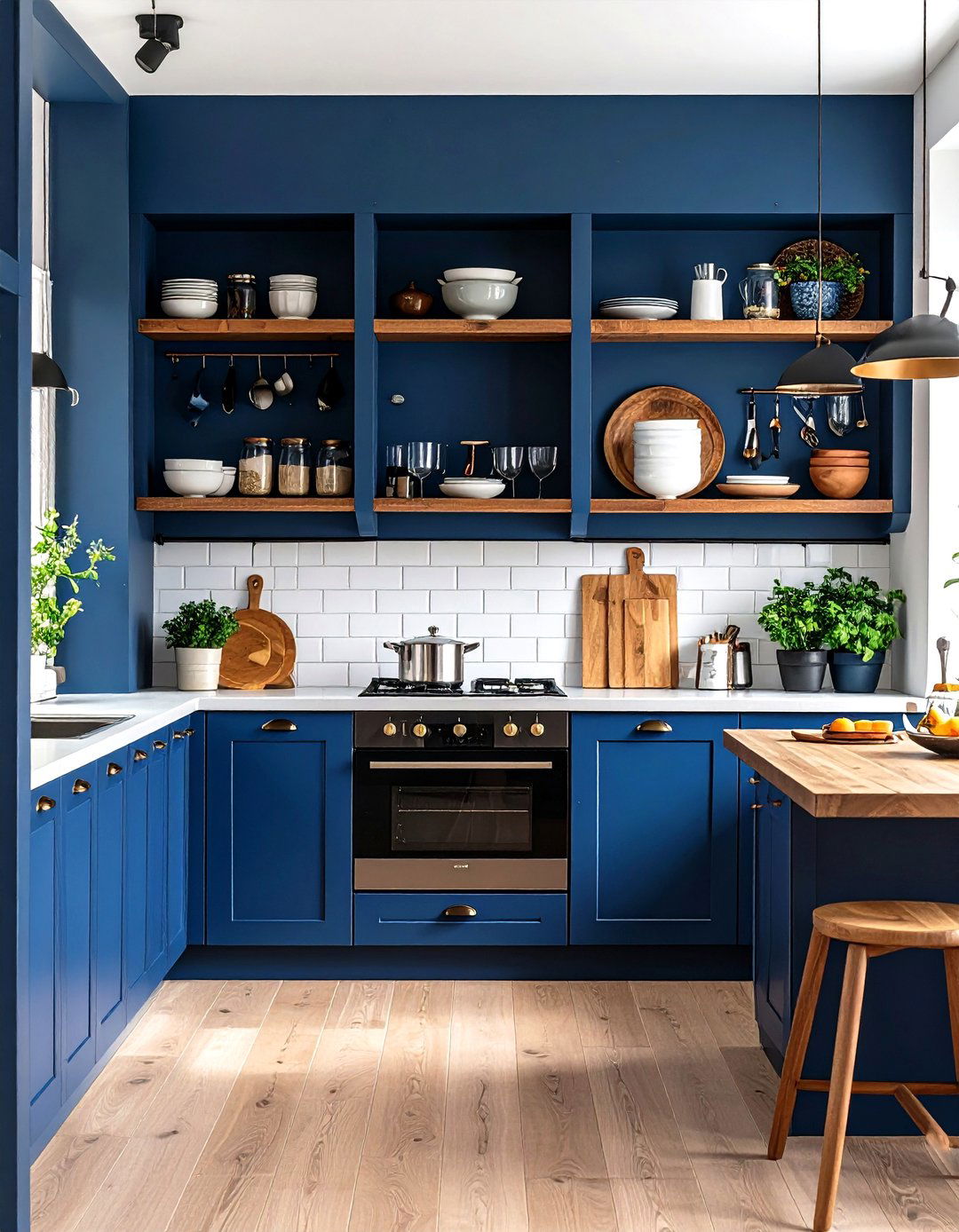
5. Moody Navy and Rich Walnut

Dark navy uppers combined with walnut-stained lowers create a dramatic, moody kitchen that exudes luxury. The depth of the navy offers an enveloping canopy effect, while the warm walnut base adds tactile warmth and depth. This duo fits well in spacious, open-plan layouts where the cabinets become a focal architectural element. Accenting with matte black hardware and integrated lighting—such as under-cabinet LEDs—enhances the richness of both finishes. Incorporating neutral stone countertops and a matching splashback keeps the design from feeling too heavy, lending a sophisticated yet grounded aesthetic.
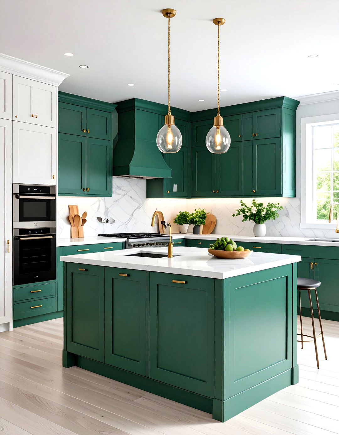
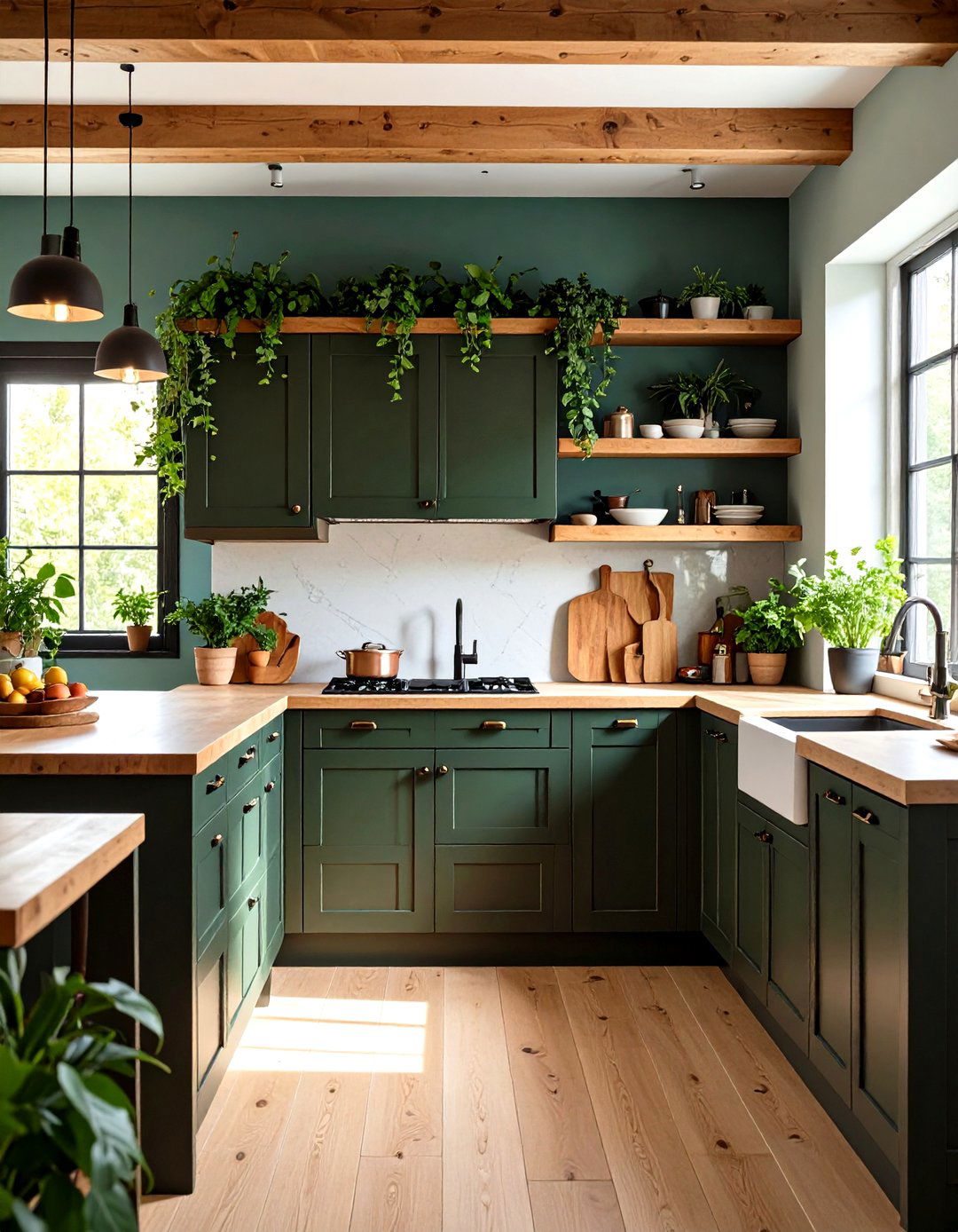
6. Forest Green and Soft White
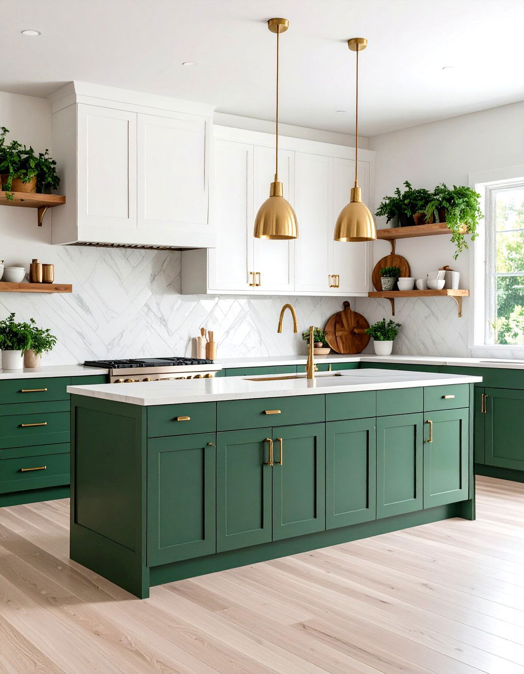
Forest green lowers paired with soft white uppers bring a touch of biophilic design indoors. The deep green base evokes natural foliage, grounding the kitchen in an organic, rejuvenating palette. Above, off-white cabinets maintain airiness and maximize light reflection—crucial in rooms with modest window exposure. Complement with brass or aged bronze hardware for a vintage flair, and consider incorporating live-edge wooden shelves or potted herbs to reinforce the nature-inspired scheme. This combination feels fresh and restorative, perfect for those seeking a connection to the outdoors.
7. Charcoal Gray and Pale Taupe
A sophisticated gradient can be achieved with charcoal lower cabinets and pale taupe uppers. The charcoal base provides depth and an elegant backdrop for cooking activities, while the taupe top cabinets softly diffuse light, creating a neutral transition zone. This restrained palette suits urban lofts or industrial-style kitchens; pair with concrete countertops and open metal shelving for an edgy, minimalist vibe. Matte finishes on both tones prevent glare and add to the refined, subdued ambiance.
8. Blush Pink and Cream
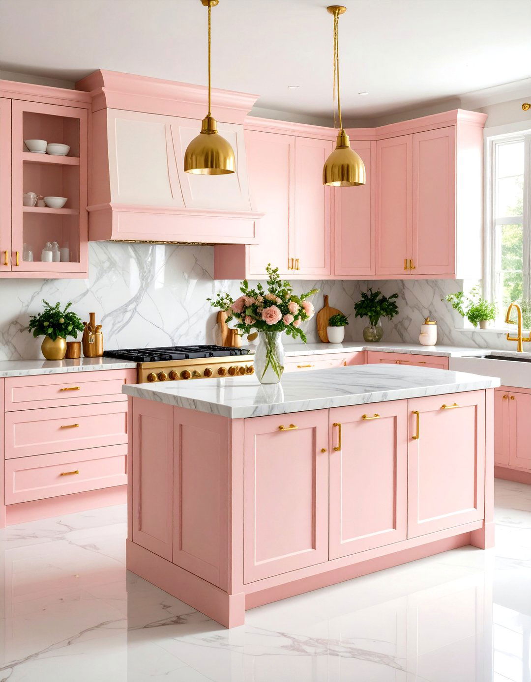
For a whimsical yet refined twist, blush-pink lowers paired with cream uppers lend a soft, feminine flair. The warm cream top cabinets uplift the space, reflecting light and preventing the pink from feeling too saturated, while the blush base adds character and charm. Accentuate with brushed gold hardware and marble countertops featuring subtle pink veining. This palette works wonderfully in vintage-inspired or cottage-style kitchens, creating an inviting and cheerful atmosphere without veering into overly saccharine territory.
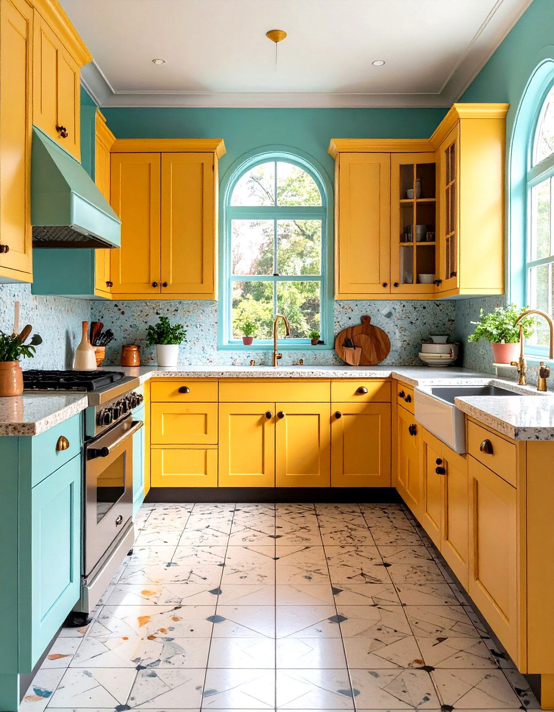
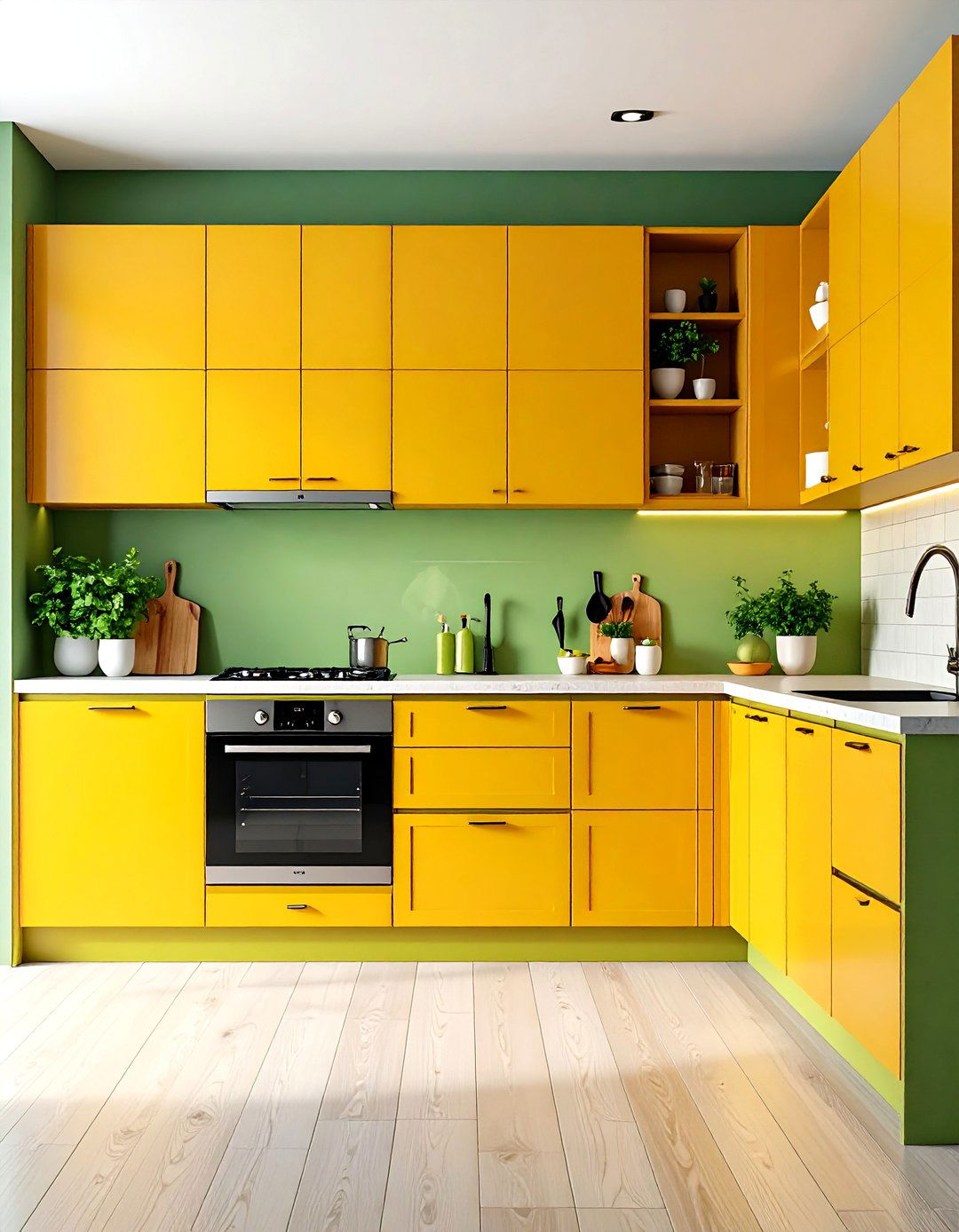
9. Mustard Yellow and Slate Blue
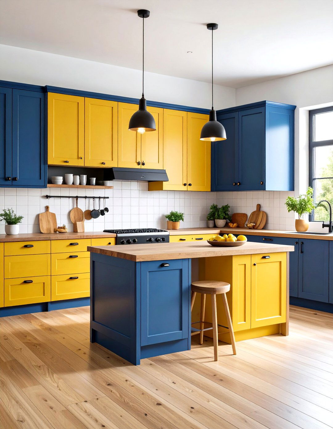
Inject a dose of personality with mustard-yellow lowers and slate-blue upper cabinets. The yellow base radiates warmth and energy, while the muted slate uppers anchor the design, keeping it grounded and sophisticated. Pair with warm wooden countertops or open shelving to tie the palette together, and opt for simple black or nickel hardware to avoid visual clutter. This bold duo fits well in eclectic or mid-century modern kitchens, offering a playful yet balanced aesthetic.
10. Two-Tone Ombre Gradient
Elevate the two-tone concept by creating an ombre effect: select three progressively darker shades of the same color family, applying the lightest hue to the uppers, a mid-tone to the island, and the darkest to the base cabinets. This seamless transition tricks the eye and adds visual intrigue, while maintaining color harmony. Ideal for contemporary kitchens, the gradient approach blends form and function, guiding the eye from top to bottom and making the kitchen feel cohesive and artfully designed.
11. Monochromatic Shades: Light to Dark
A subtler variant of ombre, a monochromatic two-tone scheme uses only two shades of one color—for instance, light gray uppers and dark charcoal lowers. This approach offers a refined, minimalist look that’s easy to update over time by swapping out hardware or accent pieces. It works particularly well in small spaces, where the tonal contrast defines zones without overwhelming the senses, and reflects just enough light to prevent the darker shade from making the room feel cramped.
12. Bold Primaries: Red and Blue
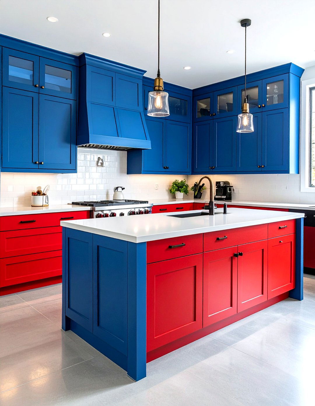
For the fearless homeowner, pairing primary colors—such as fire-engine red lowers with cobalt blue uppers—creates a vibrant, retro-inspired space. This high-energy combination is best suited to open-plan or industrial kitchens, where the bold hues can stand as artful focal points. Ground the palette with neutral countertops—think concrete or white quartz—and minimalist hardware to prevent the colors from competing for attention.
13. Glossy and Matte Contrast
Introduce texture contrast by using glossy finish on upper cabinets and matte finish on lowers (or vice versa). For example, matte navy uppers with glossy white lowers create a subtle interplay of light and shadow, adding depth without altering the color palette. Gloss surfaces reflect ambient light, enhancing brightness, while matte finishes absorb it, grounding the design. This finish-focused approach works in virtually any color combination, offering a modern twist even in traditional cabinet profiles.
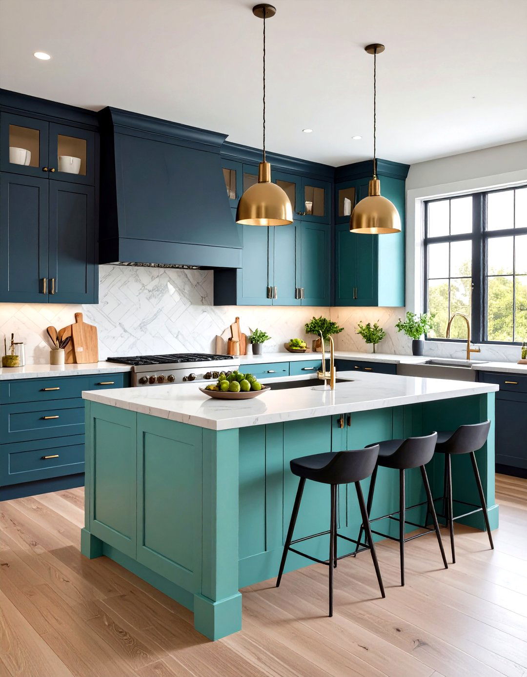
14. Island-Only Accent Color
Maintain uniform cabinetry around the perimeter in a neutral tone—such as white or light gray—and reserve the contrasting color exclusively for the island. This strategy highlights the island as a multifunctional centerpiece for prep, dining, and socializing. A jewel-toned island—emerald, navy, or charcoal—amidst softer surroundings elevates the room without committing to a full two-tone scheme, perfect for renters or those desiring a less permanent contrast.
15. Upper vs Lower Contrast
Flip the classic tuxedo layout by applying the darker hue on upper cabinets and lighter shade below. For instance, deep charcoal uppers contrasted with pale mint lowers create an unexpected twist that draws the eye upward, accentuating ceiling height. This inversion works well in kitchens with high ceilings or abundant natural light, balancing drama overhead with brightness at the work surface.
16. Wood Grain Meets Painted Finish
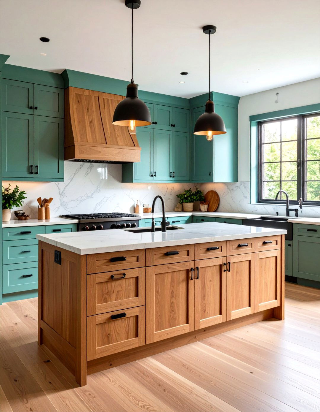
Combine the warmth and texture of exposed wood grain (such as walnut or oak veneer) with a painted finish—like sage green or slate blue. Use the wood on either the uppers or the island, and paint the remaining cabinets to introduce color. This mix-and-match approach celebrates materiality, offering both tactile richness and chromatic interest. Accentuate with matte black hardware and minimalist countertops to let the wood and paint shine.
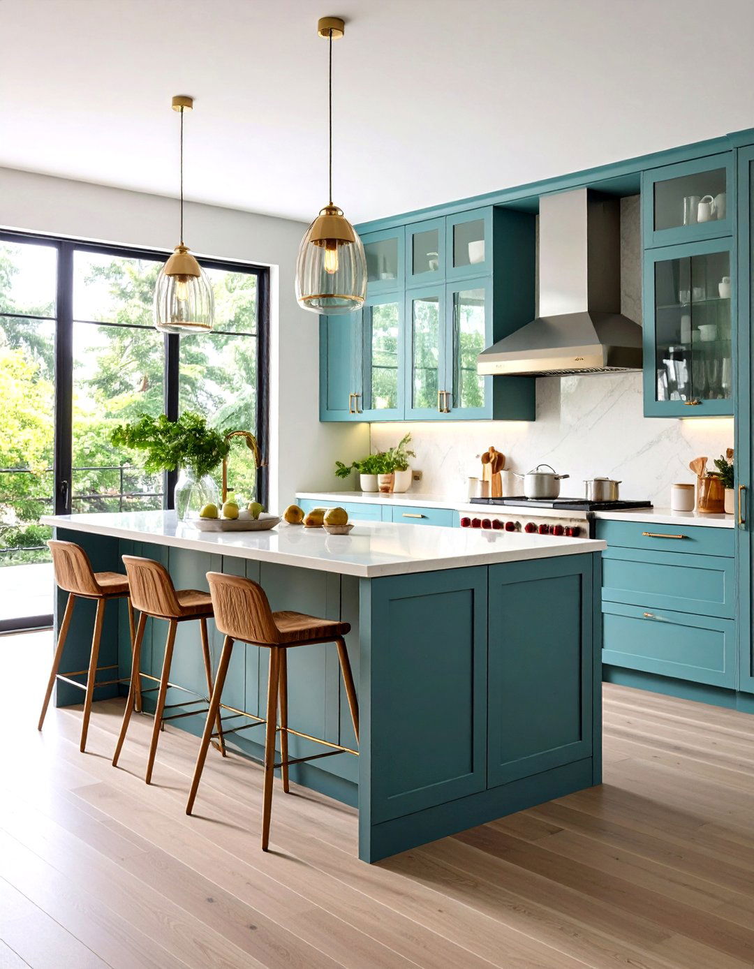
17. Coastal Blue and White
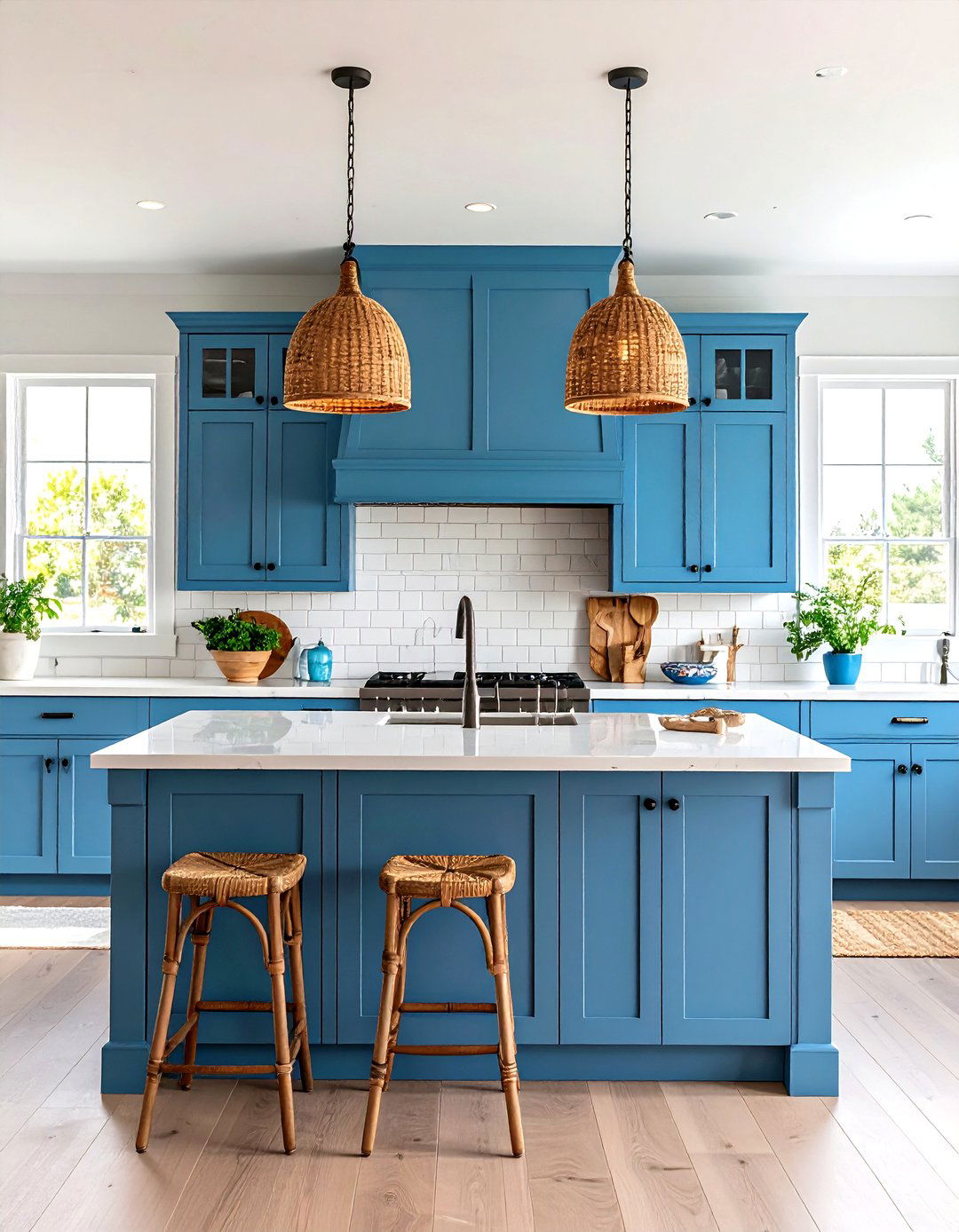
Echo the seaside with sky-blue uppers paired with crisp white lowers—or vice versa. The light blue evokes open skies and ocean breezes, while the white provides a reflective canvas that maximizes luminosity. To complete the coastal vibe, add rattan pendant lights, sea-glass accents, and a subway-tile backsplash. This breezy palette suits beach houses and urban retreats alike, infusing the kitchen with a sense of tranquility.
18. Open Shelving Balanced with Color
Blend open shelving in a contrasting hue with closed cabinets in a neutral tone. For example, navy-painted shelves set against white cabinetry become floating display zones for dishware and décor, while closed white lowers keep the look clean and cohesive. This hybrid two-tone approach injects color without the permanence of full-door painting, offering flexibility to swap accent colors seasonally.
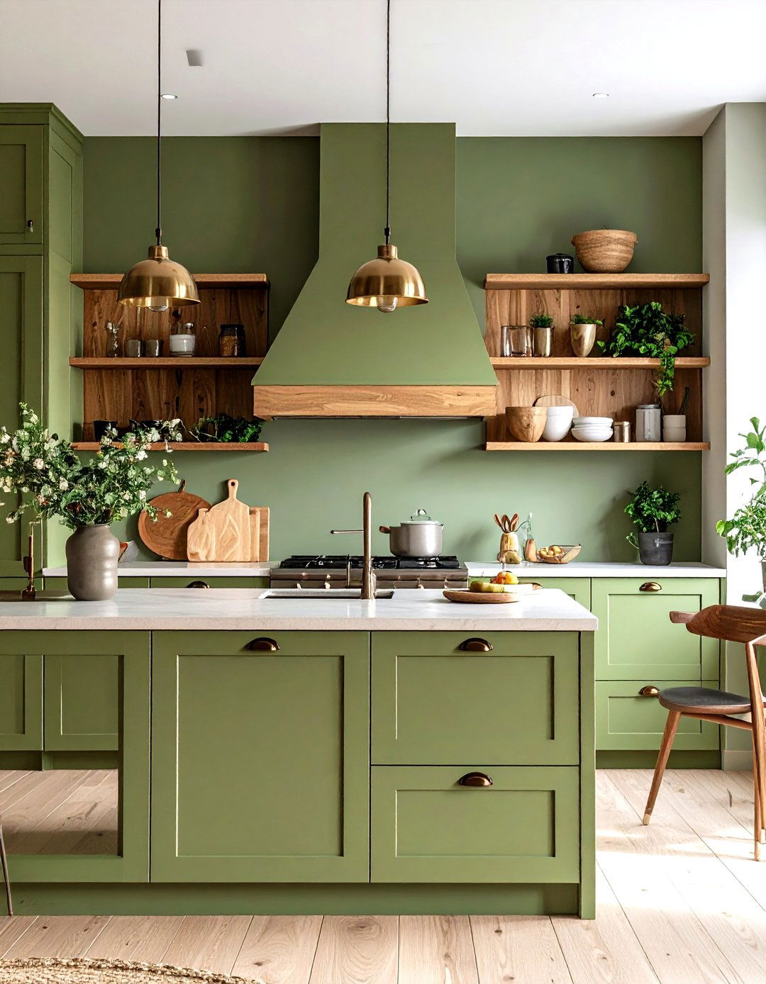
19. Biophilic Green and Natural Timber
Fuse biophilic design—deep, plant-inspired greens—with natural timber finishes. Use dark olive or forest-green lowers paired with live-edge wooden uppers or shelving to create a sanctuary-like feel. The natural timber brings warmth and texture, while the green base evokes a connection to the outdoors. Pair with stone countertops and large leafy plants to complete the nature-centric scheme.
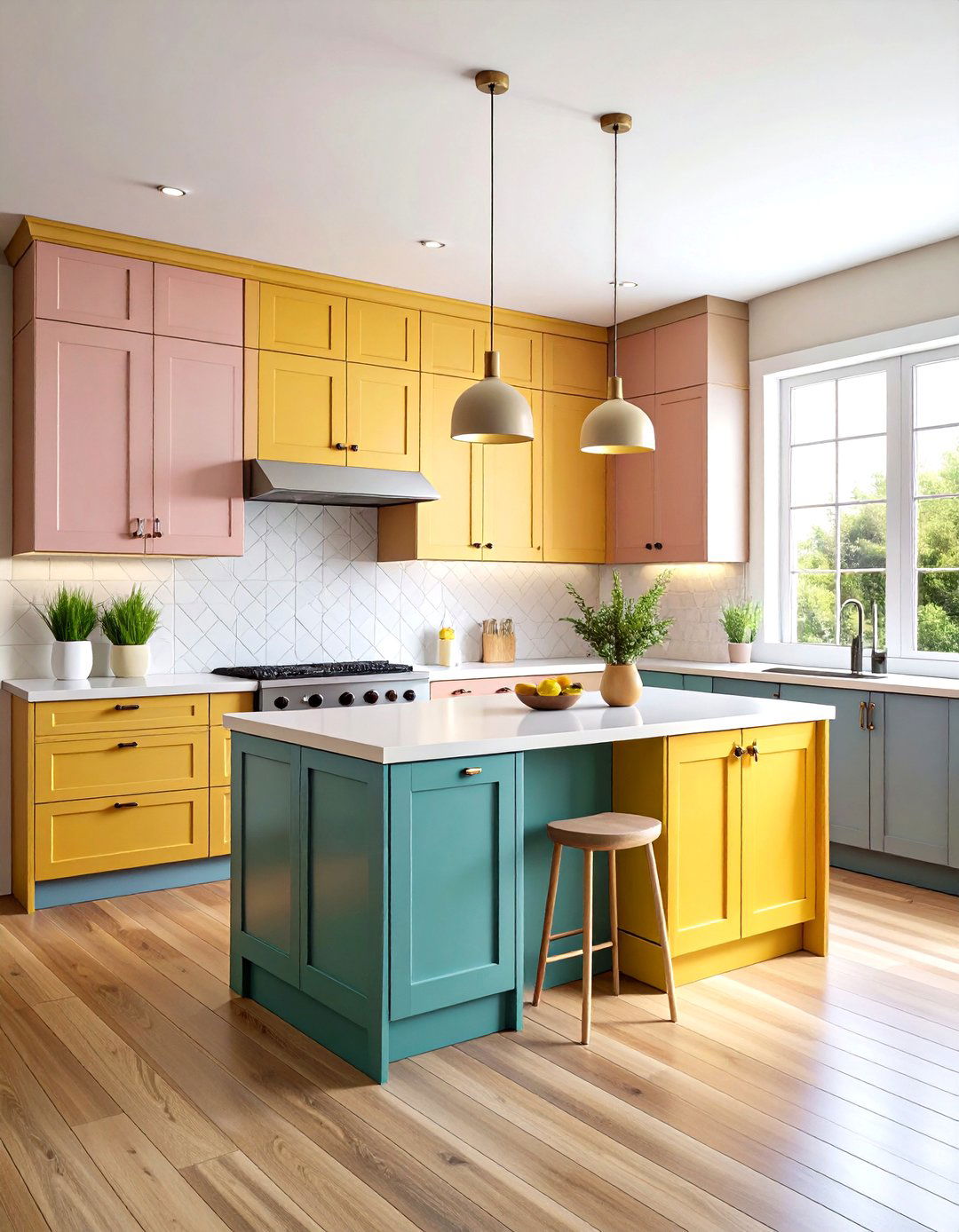
20. Retro Pastels 1950s Combo
Channel mid-century modern by pairing pastel mint lowers with buttery yellow uppers—or swap in soft pink or powder blue. These bygone hues celebrate nostalgia while retaining a playful modern edge. Complement with rounded-edge hardware, terrazzo countertops, and geometric floor tiles for a cohesive retro revival. The pastel palette feels lighthearted yet refined, perfect for kitchens seeking personality and charm.
Conclusion:
Two-tone kitchen cabinets offer a versatile, impactful way to personalize your space, whether through subtle tonal shifts or bold color-blocking. By thoughtfully combining hues—guided by the color wheel, room dimensions, and desired aesthetic—you can create a kitchen that’s both functional and visually compelling. From classic black-and-white tuxedo layouts to experimental ombre gradients, these 20 ideas demonstrate the endless potential of two-tone design. With careful selection of finishes, hardware, and complementary materials, your kitchen can become a true reflection of your style and lifestyle, elevating everyday tasks into experiences of beauty and inspiration.
Related posts:

Leave a Reply