Soft yet sophisticated, greige—the seamless fusion of gray and beige—has quietly shifted from supporting act to design headliner, largely because it adapts to both warm and cool schemes without losing its calming neutrality The Spruce. Color experts now place warm greige among the five most-recommended base shades for rooms that need future-proof flexibility, sparing homeowners constant repaint cycles Real Simple. Designers further note that layering multiple textures within one greige palette adds depth and warmth, proving the hue can be anything but bland House Beautiful. Real-estate data even suggest that a fresh coat of welcoming greige raises perceived property value by signaling a move-in-ready canvas Real Simple. Ready to let this versatile neutral work its understated magic? Explore twenty greige interior design ideas that turn an “in-between” color into an inspired focal point.

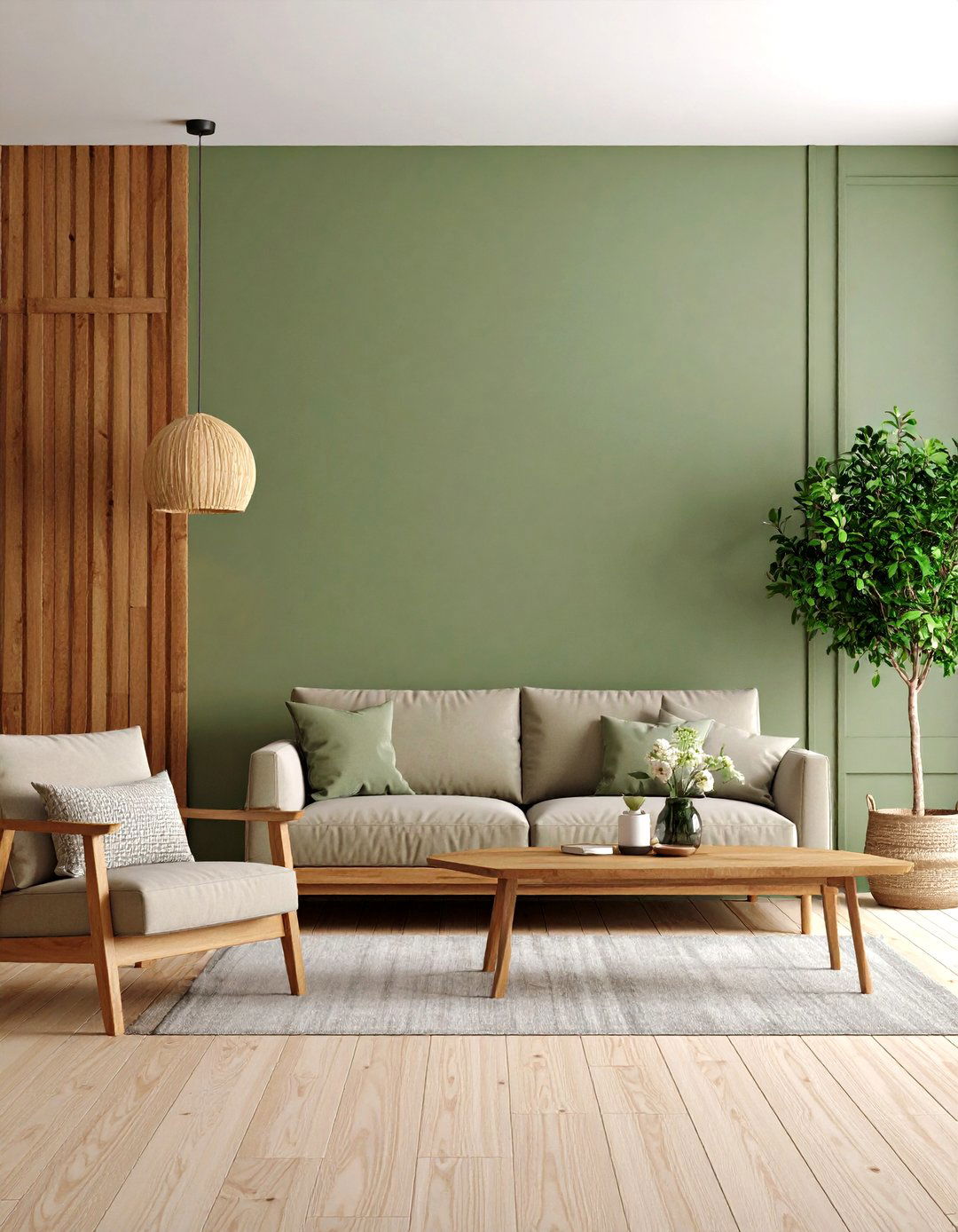
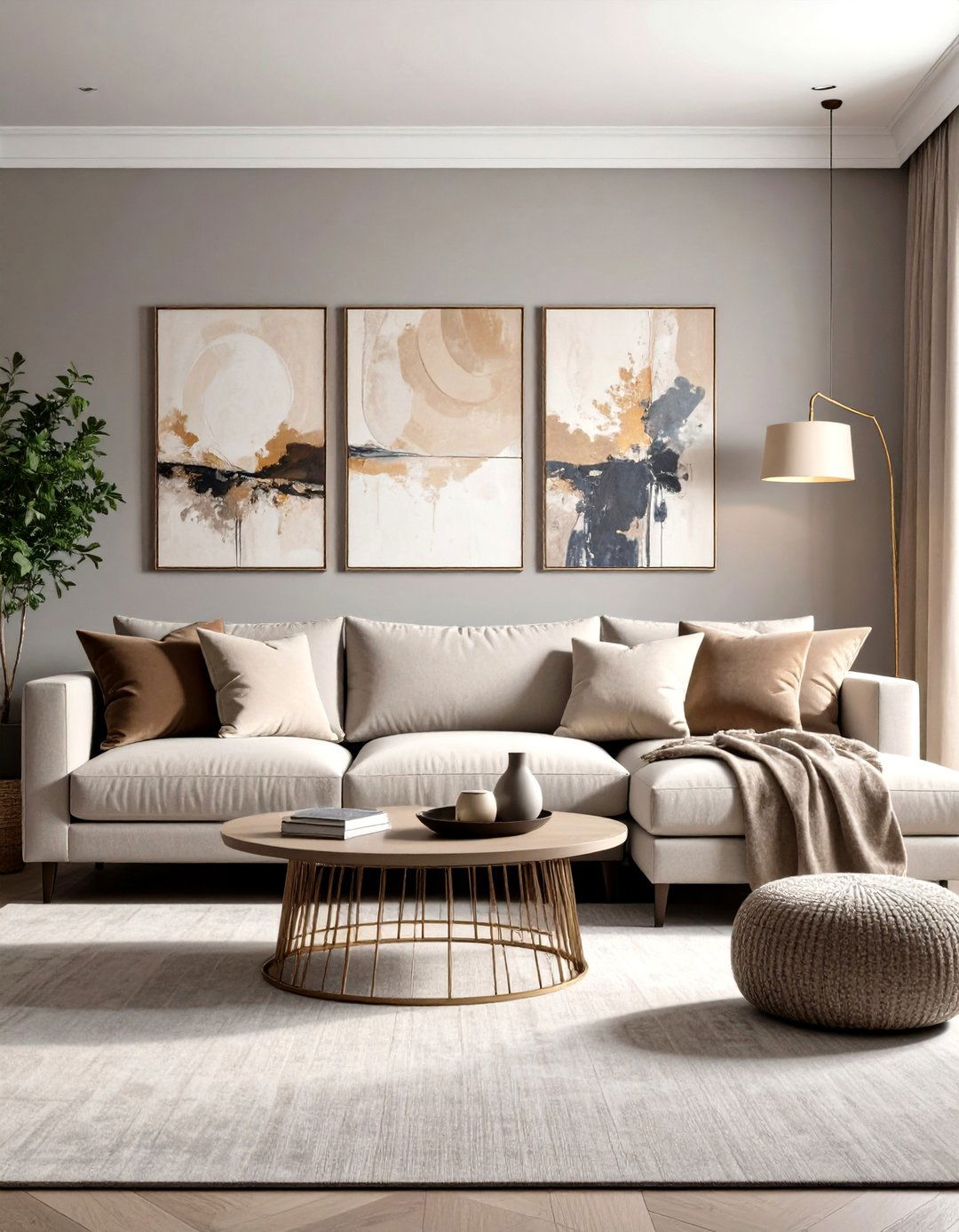
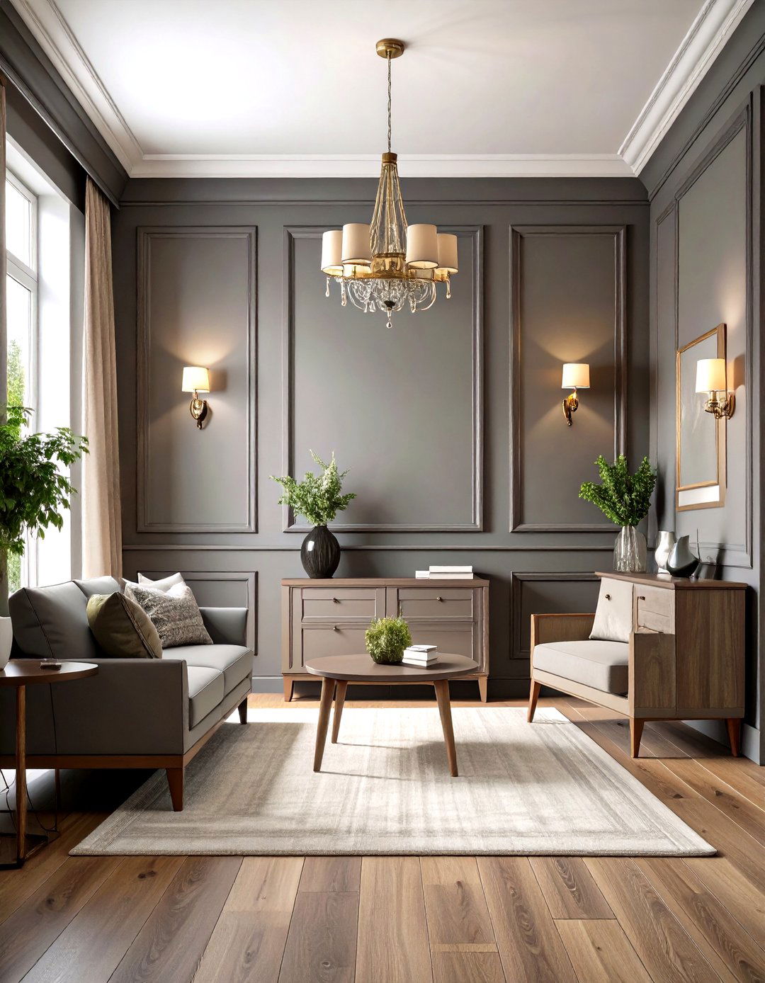
1. Layered Greige Living Room Textures
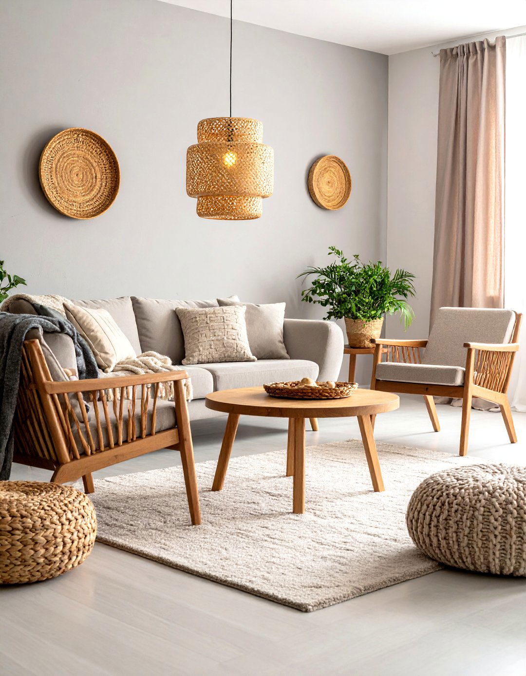
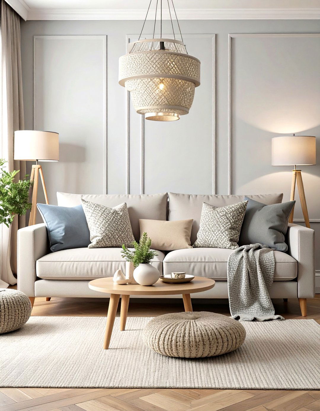
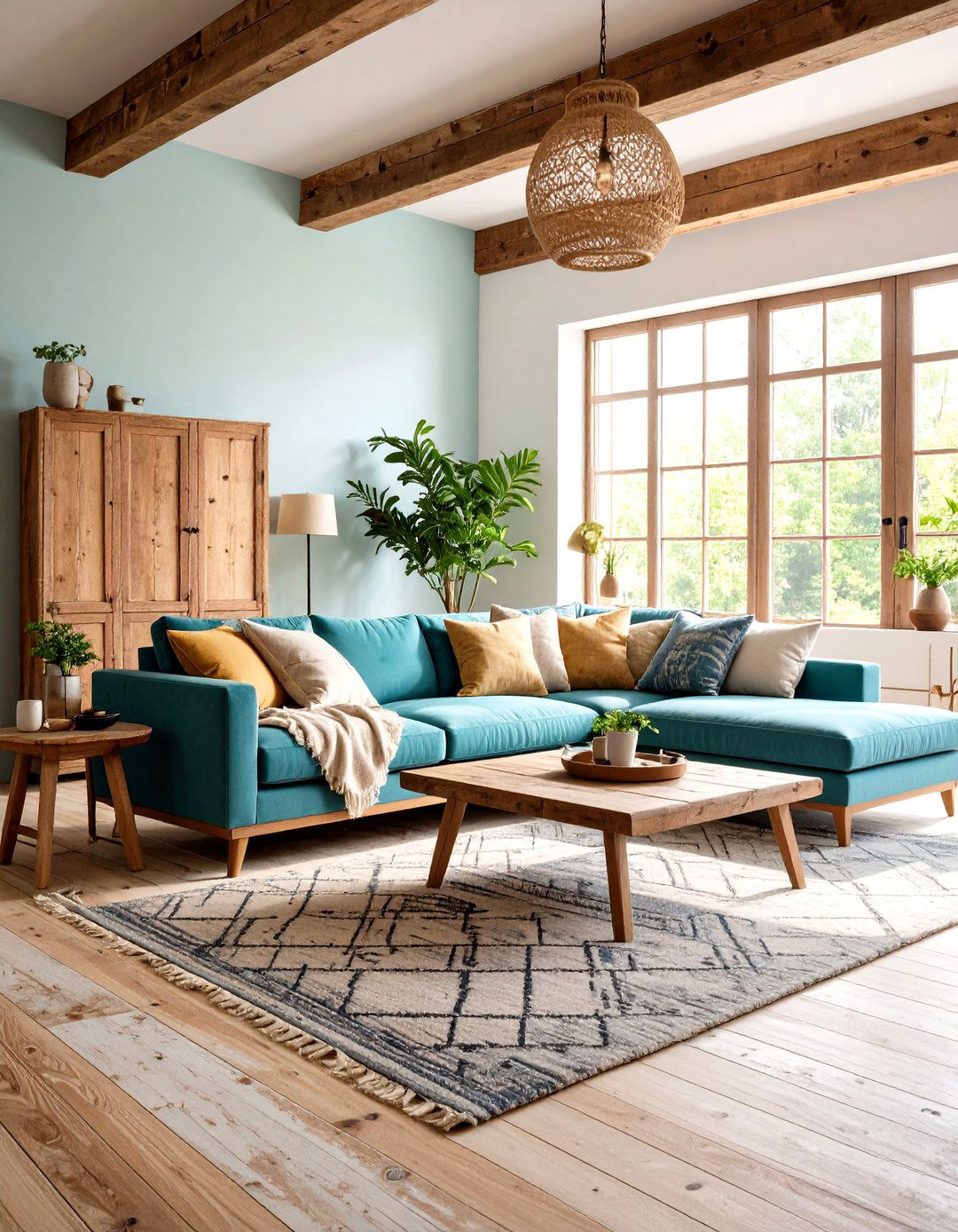
A softly lit living room instantly feels richer when you paint walls in mid-tone greige and then pile on tactile layers—think chunky knit throws, boucle accent chairs, and linen drapes. The subtle shift in weave and pile prevents a monotone look, while remaining within one hue keeps the space calm for reading or conversation House Beautiful The Spruce. Anchor the arrangement with a low-sheen greige rug, then introduce two or three organic materials such as rattan or raw wood for contrast. To stop the palette from drifting cool, choose bulbs around 2700 K and aim them toward walls rather than straight down; the reflected light warms undertones so furnishings glow instead of gray out.
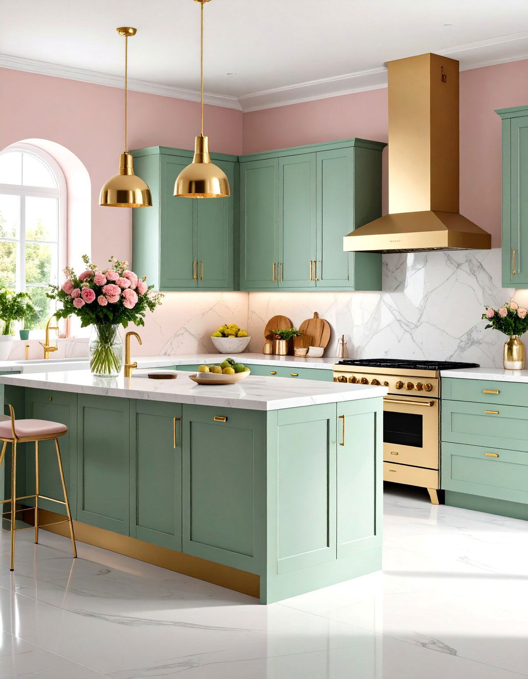
2. Greige-and-Black Modern Kitchen Contrast
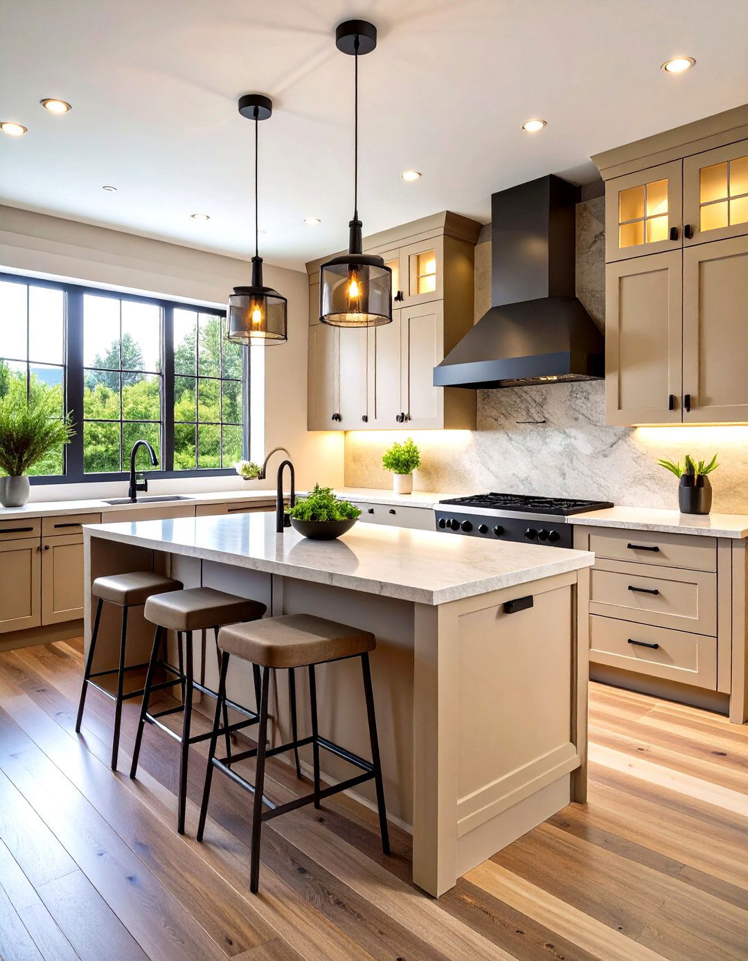
For a kitchen that feels sleek rather than sterile, pair greige cabinetry with matte-black pulls and slim black sconces. The neutral base lets the dark hardware read as intentional graphic lines instead of heavy blocks The Organic & Natural Paint Co. Keep counters pale and honed, then repeat black on window frames or bar-stool legs to create rhythm. Warm LED strip lights set under upper cabinets pull beige undertones forward, preventing the scheme from looking industrial. If budget allows, swap a single cabinet run for ribbed glass fronts; translucent panels lighten the wall yet echo the gray component of greige for seamless cohesion Real Simple.
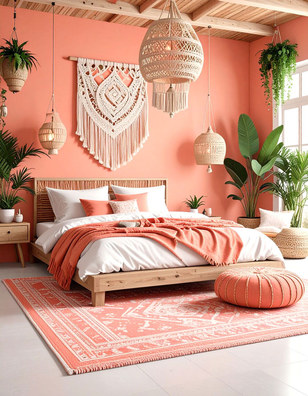
3. Cocooning Greige Bedroom Retreat
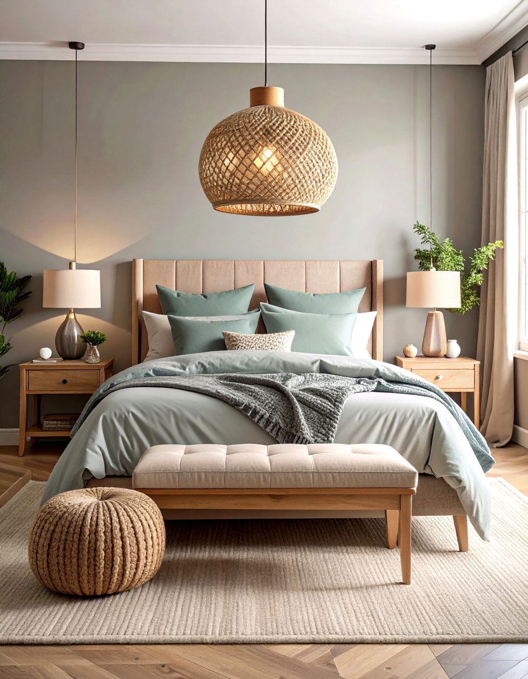
Unlike pure gray, greige contains a hint of yellow or red, which softens shadows and flatters skin—ideal for a restorative bedroom. Paint walls in a gentle warm greige, then layer tone-on-tone bedding—cotton percale sheets, a velvet quilt, and wool shams—for depth without clutter The Spruce. Finish with blackout curtains one shade darker to elongate the wall visually and improve sleep quality. Add an oversized woven pendant in natural fiber; its earthy texture bridges greige’s beige side while the weave’s tiny gaps cast subtle patterns at night for a spa-like glow The Organic & Natural Paint Co.
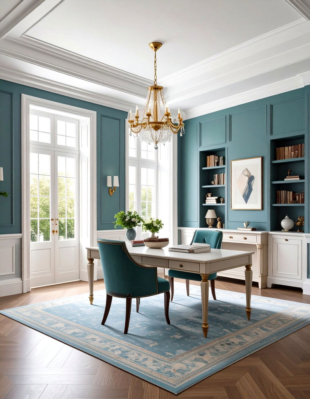
4. Minimalist Greige Home Office Focus
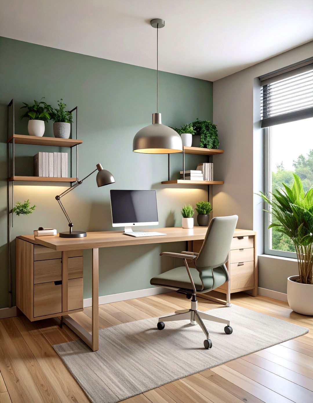
A minimalist workspace thrives on low visual noise, and a flat greige backdrop erases distracting color boundaries between wall, shelving, and desk. Opt for a slightly cool greige with faint green undertones to counteract blue-light fatigue from screens, then float slim open shelves in the same finish so books appear to hover FLOURISHED MINIMALIST. Tie in a powder-coated steel task lamp for a whisper of industrial edge. To maintain energy, position the desk perpendicular to a window; side lighting makes greige read lighter during work hours, keeping the room airy without glare The Spruce.
5. Textured Greige Lime-Wash Accent Wall
A lime-washed feature wall in warm greige delivers instant Old-World character without bold pigment. Because lime wash dries with tonal variation, the gray component deepens in recessed strokes while beige blooms on raised areas, giving depth even in small rooms House Beautiful. Seal with a breathable matte topcoat so the finish remains velvety rather than glossy. Echo the wall’s movement elsewhere with raw-edge wooden furniture or stone accessories; their organic irregularities amplify the artisanal vibe while staying in the neutral family Young House Love.
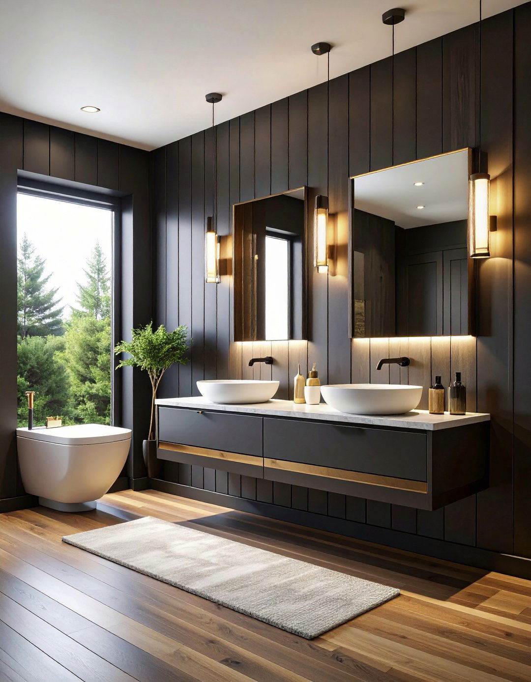
6. Spa-Like Greige and Brass Bathroom
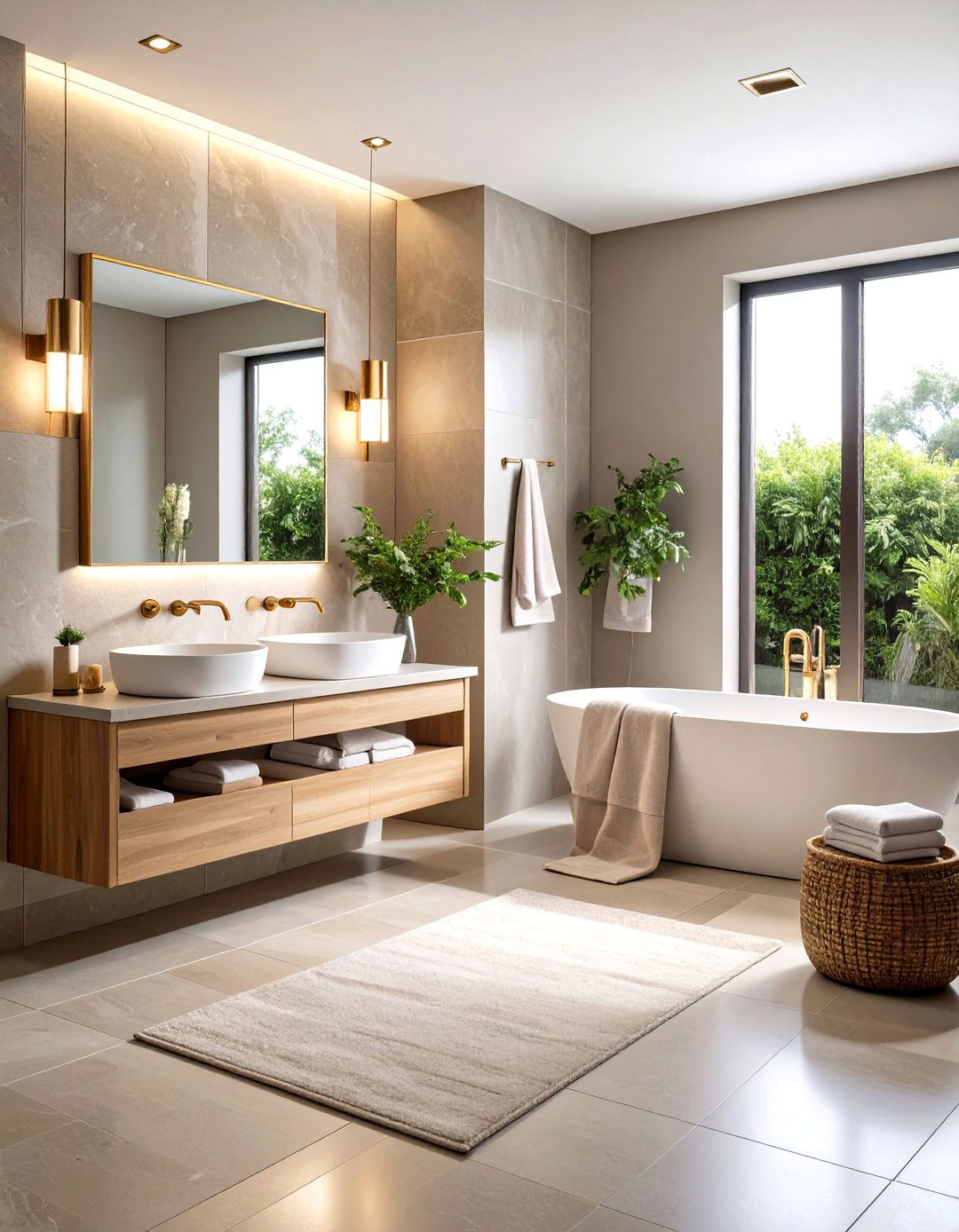
Trade stark white tiles for warm greige porcelain and suddenly brass fixtures feel like jewelry instead of bling. Because greige sits midway on the spectrum, it tempers brass’s yellow cast and flatters most skin tones—perfect for vanity mirrors Hirshfield's. Select a slightly darker greige for the floor to ground the scheme, and run narrow vertical grout lines to elongate the wall. Finish with plush towels one tone lighter than your wall color; the subtle value shift creates a layered hotel-spa effect without departing from the palette The Spruce.
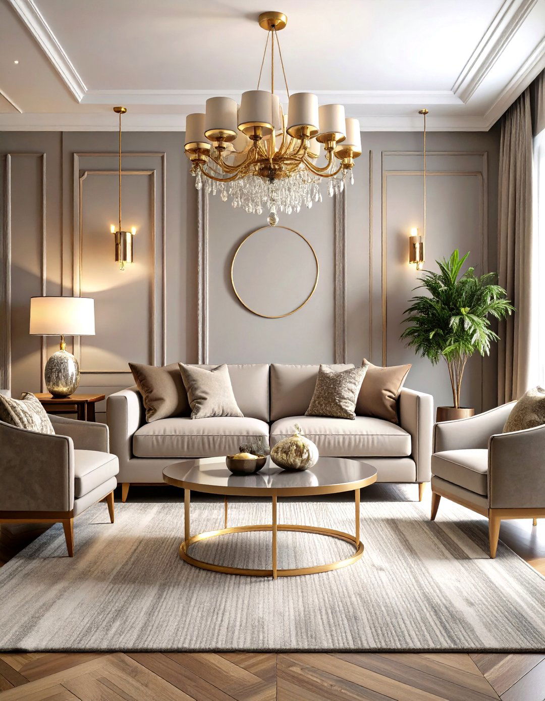
7. Greige Base with Moody Navy Accents
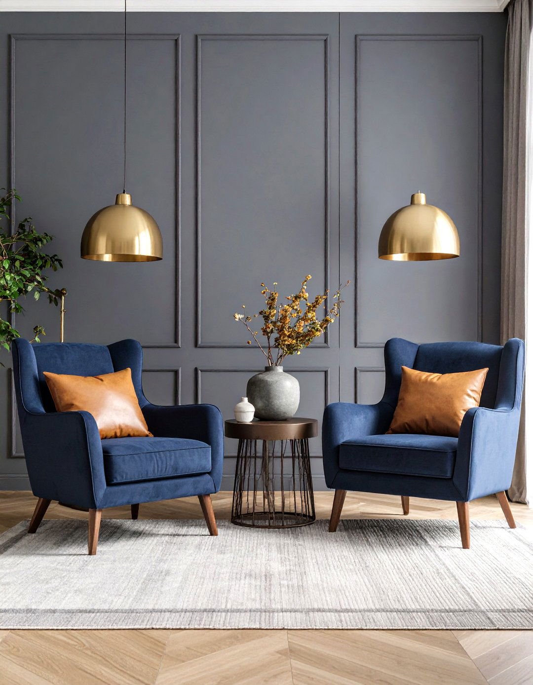
Introduce drama by letting deep navy armchairs or built-ins float against pale greige walls; designers call this the “new neutral” pairing because both colors feel classic yet current Real Simple. Keep undertones aligned: choose a greige that leans slightly cool so the navy reads crisp, then insert caramel leather cushions to bridge warm and cool notes. A single brushed-nickel floor lamp echoes navy’s coolness while bouncing light back onto the greige backdrop, preventing the room from turning cave-like at night Hirshfield's.
8. Built-In Storage in Seamless Greige
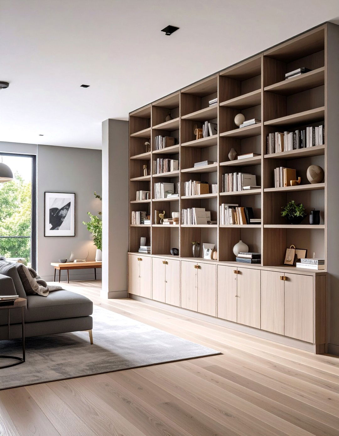
Painting floor-to-ceiling bookshelves and cabinet fronts the same greige as surrounding walls makes bulky storage disappear, which is particularly helpful in compact apartments. Be sure to test undertones beside existing flooring; a greige with subtle green notes neutralizes common pink-beige carpets, avoiding clashes Kylie Interiors. Line shelf backs with grass-cloth wallpaper one shade deeper to add depth when doors are open. Touch-latch hardware keeps the façade unbroken, allowing art or a statement chair to take center stage instead of handles and hinges House Beautiful.
9. Scandinavian Dining with Wood and Greige
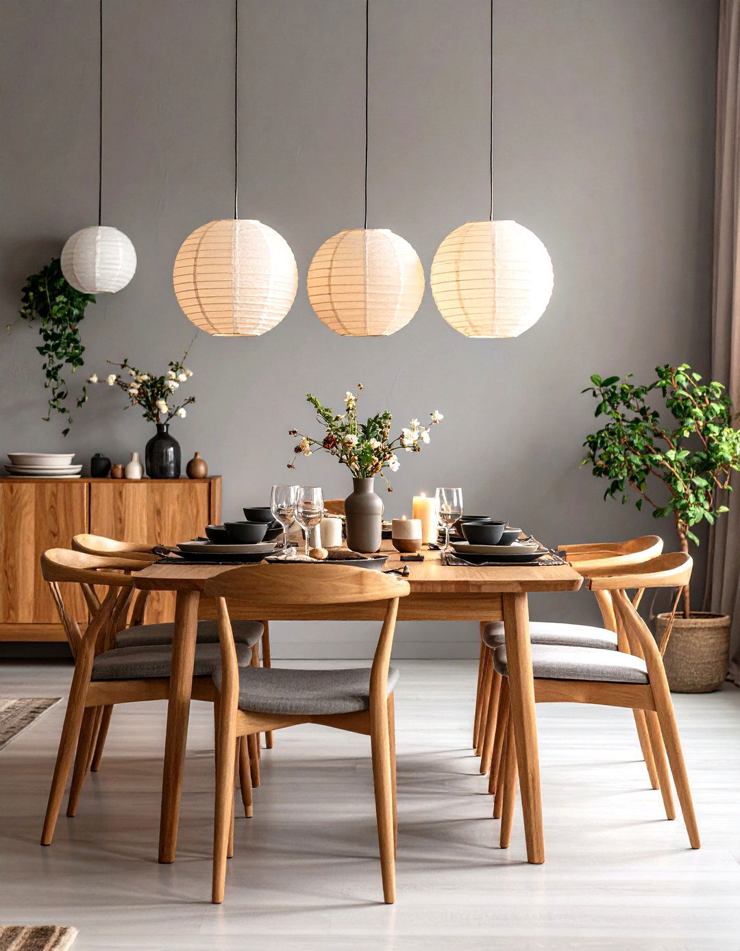
Pairing honey oak or ash dining furniture with neutral greige walls captures Scandinavian serenity without sliding into monochrome. The beige portion picks up wood’s warmth, while the gray mutes yellow undertones so grain patterns stand out crisply The Organic & Natural Paint Co. Choose matte finishes to keep light diffused, and cluster three paper lantern pendants overhead; their soft glow makes greige bloom, highlighting natural textures. Finish the table with stoneware in off-white and charcoal to echo both halves of the color blend, creating effortless cohesion for everyday meals and festive gatherings alike FLOURISHED MINIMALIST.
10. Sun-Drenched Greige Sunroom Transition
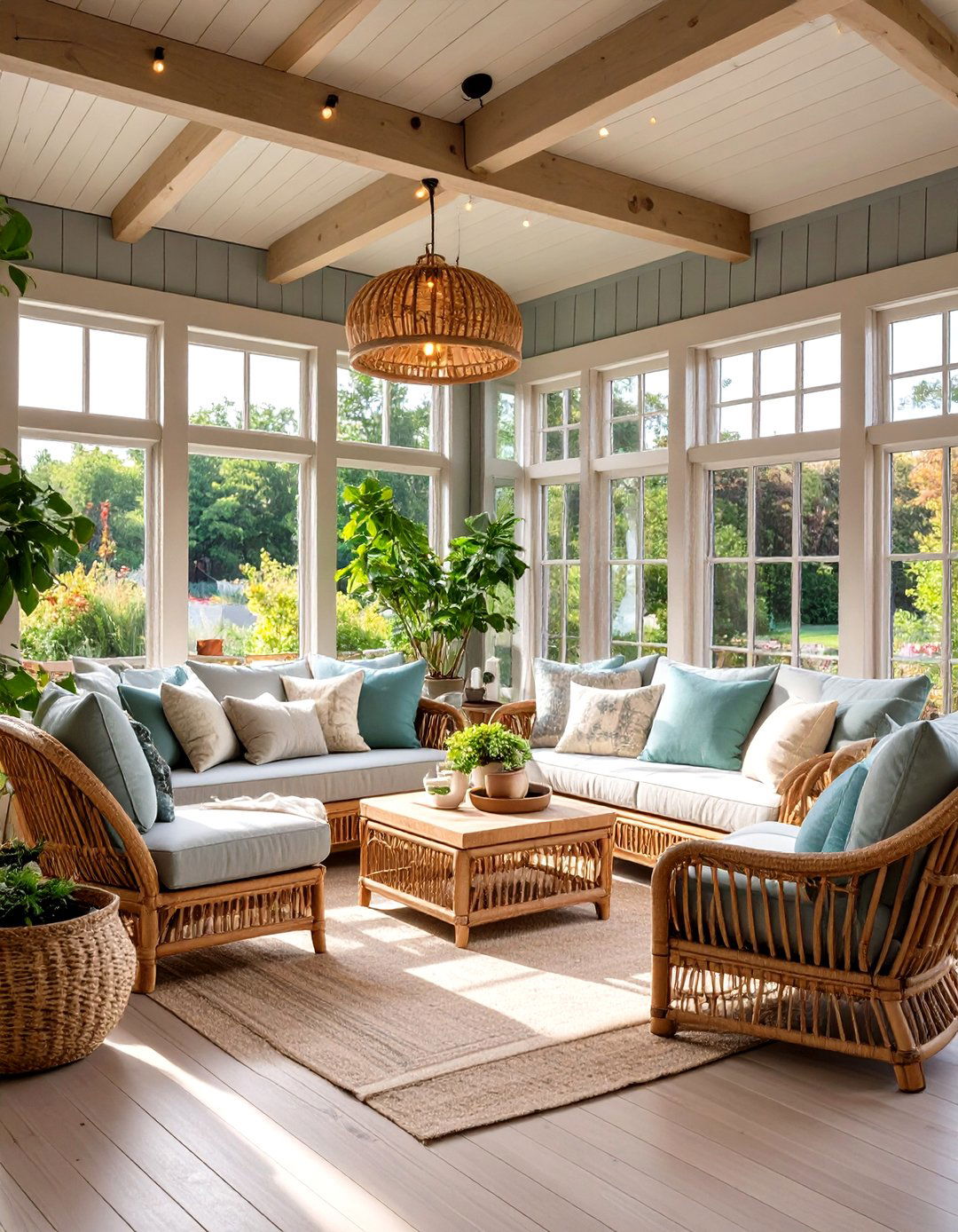
A sunroom often bridges indoor and outdoor palettes, and mid-value greige handles shifting daylight better than stark white, which can glare. Apply low-VOC greige paint to bead-board walls, then coat ceiling rafters in the same hue at half strength to visually lift the roofline FLOURISHED MINIMALIST. Rattan loungers with sage cushions pull green undertones forward at midday, while amber string lights draw out beige notes at dusk, letting the room morph with the sky. Indoor plants pop against the neutral yet never feel jarring The Spruce.
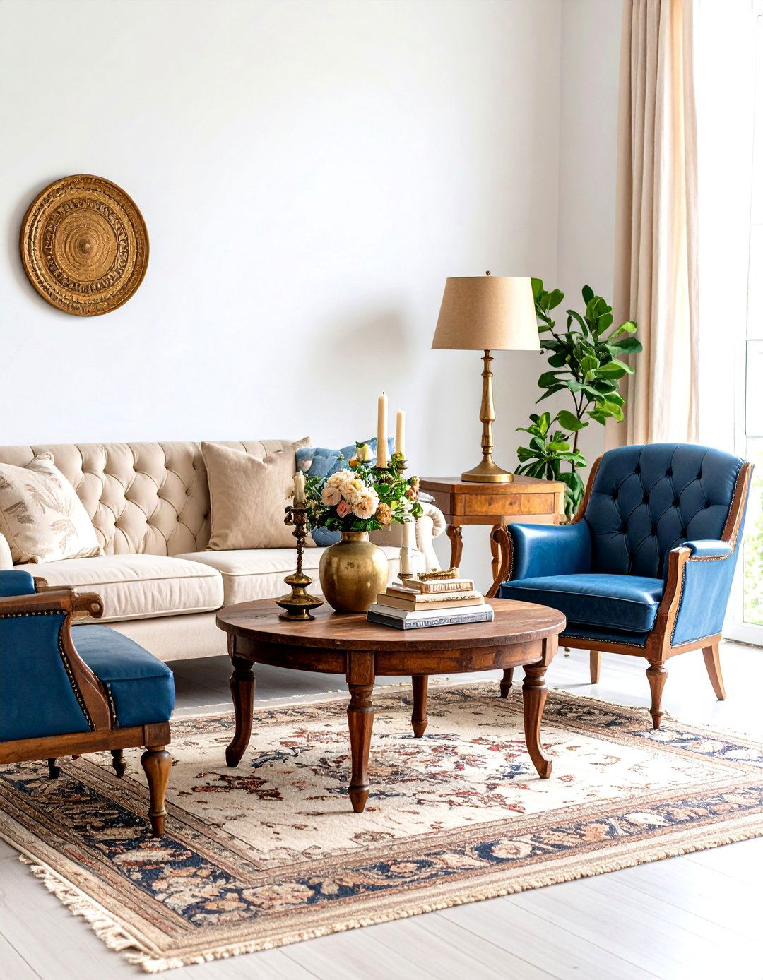
11. Greige Upholstery Meets Bold Art
Large-scale contemporary artwork shines when set against greige linen sofas because the neutral absorbs undertones from surrounding pigments rather than competing with them Hirshfield's. Opt for canvases containing one greige brushstroke to echo the palette and stitch the scheme together. To keep seating from vanishing, add two velvet pillows in the painting’s dominant color, then slide a slim picture light above the frame; its warm LED will subtly enrich beige undertones while ensuring artwork remains the focal point House Beautiful.
12. Continuous Greige Flooring for Flow
Laying wide-plank luxury-vinyl or engineered wood in weathered greige across an open-plan level dissolves visual dividing lines and makes small homes feel expansive. Realtors note that cohesive neutral flooring can increase buyer appeal because rooms transition smoothly without style clashes Real Simple. Choose boards with minimal repeating pattern so the eye glides uninterrupted, then pick wall greige one shade lighter to maintain subtle contrast. Felt underlays hush footfall, reinforcing the sense of calm continuity throughout living, dining, and hallway areas.
13. Cozying Lofty Ceilings with Warm Greige
High ceilings can feel cavernous; painting them a warm greige several tones deeper than walls visually lowers the plane, adding intimacy without structural changes. The switch simultaneously highlights crown molding, turning a construction necessity into an architectural feature Color Concierge. Track lights aimed upward bounce diffused illumination, preventing the deeper shade from reading heavy. To resolve potential cool-warm clashes, repeat ceiling color on a single accent chair or throw, tying vertical and horizontal planes together The Spruce.
14. Soft Greige Trim Instead of Bright White
Trading stark white trim for a paler greige softens contrast lines, creating a more relaxed envelope while still framing windows and doors. Choose a greige two steps lighter than the walls so profiles stand out subtly House Beautiful. Because both paints share undertones, you avoid the jarring “color cut” that often happens with pure white, especially under warm lamplight. Finish with eggshell walls and satin trim; the sheen difference, rather than hue gap, supplies the definition your architecture needs The Spruce.

15. Layering Greige Rugs for Depth
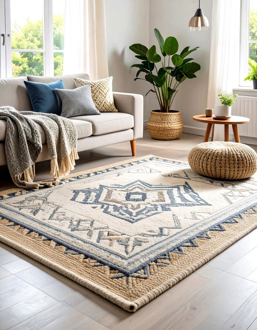
Textile designers rank greige among the easiest bases for pattern mixing, so don’t stop at one rug. Lay a nubby jute mat first, then position a smaller geometric wool piece in cooler greige on top; the change in scale and temperature sparks interest without busy color juxtapositions Young House Love. Secure layers with non-slip pads trimmed two inches shy of edges to keep trip hazards at bay. Matching throw blankets elsewhere ribbons the layered effect through the room, creating cohesive coziness.
16. Airy Greige Window Treatments
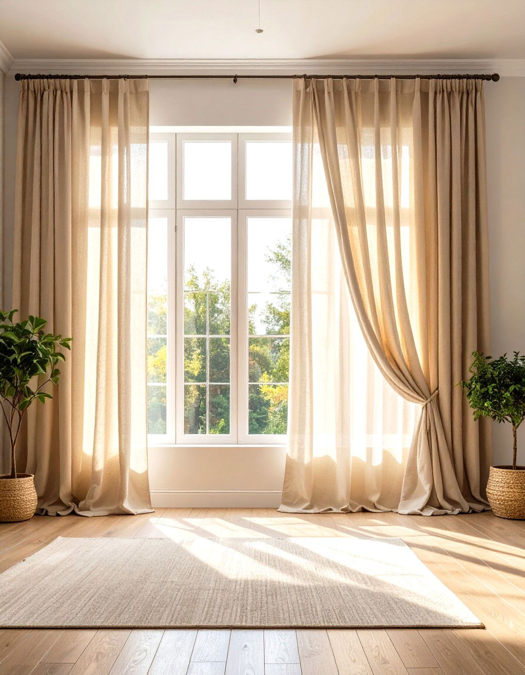
Sheer greige linen panels filter harsh sun into a flattering champagne glow, all while disguising minor dust far better than white. Because warm gray notes reduce visual heaviness, you can install floor-to-ceiling drapes without dwarfing a space Hirshfield's. For rental-friendly mounting, affix tension rods inside trims; their hidden placement maintains the continuous neutral frame created when walls and woodwork share the same family. Iron panels lightly to keep natural slub visible—texture is key when sticking to one hue The Spruce.
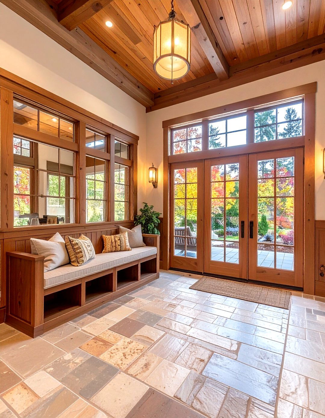
17. Welcoming Greige Entryway First Impressions
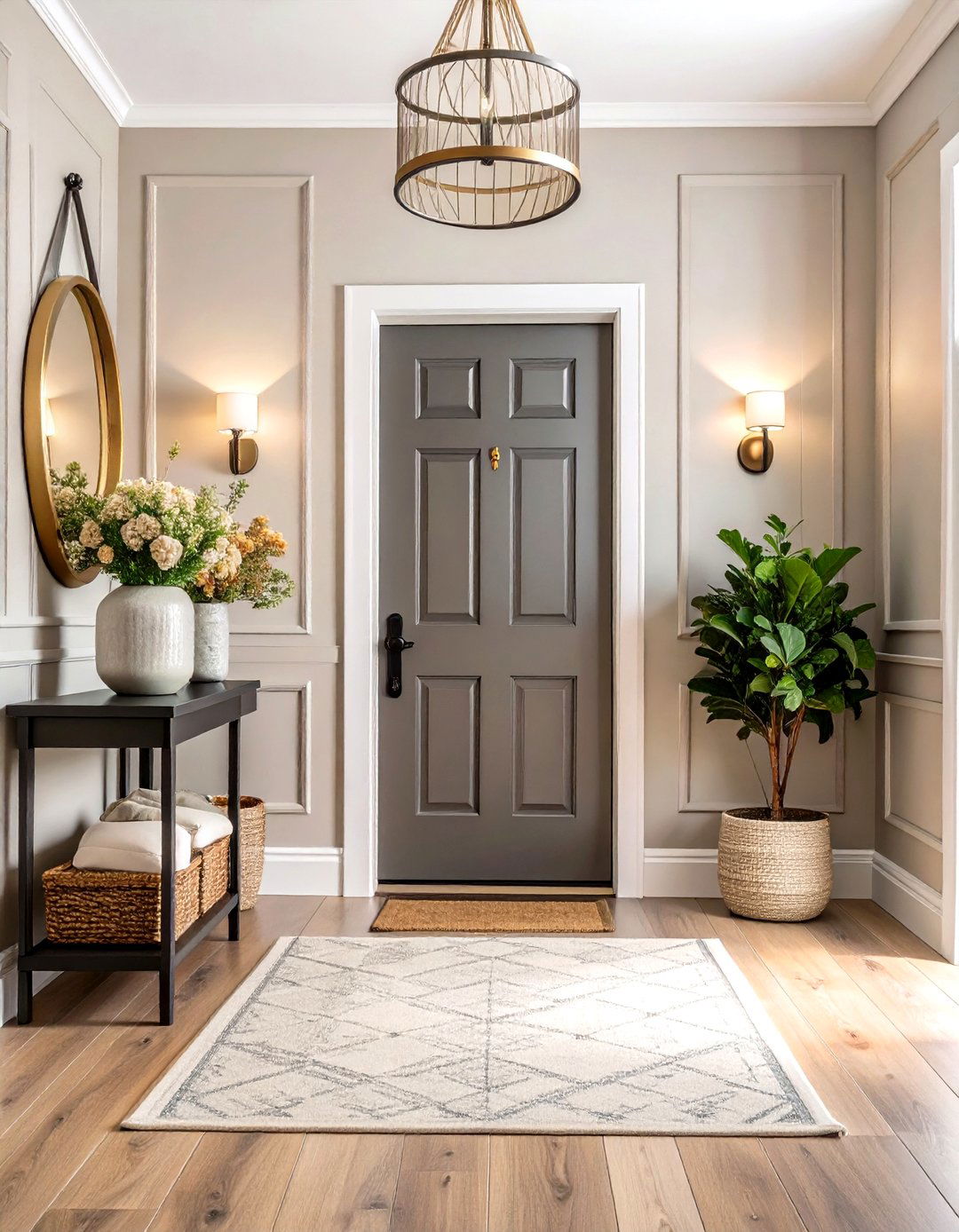
A compact foyer benefits from greige’s chameleon quality: under daylight it looks airy; beneath warm bulbs it feels cozy. Paint walls in mid-tone greige, then coat the inside of the front door one shade deeper for a tonal “hello.” Color consultants suggest peel-and-stick samples first, because hallway lighting often skews cooler than adjacent rooms Color Concierge. A slim black console echoes door hardware, while a round brass mirror bounces light to pull beige undertones forward, ensuring guests arrive to warmth, not gray gloom The Spruce.
18. Serene Gender-Neutral Greige Nursery
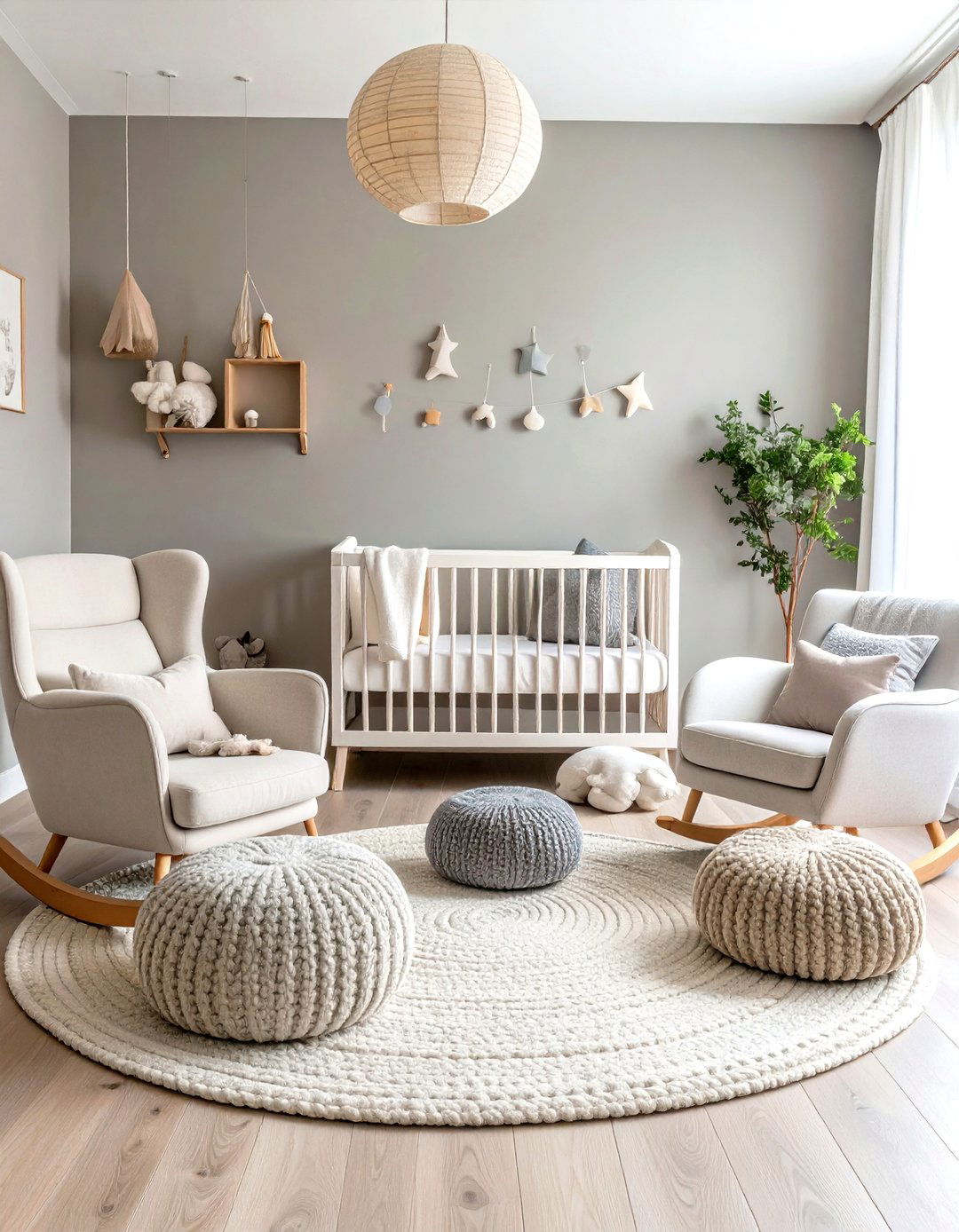
Parents seeking a calm, grow-with-me palette can skip pastel pinks and blues and reach for warm greige, which research links to lower stimulation and better infant sleep quality compared with bright hues The Organic & Natural Paint Co. Keep walls matte to minimize glare, then introduce texture—knit poufs, boucle rocking-chair cushions—to engage touch without color overload. Because greige bridges cool and warm, you can update accessories later (rust orange for toddlers, sage for teens) without repainting Real Simple.
19. Quick Update with Greige Accessories
If repainting isn’t on today’s agenda, swap out smaller accents: replace stark white lampshades, throw pillows, and picture mats with greige versions. The subtle shift mutes hard contrasts, instantly modernizing legacy color schemes. For best cohesion, pick accessories whose greige leans the same direction (warm or cool) as your dominant surfaces; a simple undertone match prevents the “dirty” look mismatched neutrals can create Kylie Interiors.
20. Greige Millwork for Architectural Drama
Painting wainscoting, coffers, or built-ins a deep taupe-leaning greige while leaving walls lighter spotlights craftsmanship without bright color. Designers favor this maneuver because the neutral shadow lines amplify depth yet stay sophisticated House Beautiful The Spruce. Complete the picture with satin finish to reflect a whisper of light across ridges, then frame art in matching greige mats so the eye reads trim and décor as one tailored statement.
Conclusion:
Greige’s genius lies in its quiet flexibility: the shade moves effortlessly between cool and warm, bright daylight and lamp-lit evenings, minimalism and layered maximalism. Whether you coat entire rooms, highlight a single wall, or sprinkle in accessories, these twenty ideas prove greige can anchor bold contrasts, calm bedrooms, elevate bathrooms, and even nudge resale value upward—without ever overpowering personal style. Choose undertones that match your light, layer textures for depth, and let this modern neutral unlock fresh possibilities in every corner of your home.
Related posts:
Leave a Reply