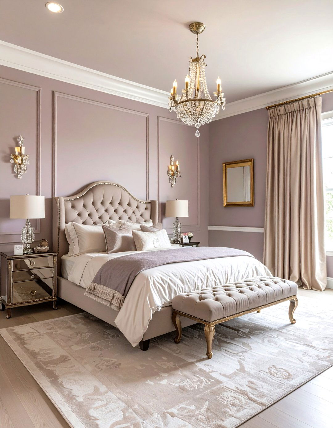
Softly layering color in a personal retreat can make every sunrise feel intentional, every bedtime ritual restorative. The following two-hue bedroom painting ideas pair on-trend palettes with easy application tips so you can look forward to wielding a roller—rather than dreading the first dip in the tray. Each suggestion stands on its own, yet together they form a toolbox of contrasts, harmonies, and finishes you can tailor to space, light, and mood. Feel the pull of the shade that matches your morning energy, then explore the technique notes tucked into every paragraph for a project that looks as polished in person as it does in your imagination. Ready to see which duo sparks the strongest “that’s it” moment? Let’s step into the color card.

1. Navy Blue & Crisp White Bedroom Painting Contrast

A dramatic swath of navy stretching halfway up the wall instantly anchors furniture, while the upper white band keeps the ceiling feeling miles away. Bedroom painting in this classic maritime pair works wonders because deep blue promotes calm focus, and white bounces daylight back into the room. Use painter’s tape to mark a straight horizon line at roughly two-thirds height, sealing the edge with the base color before cutting in the accent for razor-sharp separation. Satin or eggshell sheen on blue adds depth without glare; a flat white overhead keeps things cloudlike. Finish with nickel hardware or seagrass baskets to echo watery undertones and soften the high-contrast edge.
2. Sage Green & Soft Cream Bedroom Painting Harmony
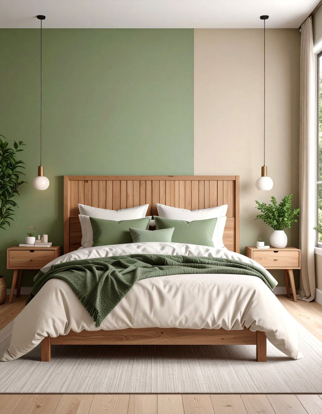
Gentle sage rolling across the lower wall grounds a bedroom with botanical calm, while a creamy top half diffuses morning light. Bedroom painting in this duo leverages research showing muted greens steady the nervous system and pair effortlessly with natural textures. Apply the green in a washable matte for a velvety, plant-inspired backdrop; then pull the cream onto trim and the ceiling for seamless wraparound warmth. A wooden picture rail at the color break acts as both level guide and shelf for small art. Layer linen bedding, woven blinds, and stoneware lamps to echo the palette’s garden-to-indoors serenity.
3. Dusty Rose & Charcoal Gray Bedroom Painting Balance
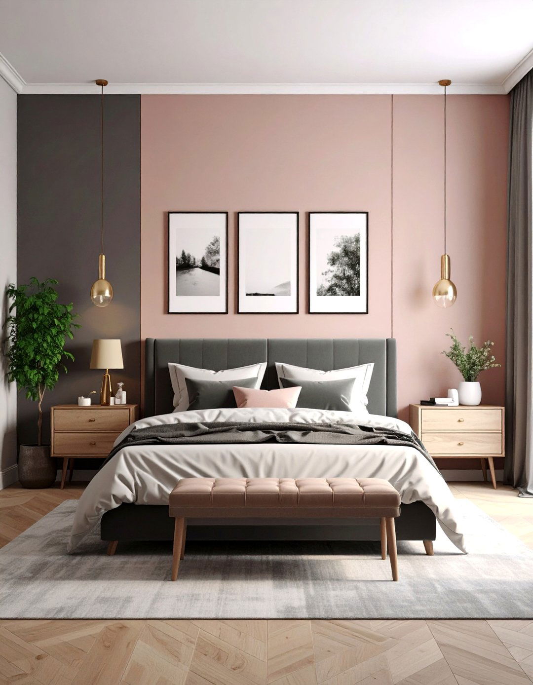
Bedroom painting gets quietly sophisticated with a band of charcoal beneath a dusty-rose upper wall. The near-black gray absorbs excess light, perfect for sleepers who crave a cocoon, while the softened pink reflects a flattering sunset glow onto skin and décor. Keep proportions even—half and half—to avoid visual heaviness; a semi-gloss charcoal resists scuffs behind nightstands, and an eggshell rose diffuses lamplight. Introduce brushed-gold pulls or rose-quartz accessories to echo the warm notes without tipping into sweetness. A monochrome art gallery on the dark portion grounds the palette and lets the blush breathe above.
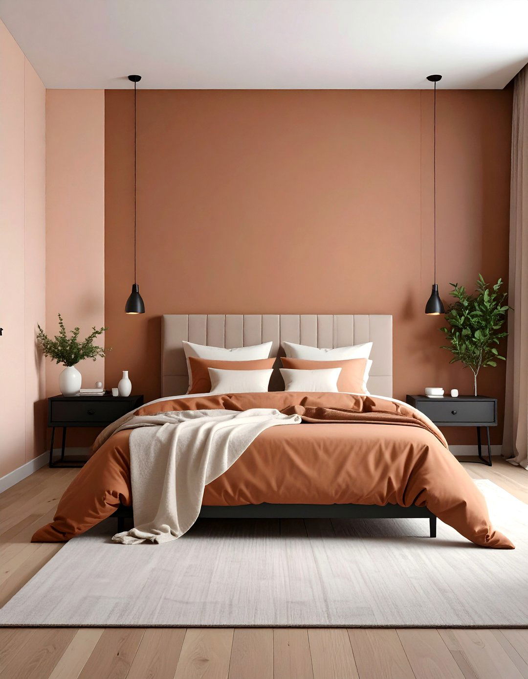
4. Terracotta & Clay Beige Bedroom Painting Warmth
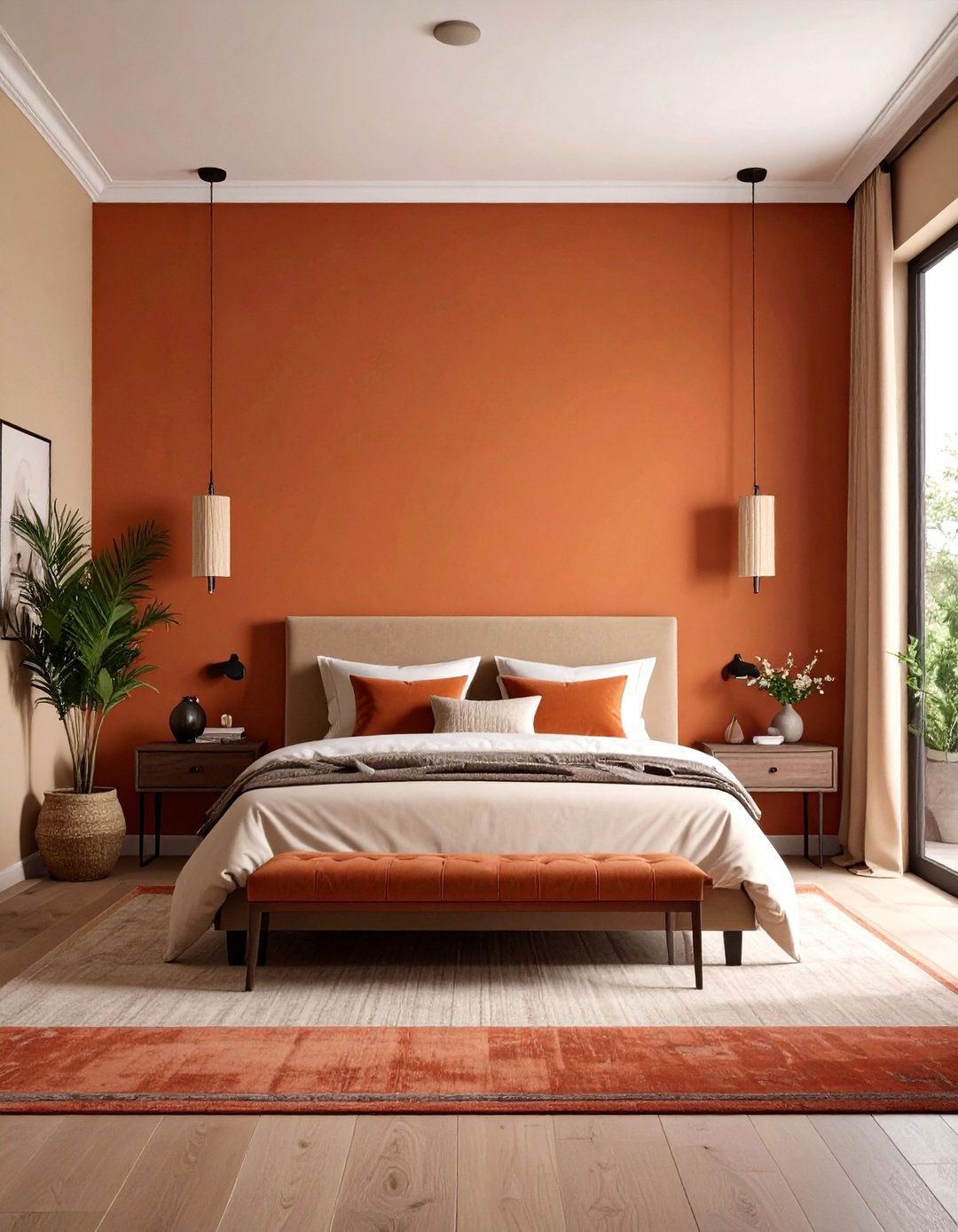
For bedroom painting that wraps you like sun-baked adobe, brush a band of sun-soft terracotta around the lower third of the walls, topping it with clay-beige all the way to the crown. Earthy reds enliven morning routines, while the neutral upper tone keeps the scheme breathable and pairs with virtually any bedding pattern. Paint the terracotta in a low-sheen enamel so the color reads dense and mineral; use the same beige on ceiling and trim for a seamless sky. Jute rugs, leather pulls, and black-iron sconces underscore the desert vibe without cluttering the palette.
5. Mustard Yellow & Slate Gray Bedroom Painting Energy
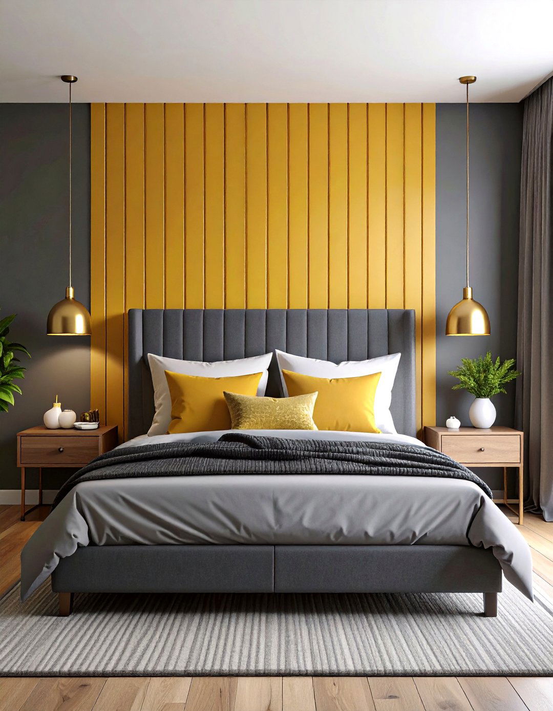
A slate gray foundation steadies the eye, letting confident mustard yellow shine on a single accent wall or wide vertical stripe behind the bed. This bedroom painting duo is invigorating at dawn yet cozy at dusk, as the muted gray softens the yellow’s brightness while spotlighting headboards and artwork. Prime first—yellows require solid coverage—then cut in gray on adjoining walls to frame the focal hue. Finish surfaces in eggshell to avoid glare, and echo the scheme with graphite throw pillows and brass lamp bases for cohesion.
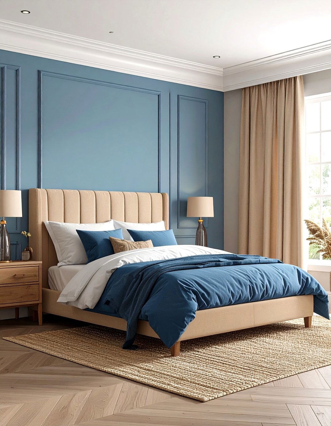
6. Sky Blue & Warm Sand Bedroom Painting Calm
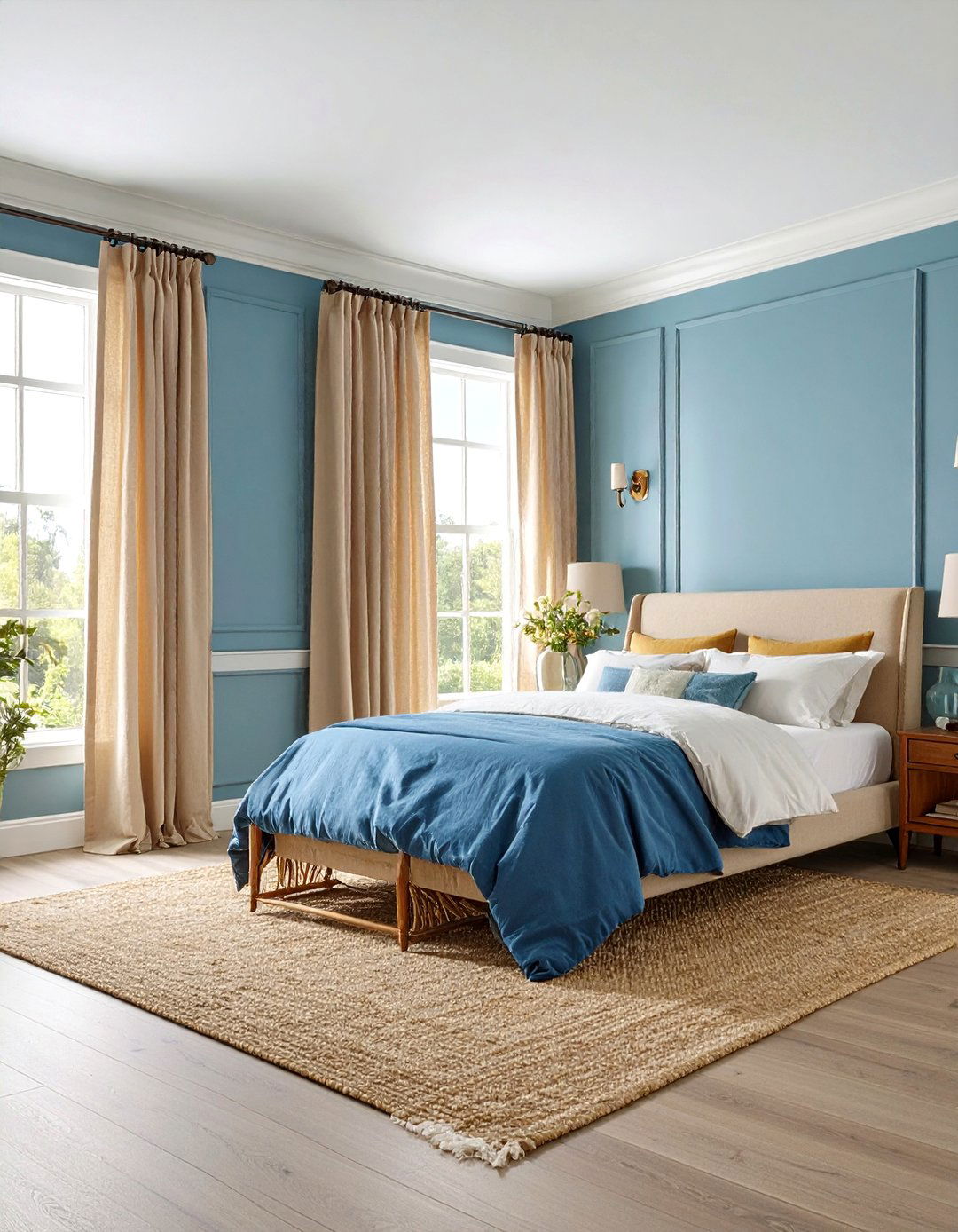
Bedroom painting that sandwiches sky blue walls between sandy baseboards and ceiling trim mimics a seaside horizon, subconsciously lowering heart rates. Light blue has been shown to induce relaxation, while beige undertones prevent the palette from feeling chilly. Roll the blue in a moisture-resistant matte, ideal if your climate swings humid; brush the sand shade on crown molding to visually stretch wall height. Add linen curtains, bleached-wood picture frames, and a sisal rug to reinforce the breezy, barefoot mood.
7. Lavender & Dove White Bedroom Painting Serenity
Float into sleep under lavender walls capped with dove-white ceiling and trim—a pairing that softens edges and makes smaller rooms feel ethereal. Bedroom painting in pastel violet whispers of spring blossoms, shown to soothe anxiety, while the warm white prevents a clinical vibe. Use high-quality tape to outline doorframes, then brush lavender first so any bleed is covered by the trim coat. Accent with silvery linens, glass knobs, and smoked-amethyst throw blankets to tie the palette together without overpowering it.
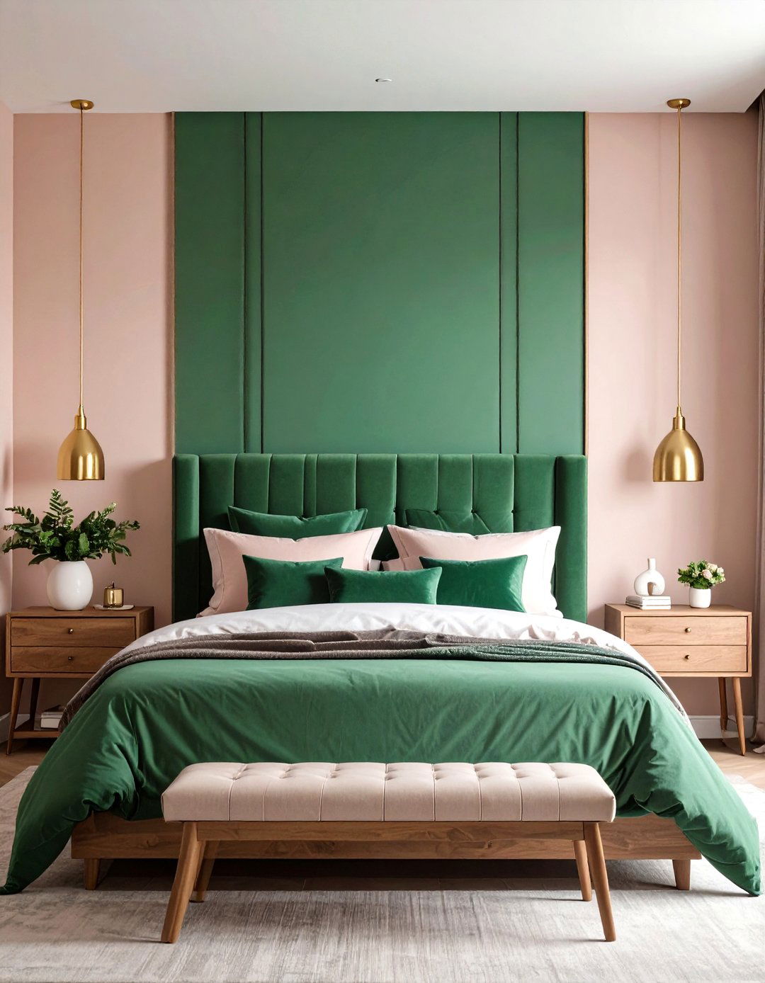
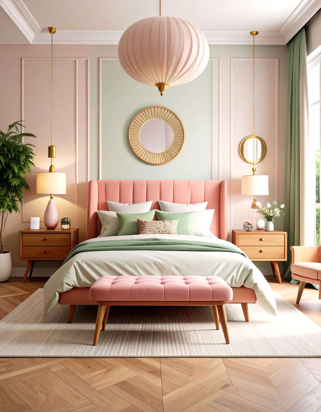
8. Emerald Green & Blush Pink Bedroom Painting Drama
For maximal yet romantic impact, paint the headboard wall emerald green and wrap the remaining three in a barely-there blush. The saturated jewel tone draws focus while the airy pink keeps volume balanced. Bedroom painting like this benefits from color-blocking tips: sketch the emerald area wider than the bed frame and mask edges meticulously for gallery-worthy lines. Satin finish on green amplifies depth; matte blush reduces reflections. Brass picture lights, velvet pillows, and natural-wood nightstands temper the boldness with tactile comfort.
9. Charcoal Black & Warm Taupe Bedroom Painting Contrast
A charcoal black lower wall partnered with warm taupe above feels tailored yet tranquil—think tailored suit meets cashmere scarf. Bedroom painting in this duo harnesses the cocooning power of dark tones without sacrificing light bounce. Keep the charcoal to the bottom 40 % of wall height and run it up door frames for a sophisticated archway effect; apply breathable matte to disguise roller strokes. The taupe upper walls and ceiling glow under warm bulbs, bridging dark panelling and soft linens. Layer taupe-striped bedding and matte-black hardware for cohesion.
10. Peach & Cocoa Brown Bedroom Painting Comfort
Bedroom painting that marries nostalgic peach with velvety cocoa brown creates a dessert-toned retreat perfect for winding down. Brush cocoa on the lower half to anchor furniture, then let the peach bloom overhead for a rosy complexion lift. Semi-gloss on brown resists scuffs, while flat peach blurs ceiling angles. Balance sweetness with black metal accents and off-white throws to keep the room from feeling saccharine.
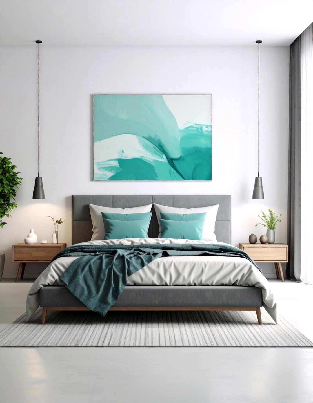
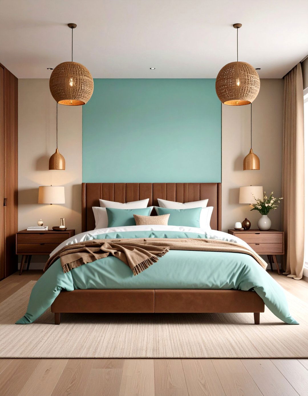
11. Deep Teal & Pale Mint Bedroom Painting Refresh
If you crave color without chaos, try deep teal on built-in wardrobes or the bed’s backdrop and bathe the rest of the room in whisper-mint. Bedroom painting in analogous greens offers depth plus a spa-like breeze. Use a medium-nap roller on teal for uniform saturation; mint can go on with the same roller after cleaning to maintain undertone harmony. Tie the scheme together with eucalyptus branches, brushed-nickel pulls, and ivory wool throws for subtle texture.
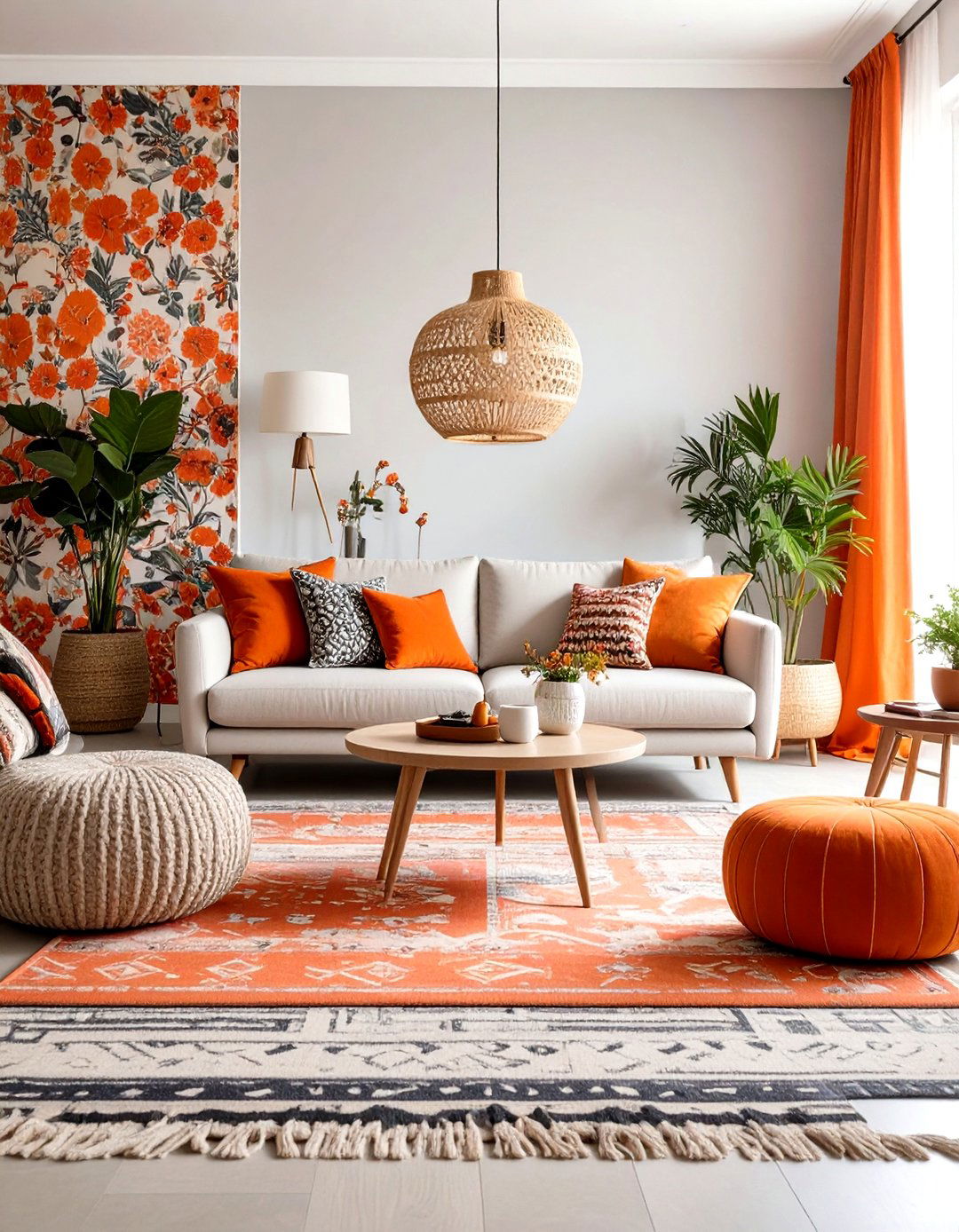
12. Burnt Orange & Cloud Gray Bedroom Painting Boldness

Pairing burnt orange with cloud gray gives bedroom painting a modernist punch—bright enough to energize, cool enough to calm. Roll gray across three walls, then stencil an oversized arch or angled stripe of orange behind the headboard. Stencils or laser levels ensure edges stay crisp; seal tape with the base gray first, a pro trick for zero bleed. Keep bed linens neutral linen or charcoal and add one terracotta vase to echo the focal hue without clutter.
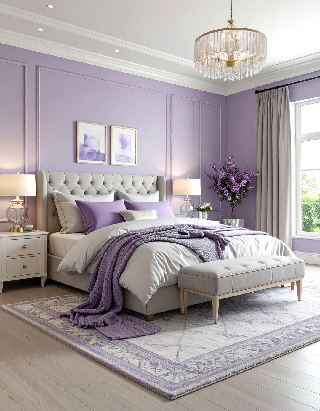
13. Plum & Champagne Bedroom Painting Luxury

Deep plum walls framed by champagne-tinted wainscoting deliver boutique-hotel opulence in a standard bedroom. Rich purples encourage introspection, while the pale metallic neutral reflects soft glamour. When bedroom painting with dark colors, tint primer first to reduce coats. Use eggshell on plum for a velvet appearance; high-gloss on the lower champagne paneling pops architectural lines. Accent with mirrored trays, silk draperies, and crystal knobs to echo the light-catching undertones.
14. Pale Aqua & Mocha Bedroom Painting Coast-Meets-Cafe
An airy aqua ceiling descending halfway down the walls meets a mocha lower band, blending coastal freshness with coffee-house warmth. Bedroom painting in this orientation lifts ceilings visually while anchoring bedside case goods. Mark the drop line with a chalk snap, prime, then roll aqua first to prevent dark bleed-through. Choose flat for aqua to evoke sky, and satin for mocha to mimic polished wood. Introduce rattan pendants and cream throws for effortless cohesion.

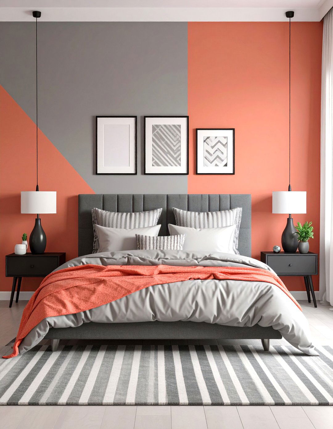
15. Coral & Cool Gray Bedroom Painting Cheer
Bright coral splashed on a geometric colour-block—think offset rectangles—over mist-gray walls brings playful energy without overwhelming bedtime routines. Bedroom painting with bold shapes owes its success to precise taping; press edges firmly and remove tape while paint is tacky to avoid tears. Matte gray subdues the backdrop, whereas satin coral pops. Echo the palette through striped cushions and matte-black picture frames for a balanced, grown-up finish.
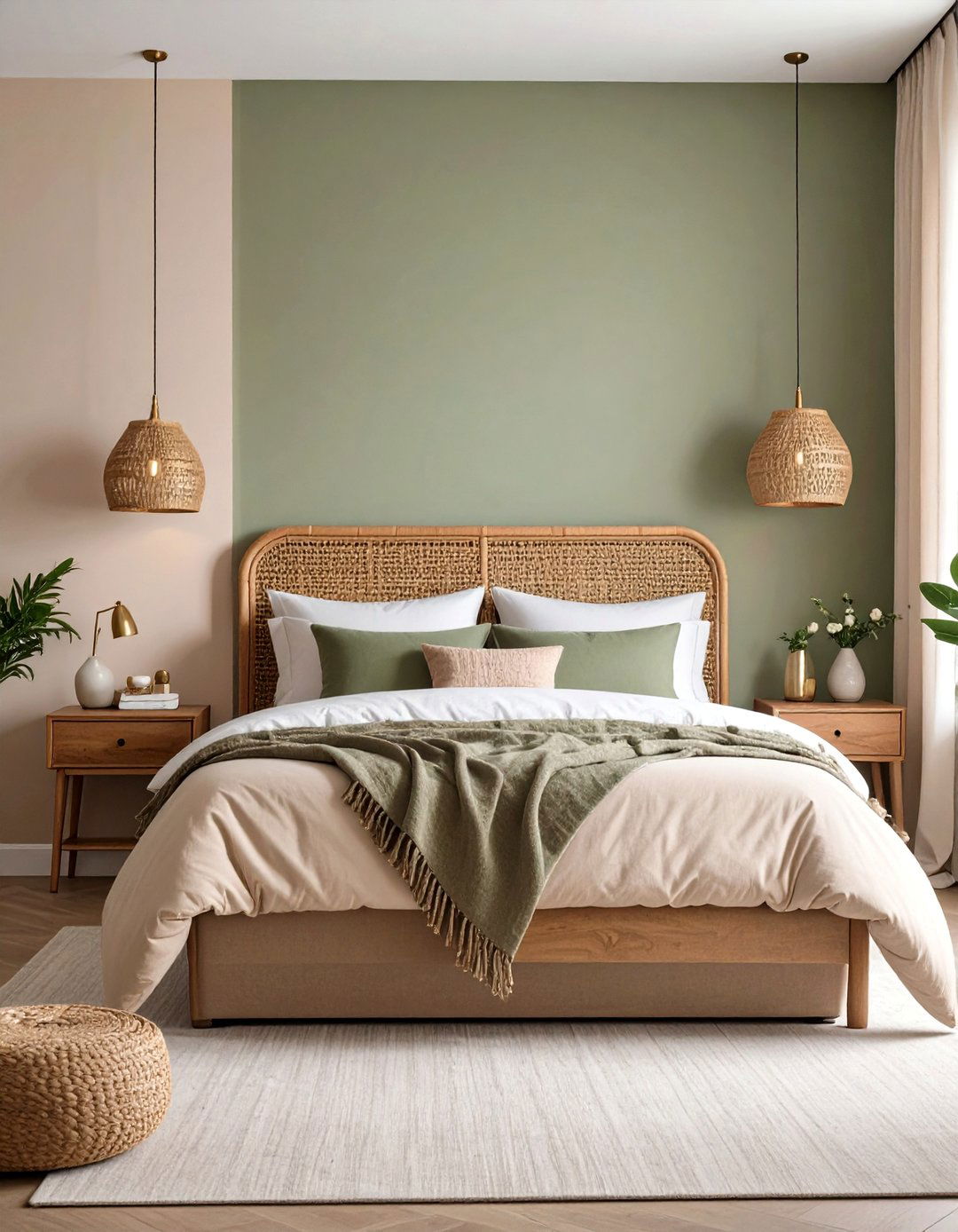
16. Olive Green & Soft Blush Bedroom Painting Nature-Nurture
Olive green wrapped around the lower two-thirds of walls grounds a space in woodland calm, while a tender blush upper third adds daylight-catching warmth. Bedroom painting in this ratio suits tall ceilings by lowering the perceived canopy. Choose a durable eggshell for the olive to withstand furniture bumps; flat blush lets art float seamlessly. Layer rattan headboards, floral throws, and antique brass lamps to weave the outdoorsy palette into every detail.
17. Steel Blue & Warm Vanilla Bedroom Painting Tranquility
Steel blue walls lined by warm vanilla trim cultivate a fog-before-sunrise mood—ideal for unwinding. Bedroom painting with a mid-tone blue softens visual noise, while creamy accents prevent a too-cool chill. Use a quality angled brush on trim, and finish walls in washable matte so framed art doesn’t glare. Complement with oatmeal bedding, pewter hardware, and knit throws to round out the cozy atmosphere.
18. Chocolate Brown & Powder Blue Bedroom Painting Depth
Dark chocolate enveloping one accent wall paired with powder-blue surroundings gives bedroom painting an enveloping hug balanced by sky-hued optimism. Brown fosters security, while soft blue supports calm cognition. Prime thoroughly—dark pigments need a base—to avoid streaks. Satin brown adds richness; matte blue expands perceived space. Herringbone rugs, brass reading lights, and cream linen shams complete the café-mocha-in-clouds sensation.
19. Mauve & Midnight Blue Bedroom Painting Sophistication
Split mauve and midnight blue on a diagonally bisected wall for an artful boutique feel. Bedroom painting diagonals means snapping a plumb chalk line corner to corner, taping, then painting the lighter colour first. Mauve’s subtle warmth counterbalances the deep blue, preventing a cave-like effect. Opt for velvet cushions in each hue, and introduce glass-front nightstands or mirrored accents to reflect light across both tones.
20. Sunflower Yellow & Olive Gray Bedroom Painting Accent Stripes
Transform a plain wall into a striped canvas by alternating wide sunflower yellow bands with narrower olive-gray lines. The joyful yellow sparks serotonin, while the earthy gray tethers the scheme to nature. Bedroom painting stripes requires precise measurement: mark equal increments with a level, tape edges, and roll yellow first for efficient coverage. Use eggshell finishes on both colors to maintain visual unity. Pair with woven jute baskets, botanical prints, and matte-black curtain rods for a balanced finish.
Conclusion:
The magic of two-color bedroom painting lies in its versatility: every partnership above leverages contrast or kinship to serve a specific mood—from sea-breeze serenity to jewel-box drama—while simple pro techniques ensure crisp lines and durable beauty. Whether you gravitate toward grounding earth tones, energizing brights, or soothing pastels, choosing a thoughtful duo empowers you to sculpt light, proportion, and atmosphere with a single weekend project. Let these combinations guide your next refresh, and enjoy waking up inside a palette tailored precisely to how you want to feel.
Related posts:


Leave a Reply